The Best of BP&O — June 2016
Opinion by Richard Baird Posted 1 July 2016

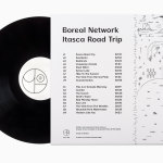
June’s highlights included Ahoy’s brand identity for Manchester bar, restaurant and club Neighbourhood, Bedow’s work for Erik Penser Bank and Boreal Network, and The District’s brand identity and wayfinding for property developer Learig. However, there were five projects that stood out, and have made it into BP&O’s Best Of Series.
This feature brings together some of the most unexpected and unusual projects published on the site each month for another opportunity to be seen and shared. These typically balance a strong communicative concept with a compelling aesthetic that appropriately plays with a mix of material colour, texture and image, form, type, layout and print finish.

Wagon Wheel by Perky Bros, United States
Wagon Wheel is a Nashville-based boutique real estate title and escrow company established by three partners with substantial experience working for larger corporate law offices who wanted to establish a company with a more casual corporate culture and client experience. This, and Wagon Wheel’s Nashville roots, is expressed throughout its new brand identity, designed by graphic design studio Perky Bros, using a combination of a strong graphic approach and tactile material choices. This extends across folders, business cards, coasters, posters and signage.
See more of this project here


Hedeker Wealth & Law by Socio Design, United Kingdom
Hedeker Wealth and Law is an American independent business group dedicated to helping people protect, preserve and grow their wealth through services based around four key areas of expertise—investment, management, financial planning and tax advice. This complete and holistic combination marks Hedeker out from what is a crowded market of individual businesses providing fewer services.
To better express their experience and breadth of service, and to help reposition the group in a way that would attract more affluent clients, Hedeker worked with London-based studio Socio Design to create a new brand identity. This included logo and logotype design, stationery, business cards, quarterly newspaper and website.
See more of this project here

Collected Coffee by Fivethousand Fingers, Canada
Collected Coffee is a New York-based coffee subscription service committed to sourcing the world’s best coffee beans, prepared by speciality roasters. The service worked with Canadian design studio Fivethousand Fingers to develop a brand identity, which included logo, packaging and web design, that would be perceived as intelligent, cultured and curious to a sophisticated coffee enthusiast. This was achieved through a contemporary gallery-like aesthetic of plenty of white space, still life photography and clear product insight, consistently expressed using Calluna, that builds on the curatorial nature of name and service.
See more of this project here
Paco Rabanne by Zak Group, United Kingdom
Paco Rabanne is Spanish designer and French fashion label established in 1966 with a catalogue of ready-to-wear garments, shoes, fragrances and accessories. Rather than an interest in the past, Paco Rabanne, who originally trained as an architect, has created strong silhouettes from new materials, and often rejected the spirit and art of the time.
Paco Rabanne’s creative director Julien Dossena worked with London-based design studio Zak Group to reinterpret and express the essence of the fashion label through a new brand identity system. This included a revised logo and monogram, custom typeface, shopping bags, invitations, website, print campaign and art direction. The launch of this new brand identity coincided with the opening of the label’s first new shop in ten years.
Read more of this article here

Arco by Raw Color, the Netherlands
Arco is a family run contemporary furniture design and manufacturing company that currently rests in the hands of forth generation family members, and has a respectable 110 year history. Arco has tables and chairs at the heart of its collection and specialises in woodwork, a reflection of its location in Winterswijk, an area of dense natural woodland in East Netherlands.
Eindhoven-based graphic design studio Raw Color worked with Arco Creative Director Jorre van Ast to revise the company’s brand identity, with a focus on its unique location and local production. This is expressed through the documentation of the surrounding area, the factory and its craftsmen. While the logotype remains the same, Raw Color delivered a compelling visual identity that juxtaposes solid colour and seasonal image, and uses contemporary type to deliver a collective tone of voice. This extends across and links a variety of print communication that includes business cards, leaflets, brochures, catalogues and postcards.
Read more of this article here