Landhaus Keller by Seite Zwei
Opinion by Richard Baird Posted 11 July 2016

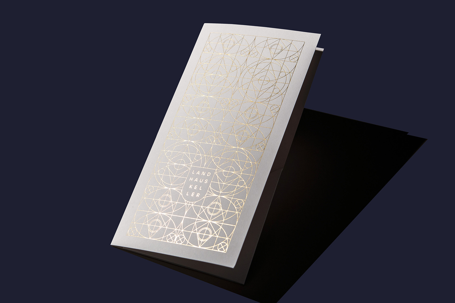
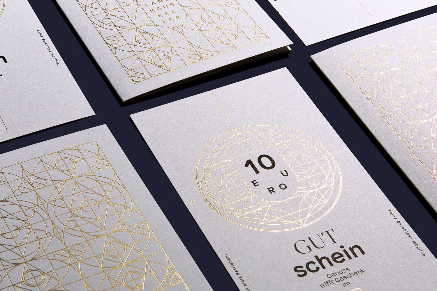
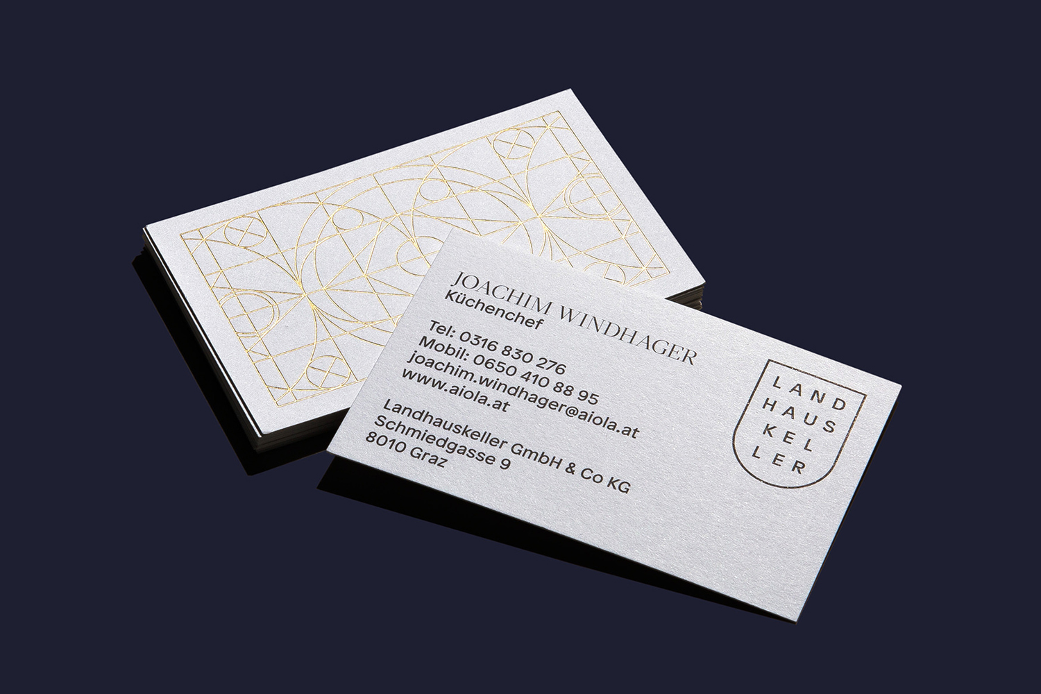
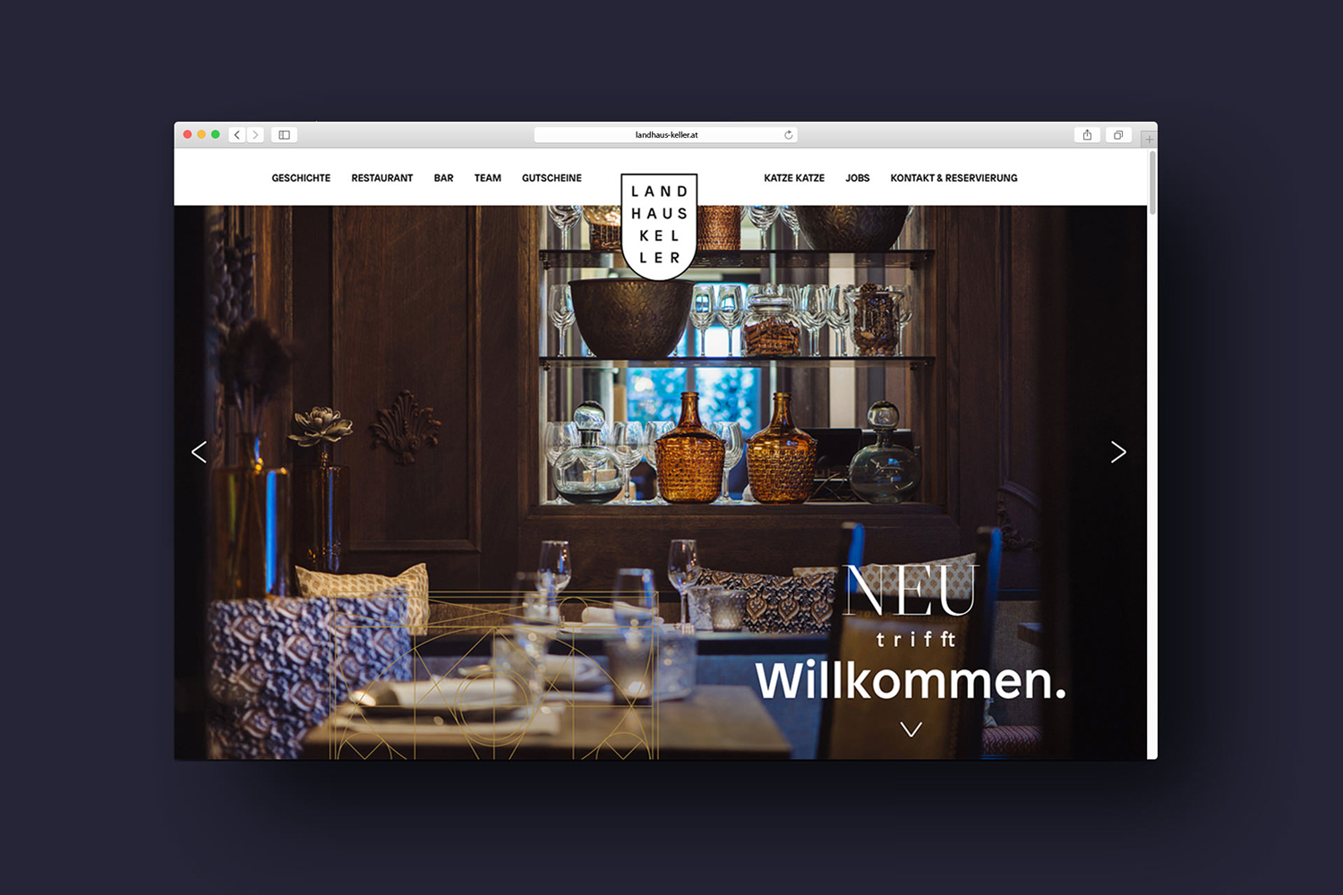
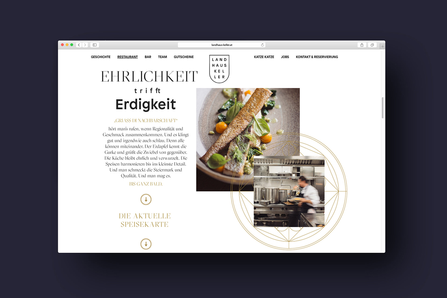
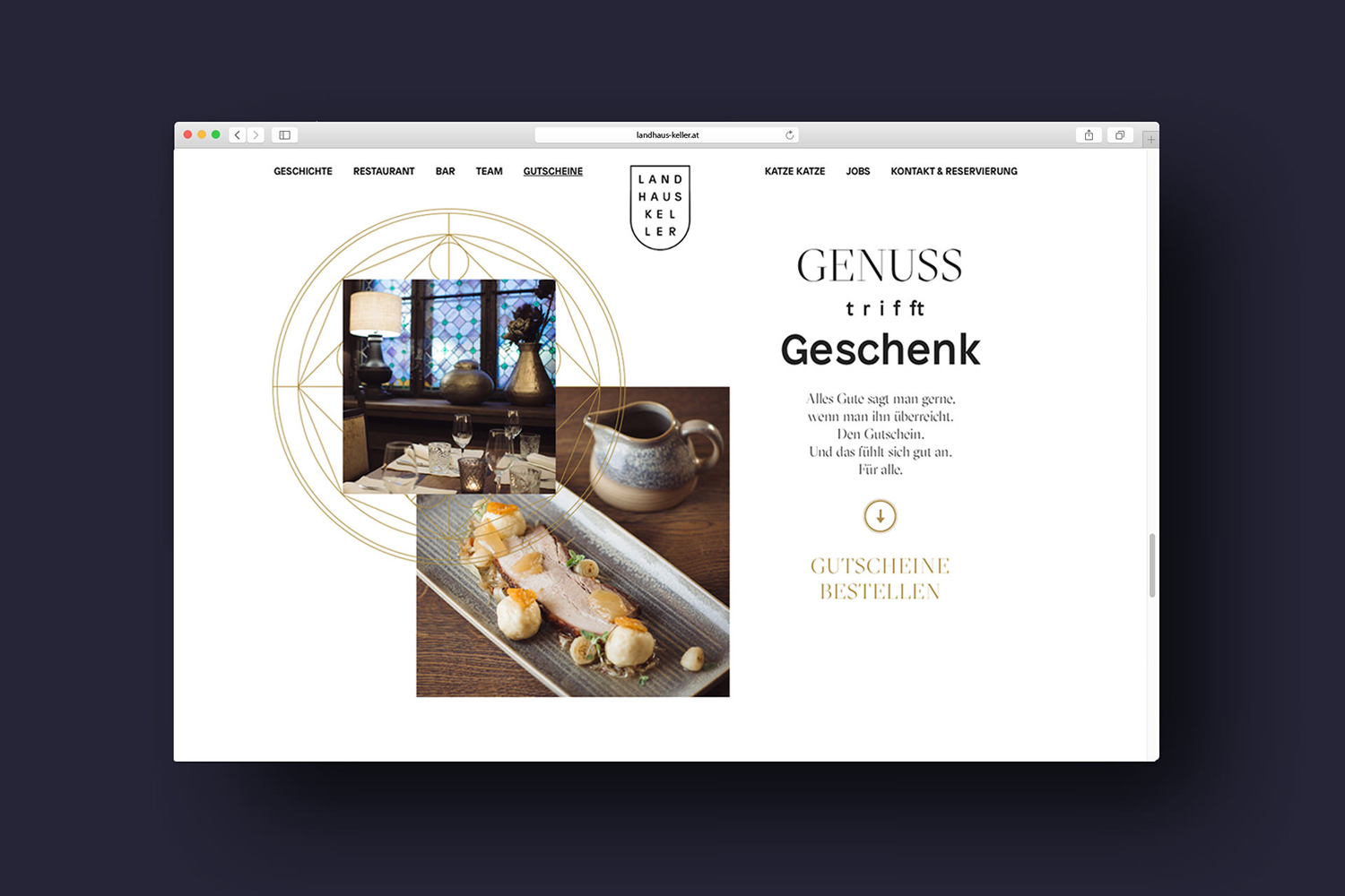
Landhauskeller is a restaurant and bar in the Austrian city of Graz, housed within a building that is over 400 years old. It has a distinctive and highly ornamental interior reflective of the building’s history, and a quirky, current and unusual presentation style. Together these play with classical and contemporary materials, details and forms. This also runs throughout Landhauskeller’s brand identity, designed by Seite Zwei, in the use of typographical juxtaposition, choice of materials, illustrative flourish and print finish. This links business cards, coasters, menus and website.
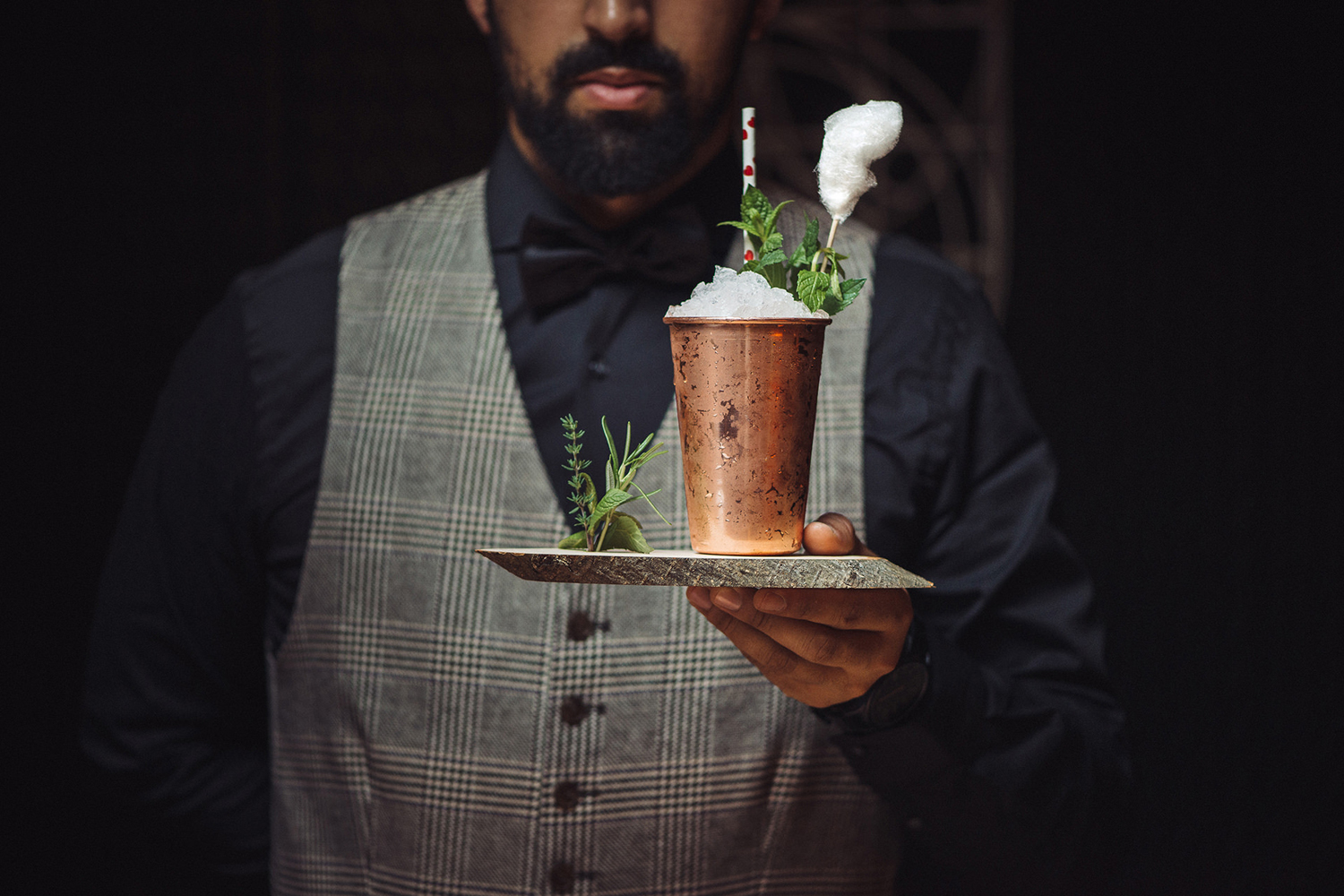
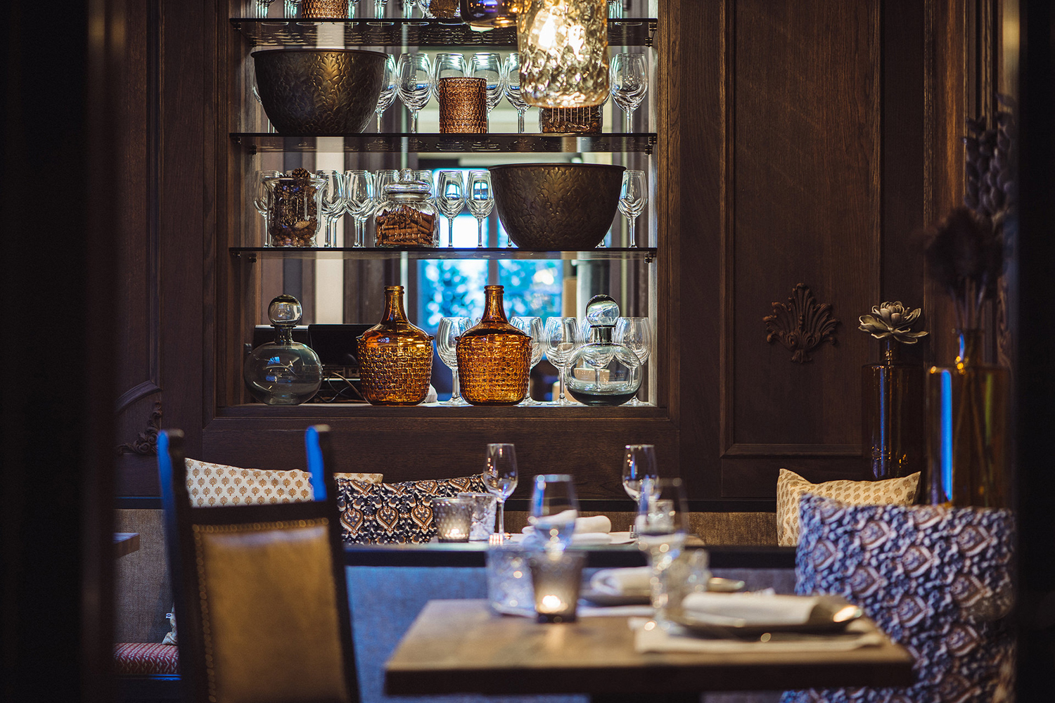
Seite Zwei’s work for Landhauskeller is a reductive expression of interior and experience, and the concept of yesterday meeting today. A rich space of ornament and flourish, and a more modern take on the traditional is distilled down and expressed through a few key details; type contrast, geometric pattern, a couple of good quality material choice, print finish and the way these have been worked together.
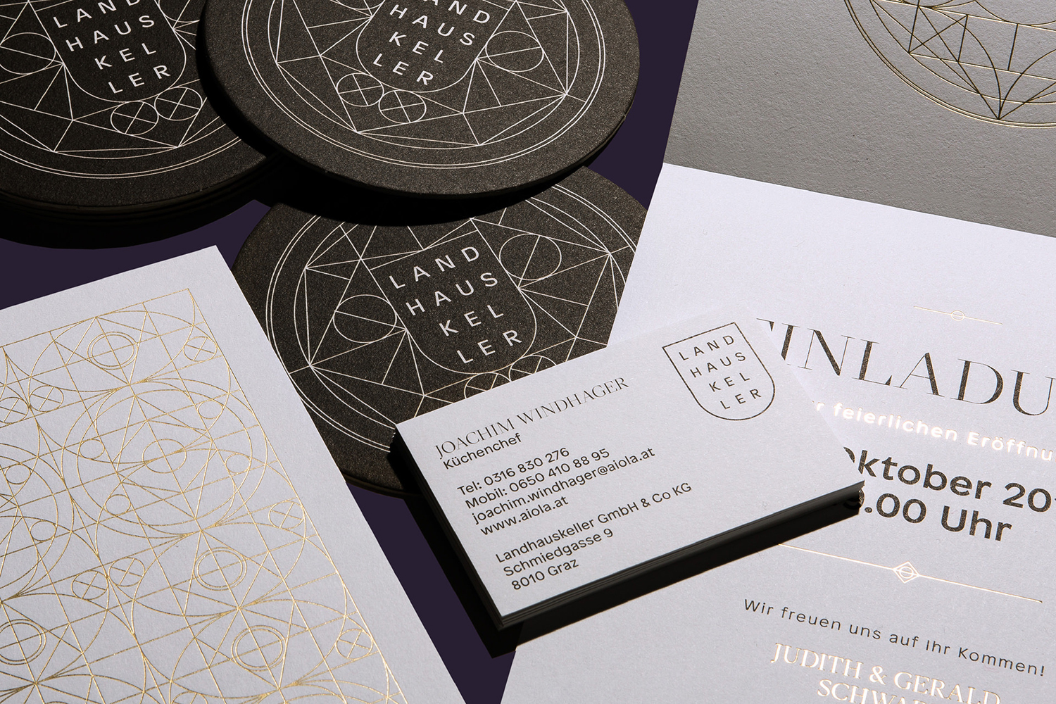
The reductive and contemporary qualities of Milieu Grotesque’s Patron, set alongside the high contrast and classical calligraphic strokes of Grilli Type’s Sectra, make for an impactful, slightly awkward and occasionally disjointed pairing. Their disparate qualities are drawn out further through sentence case and all caps typesetting. Although past meeting present is far from an original concept, it is rooted in a genuine and significant history and a modern dining experience.
Concept also emerges through a mix of good quality white and dyed black boards, the expense and continued favour for gold block foiling, and the way geometric type has been stacked and set within a simple shield motif.
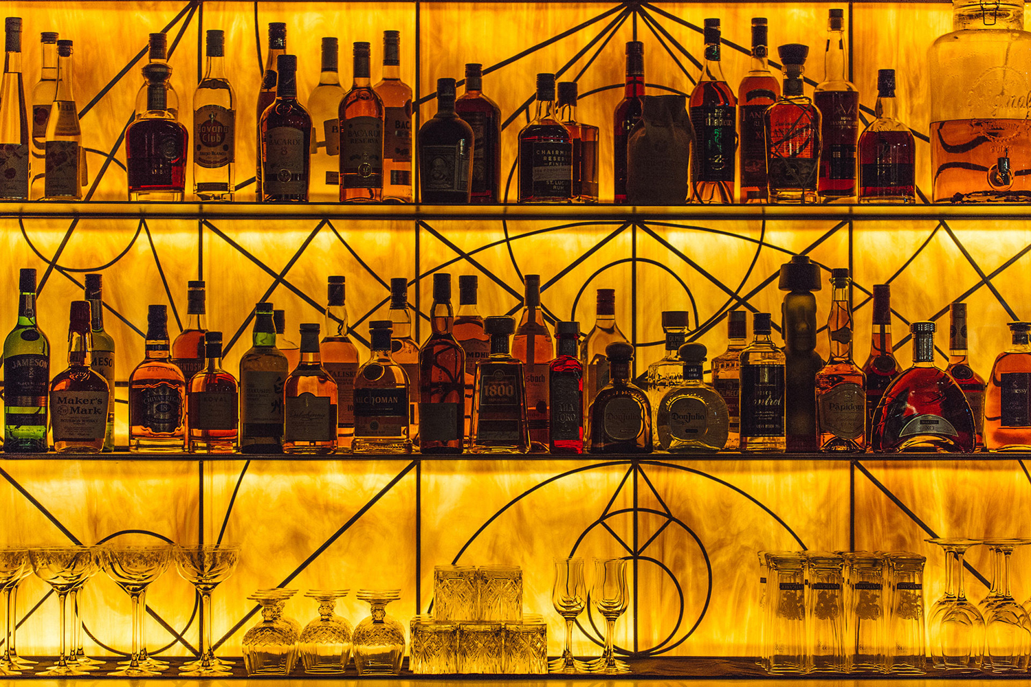
Seite Zwei where also involved in environmental branding. A connection between physical space and brand identity in print and online is made more directly through geometric patterns. These are interesting and intricate, adapt well across a variety of contexts, and their fine lines take a gold block foil particularly well. These are the centre piece of much of the printed material, and for good reason, where type has clearly defined period qualities, pattern feels timeliness.
Design: Seite Zwei. Opinion: Richard Baird. Fonts Used: Patron & Sectra.
