The Glamoury by Glasfurd & Walker
Opinion by Richard Baird Posted 25 July 2016

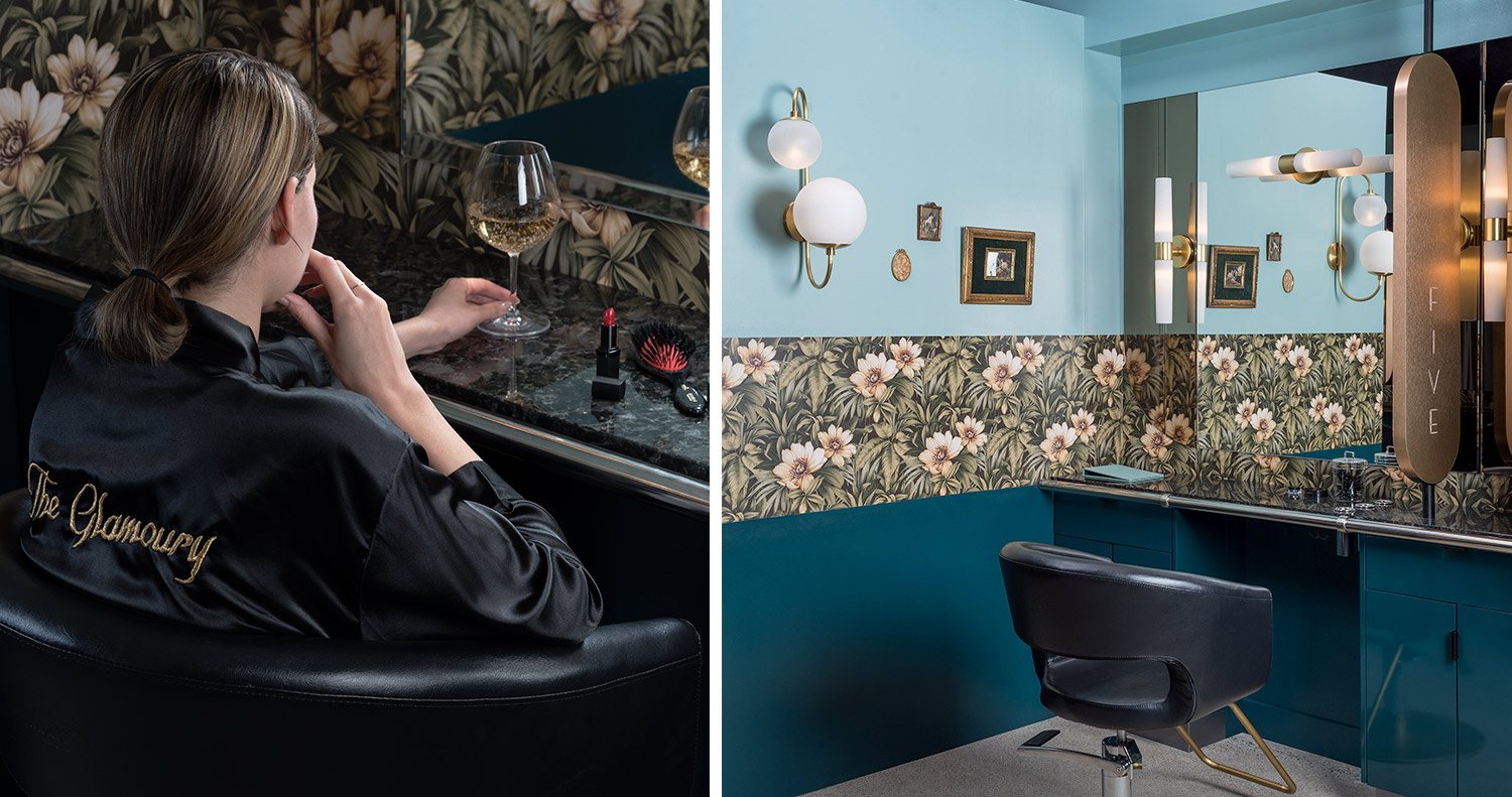
The Glamoury is a Vancouver-based luxury make-up and styling salon where the classical and timeless meets the modern. The salon takes a personal approach, creating tailored looks that express the personality of its clients. It has a distinctive interior of period shapes, sufaces and detailing, flat colour and illustrative borders, and a brand identity, designed by Glasfurd & Walker, to match. This runs across menus, stationery, business cards and packaging, and features custom typography.


Identity, both in its materiality and graphic expression, appears as a fair distillation of experience; a mix of personal, customised and luxury service and an interior that blends Art Deco and mid-century modern aesthetics. This is achieved through colour palette and paper texture, plenty of space, the finish of a gold block foil, fine lines, the flourish of motif, custom typeface and strong geometric forms. Where interior is lavish and varied, identity feels precise, focused and informed.


Interior space and brand identity are connected explicitly through signage at the reception and implicitly using complimentary colour, typographical form and finish. The motif takes its cues from the ornamental and art deco, but is modern in its implementation. Logotype and typeface are well-drawn with a pleasant calligraphic quality and some nice lettershapes but perhaps lack a clear individuality and the character set to really justify a custom build. The embroidered cursive logotype plays with Hollywood glamour (think classic film titles), the personable in its drawing and the high quality in its gold stitching.


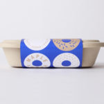
The use of dyed green board with what looks like a sandgrain surface texture and a gold block foil, alongside interior, is a highlight. These choice take what is a very lavish environment and retrospection; one of illustration, metallic surfaces, brass fixtures and fittings, and distils it down and expresses this with a current eye for restraint. Where interior favours blues, the green allows product packaging to stand out and whilst also being complimentary.

The make-up illustrations of the menu are well-intentioned but throws things off a bit. These are well-illustrated (in a way that is authentic to a period), have a personal crafted quality, and are functional, however, these do not feel particularly luxe, and there is a lack of continuity in make-up and hairstyling images online.

The Glamoury website feels a touch unresolved in its structure, use of photography, type and typesetting, and the illustrations kind of stick out. Colour holds most of this together. There are some nice ideas here, and distinctive interior design is a prominent detail, although it probably should not have been buried below a generic glamour shot. Across stationery and packaging, when used sparingly identity feels far more balanced, contributing to interior, and conveying some of its qualities outside. More from Glasfurd & Walker on BP&O.
Design: Glasfurd & Walker. Opinion: Richard Baird.