VonHof Cycles by Franklyn
Opinion by Richard Baird Posted 1 September 2016
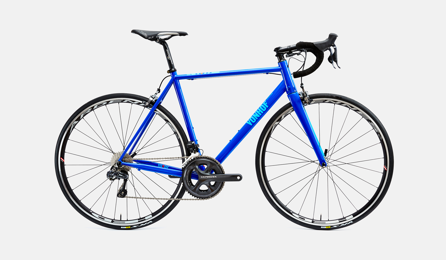
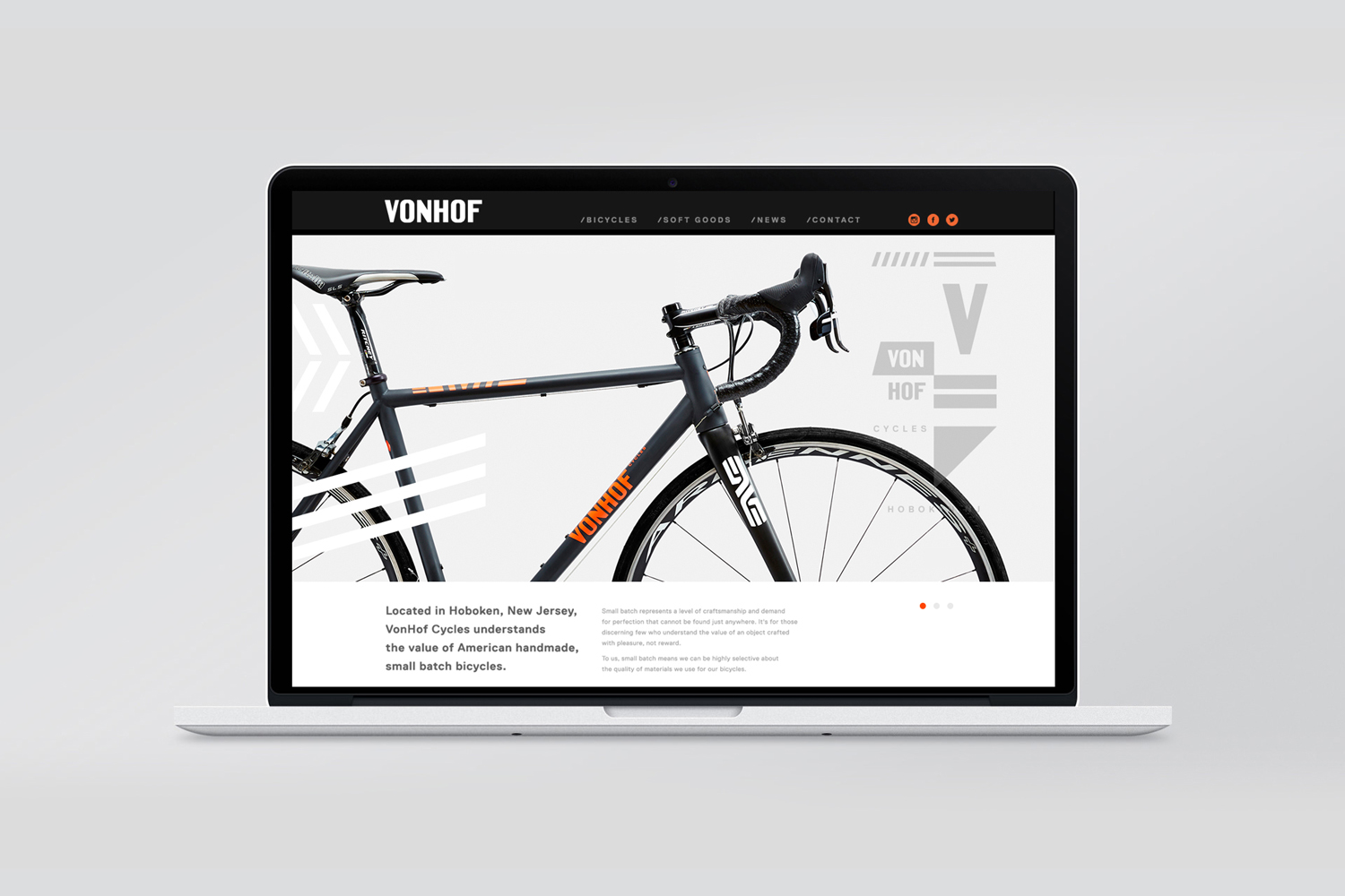
VonHof crafts bicycles in small batches by hand for mountain, road and cyclocross categories from its location in Hoboken, New Jersey. Keeping true to the process of crafting bikes, one that produces a range that is uniquely poised, handsome and of exceptional quality, New York graphic design studio Franklyn took a boutique approach to VonHof’s brand identity. This included wordmark and a system of typographic, pattern-based and informational components to be used in print (across bikes and promotional materials), and online.
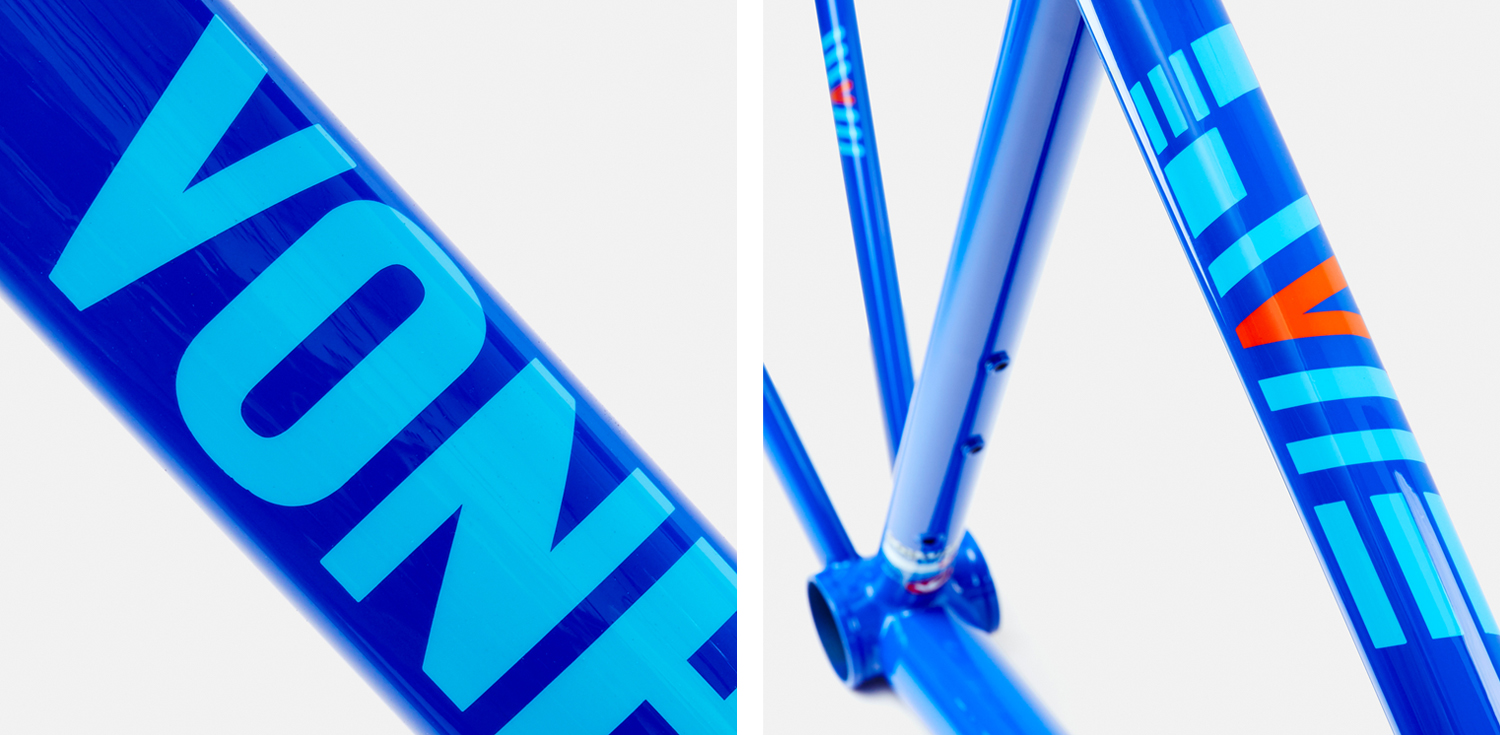
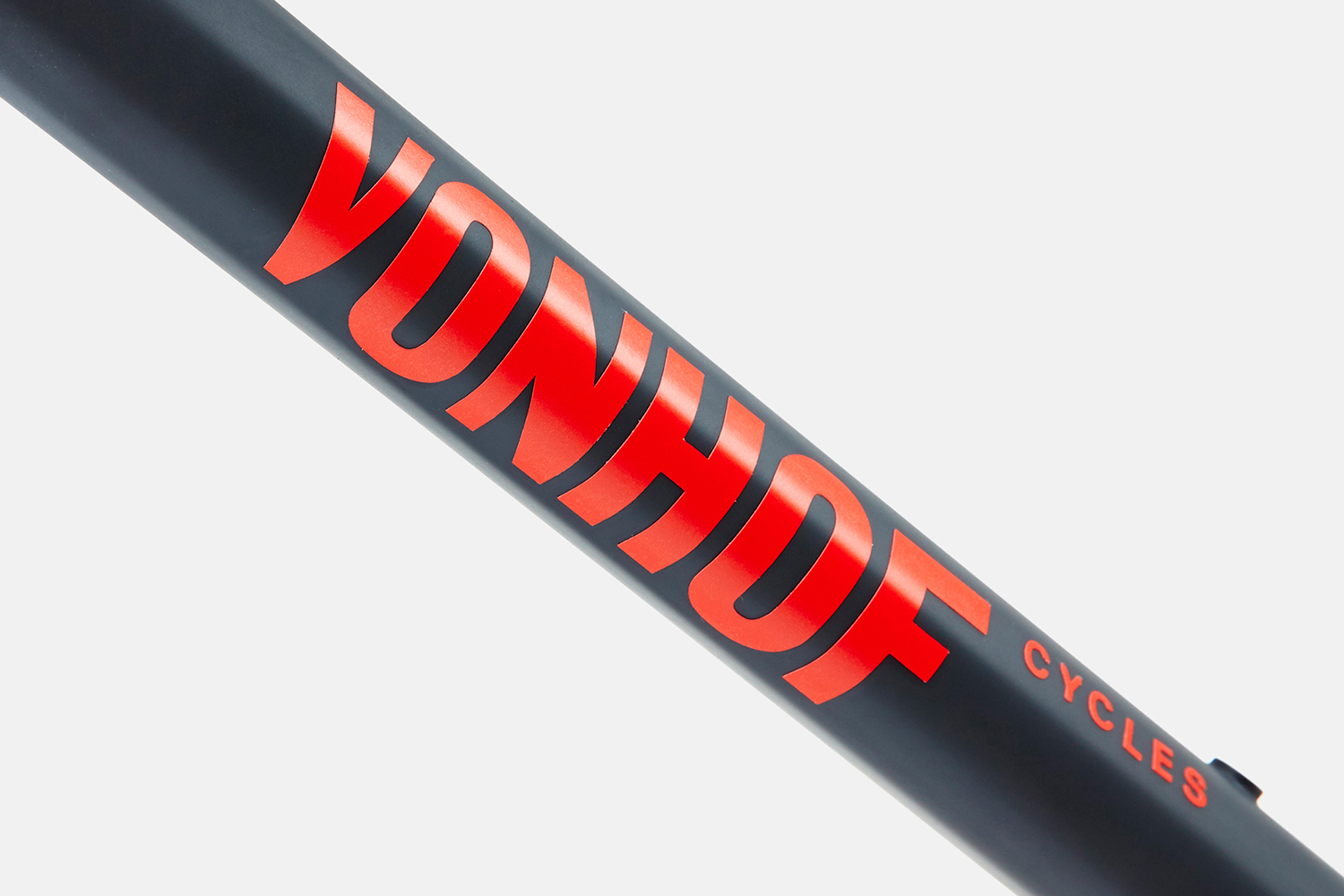
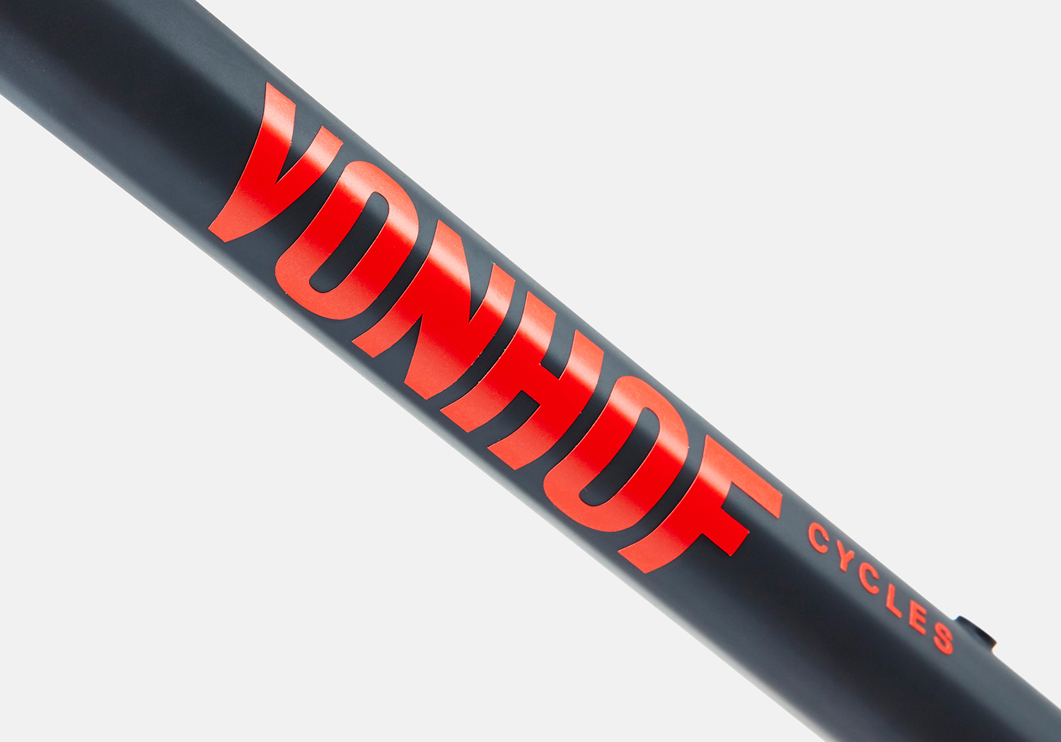
Franklyn created a custom wordmark of bold uppercase characters with a mild stroke contrast and a pleasant monospaced quality. These choices clearly acknowledge a very specific context and allow the VonHof wordmark to work equally well stacked vertically down a seat tube, or running horizontally across a top tube. It has good visibility and delivers impact across the constrained canvas of curved tubes and in a couple of different colour combinations, and stands up well in more familiar contexts such as website.
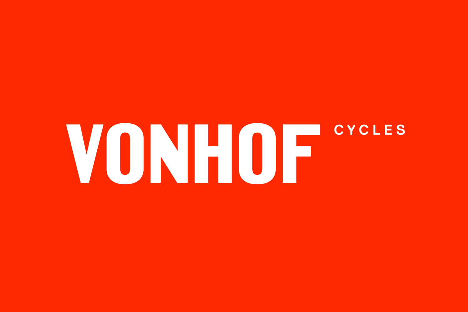
Alongside a unique name, there are some distinctive character shapes. The heavier diagonal of the N and its lighter vertical strokes, in opposition to the wider vertical strokes of other characters, adds variation and character. The wordmark benefits from a natural balance in the equal number of letters and the Os either side of the NH. This sense of balance is also helped by some consistent spacing. “Cycles” does feel a touch tacked-on; in position, sizing and weight, but shares an uppercase set of letterforms while the cuts to the Y have a appropriately mechanical quality.
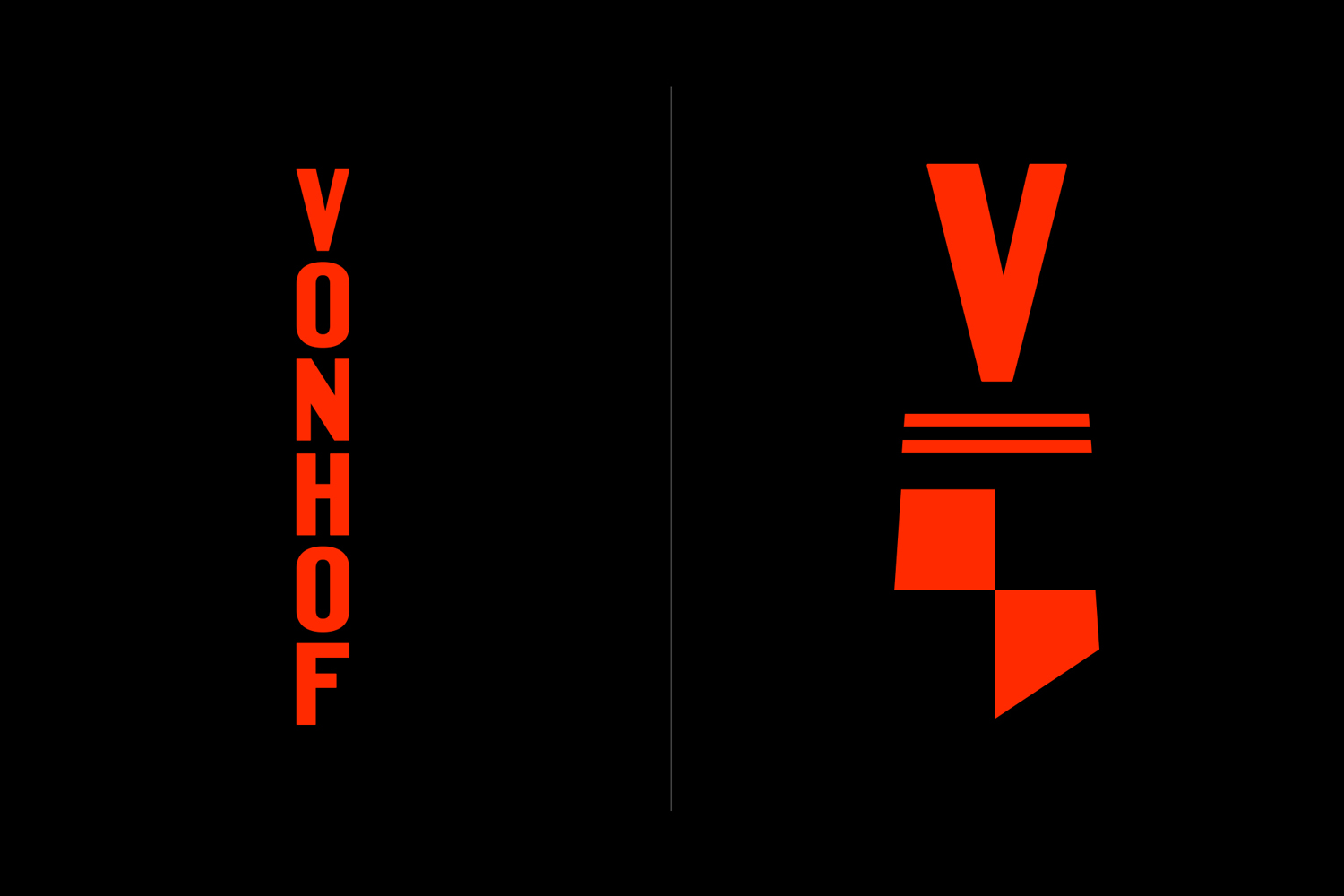
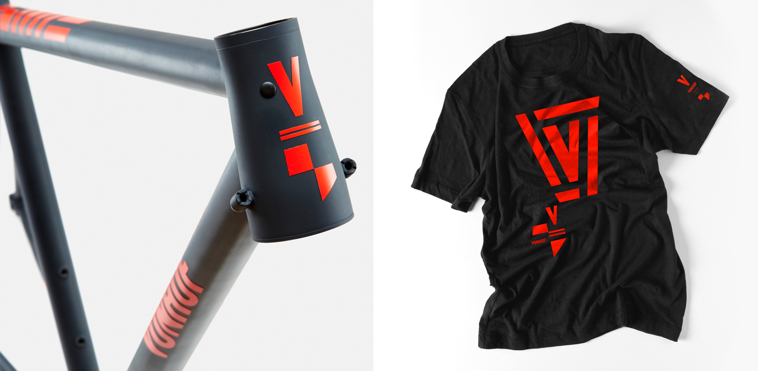
The typographic and pattern-based system plays with lines, shields and letters, mixing speed with legacy and tying these well to wordmark. The shield’s balance of positive and negative space and the absence of frame is a pleasant and confident detail that looks particularly good and rather contemporary on the headset as a decal rather than a more classical metal badge.
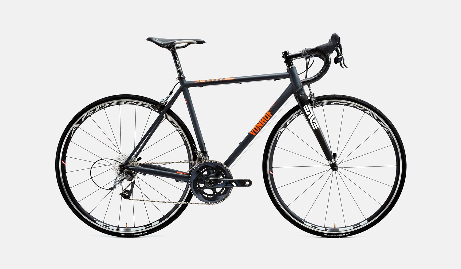
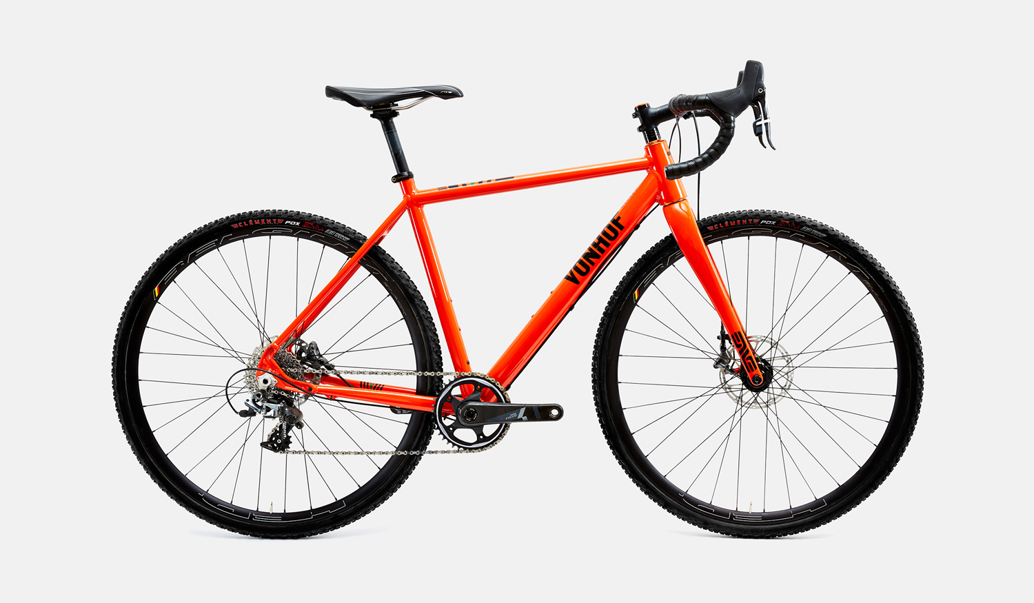
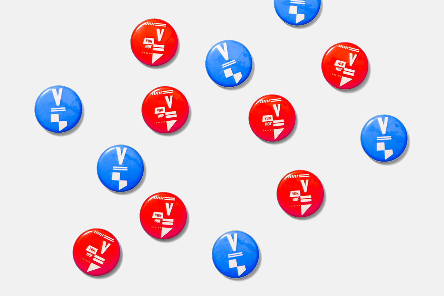
Occasionally the modular system feels a bit much on bike when there is such as strong wordmark and logo, and there is a bit of a haphazard approach to using the modular assets online. The bike graphics, Twitter and Facebook headers and the three icons on the VonHof website lack a sense of continuity between them and do not feel as well resolved as they are presented here, however, the badges and t-shirts begin to show the potential of the system. More from Franklyn on BP&O.
Design: Franklyn. Opinion: Richard Baird.
