Stevenson Systems by Socio Design
Opinion by Richard Baird Posted 15 September 2016

Stevenson Systems is an American business that specialises in ‘space accounting’, an industry that measures architectural spaces using a variety of laser scanning and measuring devices, goes on to classify areas within larger spaces and produces reports and offers consultation on how to draw the most value from these.
Stevenson Systems pride themselves on their ability to add value, rather than just delivering data, and providing their clients with an array of services that look at the complete lifecycle of a building, from purchase through development and finally to sale. The company is a leader in its field, a position it has held since its foundation in 1986, however, its brand identity fell short articulating this authority amongst a crowd of newer competitors.
London-based Socio Design recently worked with Stevenson Systems to develop a brand identity that would counter the perception that they just measured buildings and would communicate an authority. The studio was responsible for strategy, logo and iconography design, stationery, brand guidelines, art direction and website, both design and build. Underpinning this rebrand is a new mission statement “Discovering Hidden Value”.
There is a pleasant visual language at work in the drawing of assets, in the art direction of photography and structure of site and stationery. Dimensionality, a balance of space, a wireframe-like quality and the monolinear isometric stacked S of the logo speaks clearly of space, structure and planning, which then goes on to inform the build of a few different icons and graphic device across the business cards.
New Rail Alphabet, “a revival of the British Rail alphabet designed by Margaret Calvert Associates in the early sixties” and Maison Neue, a reworking of a typeface with geometric principles now with “harmony, rhythm and flow”, appears precise and has a contemporary aesthetic and functionality.
The flat bottoms of the V and Y of the logotype offer something in the way of the technical and proprietary where everything else remains fairly neutral, in shape and monolinear line. These changes are subtle but well-intentioned, and are worked in well alongside other characters, although that second s on the first line looks a touch small.


The graphic device that runs across the business cards takes a similar approach to logo in the use of space and structure. Socio Design did provide a more lengthy explanation of this, however, its strength lies in its visual language. It is a simple but effective graphic expression, with a topographical quality in the way lines are hidden behind and run over planes, rooted in the scanning of space, emphasised by animation, with different crops providing both moments of variation and continuity in print.


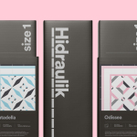
A colour palette of white and cools greys lean on some well-established associations; think modern concrete buildings and architectural landscapes, with purple introducing a bit of character whilst also working to differentiate.
In print, layouts are grid-based and straightforward with a good eye for space. There are some nice details that resonate with the structure of the logo, in particular the stacking of e-mail and web address. Coloured papers and boards, white ink and block foil print finishes give identity a high-quality materiality but, much like the logo and choice of type, shows restraint.

Socio Design build out identity with some solid art direction. The breadth and scale of Stevenson Systems’ work is effectively articulated in the content and composition of image. A skyscraper fills the frame while a lifeguard hut appears in its completeness surrounded by plenty of space, and a complex network of city utilities (storm drain, railroad tracks and powerlines) in one image are in stark contrast to the unfurnished, uninterrupted internal space of a new office building.
These images also function to give Stevenson System’s a sense of place (not far from Los Angeles or Laguna Beach), while colour grading does a good job to link these. BP&O loves neat logos, patterns and good quality materials but it is this thoughtfulness that really stands out.


A website, which will acquire further functionality as new content becomes available, shares a little of the compartmentalisation of space that is the foundation but not the entirety of Stevenson Systems services in its modular panels, their responsive nature, and in its generous use if white space while a lightness of type and a good use of photography builds on the precise and technical, the scale of projects and the company’s locality.
Each asset feels well-weighted and well-intentioned, and there is a clear continuity between print and digital presence. It is good to see the graphic device of the business cards remain a print detail, also across report covers, adding a visual flourish, like the purple, just in the right place to keep it from becoming clinical. More from Socio Design on BP&O.
Design: Socio Design.
Opinion: Richard Baird.
Fonts Used: New Rail Alphabet & Maison Neue.
Papers: Colorplan Amethyst, Ice White & Real Grey.
Finishes: White Foil & Pantone