Little Italy by Here Design
Opinion by Richard Baird Posted 21 November 2016

Little Italy is a restaurant, gelateria and pizzeria located in the Jordanian capital of Amman. The restaurant features a distinctive, period and European-inspired interior of stained wood, glossy white tiles, concrete floor, vintage glass light shades, wood panelling and exposed I beams, brought together with a modern balance and lovely sense of form and contrast. This continues through to the restaurant’s brand identity, developed by London based Here Design, in its mix of type and illustration. This links menus, interior graphics, signage, packaging and business cards.


The contrast that exists throughout Little Italy’s interior design, seen in the curving wood of the staircase and the linear and black painted I beams, the geometry of pergola and the lines of the railings, also proliferates brand identity, but is similarly held together by a strong desire for authenticity. The extent to which this authenticity has been researched and implemented, likely elevated by its Middle Eastern context, is impressive, and reflects a menu made up of homemade pastas, imported Italian cheeses and locally sourced ingredients.


Brand identity, outside of interior experience, comes down to two key expressions; typography, referenced from genuine Italian neon and hand written signage, and the etched illustrative detail of crests and icons.
Script, condensed and regular letterforms are held together by a preference for consistent line weights. “Little” feels modern in its polish but authentically period in its parallel lines, loops and ligatures. Although different in form, this authenticity continues through to the condensed characters of “Italy” and the low bar of the A.
While compositionally quite busy, letter size, spacing and stepped structure, finishing in a more detailed crest, appears well-balanced and communicatively clear. This is aided by the use of two inks which give logo a layered quality and helps to both unite and define the caffe, pizzeria and gelateria.
The illustrative work is a particular highlight. Irregular lines and an etched quality feel distinctly and authentically period. There is a good relationship between light and shade, moments of detail and areas of space and simplicity. Although not mirrored, crest feels balanced, with variations in the birds, leaves, and small imperfections establishing a strong sense of age, legacy and craft.

The icons build on those qualities established by crest. These have a strong sense of the provincial, emphasise ingredients and a sense of tradition. Although these may well be familiar and common place to those in Europe, these are going to appear more distinctive and memorable within a Middle Eastern context.

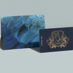
Type, crest and icons are remixed across print and packaging. Their craft value and provincial qualities are aided by the material; a mix of uncoated and unbleached pizza boxes, stickers, wrapping paper and the blind embossing of business card. Colour functions to add variation where there is repetition of form, and icons function to call out key ingredients.
Other highlights include the postcards, drawn and printed in a way that looks thoroughly period, the implementation of crest across crockery, and the male and female icons, presumably to divide restrooms.

Much like interior design, there is an Italian authenticity to brand identity but also a considered and contemporary quality to its implementation. Assets are clearly defined, and there is an evident system that underpins there use. This does not confuse communicative intention but rather makes some period references, coherent and useful.
Design: Here Design. Lifestyle Photography: Ali Saadi. Opinion: Richard Baird.