Frameline 41 by Mucho
Opinion by Richard Baird Posted 13 June 2017

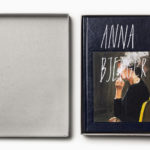
Frameline is an American nonprofit arts organisation and the world’s longest running LGBTQ film festival. Frameline continues its mission, since its founding in 1977, to change the world through the power of gay cinema, and to connect filmmakers with audiences locally and internationally. Graphic design studio Mucho worked with Frameline on its visual identity and campaigns for its 40th and 41st LGBTQ film festivals, delivering a system based around a framing device. This links membership cards, stationery and business cards, as well as campaign specific materials such as individual event invitations, posters and tote bags.
Mucho’s work for Frameline is a mix of good observation and happenstance (in the right angles of the initials), and rationalisation (in the description of the backwards L as being “queer”). Although the framing device is a familiar and recurring graphic tool, it is, however, universal and relevant, and finds a comfortable meeting point between an expression of inclusivity and filmmaking whilst remaining simple. These themes were appropriately built upon in Frameline 40’s use of image, held within the frame and tied to captions written by David Begler.

The logo functions well as a square asset, perfect for social media and tote bags, and expands and contracts within the context of flyers, posters and t-shirts. This provides a visual variety and communicative flexibility, with a strong sense of continuity, which can be seen in this year’s festival campaign, Frameline 41.

Frameline 41 continues to utilise the visual identity developed alongside the campaign for Frameline 40. However, rather than framing imagery, Frameline 41 focuses on a strong typographic approach, with copywriting by David Begler. This is described as playing on how people identify themselves within the LGBTQ community. The campaign evolves the phrase ‘Transgender’ to ‘Transgenre’, as a way to express the coming together of the LGBTQ community and film. This is is then expanded upon, leading to a twist on genres such as ‘Genre Queer’, ‘Genre Spectrum’, ‘Genre Equality’ and ‘Genre Fluid’.

Copy Opinion by Seth Rowden
This picture doesn’t need a thousand words – just two. Like the best films, David Begler’s copy asks us to think and participate, rather than passively spectate.
The absence of photography and the sparse use of copy leave room for the imagination, making it possible for a diverse group of people to find meaning in the words and identify with the statements on a personal level. I can imagine people taking ownership of the slogans and wearing them with pride, something that would be impossible to achieve with images. It’s the same reason the I Love New York logo is iconic; because it’s personal to each of us, yet outwardly celebrates what we have in common.
The spin-off statements around the main theme show a rainbow of copy positioned in the centre of the frame against a theatrically dark background. It’s active, witty, colourful, assertive, expressive – the perfect voice to speak on behalf of this community. The wordplay dares us to look more closely at something our eyes made a snap decision on at first glance. It’s a sophisticated, multilayered campaign. For me, the copy delivers a powerful and nuanced message: that both film and our communities would be lacking without genre/gender diversity. That’s a lot to say in just two words.
Bold and condensed characters, and a slanted baseline, alongside bright colours and a dark background provide impact from a distance, and a dynamic and changing quality where the framing device is static and consistent. The expressive nature of colour, form and words feel right in line with film (both moving image and the visual language of film posters) and the language of equality and pride.
Colour, much like the logo, relies on a well-established association but manages to draw something of a more sophisticated quality from this. Rather than the solid colours used throughout Frameline 40, here, gradients, sampled from parts of the rainbow spectrum, find another elegant way to work in a universal and inclusive motif without being blunt or tired. The use of plenty of black space helps to both emphasis and temper this, and delivers contrast, as well as breaking from the previous year’s visual identity which favoured white.

Avenir Next establishes a continuity throughout campaigns and other Frameline activities. It does not stray too far from what is an accepted sense of modernity and accessibility. However, alongside logo, the layout of print communication, unique copy and colour palette, and within the context of a nonprofit organisational body, this appears professional and practical whilst avoiding the corporate. It is also used effectively to complete the frame created by the expanding logo.

Although much of what Mucho draws on is familiar, the studio manage to create something smart and distinctive from their combination while also retaining much of their associative value. The direction feels restrained but well-suited to a professional organisation looking to engage with a diverse community, with room for creativity and a range of expressions in the image of Framline 40 and phrases of Frameline 41 that could be considered representative without being contrived. More from Mucho on BP&O.
Design: Mucho. Copywriting: David Begler. Opinion: Richard Baird. Copy Opinion: Seth Rowden. Fonts Used: Avenir Next.