Omakase Room by Tatsu by Savvy
Opinion by Richard Baird Posted 13 July 2017

Omakase Room by Tatsu is a unique sushi dining experience located on New York’s Christopher Street. The concept is rooted in the centuries-old family traditions of Japanese Executive Chef and host Tatsu Sekiguchi and the celebration of the individual and personal. This can be experienced in the restaurant’s unique and intimate setting, one that seats only eight, and a menu carefully crafted by Tatsu for one evening and for that specific group of eight, based on their mood, curiosities and preferences.
The restaurant features a light interior design of soft bamboo and fabric centred around Japanese minimalist traditions. Materials a few but high quality, the ceiling is low, and the design of the table and layout of chairs lend the restaurant a quiet and earthy material quality with little distraction, and establish an intimacy with the chef, and focuses the mind on the food.
Building on this, design studio Savvy developed a multi-sensory brand identity, with a similar restraint, materiality and discretion. This offers something of its own subtle character but does not detract from the food, while also working in small thoughtful details such as scent and semi-transparent paper that links type with interior. The project included menus, stationery, business cards and a ceramic gift.


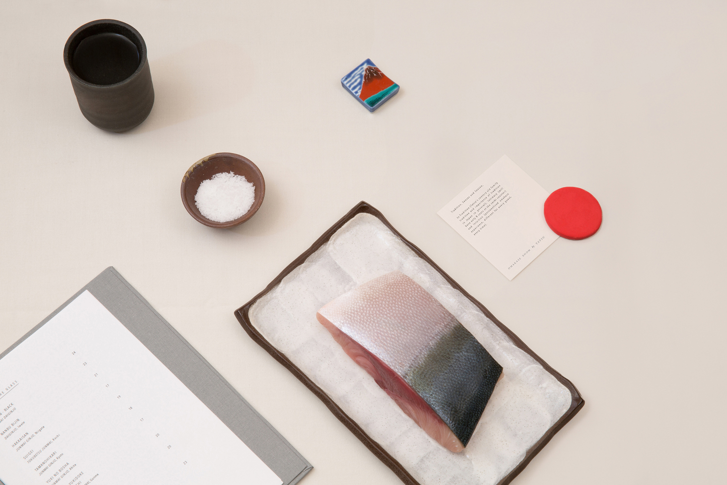
Savvy effectively channel the conceptual and material qualities of the restaurant. These are literal and observable, but also subtle and visceral. The former really comes through in the fabric of menu cover, similar to that of the seating, and in the semi-transparent qualities of rice paper, which draws in the material of its surroundings and the hands of those that are holding it.
The visceral comes through in the development of a scented ceramic disk, a collaboration between Savvy, ceramic artist Perla Valtierra and conceptual perfumer Barnabé Fillion. This is gifted to diners at the end of the evening with the intention of allowing the experience to linger after leaving the restaurant.
This disk changes colour and scent according to the season, and attunes diners to the five Japanese seasons: spring, summer, autumn, winter and doyo, an 18-day period of transition that falls in between each of the other seasons. The first scent is pure hinoki, a cypress tree native to Japan, prized for its woodsy, citrusy scent that grounds the body but opens the mind spiritually.


Much like the restaurant’s high quality materiality but stylistic restraint, Savvy’s choice of few fonts, pairing the free brush strokes of font Kouzan Gyousho with the generous spacing of Avenir Next Condensed, finds a balance between individual aesthetic character and conceptual subtlety, channeling something of New York’s architectural signage, and the personable calligraphic craft of the East. These are nuanced but discernible ideas and details that layer but remain in line with experience.

Generous kerning and arrangement, which plays with the linear and the justified, manages to draw on the geometric and linear build of the interior. The balance between open space and blocks of text, the space between lines and letters, offers pause, there is direction the way to read the words, and by extension, experience the food.


Colour palette, like material choice, type and typesetting, draws on interior. It has a neutrality that avoids distraction. Colour and detail comes exclusively from the individual ingredients and complete dishes, and the bright singular colour of the scented disk that intends to leave a residual impression. More work by Savvy on BP&O.
Design: Savvy. Opinion: Richard Baird. Fonts: Garamond, Avenir Next & Kouzan Gyousho.