MOAA Architects by Inhouse
Opinion by Richard Baird Posted 9 October 2017

MOAA Architects was founded in 2010. It has an office in Hamilton, New Zealand, and a portfolio of new builds and renovations that span the residential, education, commercial and public sectors. Highlights include their work on St. Johns Church, a square plan rotated 9 degrees off the street grid, and Piako House, a renovation and extension of 1940s domestic planning to meet a 21st century lifestyle.
MOAA Architects have a passion for ideas and people. An ethos rooted in reduction and a responsiveness to client needs. And an approach that seeks out innovation yet remains friendly and accessible. This is expressed by a flexible new graphic identity of modular play and variety, and a bright yellow and cool grey colour palette designed by Inhouse. This post was updated November 2017 to include images of Inhouse’s work on MOAA Architect’s website.
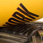
Inhouse’s graphic identity for MOAA Architects is built around a grid-based typographic system of modular, building-like letters that can be compressed and extended, stacked horizontally and vertically, and rotated to fit a variety of contexts. These include portfolio cover, business cards, stationery, tote bags, notebooks, gridded-paper, signage and website.
Conceptually it is simple and familiar, however, the changing forms, their contextual sensitivity (a critical architectural consideration) and variety, alongside colour palette, lend the work a distinctiveness and memorable quality.
The responsive, playful and universal nature of graphic identity translates well online, utilising browser size and rollovers to trigger different states of the logo. This, in conjunction with colour, image and type establish a clear continuity between print and digital assets.


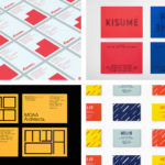
Variety and interest comes from the freedom to rotate, compress and extend letterforms within a clear grid-system. The use of a more formal sans-serif logotype affords the logo an opportunity to push readability and to favour the more structural. The use of individual letters across headed paper and notecards establish a discernible continuity whilst avoiding repetition.
There is also a satisfying and more obvious connection made to structure, and the studio’s iconic work, in the cropping of portfolio cover, placing the graphic and photographic side by side.
There is a pleasant and subtle material sensitivity in the choice of dyed, uncoated papers and boards, open stitching, edge painting and black block foiling that elevate the graphic language into the material world of architecture.
The pairing of a cheerful sunshine yellow with a variety of grey boards channels something of the typographic and architectural play of the graphic system, the approachable positioning of studio, and works in an element of the industrious.

Other small details include yellow rather than grey grids on the sketch paper, the two different colours and communicative tones of headed paper and their play with space, structure and visual weighting, and the stacked numbers of the studio’s door.

It is a simple and straightforward graphic expression. It derives distinction from its contextual responsiveness and variety, initial impact in colour and use of form, and is reassuring in its use of familiar industry cues and material quality. Although perhaps a touch transferable, stylistically it appears to be grounded in a personable approach and a desire to convey architectural ideation in a cheerful, playful and universal way. More work by Inhouse on BP&O.
Design: Inhouse. Opinion: Richard Baird. Fonts: Neuzeit S.