Logo Design Trends: Flexible Logos
Curve Club by Wildish & Co.
For a type-nerd (hello!) there are few things more seductive than a beautiful, beguiling letterform. But what makes such shapes even more siren-like is when they leap off the page and come to life, not just in motion, digitally; but in a physical environment. The branding for new private members club Curve Club, then, certainly ticks a lot of boxes...
Mode by Gretel
How to make a data business approachable yet hold gravitas? Can it be engaging yet authoritative, sage yet cool? These are the implicit tensions NY-based Gretel has grappled with in its branding of Mode, a data intelligence and technology business seeking to widen its appeal. Gretel has established a brand identity which is triumphant and clean. It balances the contradictions that so...
Eurostar by Design Studio
Train related rebrands are often some of the most divisive when it comes to the design community Twittering classes. That’s perhaps unsurprising when you consider the ubiquity of Standards Manual books on design studio coffee tables – and the fact that they’re among the rare graphics projects that get broadsheet attention (for better or worse, as the swathes of National...
Forskningsrådet by ANTI
2022 was, let’s say, an interesting year for Forskningsrådet (The Norwegian Research Council). The public institution, which provides public funding for research and innovation across a wide range of fields, usually operates without controversy or intense public scrutiny. This changed in September 2021 when Norway held its national elections and got itself a change of government. And along with that,...
Peerspace by Mother Design
Straight up, I’ll admit that I struggle to resist a condensed sans typeface set in uppercase. I’ll also confess that I’ve spent the last hour (no lie), trying to identify this one… Helvetica? Hell no. Railroad Gothic? The wrong track. Söhne? Sö not. Must be Knockout? Another blow. For Druk’s sake is it Druk? Well, whatever it is, it’s neatly...
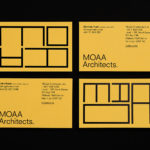
MOAA Architects by Inhouse
MOAA Architects was founded in 2010. It has an office in Hamilton, New Zealand, and a portfolio of new builds and renovations that span the residential, education, commercial and public sectors. Highlights include their work on St. Johns Church, a square plan rotated 9 degrees off the street grid, and Piako House, a renovation and extension of 1940s domestic planning to meet a 21st...
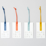
John Lewis Childrenswear by Charlie Smith Design
London-based studio Charlie Smith Design worked with British department store John Lewis to develop the visual identity system and packaging for their childrenswear department. The system needed to appeal to girls and boys aged from 2 to 14 (and presumably their parents), and connect a broad range of accessories and garments that included denim, swimwear, shoes and underwear. The result is as a...

London Design Biennale by Pentagram
London Design Biennale is the world’s first purely design-focused biennale from the team behind London Design Festival. It will take place between the 7th and 21st of September at Somerset House. The theme of this year’s event, Utopia by Design, will include entries from 37 countries. These intend to interrogate the history of the utopian idea, engage with some of...
A-TO-B by Stockholm Design Lab
A-TO-B is a retail destination dedicated to all things travel. It curates and sells smart practical products for the modern traveller, complimented by insight and advice. Whether it be an around the world trip or the daily commute, a preference for small private labels or well-known bag brands, A-TO-B has it covered. Venue Retail Group—owners of A-TO-B and over 150 shoe, bag and...
Have A Great Day Films by Hey
Have A Great Day Films is the production company of French filmmaker Jérôme de Gerlache. Jérôme is said to have a taste for professional risk-taking and a distinct way of making short films, advertisements and TV comedies. Barcelona based graphic design studio Hey recently worked with Have A Great Day Films to develop a brand identity that would reflect Jérôme’s personality, convey a...
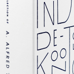
The Collection of A Alfred Taubman by Franklyn
The late A. Alfred Taubman was an American real estate billionaire, philanthropist and former owner and chairman of Sotheby’s, who had built a significant art collection, valued at around $500 million, that included works by Raphael, Kandinsky and Picasso, amongst many others. Following Taubman’s death this year, and with the hope of restoring his image after a price-fixing conviction in 2002, Sotheby’s held a...
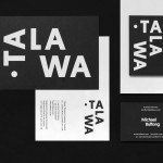
Talawa by Spy
Talawa, Jamaican patois for “small but feisty”, is an all black theatre company that looked to address the lack of opportunities for minorities and their marginalisation at the time of its founding in 1986. Since then it has established itself as one of the most successful theatres of its type in the United Kingdom. “Our work is informed by the wealth...