Moriarty by Bond
Opinion by Richard Baird Posted 18 October 2017

Inspired by the spontaneity and celebratory energy of parties and exploring the idea that curating great events is an art form, design studio Bond crafted a visual identity for new luxury event planning business Moriarty based around a series of abstract ink illustrations. These are paired with high quality dyed papers and boards, bringing a measured and distinctive contrast to printed assets that included folders, business cards and pitch documents.

Bond utilise a familiar visual language in the swirling forms of ink in water and the stencil cuts of type. The distinctiveness of the work really comes through in the quality of its execution, in the time and experimentation given to the creation of ink images, the use of complimentary solid colour and the materiality of uncoated dyed papers and block foiling.
The colour contrast and gradation, layers, bubbles and gold flecks of image make deliver an immediate impact and connection with arts and crafts. For many, it is something associated with the very early years of art education, when a link is made between a systematic process and unexpected and surprising outcomes. Well-suited to event planning.
Although it is an aesthetic that does often crop up, there have been a couple this week, this stands out for its event planning context, colour palette, the detail achieved by mixing inks and glitter, the balance provided by the solid colour of papers and boards, and the contrast established by the precise lines and the oppositional utilitarian component of type.
The images do occasionally falter. The brighter colour combinations of yellow, blue and green, and the more vivid pink are perhaps absent the sophistication of some of the others, but these do share a spontaneous and unexpected quality rooted in a process and concept that is discernible.


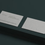
It is worth noting, Commercial Type’s Dala Moa and similar typefaces, have their roots in stone carving and in the weathering and eventual decay of the finer lines that connect broader horizontal strokes. This often gets misread as stencil cuts, an expression of utility and industriousness (with an persistent element of period elegance). In this case, and within the context of image, this use of secondary perception feels well-intentioned, bringing communicative, as well as visual breadth to the project. Dale Moa works as logotype and as headings, but is less distinctive (and often used) as logo. A secondary display choice, one with the finer lines intact, feels misplaced in the delivery of information. It takes a foil really well but is harder to read.

The abstract images, when presented together here, appear busy, yet within the context of folders, business cards and envelopes, framed in a gallery-like way, begin to feel well-moderated. The choice of skin, cool grey and navy blue papers and boards, as well as the debossed impression of block foil lend the work a high quality materiality in line with the overall sense of craft and crafted events, and provide balance, a visual counterpoint and corporate restraint to the individual expression of image.
Unfortunately, this does not feel as well implemented online. Abstract imagery, its colour and detail, alongside event photography without a strong sense of art direction, together feel overwhelming. The solid colours that punctuate, frame and bring balance in print are missing, and the use of Dala Moa, uppercase for headings, although establishing a continuity with print, does not feel as elegant.


There is a lot to like here, conceptually, visually and communicatively. It occasionally reaches too far, becomes busy and looses some of its elegance and craft in the selection and variety of image, yet pulls it back with stunning combinations like the above, which really calls to mind something of a contemporary gallery. Less might well have been more in this case, particularly online. More work by Bond on BP&O.
Design: Bond. Opinion: Richard Baird. Fonts: Dala Moa.