Kape 24h by Bond
Opinion by Richard Baird Posted 12 January 2018

Kari Aihinen is a Finnish chef with a growing international reputation. Aside from creating exclusive pop-up Finnish dinning experiences for New Yorkers, working for Ravintola Savoy and developing one-off Nordic-Asian menus with chef Eric Neo in Singapore, he is also the co-founder and headchef of Helsinki restaurant Roster.
Roster is a distinct experience. It features an interior design of custom furniture with a vintage twist, raw and refined materials and hand-picked design objects. Although sophisticated, Roster is a casual rather than formal dinning experience. The restaurant’s graphic identity, designed by Scandinavian studio Bond, is an articulation of this, and the brisk, humorous and warm personality of Kari Aihinen. This is furthered explored in the design of Kari Aihinen’s new cookbook Kape 24h, also designed by Bond.

There is a strong conceptual continuity between the interior design and graphic identity of Roster, and the design of Kape 24h, although the visual and material articulation of this is different. The book serves not only to give readers access to the culinary craft and insight of chef Kari Aihinen, express something of his personality—one that is warm, humorous and energetic—but also foster a closer connection to the man and his work. It does this in a multiple of ways, whilst remaining concise and resolved.
There are some familiar and universal visual languages at play yet the result is distinct. Intimate photography and a bright red hand drawn script deliver an intimate immediacy to the cover. For a chef with the reputation of Kari Aihinen, and an associated style that is refined and potentially perceived as challenging, the cover is disarming and accessible. Its materiality layers this with an aesthetic pleasure and further communicative value, more on that further down.
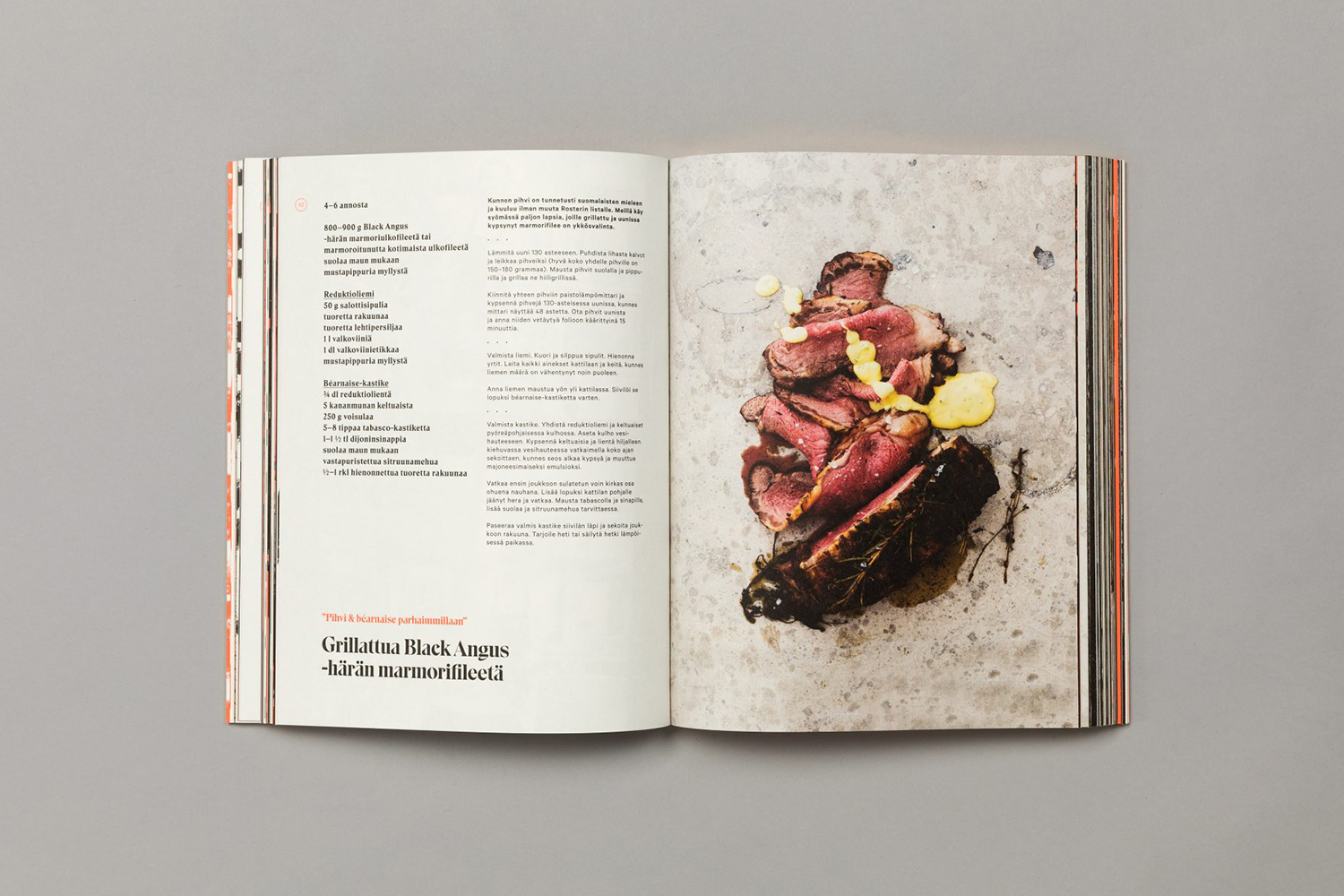
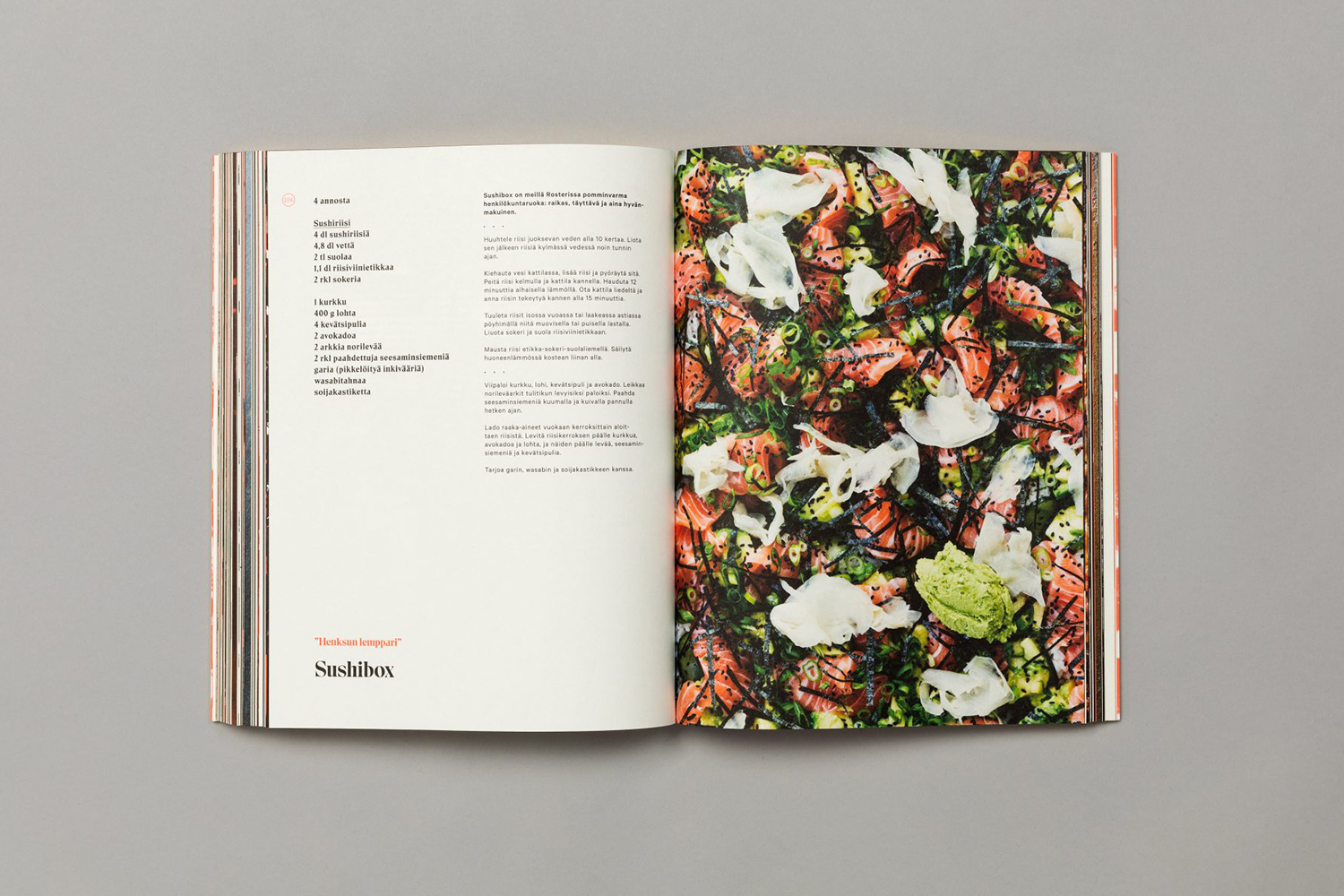
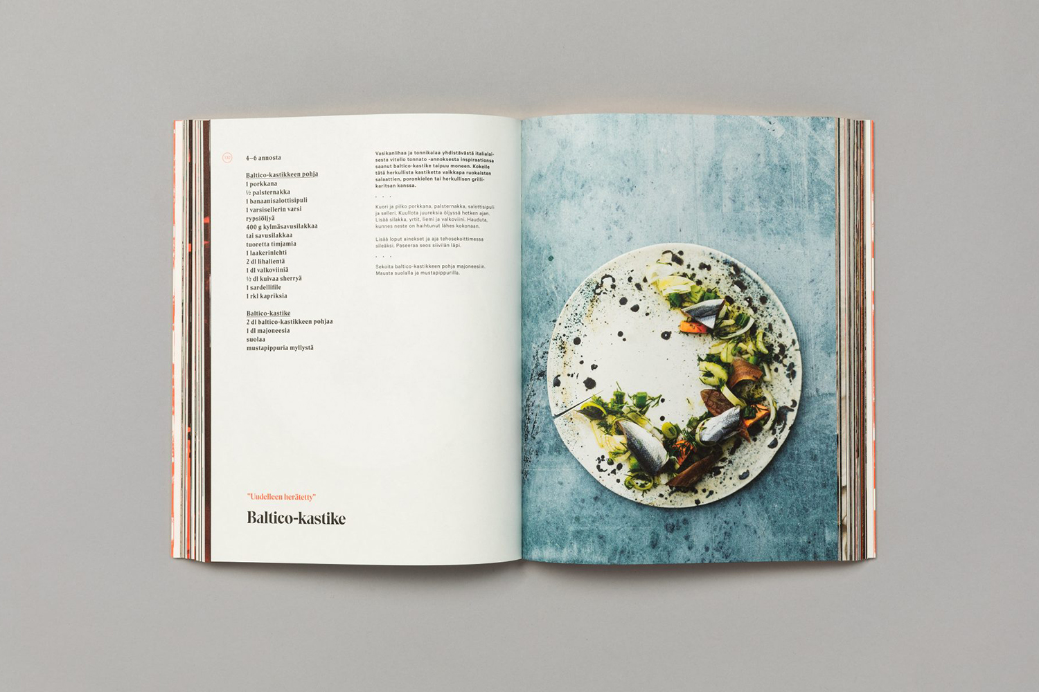
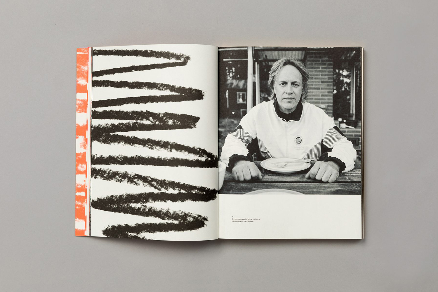
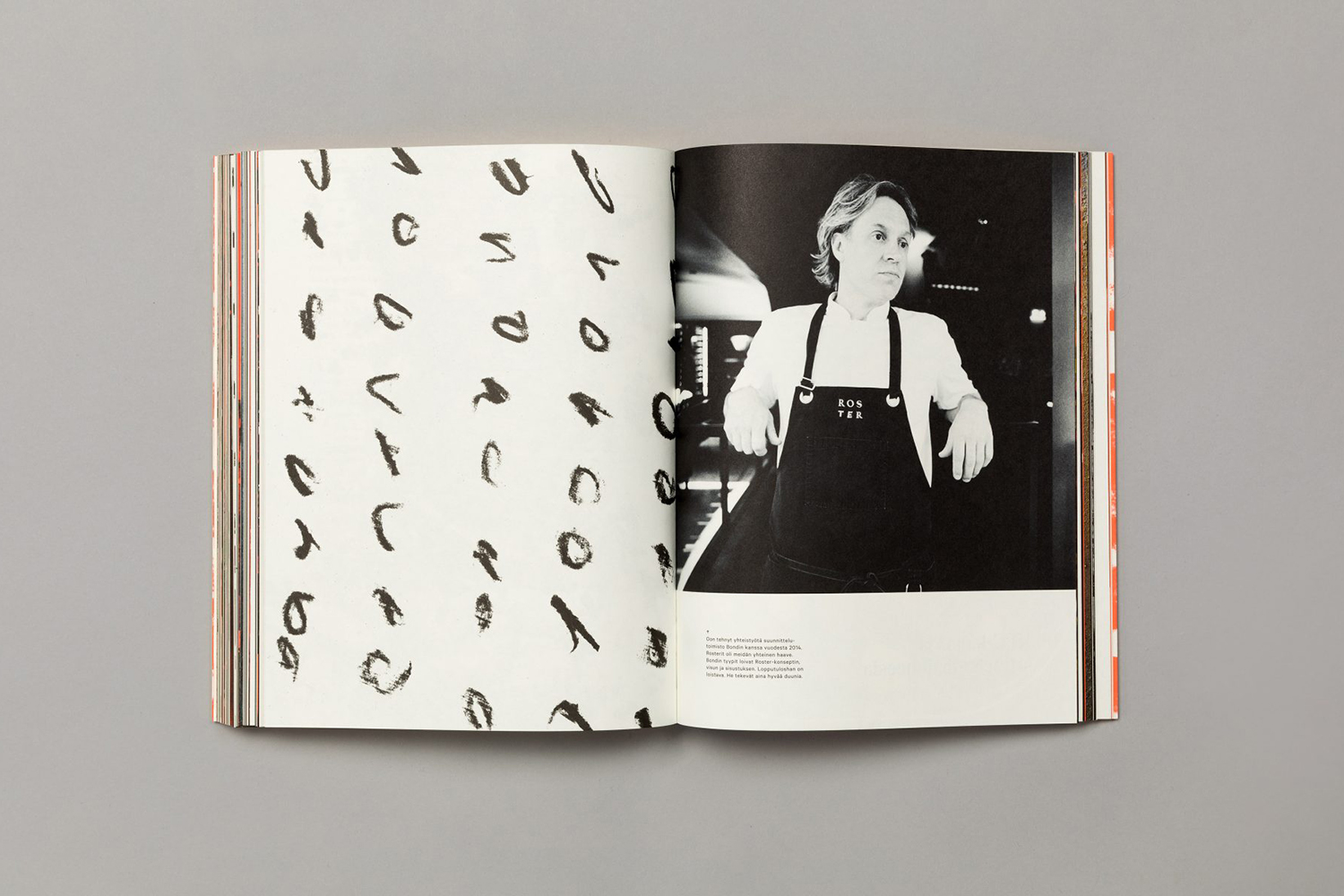
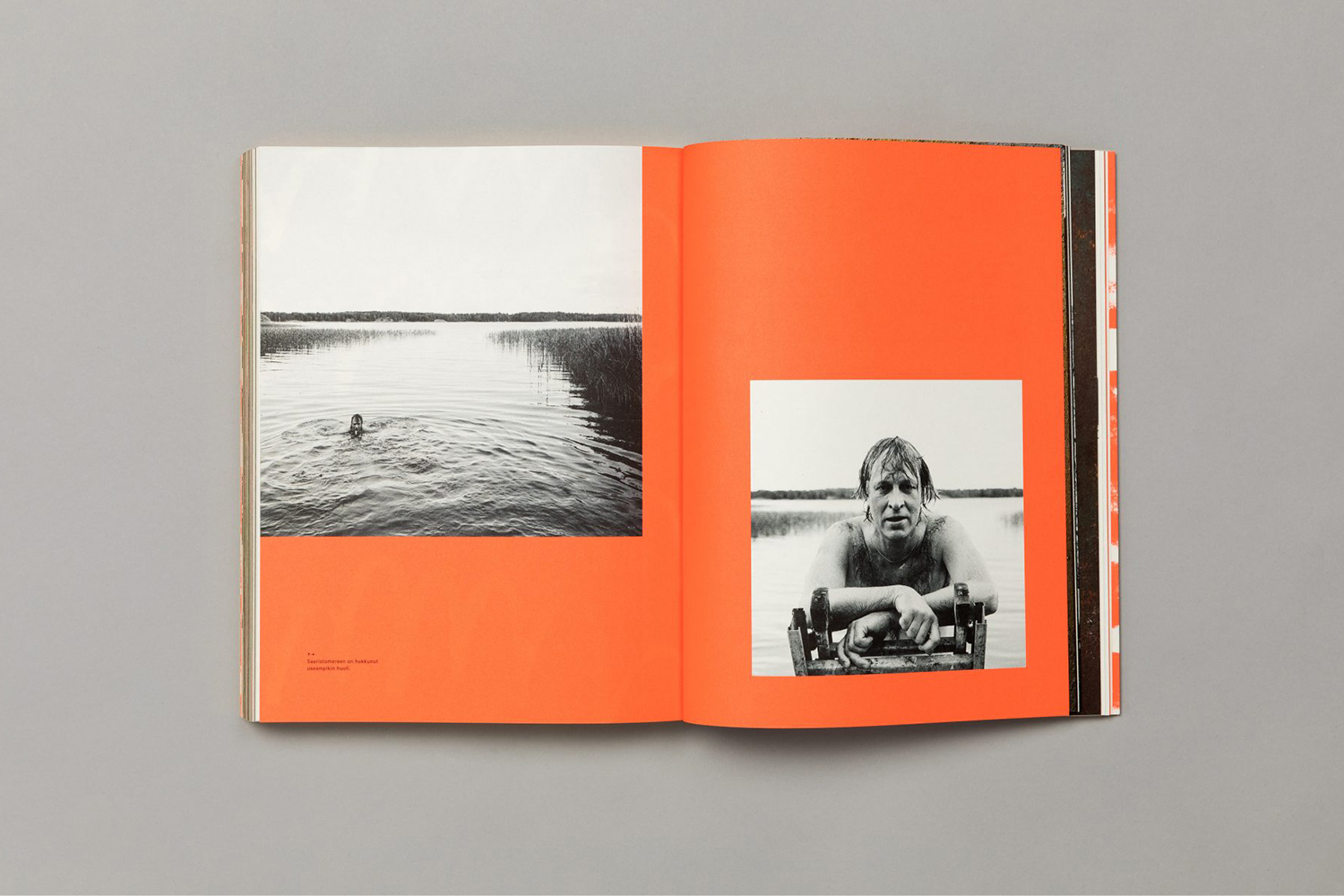
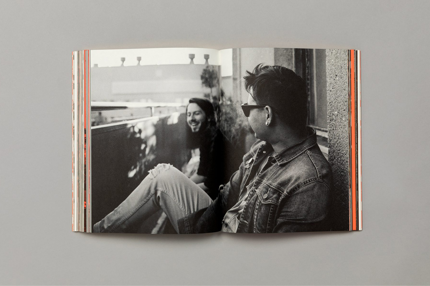
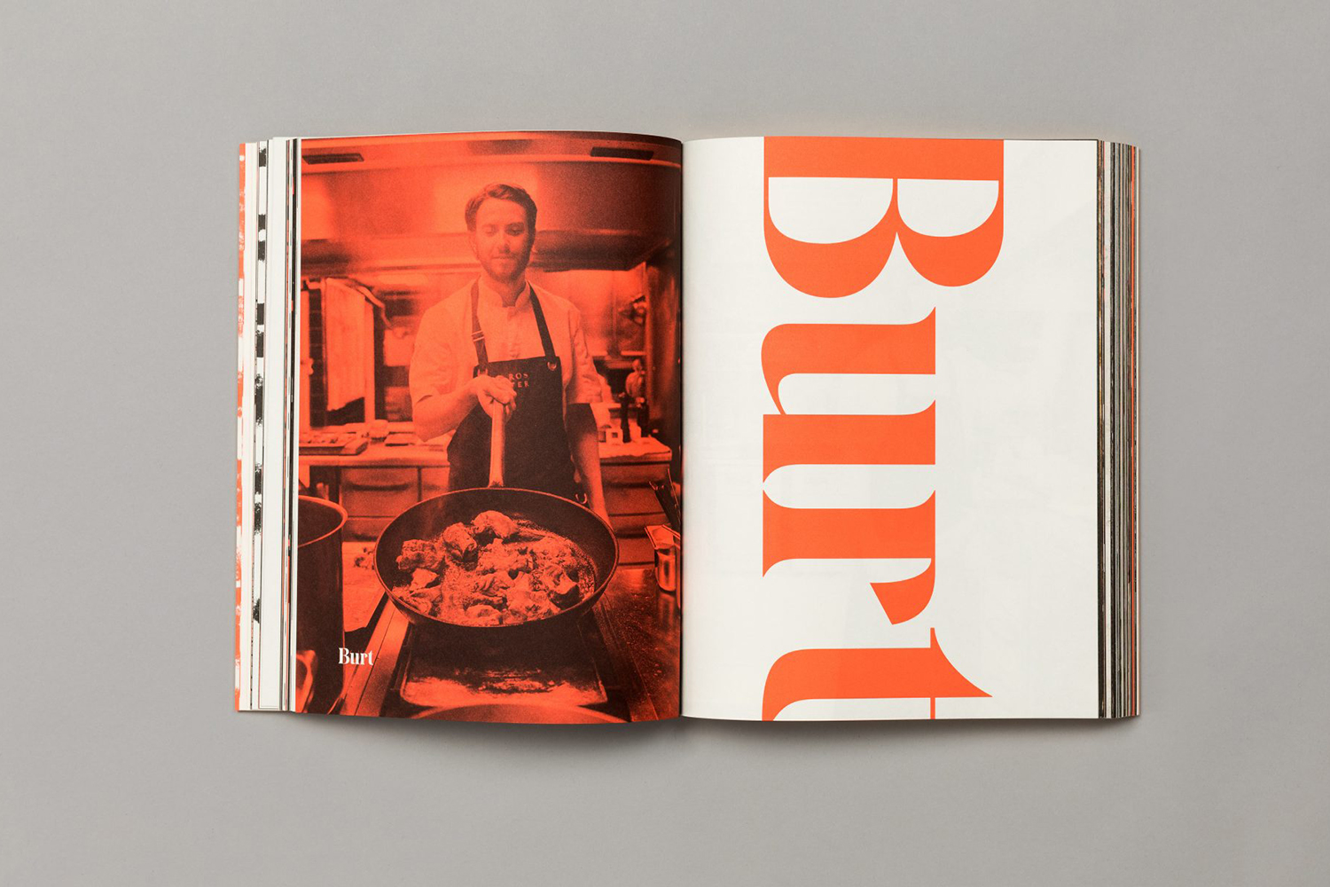
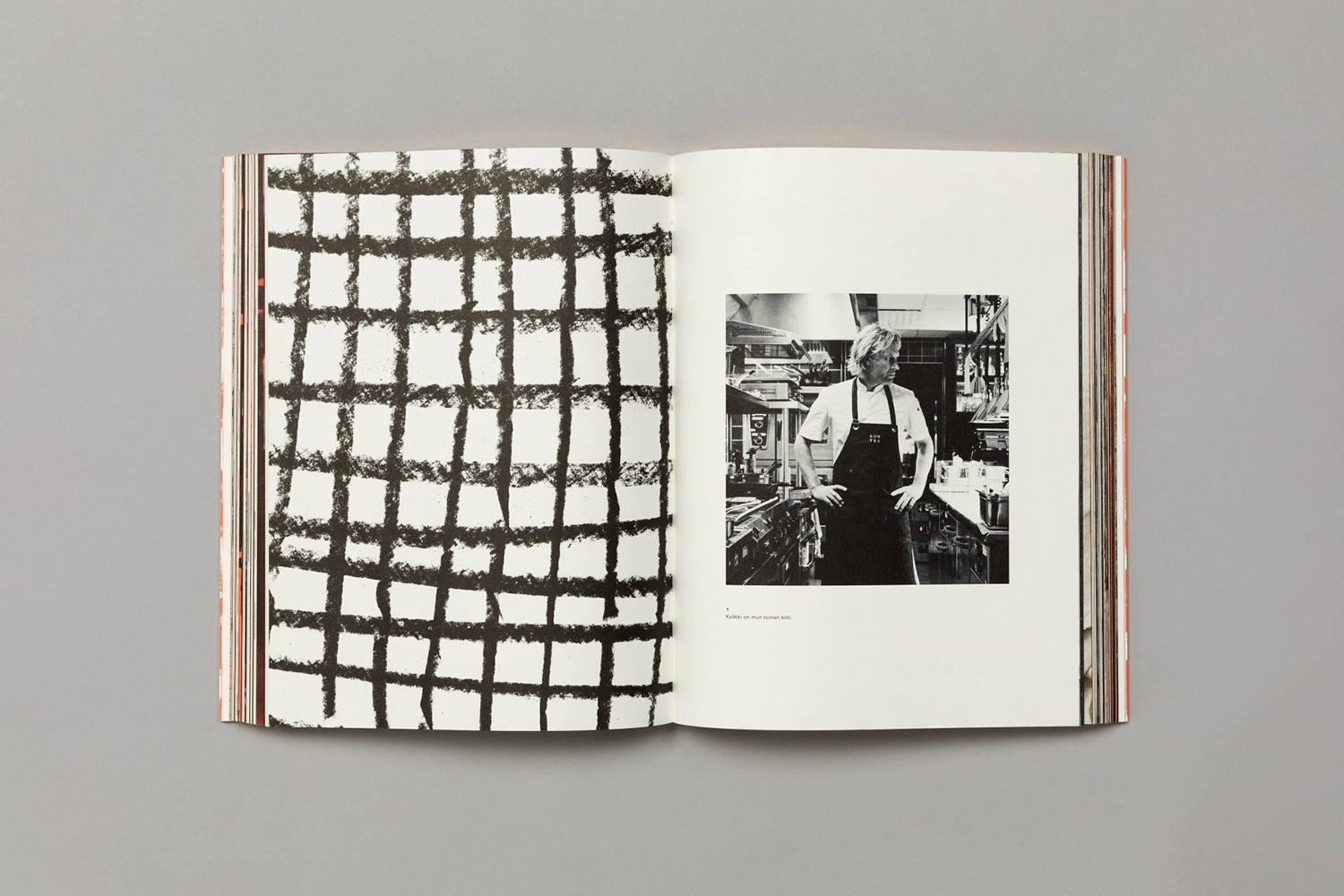
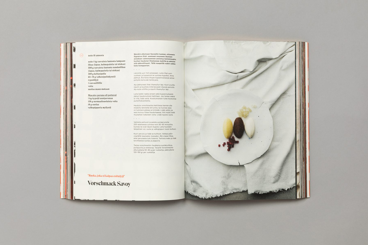
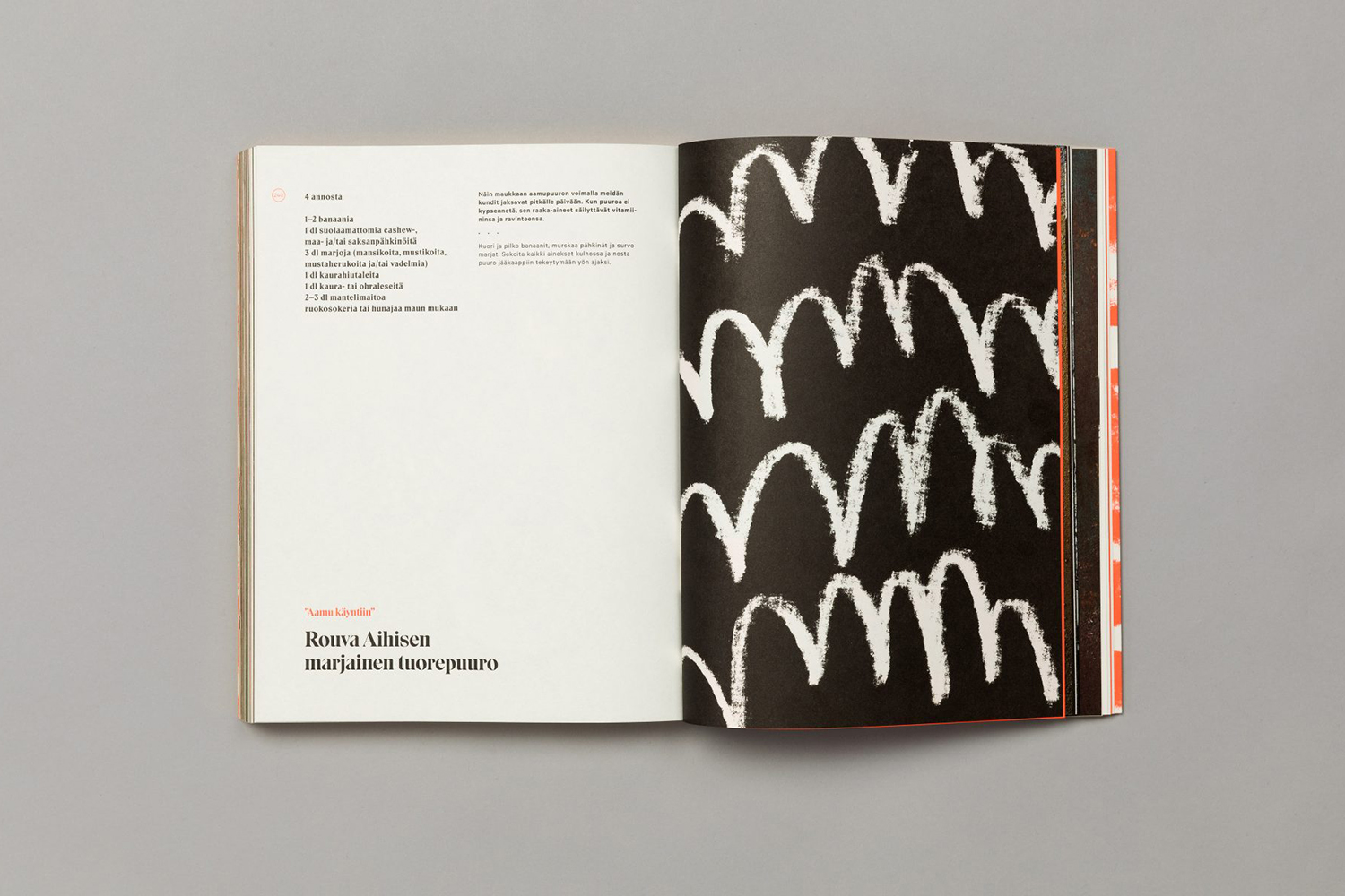
Inside, the book articulates something of the modern sophistication and traditional flourishes of the dishes (which also exist within the restaurant) through the photography of Sami Repo, styling by Kirsikka Simberg, and in the pairing and formatting of type and the combination colour. There is a lovely interplay between the man and his work throughout. The portraiture brings a conviviality, intimacy and context to finished dishes, and breaks down any preconceptions of the chef as intense, or distant, or egotistical. Charcoal lines across pages add a spontaneity and energy that ties in with the cover, and custom designed plates speak of the chef’s holistic viewpoint.

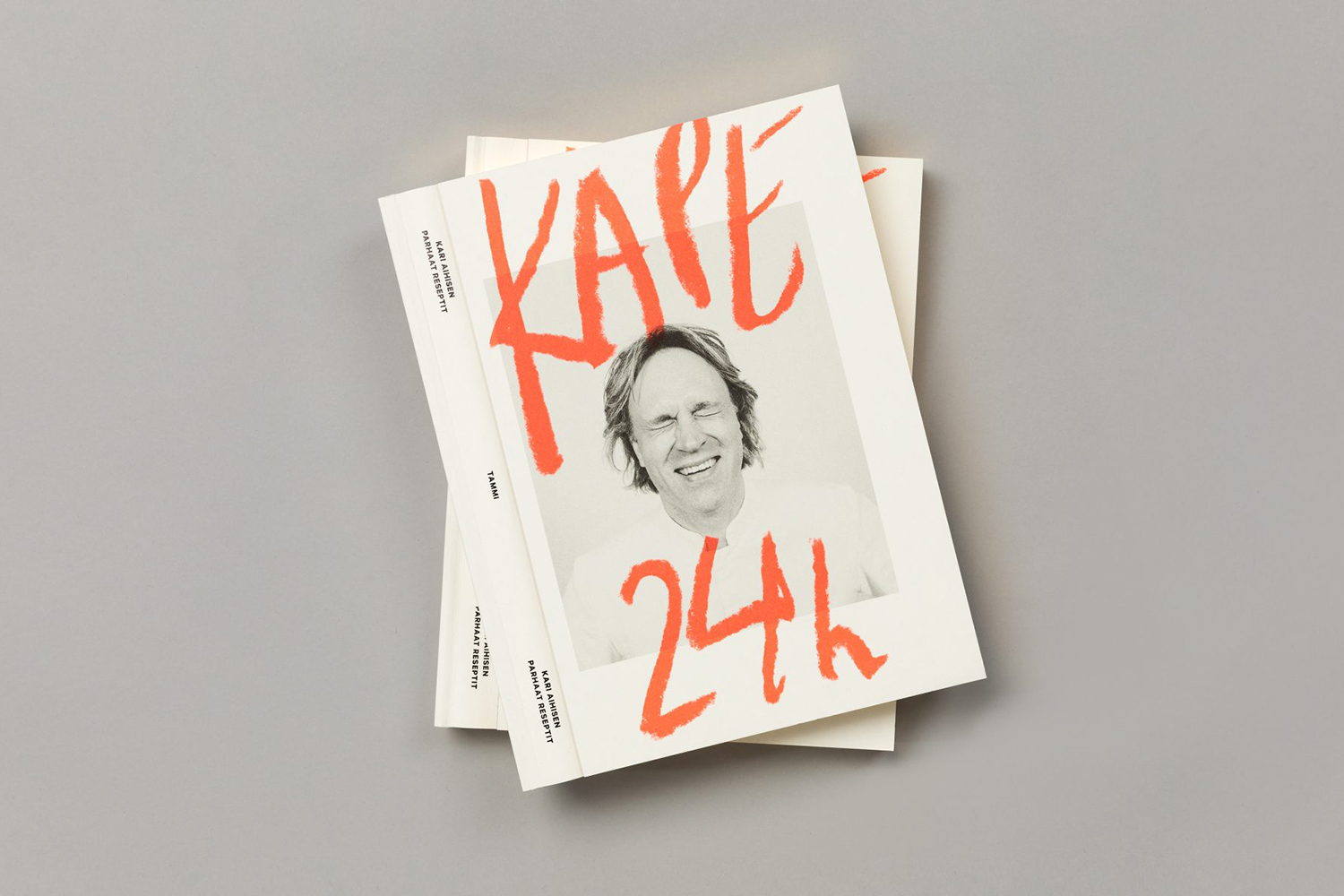
There is a clear design craft at play that resonates well with culinary craft, and the material component of Roster. The gold edge detail of the book is unexpected, and a particular highlight. There is a interesting duality to this in its association with exclusivity yet a universal and inviting warmth. The way this casts a golden halo around the book when its set down is particularly neat.
Although the cover has a lightness to it in the generosity of white space, there is a material weight and robustness to the choice of board, just as the gold edge creates a strong sense of volume and visual weight. There is an interesting oppositional quality in the material language of the book. On the one hand, it suggests the book be coveted, seen as a high quality design object, to be savoured, and on the other hand, has a utility to it, a build that is there to withstand repeated use. Whether international or not, there is something of a cookbook commentary at work here that feels rather fitting. A touch subversive and humorous in intention.

Through their food the best chefs express something of the very personal; a journey, a story, life philosophy or viewpoint. The graphic and material language of Kape 24h makes this connection more apparent. The dichotomy of the gold; the sense of exclusivity and inviting warmth, the casual dining experience within a design sophisticated restaurant space, a robust utility and a clear design craft, and the disarming approach to refined recipes, speaks volumes about the chef. More work by Bond on BP&O.
Design: Bond. Photography: Sami Repo. Styling: Kirsikka Simberg. Opinion: Richard Baird. Fonts Used: Eskell Display. Papers: Munken Pure Print Cream.