Arper 2018 by Clase bcn
Opinion by Richard Baird Posted 11 July 2018

Arper is an Italian furniture company producing chairs, tables and furnishings for community, work and home spaces. They seek an elegant resolution of function, form and finish which is founded on a total design philosophy that covers design, production and long-term impact. Arper commissioned Spanish studio Clase bcn to develop and design a new on and offline graphic identity for all their 2018 communications and promotional materials. These included catalogues, notebooks, press packs and tote bags, were complemented by distinctive art direction and newsprint. These draw on and add to the essential forms and colours of Arper’s Salone del Mobile stand designed by MAIO Architects.

The opportunity and confidence to reconfigure graphic identity, to be able to remain very much rooted in the present through reinvention, to continue to surprise and delight is strategically a useful tool. Brand philosophy serves as the foundational component, expressed in new ways, materially and graphically each year across print, environment and digital contexts. This year, a carnival of solid colour and simple form sit alongside unusual art direction, texture-focused monochromatic newsprint and photography and words within space.
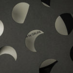
Clase bcn’s concept draws on two critical components intrinsic to the Arper brand; essential forms and sensitivity to colour. This is materialised throughout Arper’s collections as simple but strong silhouettes and as solid colours in fabric, moulding and coatings. Many of Arper’s pieces, individually; in form and colour, have a strong graphic potential, this was built on by MAIO Architects for the Salone del Mobile stand, and furthered by Clase bcn’s graphic language of geometric shape and colour blocking in print. This is an expression and distillation of a philosophy, an articulation of the power of the individual object, their collective arrangement and the implication of a dialogue rather than directly referencing the forms and texture of the furniture.
There is a graphic immediacy and simplicity to Clase bcn’s work that creates compelling individual printed objects and collectively a variety and opportunity for expression in the differing proportionalities and volumes of printed surfaces. Although there is clearly a non-verbal language at play here, there is also a simple aesthetic pleasure to be derived from a multi-coloured mix of shapes.

Texture, art and craft is layered in through compelling art direction, tied to the abstraction of print through colour, and in the contrasting monochromatic approach to newsprint. In the absence of colour, Newsprint serves to draw the eye to finer material texture and intersections yet connects back to the colour blocking in the proportionality and arrangement of image and text. Where you might see these details resolved into a singular gesture, replicated across all touch points, here there is a sensitivity to the different modes of communication. They are linked by either colour or form, but find variety and sophistication in the differencing contexts.


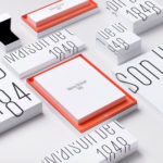
Text, set in Futura, finds a useful balance of commonality and difference; a commonality in geometry and a difference in weighting. It is an essential and observable continuity throughout, in print, online and within space, offering a finer counterpoint to solid blocks of colour and the heavier lowercase Arper wordmark.
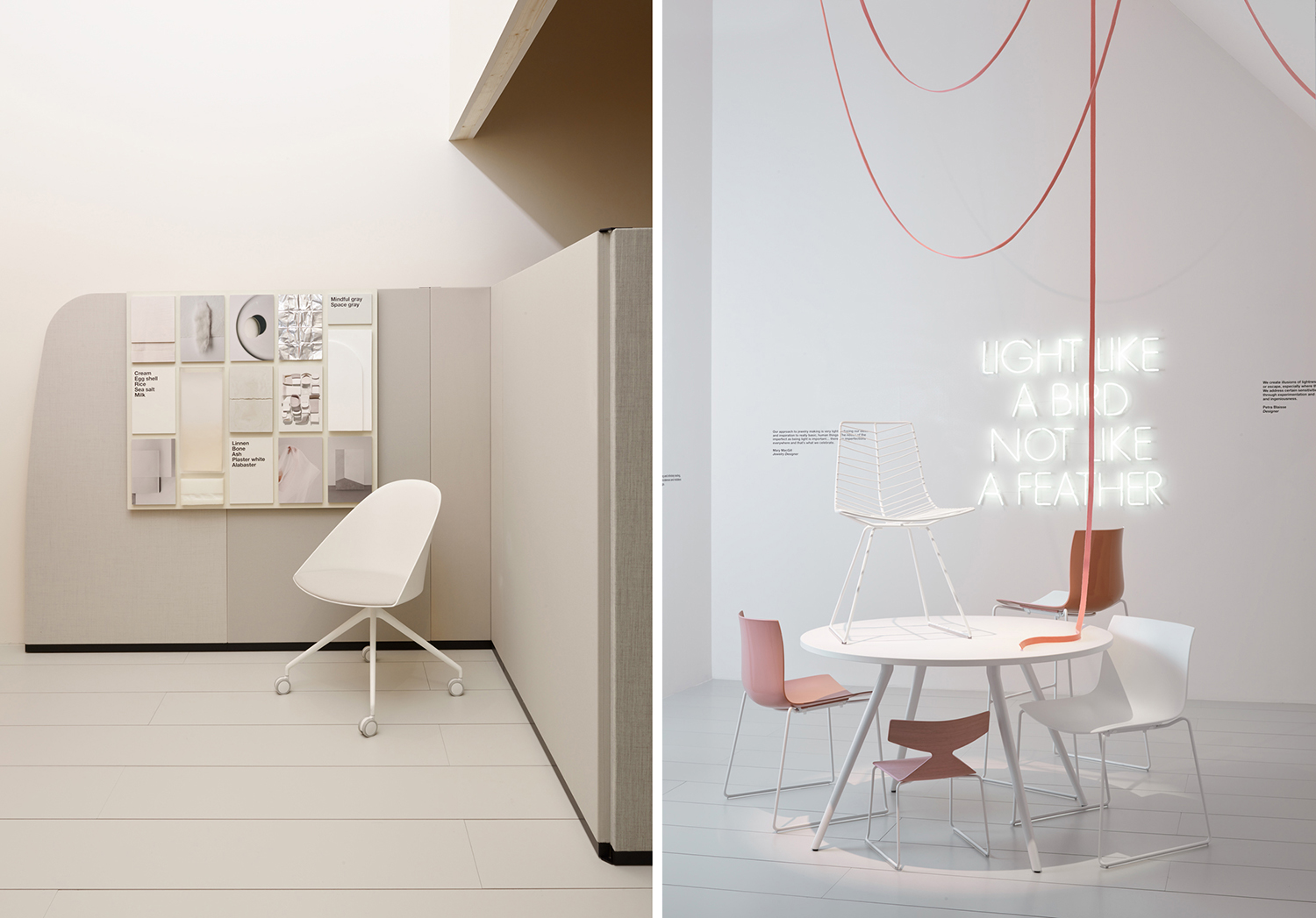
In collaboration with Jeannette Altherr–Arper’s creative director–and the stylists at Favaloro-Lucatelli, Clase bcn developed visual elements for Arper’s stand at the Salone. Much like the promotional materials, photography, video and illustration build to create a dialogue, a dialogue that expands the two essential values of form and colour to include play, family, intuition, light and balance. The result is an exhibition that contextualises the product and layers it with an intangible value beyond the graphic and material. More from Clase bcn on BP&O.
Design: Clase bcn. Photography: Gerhardt Kellermann. Opinion: Richard Baird. Fonts: Futura.