Stencil Cut Serif Logotypes
Croft Knitwear by Commission
Croft is a contemporary men’s knitwear brand that specialises in high quality cashmere and soft wool garments. These are available exclusively through online retailer Superdemin. Each garment is hand knitted on Scotland’s Shetland Islands by crofters, a name given to those using traditional batch production processes within small communities unique to the Highlands. Alongside a new logo, London-based design studio Commission worked with photographer Luke Evans to...
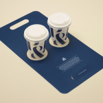
Pablo & Rusty’s by Manual
Pablo & Rusty’s is a small-batch coffee roaster, wholesaler, retailer and cafe with four locations in and around Sydney, and a company culture passionate about sustainability and the pursuit of perfection. San Francisco based studio Manual created a visual identity for Pablo & Rusty’s that would better reflect their values, was sensitive to local coffee culture and is described as having a level...
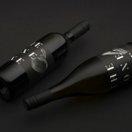
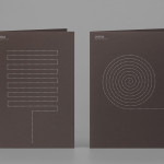
The Bone Line by Inhouse
The Bone Line is a New Zealand winery with a name that references the K—T Boundary, a thin band that runs close to The Bone Line’s location in the Waipara Valley, and that marks the end of the Mesozoic Era and the extinction of the dinosaurs. Auckland based graphic design studio Inhouse worked with the winery to establish a distinctive packaging and identity treatment. Like...

The Empire Café by Graphical House
The Empire Café is a pop-up venue located in Glasgow’s Merchant City that looks to explore Scotland’s relationship with the North Atlantic slave trade through coffee, sugar, tea, cotton, music, visual art, poetry, debate, workshops, walks, film and literature. The café’s brand identity, a ship-like logo, bold sans-serif typography and both a limited and rich approach to print, designed by Graphical House, is described as linking a contemporary ‘artistic programme...
Alphabeta by Village Green
Alphabeta is an extensive property redevelopment project, designed by architects Studio RHE and located in London’s Finsbury Square, that is described as the latest architectural expression of the ‘new economy’. Due to open in late 2014 and managed by Resolution Property, the project will reconfigure a ‘substantial landmark building’ to create a new standard in contemporary work environments for the creative and technology sectors. The space will feature large...
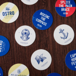
Seafarers & Ostro by Inhouse
Seafarers is a recently rejuvenated seven floor habour front building located in Auckland’s Britomart precinct that will house, over two floors, Michelin starred chef Josh Emett’s flagship restaurant, due to open in stages throughout 2014, as well as brasserie and bar Ostro. The brand identity for the building, restaurant and brasserie, developed by Inhouse, draws on the rich history of the space—once known as...
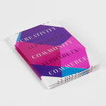
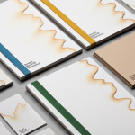
Coma by Mucho
Coma is an independent analysis, strategy and executive coaching business located in Spain. It provides support to individuals, businesses and institutions with the aim of fostering talent and leadership. Coma’s philosophy is focused on forward momentum and progress. This philosophy is expressed by the firm’s new brand identity, developed by global design studio Mucho, through illustrative paths that finish on a comma. These link...
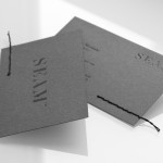
Seam by For Brands
Polish design agency For Brands were recently commissioned to create a new visual identity for Seam, a distributor of luxury clothing brands, that would convey a sense of craftsmanship and an eye for detail. For Brands mixes classic typographic detail with contemporary customisation delivered across tactile material choices with hand finished detail, fusing urban, craft and fashion sensibilities....
Jeremy Maxwell Wintrebert by Hey
Jeremy Maxwell Wintrebert is a glassware designer and manufacturer currently working in France with a free hand glass blowing philosophy mastered while traveling internationally across the US and Europe. Spanish design agency Hey recently developed a new visual identity solution for Jeremy that captures the heat, craft and art of glass blowing through a smart combination of colour and laser...
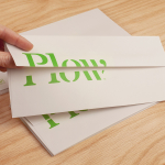
Plow by Perky Bros
Plow is a Tennessee based customer acquisition service and telecom/energy contractor for the large to mid-size business sector. Their identity, created by multidisciplinary design agency Perky Bros, neatly communicates the experience, professionalism and advisory nature of Plow’s service, the commodities they manage and their renewable energy options through a logo-type built from a stencil cut serif typeface and apostrophe detail set...