Structural Design
A collection of custom structural designs developed as part of a new brand identity or packaging project.

TWYG by Seachange

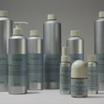
Hello Klean by Two Times Elliott

Dark Arts Coffee by NOT Wieden+Kennedy

Tsukiyo by The Colour Club
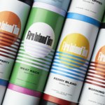
Fire Island Tea by Stephen Moss
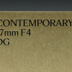
Sigma by Stockholm Design Lab
To My Ships by Formafantasma

being by Zuru Edge

Stuzzi by Perron-Roettinger
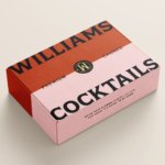
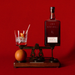
Williams Cocktails by Offff

Tameko by DutchScot

Graza by Gander
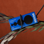
Sense by Buck

Kindred Black by Ania et Lucie

Tessas Eplegård by Olssøn Barbieri
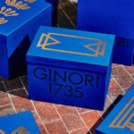
Ginori 1735 by AUGE
The Gospel by DDMMYY

Trulli Ulivi by Here Design

Recchiuti by Manual
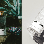
Casa Malka by Nihilo