
Hidden Characters by RE
Hidden Characters is the latest PR offering from international advertising agency network M&CSaatchi. It replaces/is an evolution of Bang PR, developed in response to the changing public relations landscape. With the advent of social media and the subsequent growth of non-traditional influencers and an increase in inauthentic product placement, Hidden Characters intends to make sure that their client’s reach is handled in an ethical and authentic...
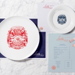
Little Italy by Here Design
Little Italy is a restaurant, gelateria and pizzeria located in the Jordanian capital of Amman. The restaurant features a distinctive, period and European-inspired interior of stained wood, glossy white tiles, concrete floor, vintage glass light shades, wood panelling and exposed I beams, brought together with a modern balance and lovely sense of form and contrast. This continues through to the restaurant’s brand identity, developed by London based Here Design, in...
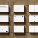
Emma Magnusson Arkitektur by Lundgren+Lindqvist
Emma Magnusson is an architect working from the Swedish city of Gothenburg primarily on private commissions and occasionally with larger corporate clients. These have included Benify and Warner Music. Scandinavian graphic design studio Lundgren+Lindqvist recently worked with Emma to craft a new visual identity. Drawing on some architectural staples such as space and materiality, and working in the systematic and the playful, Lundgren+Lindqvist’s identity work...
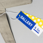
Gallery & Co. by Foreign Policy
& Co. links museum shop, a food and drink retailer and cafe housed within the National Gallery Singapore. These share a brand identity designed by Singapore-based graphic design studio Foreign Policy, built around the basic foundations of modern art and design; primary colour, geometric form and repetition, and Grilli Type’s GT Pressura. This runs across and unites a variety of printed materials that includes, but is...
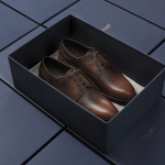
Faust by Snøhetta
Faust is a high-end shoemaker with its first signature store located in Oslo’s Barcode area. The shop is a small but impressive space consisting of five concrete niches and large carved wooden doors. Faust worked with Scandinavian studio Snøhetta to create both interior and brand identity. This was based around the The legend of Faust from the Renaissance, its basis for many literary, artistic, cinematic and musical...
Common Lot by Perky Bros
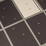
Common Lot is restaurant located near the Papermill Playhouse in Millburn, New Jersey. It has a menu of seasonal dishes made from locally foraged produce and fresh ingredients, and features an interior design described as being minimalist with unexpected finishes, natural materials, texture and light. The restaurant was created by Australian chef Ehren Ryan and draws upon his globally diverse culinary background and free spirit....
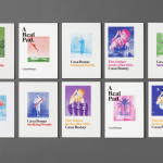
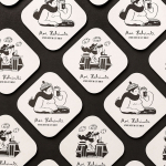
YO! by Paul Belford Ltd
London-based graphic design studio Paul Belford Ltd. worked with UK restaurant chain YO! Sushi, now Yo!, to rebrand, as it expands into the US, the Middle East and further into Europe. This included an updated logo together with an extensive 200 page brand book, presented in a bespoke Japanese bento box, that covered a variety of new assets. The brand book covers menus, packaging,...
Casa Bonay by Mucho
Casa Bonay is a unique hotel destination in the neighbourhood of Eixample Dret, Barcelona, housed within a historic nineteenth century building with a neo-classical façade. Although the setting has a strong historical value, inside and out, the hotel experience makes a connection with the creative talent that populates the city today. This is achieved through collaboration with pioneering chefs, young designers, renowned furniture brands and...
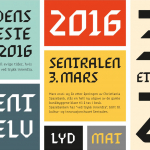
Sentralen by Metric Design
The former building of Norway’s first savings bank, which began as a social initiative to serve the working class people of Oslo, now houses Sentralen, a mixed-use cultural centre. Sentralen continues in the traditions of the bank, functioning as a hub for innovators concerned with and looking to address present day societal issues. The centre houses over 350 tenants working...
Collect by Spin
Collect is an international art fair that will take place between the 2–6 of February 2017 at London’s Saatchi Gallery. Presented by the Crafts Council, Collect will give visitors the chance to see and buy museum-quality and contemporary ceramics, glass, jewellery, wood, metal and textiles created by established and emerging artists and makers represented by over thirty of the world’s best...
Moi Helsinki by Bond
Moi Helsinki welcomes visitors to the Finnish city of Helsinki, and offers a place to relax after a long journey, with an extensive menu of beers and snacks from its location in the arrivals lobby at Helsinki-Vantaa Airport. The bar features an interior design of light wood and bright neon signage, alongside dark walls, furniture and tiles. Where there are...
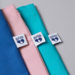
BIFAN 2016 by Studio fnt
Bucheon International Fantastic Film Festival (BIFAN) is an eleven day event that takes place each year in a number of locations throughout the South Korean city of Bucheon, a satellite city of Seoul. It celebrates world cinema; specifically those dealing with the themes of love, fantasy and adventure, plays host to international, Asian and national premieres, and includes, alongside the...