Waffee by A Friend Of Mine
Opinion by Richard Baird Posted 28 July 2014

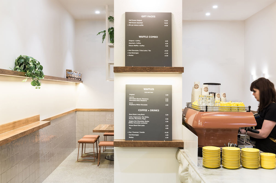
Waffee is an authentic Belgian waffle and coffee chain with locations across Melbourne and Altona. Developed by holistic design practice A Friend Of Mine, Waffee’s brand identity, which included logo and packaging design, menu boards and a signage system created in collaboration with architects Hecker Guthrie and Foolscap Studio, mixes a typographically adventurous logotype with an illustrated character to establish a rich communicative duality and contrast of literal and subtle narrative detail that binds print and interior space.
The literal approach to the logotype — a waffle iron pattern formed by extending and intersecting the F’s of Waffee — is enthusiastic and perhaps a little awkward in its spacing and condensing of the ‘a’ but its single consistent line weight, seal-like container and lowercase letterforms are largely well balanced, and effectively leverage a broadly understood pattern to convey an everyday accessibility and create distinction in a way that resonates well with the compounded nature of the name.


The illustrative work — a racoon eating, stealing and dreaming about waffles — is where the project really shines. These introduce a subtle layer of narrative detail and a more sophisticated sensibility through their geometric rendering, stipple fills, poses and shade of grey, and create a smart visual and communicative counter balance to the logo with their finer detail and motion. Both logotype and illustration share a playful quality in a way that is youthful yet far from childish and is reinforced by a colour palette of broad white panels, bright yellow packaging interiors and bronze foil print finish that mixes a buttery warmth with a contemporary high quality and restraint.
Design: A Friend Of Mine
Opinion: Richard Baird