DF / Mexico by BuroCreative
Opinion by Richard Baird Posted 25 September 2014
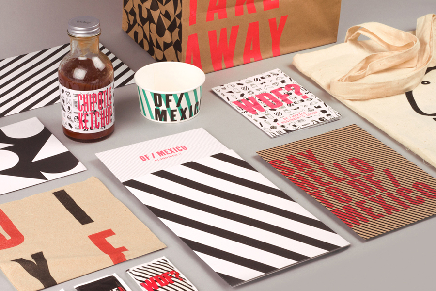
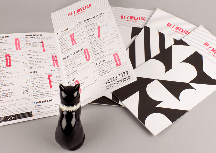
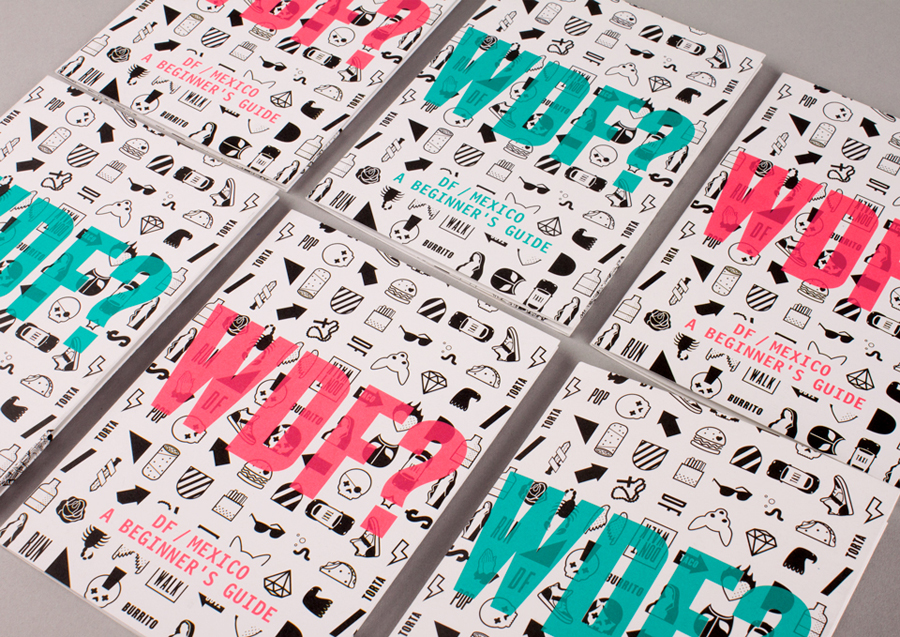
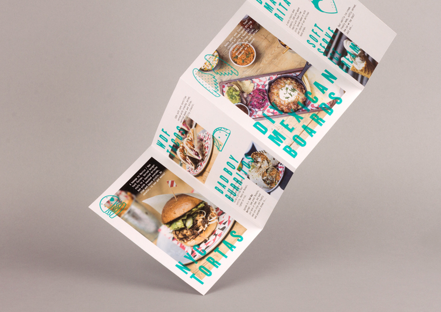
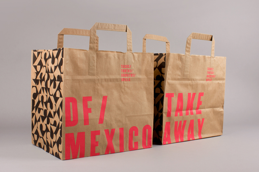
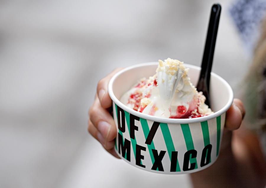
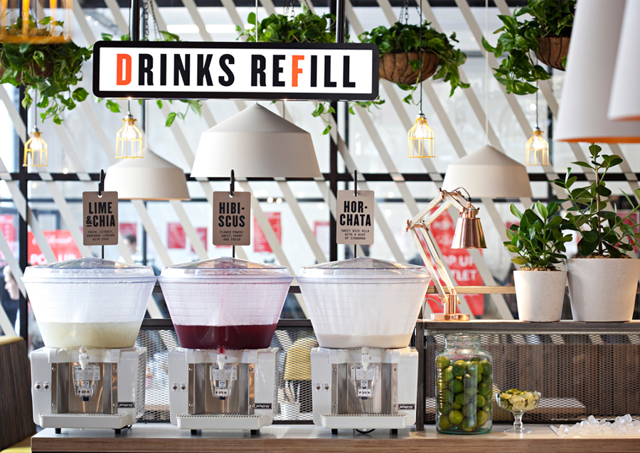
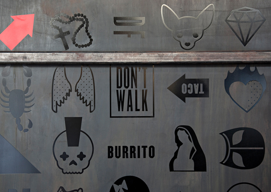
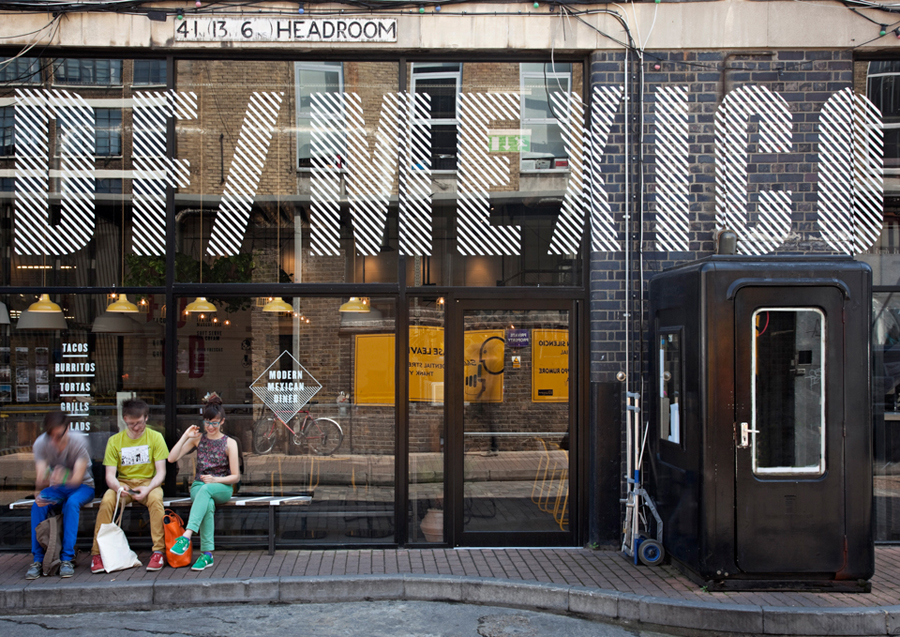
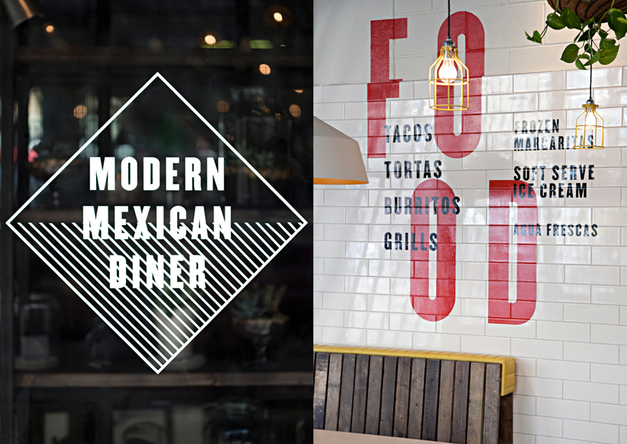
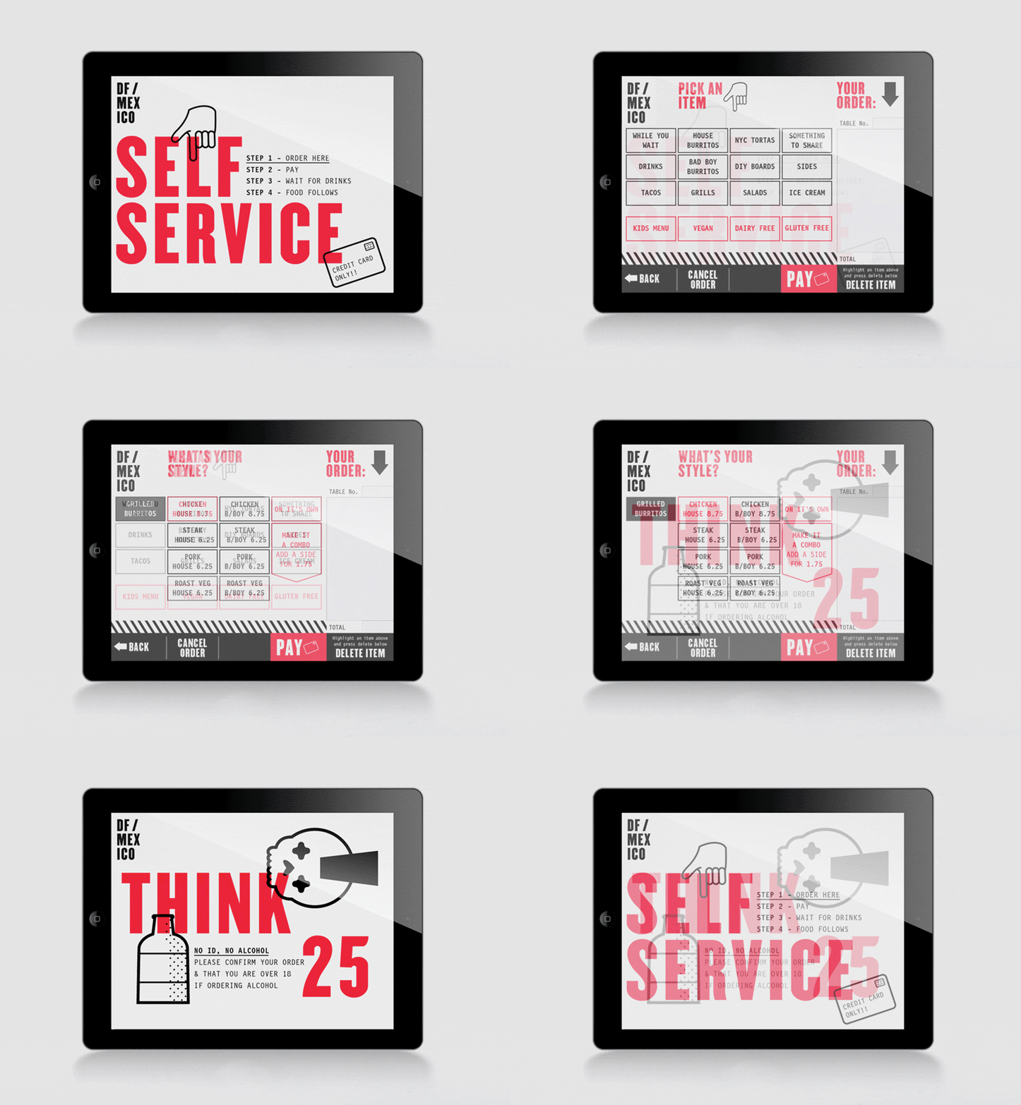
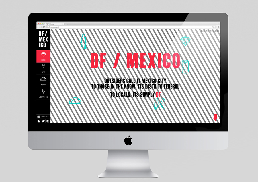
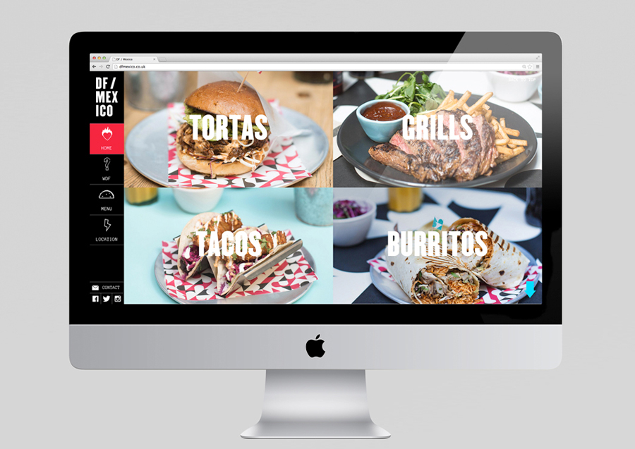
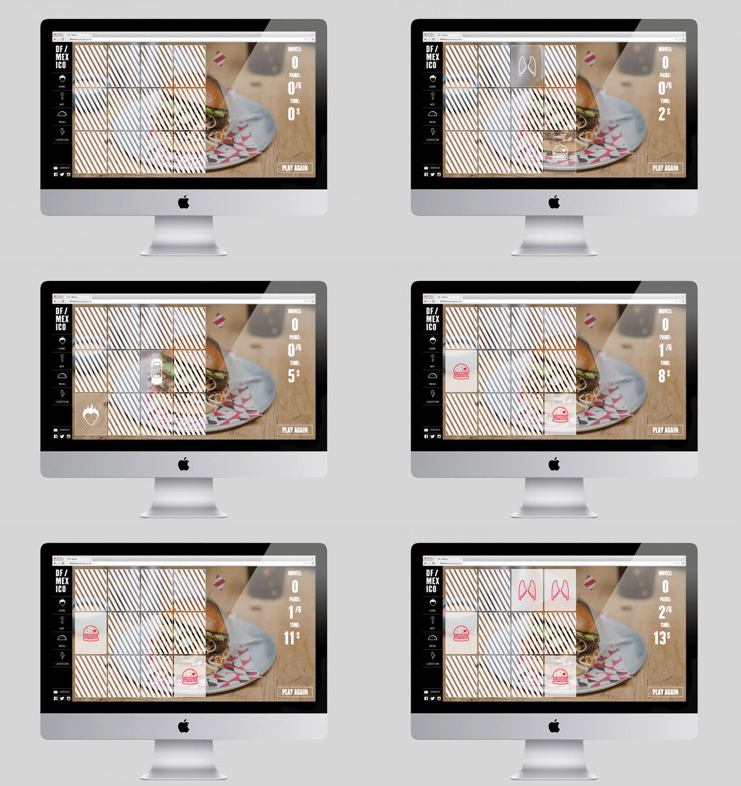
DF / Mexico is the latest restaurant concept from the creators of Mexican market food experience Wahaca. Located on London’s Hanbury St. the restaurant combines an informal diner-style setting with Mexican fast-food and modern American influences. Its brand identity, a broad combination of print, signage, environmental graphics and website design by BuroCreative, is built around a simple mix of condensed type, iconography, patterns and a limited colour palette. These have been extensively remixed across a variety of surfaces to deliver a distinctive, diverse and cohesive visual impact. The project included signage, flyers, menus and packaging.
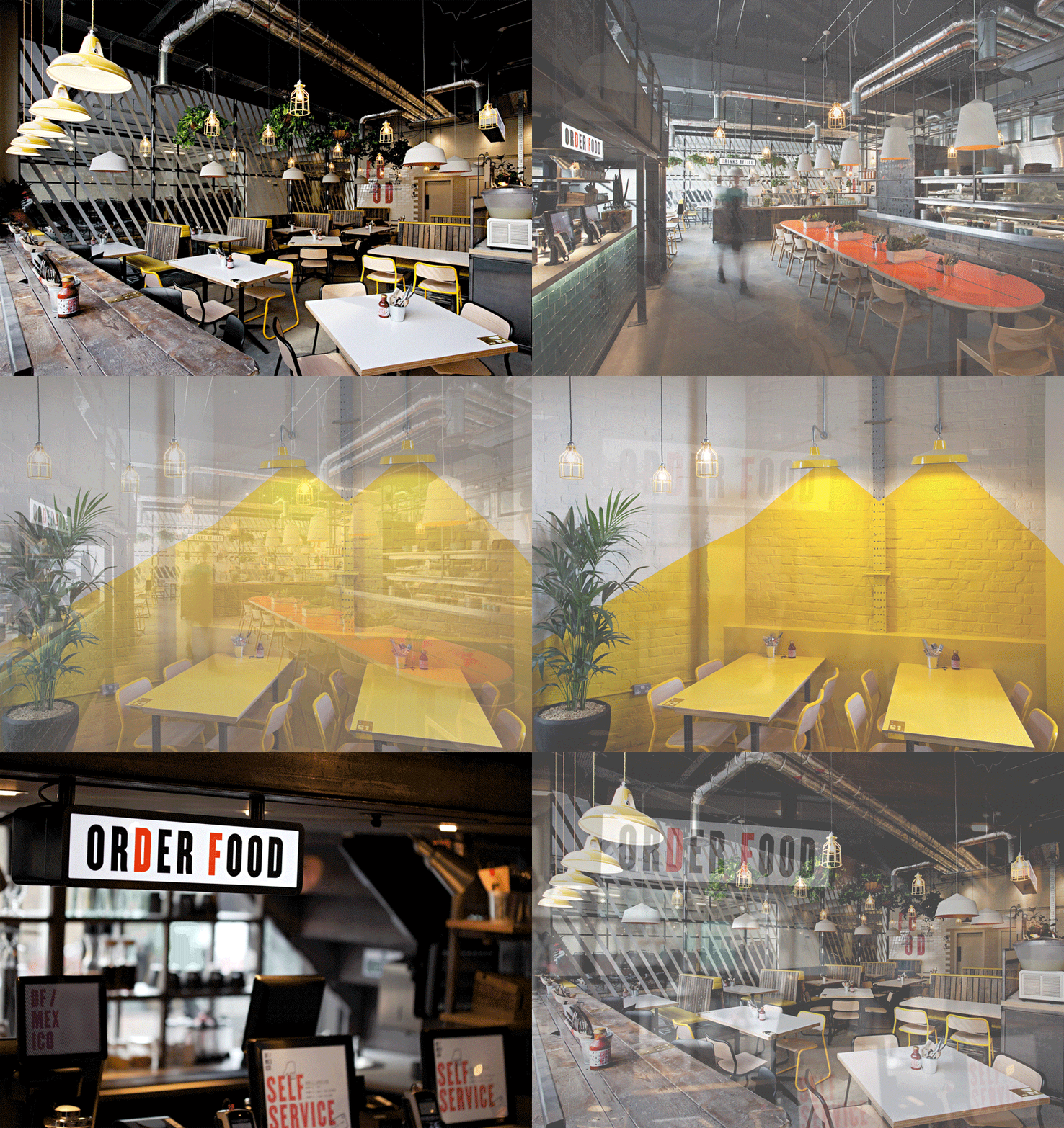
In response to their work for Wahaca, which was quickly appropriated by similar dining experiences, BuroCreative looked to disrupt the sector with a new aesthetic, fusing Mexican urban culture with the fast-food influences of its neighbour. The visual richness, clear cross-border mash-up and an unrestrained use of graphic assets, both small and confidently oversized, permeate every aspect of the experience and sit well alongside the industrial sensibilities of an interior of exposed utilities, brick walls, white tiles and worn woods.
It is difficult approach to get right, frequently cluttered, distracting or lacking cohesion, however, executing it well also makes it far harder to imitate. Here the interior design and brand identity appear to seamlessly weave together. Details such over prints, crops to type, an absence of unprinted space and diagonal lines rolled together have an intensity and energy you might associate with any large city, while the iconography helps to tie this down to an MX and US specific fusion experience.
Design: BuroCreative
Opinion: Richard Baird
