Here East by dn&co.
Opinion by Richard Baird Posted 22 October 2014

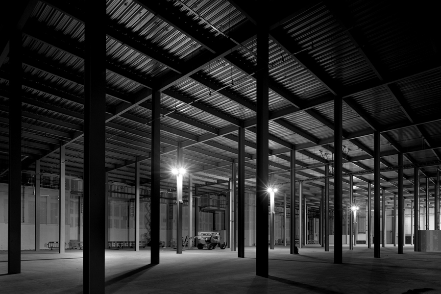
Here East is a 1.2 million sq ft commercial space developed by Delancey and housed within the former Olympic Press and Broadcast Centre near Hackney Wick in East London. Here East is described as an ecosystem looking to attract businesses from the design, technology and modern manufacturing sectors who are looking to scale, and those of scale looking to behave more creatively. So far BT Sport, Lougborough University, Infinity and Hackney Community College have all signed up for space.
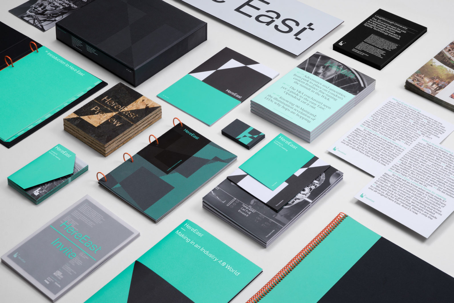
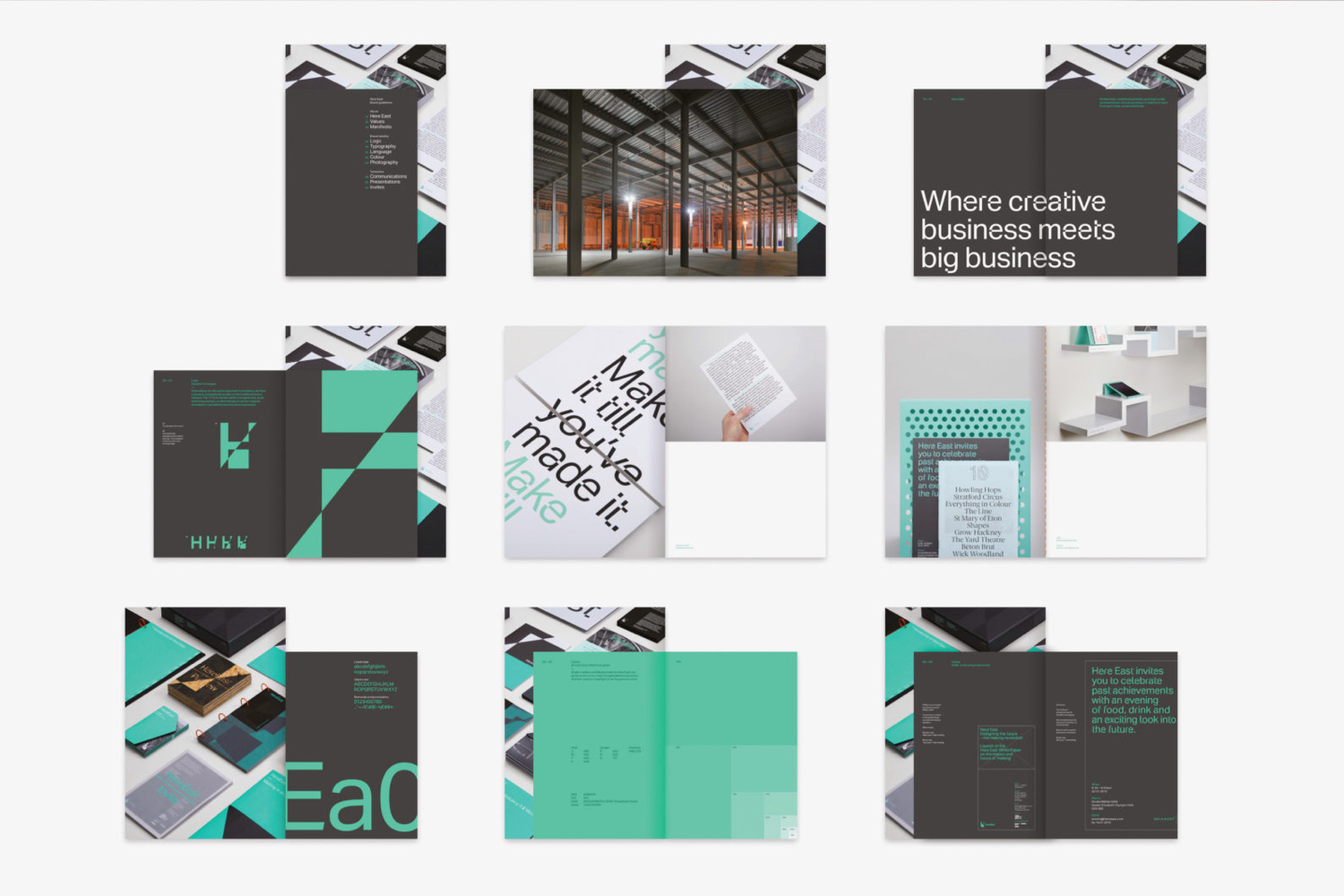
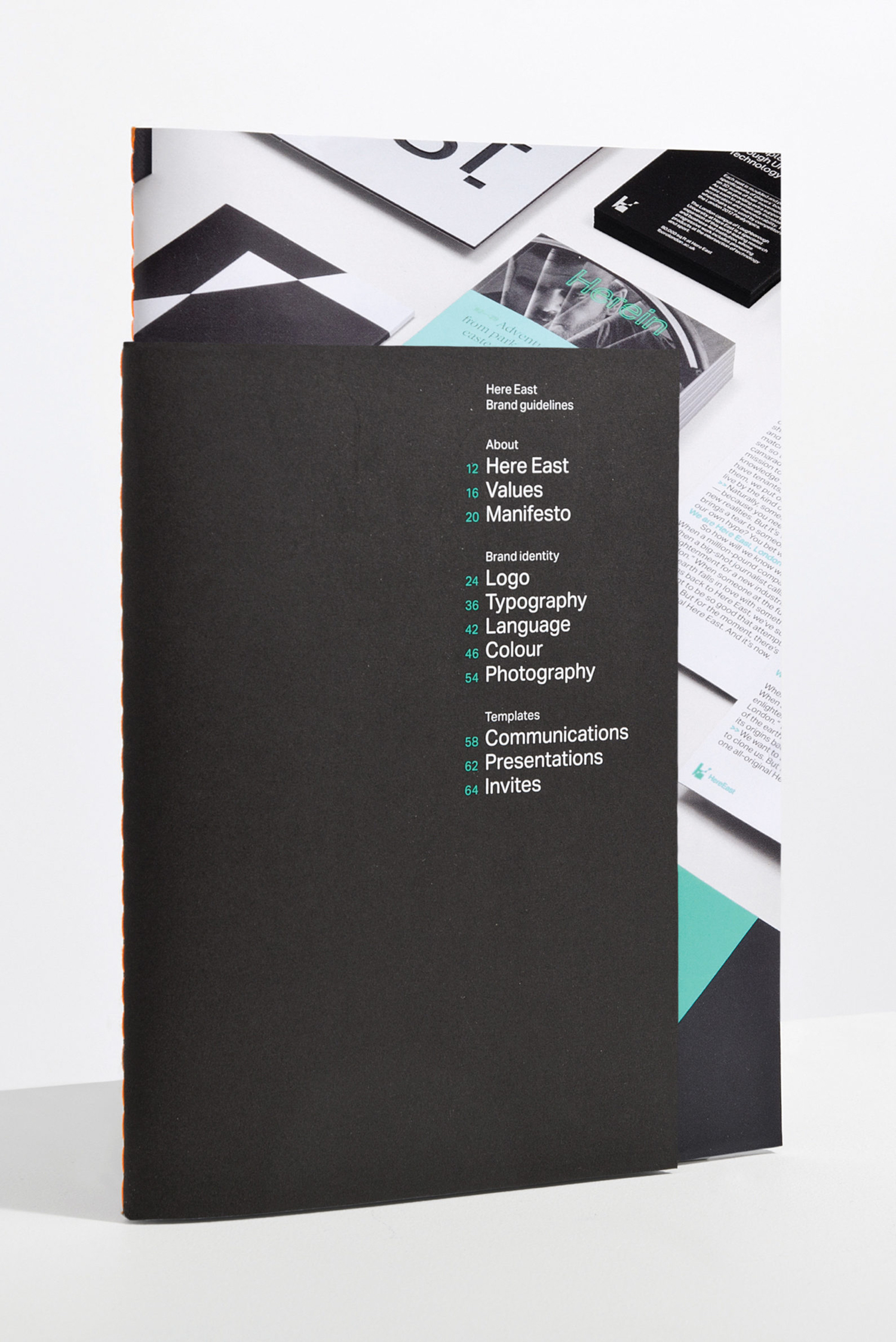
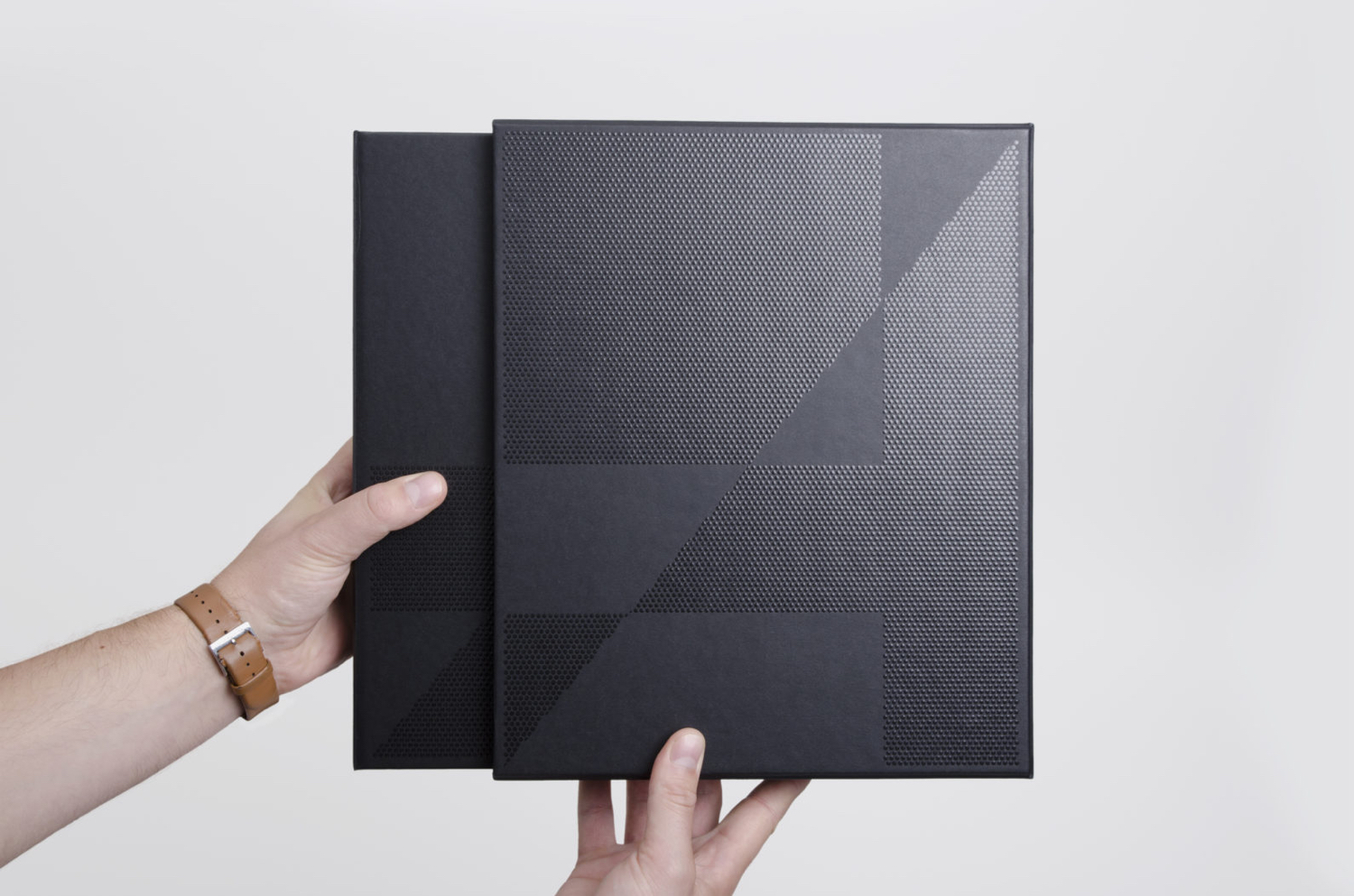
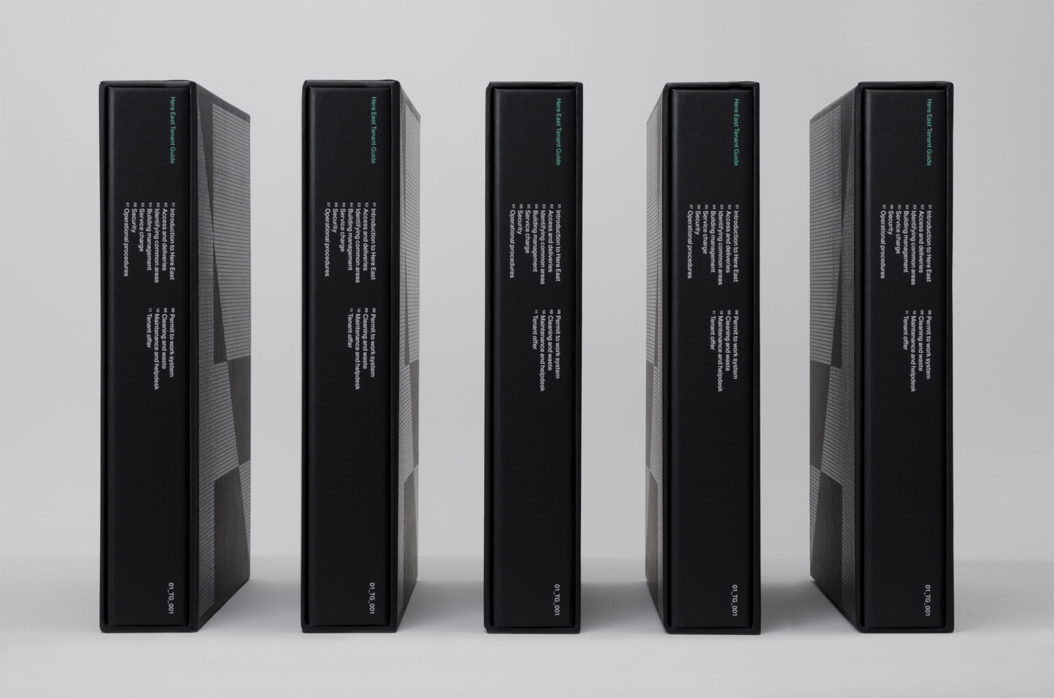
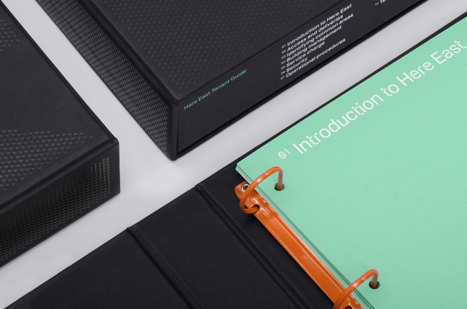
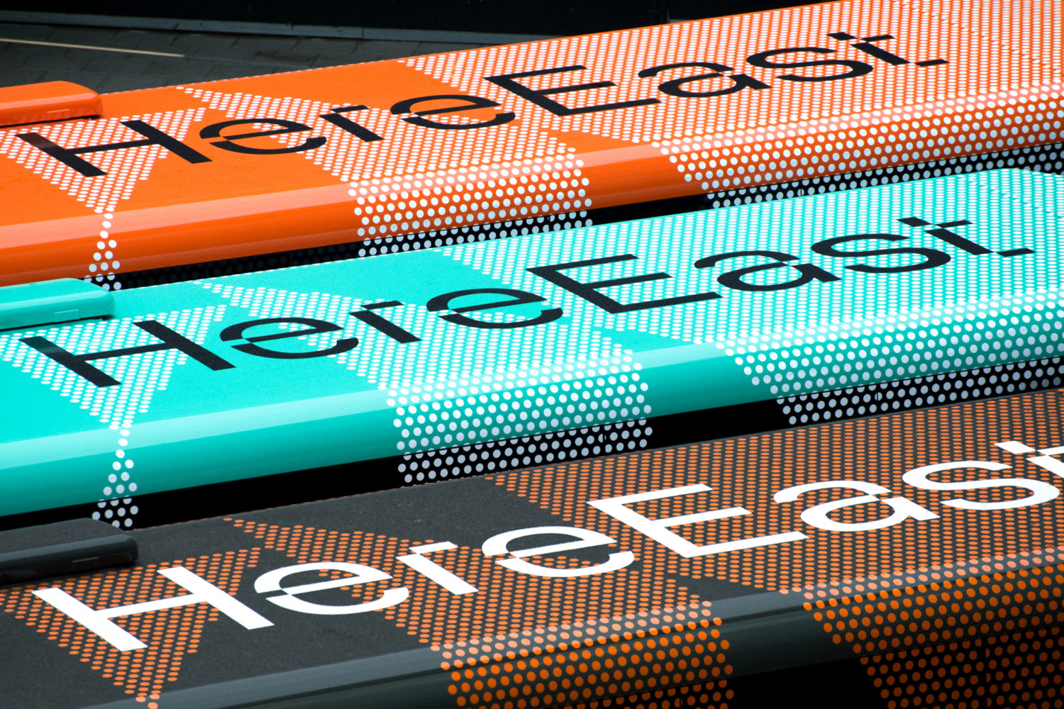
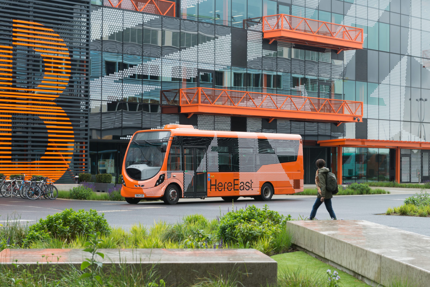
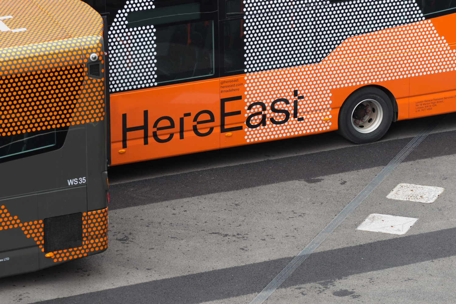
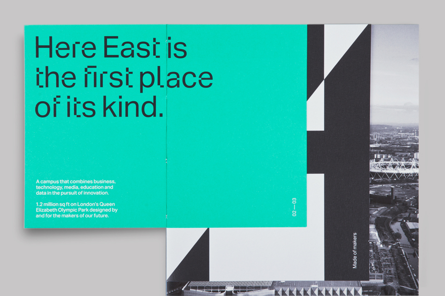
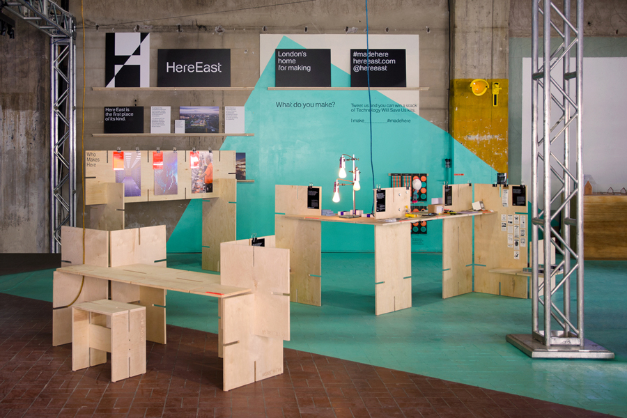
Here East’s brand identity, developed by dn&co., reflects its intentions of bringing together specific business types and the connected nature of its space through a contrast of digital generative elements and physical handcrafted detail. The studio was also responsible for Here East’s broader brand strategy alongside Poke, who designed the website, and architects Hawkins\Brown. This post was updated in 2016 with images of signage and wayfinding, and 2018 with tenant guide, bus liveries and brand book.
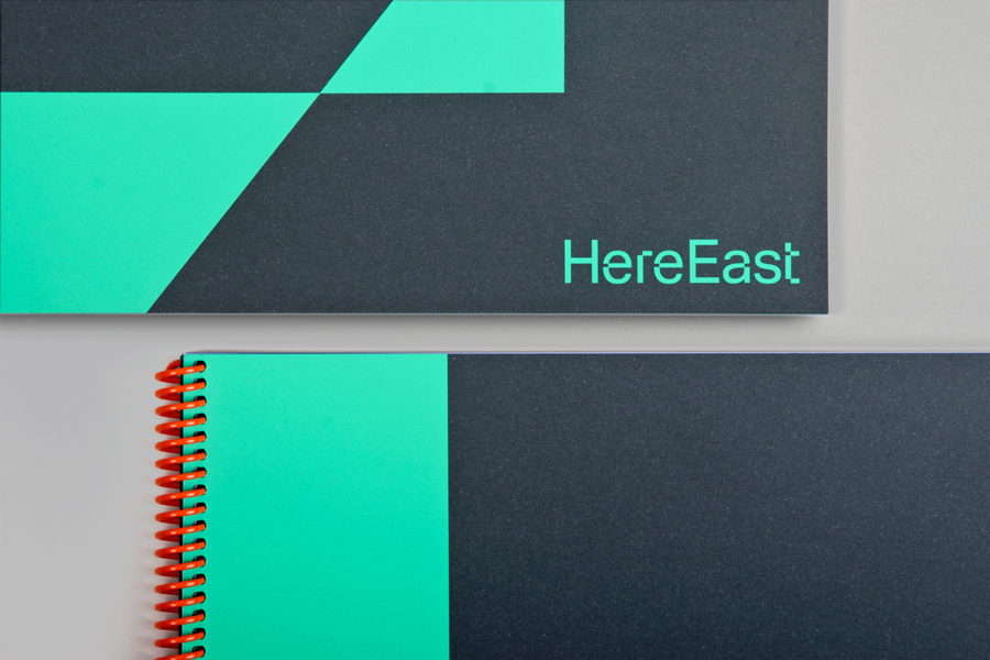
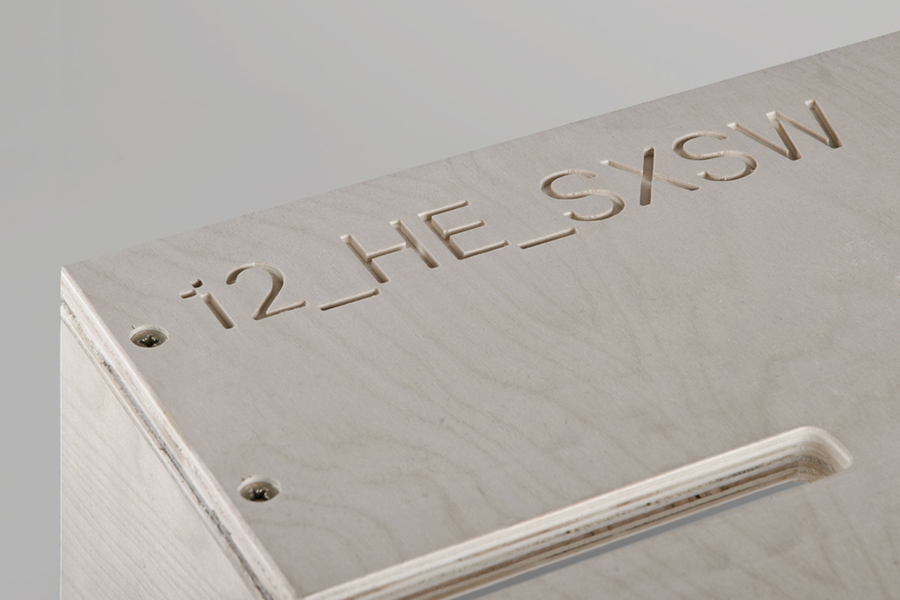
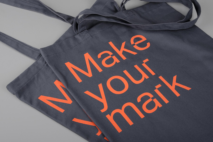
dn&co.’s solution is based around custom typography—a revised version of Aktiv Grotesk and a co-production between dn&co, Colophon and Dalton Maag. The addition of small cuts, a subtle detail that significantly alters character, and which occurs across a variety of glyphs, give Aktiv Grotesk a distinctive pixel-like aesthetic.
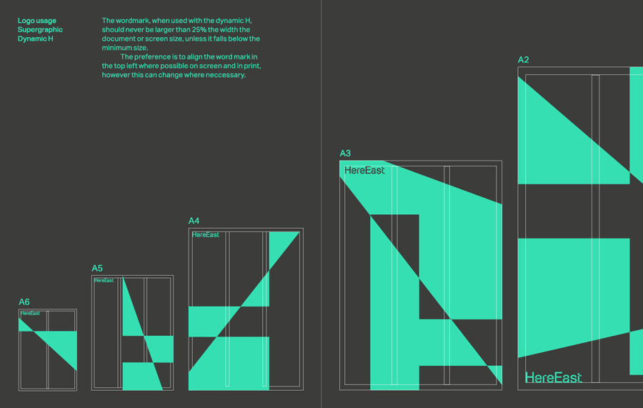
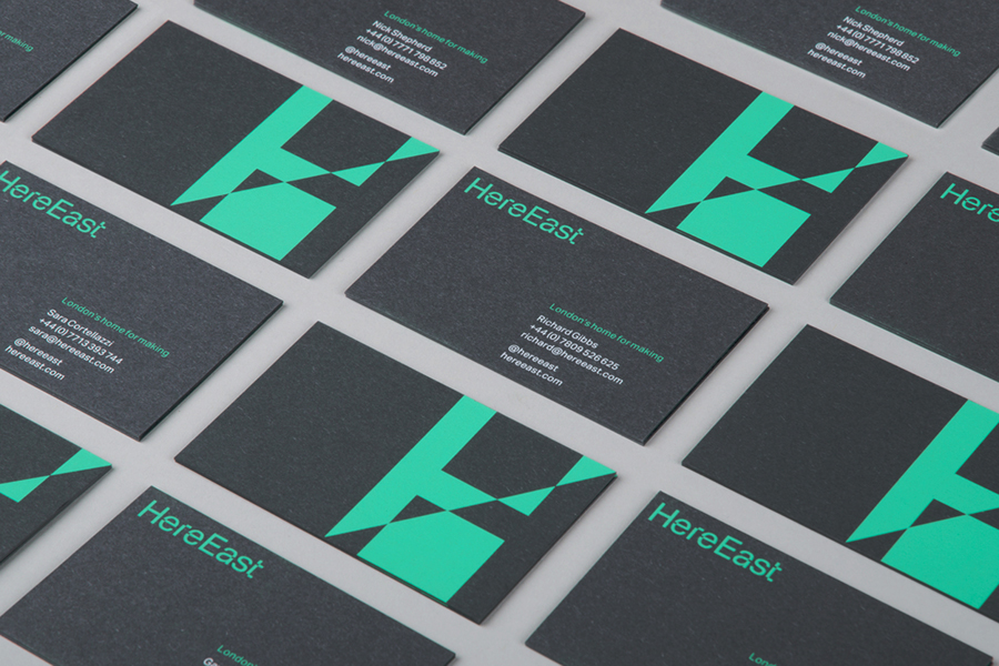
This is complemented by a bold dynamic sans-serif H that acts as a monogram and a supergraphic, its diagonal split, intersections, nodes and oversize in print, and the prism effect in motion, work well to reflect, much like the pixel nature of the typeface, Here East’s data and connectivity infrastructure and the technology businesses it is looking to appealing to.
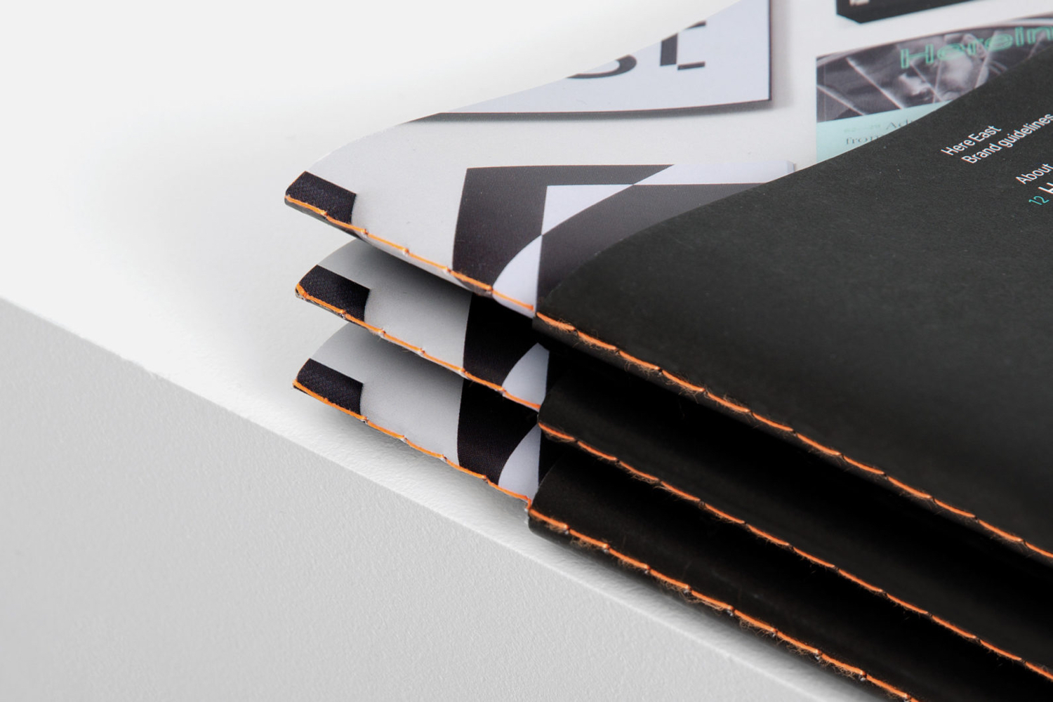
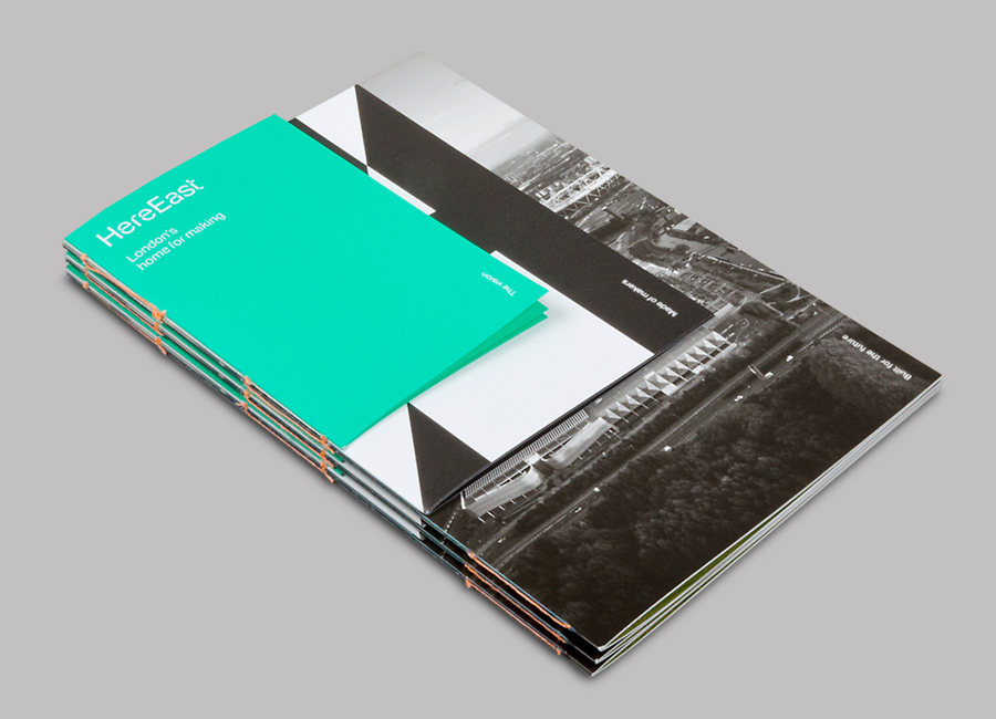
A limited and restrained colour palette of a fluorescent turquoise, bright orange, grey, black and white has been used consistently throughout and functions well to reinforce the custom type in its communication of technology and a contemporary urban space. A mix of uncoated, high-fibre and dyed papers, visible stitches, contrast of paper sizes and untreated wood introduce a tactile ‘made’ quality, emphasising manufacturing and creating a nice counter-balance to the high-tech inspired typography and colour palette.
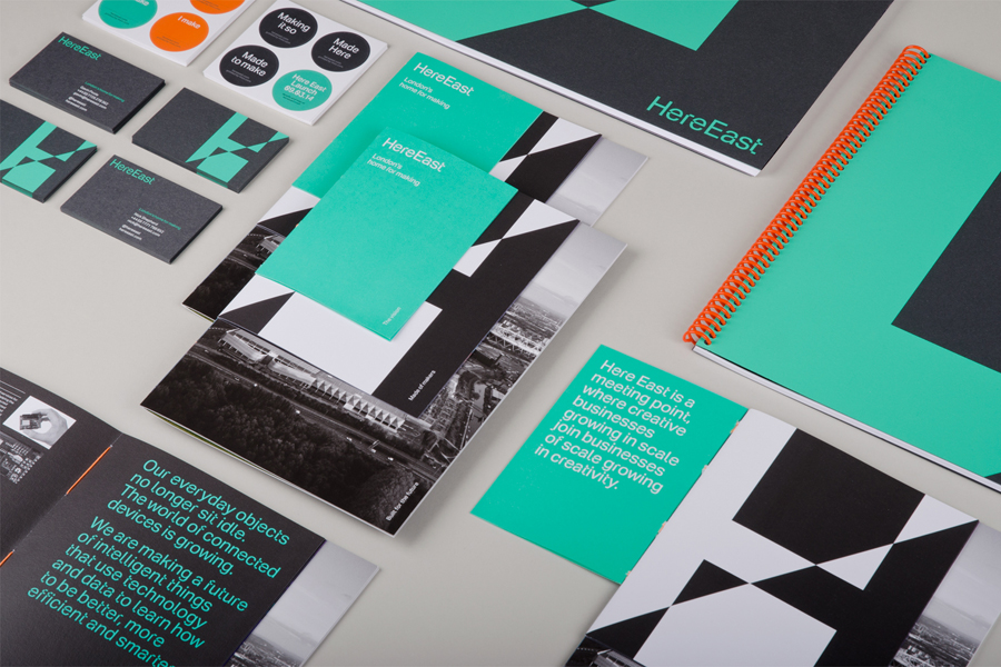
It is refreshing to see an identity that does not rely heavily on a symbol or wordmark, but on its typeface and colour to create brand presence, establish recognition and resonate with the markets it is looking to connect with. A bespoke typeface can be the ultimate tool in a responsive identity. It naturally adapts to any medium, can be broad yet cohesive in its messaging and makes for a truly flexible visual identity.
Design: dn&co. Opinion: Robert Holmkvist. Fonts Used: Aktiv Grotesk.


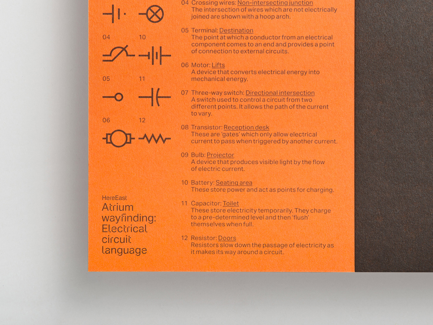
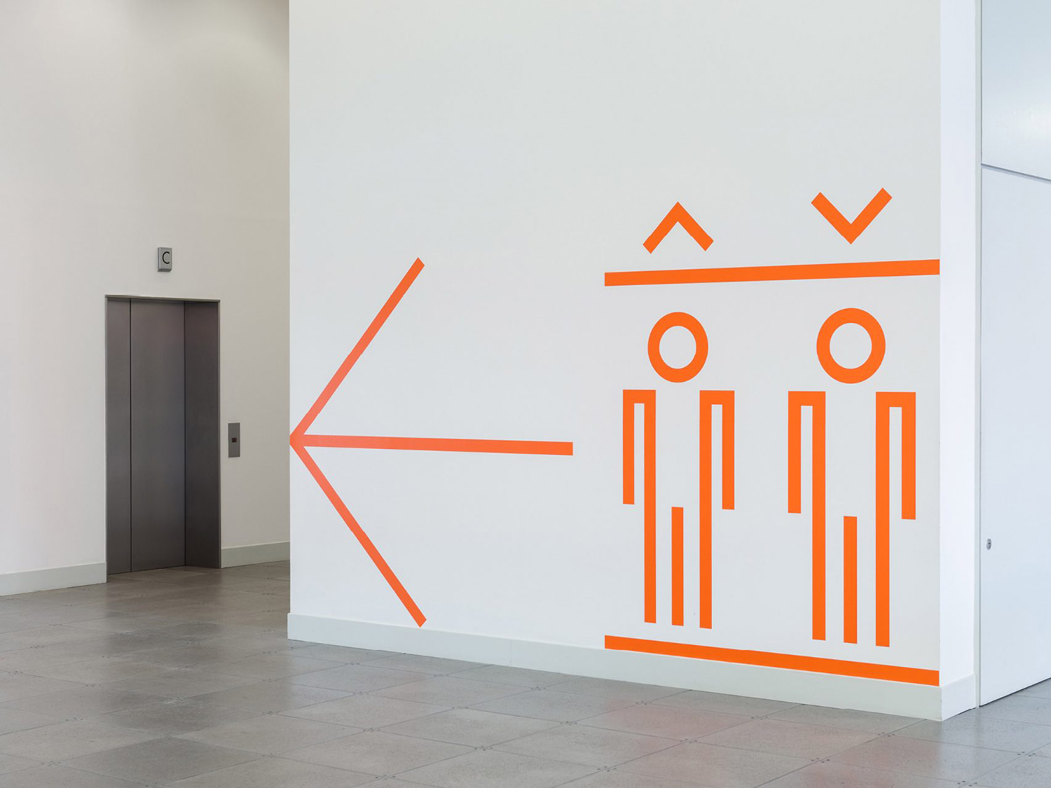
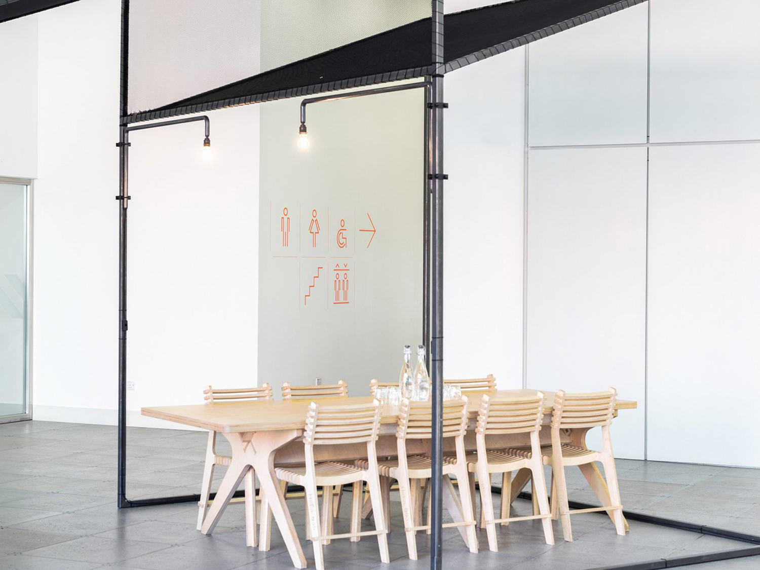
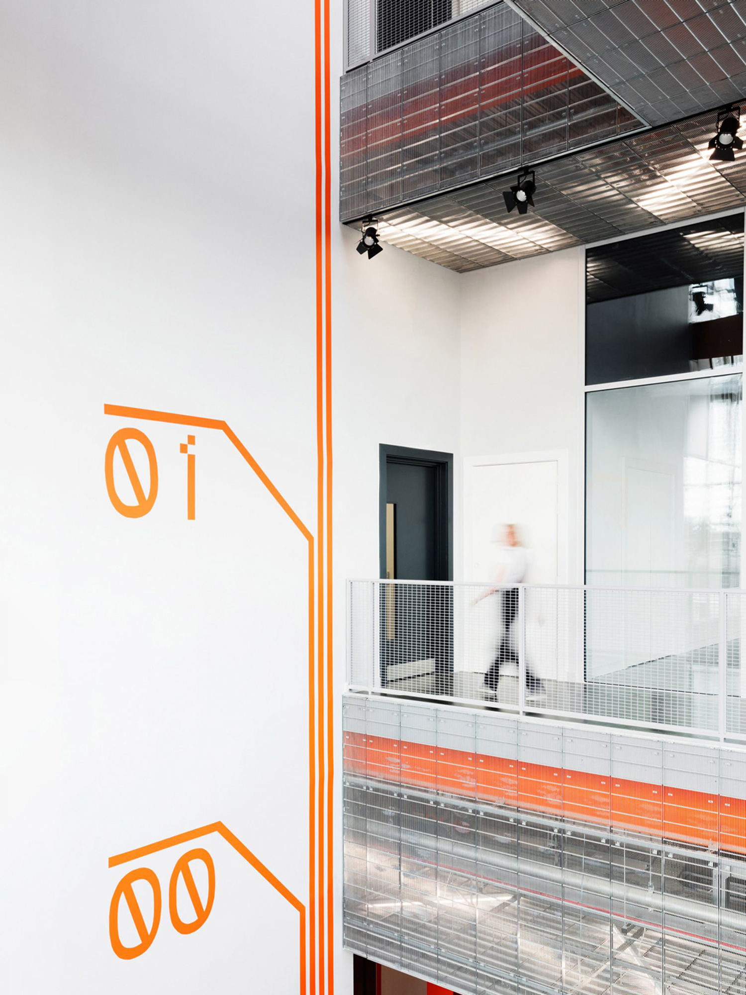
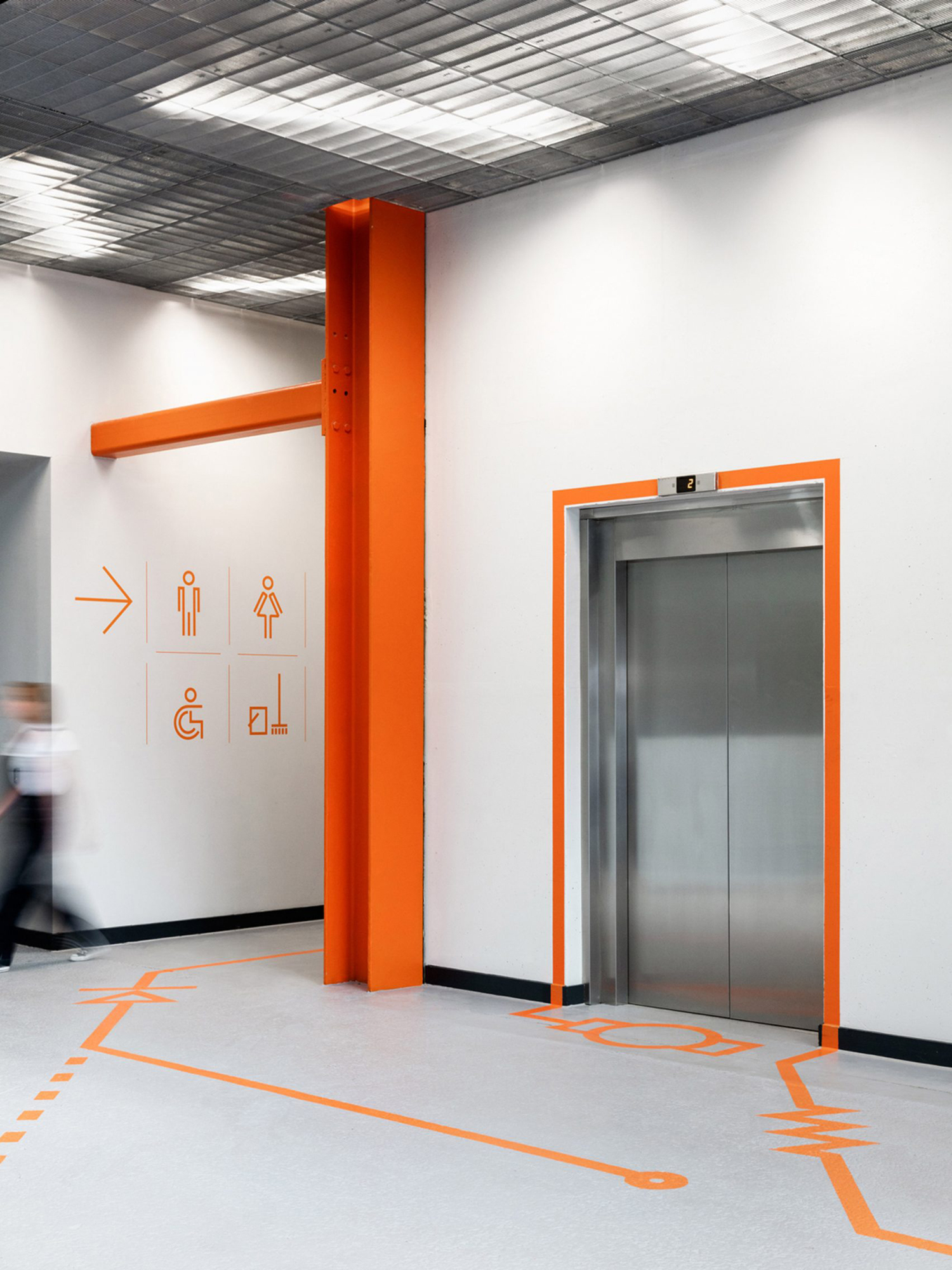
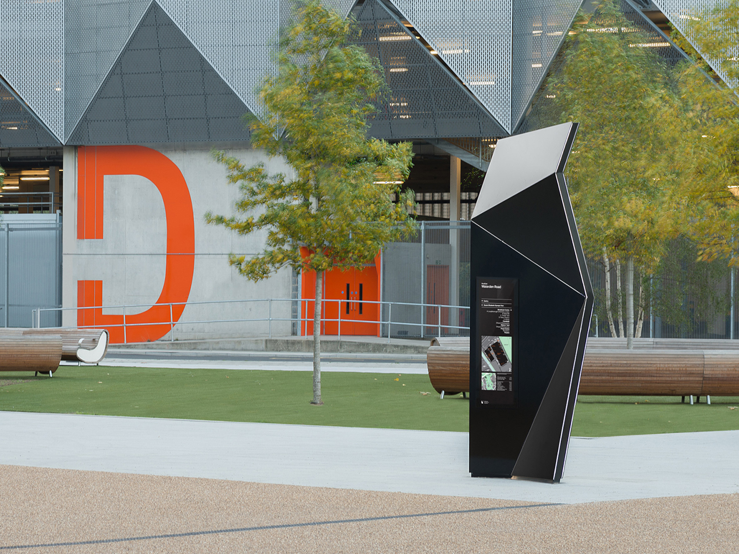
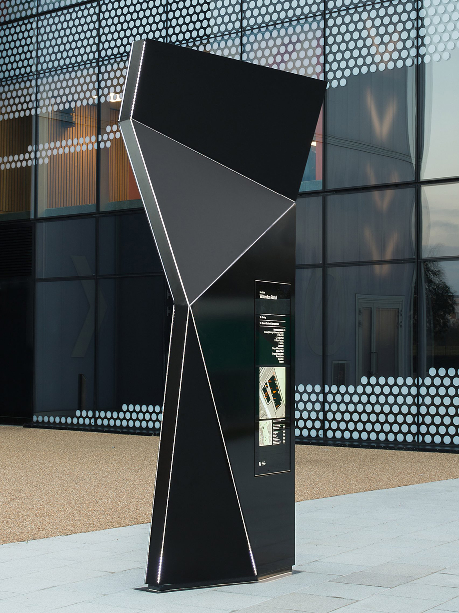
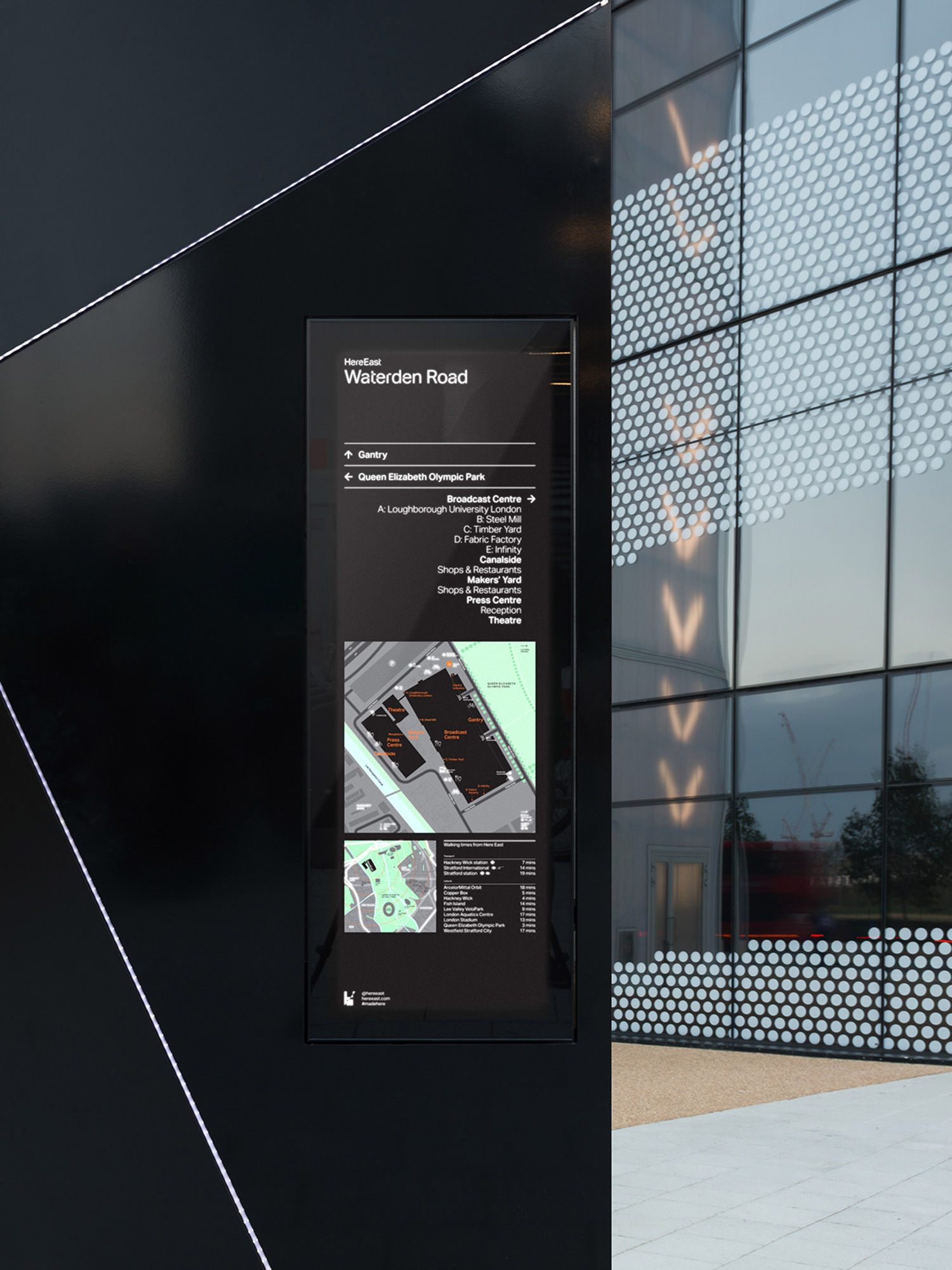
dn&co. continue to work with Here East into 2016, designing a interior wayfinding system built around circuitry, finding a neat balance between functionality and play, and exterior signage takes the intersections, lines and nodes that make up the logo and gives these an impressive physicality, emphasised by black panels and illuminated edges. The update also included a wayfinding language guide printed on bright orange board.

