Pablo & Rusty’s by Manual
Opinion by Richard Baird Posted 17 December 2014
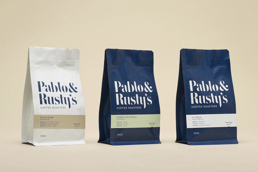
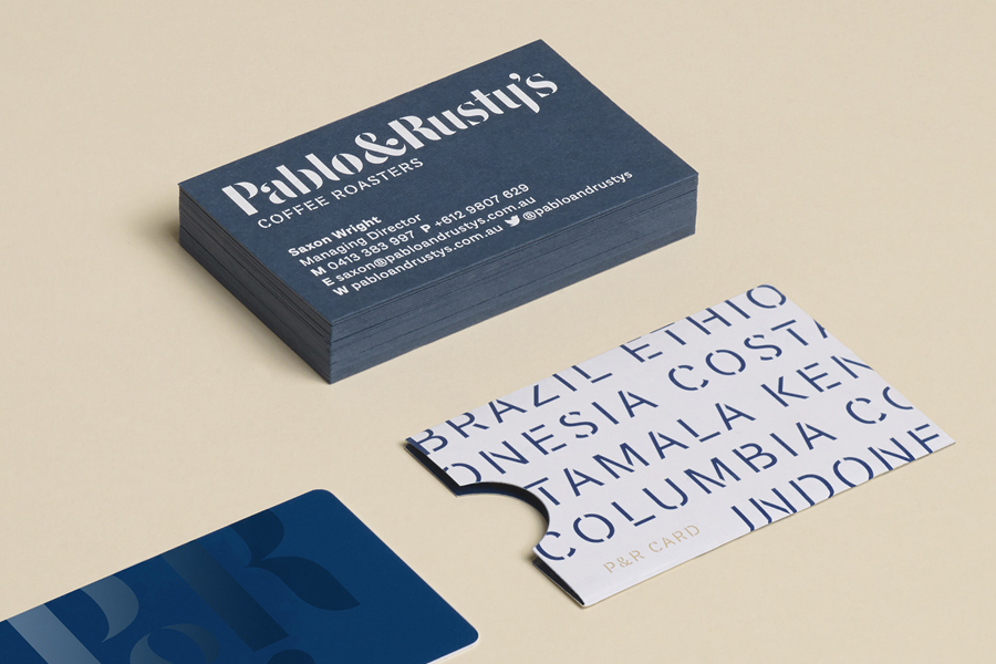
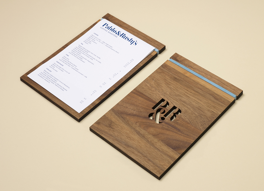
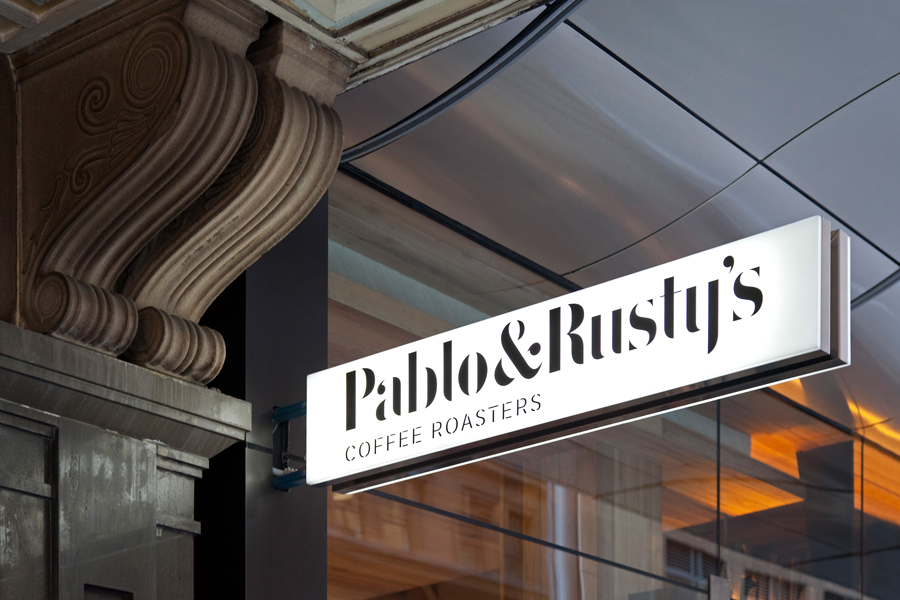
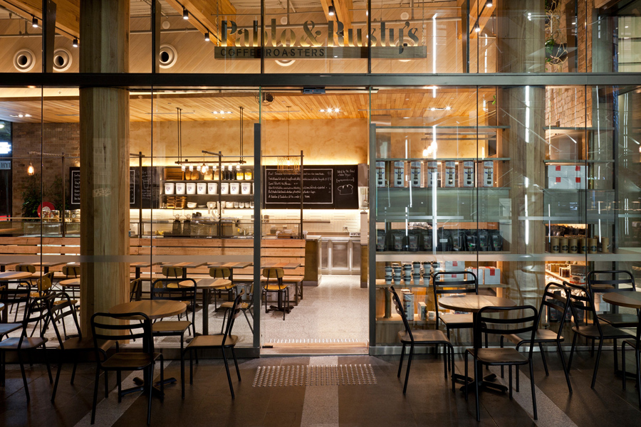
Pablo & Rusty’s is a small-batch coffee roaster, wholesaler, retailer and cafe with four locations in and around Sydney, and a company culture passionate about sustainability and the pursuit of perfection. San Francisco based studio Manual created a visual identity for Pablo & Rusty’s that would better reflect their values, was sensitive to local coffee culture and is described as having a level of design sophistication that would allow the cafe experience and coffee to remain the focus. This extended across packaging, business cards, menus and signage.
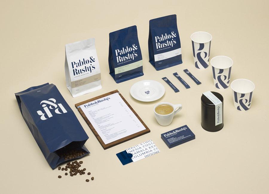
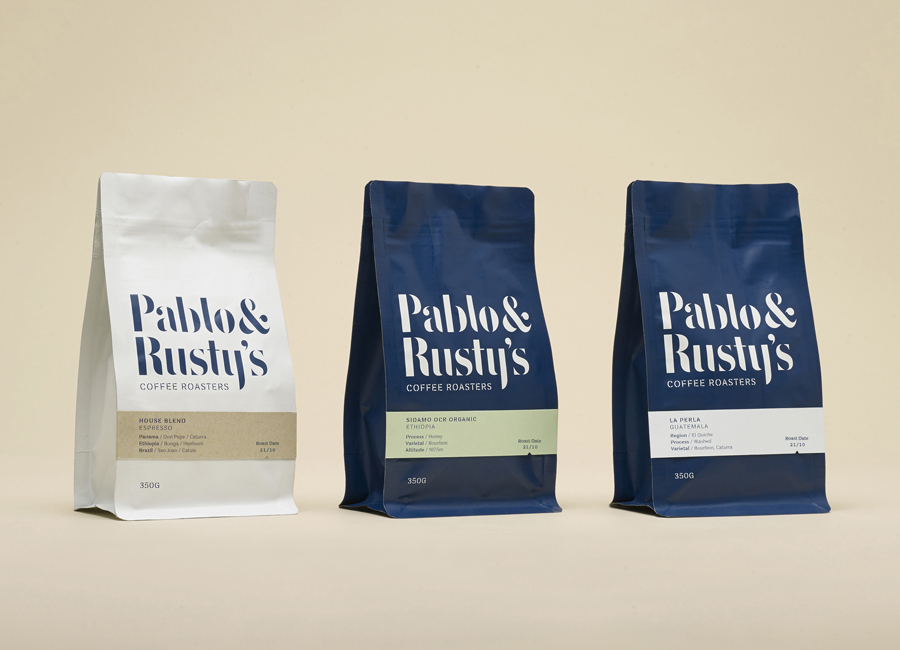
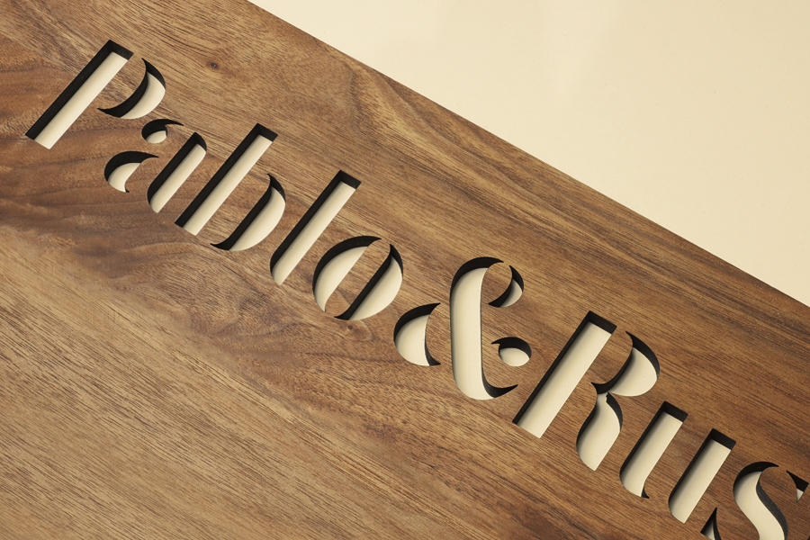
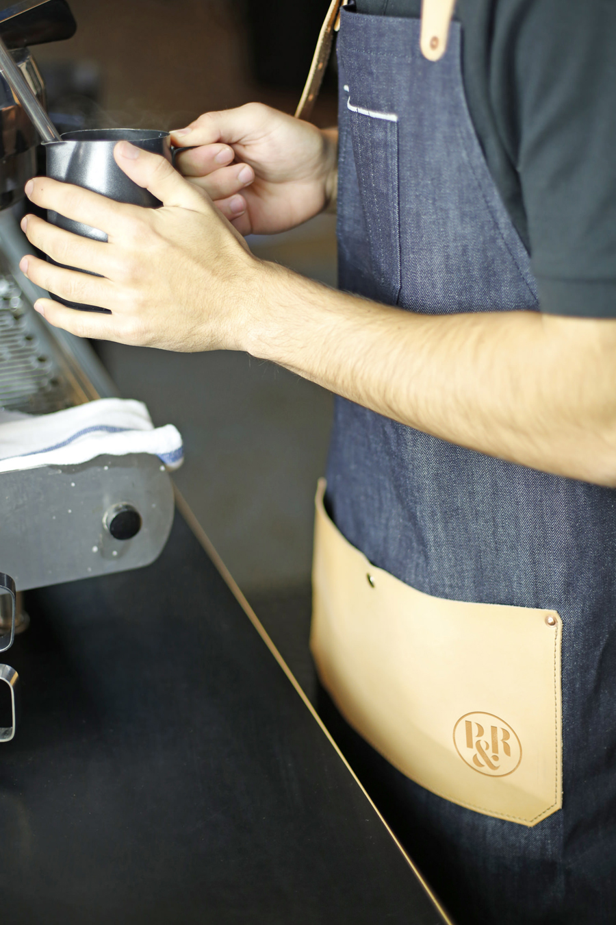
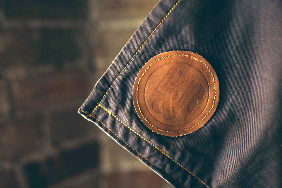
The partnership of the business, reflected in the name, clearly informs a number of aesthetic choices. This is perhaps most explicitly seen within the logotype and monogram. These leverage the intrinsic duality of stencil cut serif characters and their balance of the utility associated with coffee sacks, crates and industry in general, and the perceived high quality of classic serif detail. This choice, while familiar, current and increasingly used within similar contexts, is still a fresh aesthetic outside of design blogs, well-suited to a commodity such as coffee, and the desire to convey the unique value given to it through the craft of its roasting and preparation.
Stencil cut serif typefaces are currently experiencing a bit of a resurgence with plenty of new and original interpretations to choose from, however, Manual have taken a custom approach. The Pablo & Rusty’s logotype is largely well-drawn with a good mix of small flourishes alongside heavier stroke widths picking out the P and R, and a tall x height that improves legibility where the breaks that give it its utilitarian quality may have slightly undermine this. It could be argued that, while handled with care, the absence of some real brand defining proprietary features, beyond the name, is a bit of a opportunity missed when there are many similar and equally well drawn fonts available.
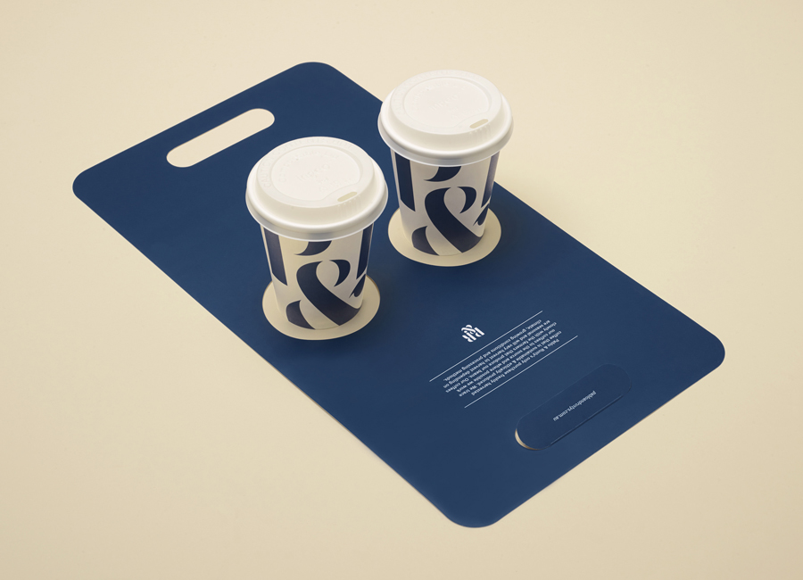
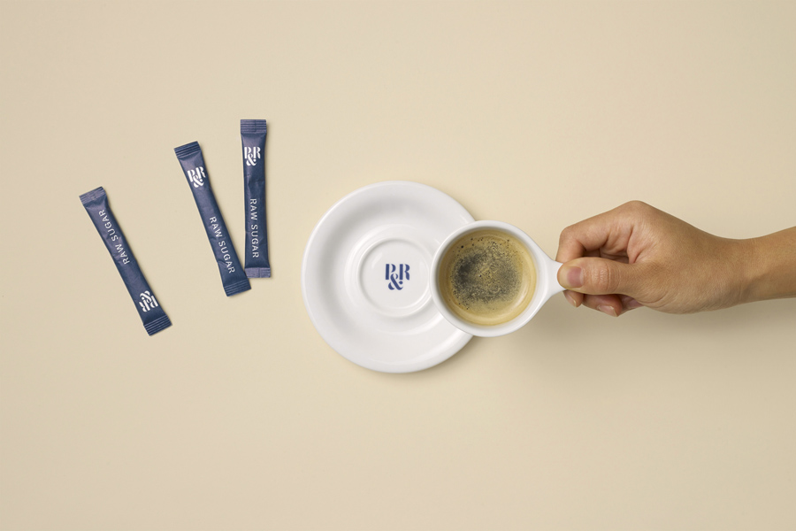
This also includes the monogram where the three characters are perhaps not as creatively resolved as they could have been, check out Iris & June by Proud Creative, but work well as large and cropped detail across the coffee cups. The repetition of both monogram and logotype, and their oversized application across stationery and packaging — giving the project a logo-centric and straightforward branded sensibility — is conceptually simple but impactful and flexible.
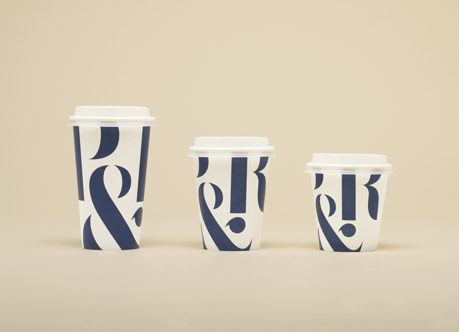
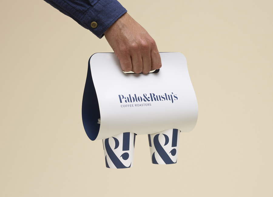
The duality of the type and name, the tension between utility and unique quality, commodity and premiumisation, also extends to the dark and light colour palette, a strong contrast between logotype size and supporting copy, the economy of off-the-shelf cups and coffee bags alongside the custom detail of the card bands, the cut wood of the menus and the practicality of the cup cradle.
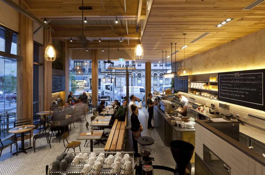
A predominantly blue and white colour palette defies period, avoids current coffee shop visual vernacular of small-scale craft, unbleached bags and hand stamps in favour of a retail quality and polish alongside those associated with type. The logo-centric approach, underpinned by a familiar but understandable dual communicative intention and aesthetic simplicity likely to sit well within an interior of plenty of good quality material detail and the utility of some of the furniture, and stand out in other retail environments.
Design: Manual
Interior Photography: Andrew Worssam
Opinion: Richard Baird
Fonts Used: Plan Grotesque Stencil
