Luka Žanić Photography by Studio8585
Opinion by Richard Baird Posted 29 January 2015
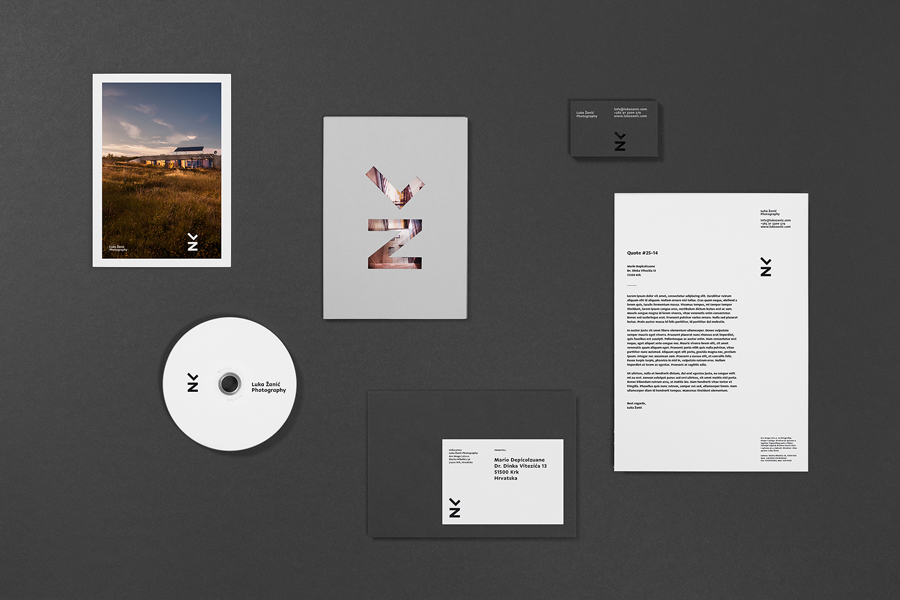
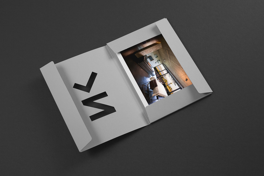
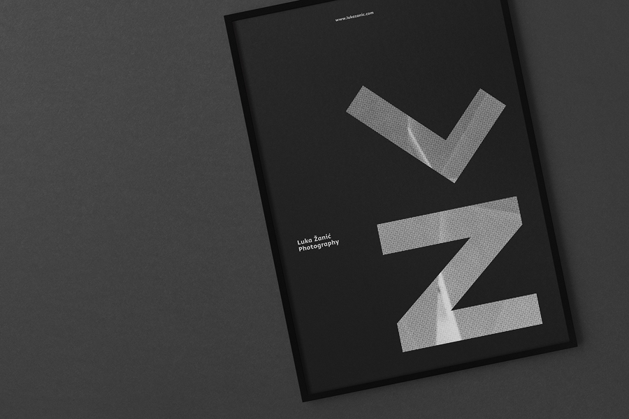
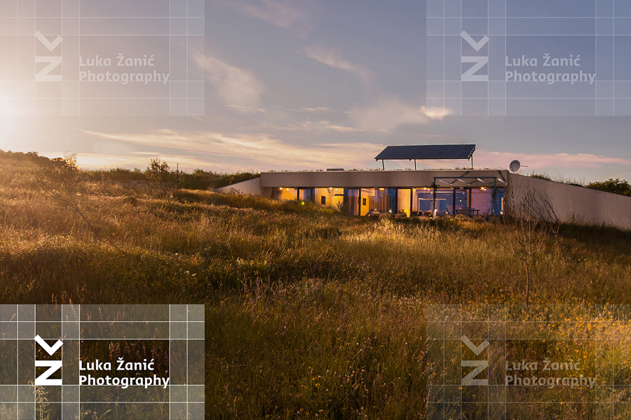
Luka Žanić is a Croatian interior and architectural photographer who works with clients worldwide. He approaches each project individually, gathering information about objects, spaces and their purpose before beginning a shoot. His brand identity, designed by Studio8585 and which included stationery, poster and portfolio folder, takes advantage of a typographically challenging set of characters in the form of a monogram and uses this to frame the colour of Luka’s images and sets both of these within the context of cues associated with modern architectural identities.
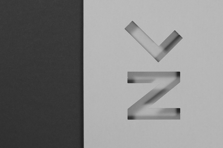
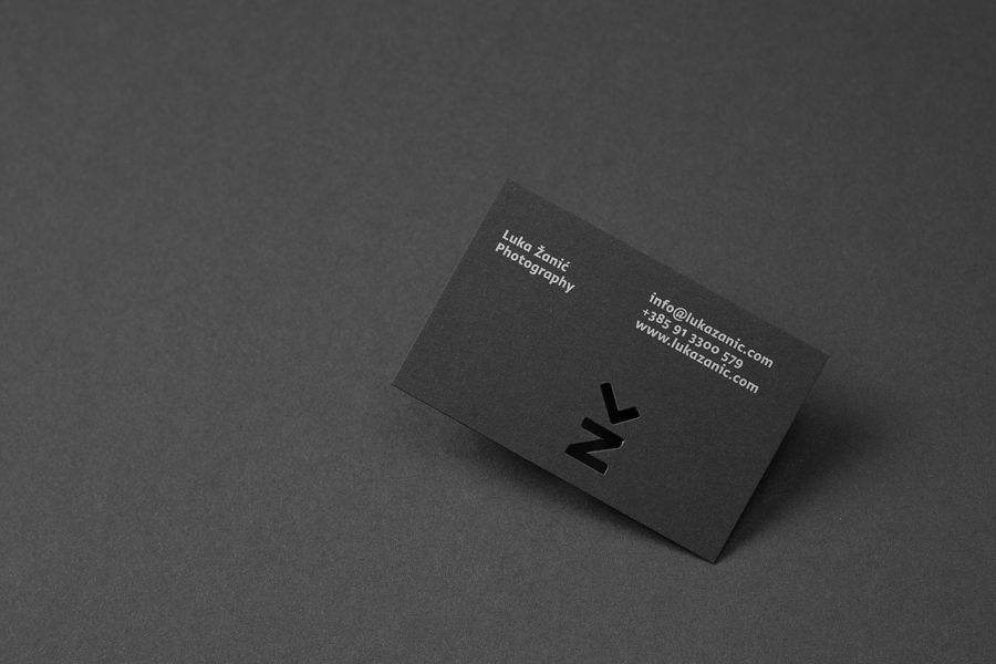
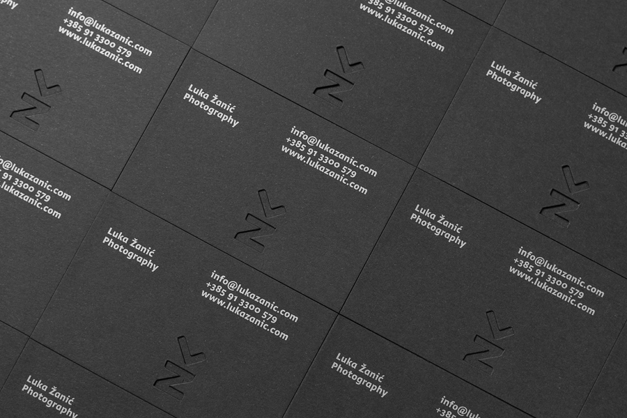
The monogram’s simple forms, consistent line weight and similar angles contribute to a bold and robust symbol with a sculptural quality in its asymmetry, vertical balance and diagonal movement between the two shapes. It makes great use of the háček / diacritic above the Z, doubling as the L – an intelligent observation, reductive in its implementation, and functioning, at its most basic level, as an appropriate shorthand for a long business name while also referencing a couple of familiar architectural ideas.
Greta Sans introduces a softer and more accessible quality to the identity alongside the impersonal geometric forms of the monogram and the absence of colour or warmth across the collateral. As a logotype, the characters feels distinctly more personable, as words are competently split across two lines and as individual letters are well-spaced. As blocks of copy on-line the choice of a Greta Sans Bold creates a slight barrier, is a little harder to read, and for me, on an admittedly superficial level, does not feel quite right. This may well be because of an association bias I cannot quite place, but understand the intention.
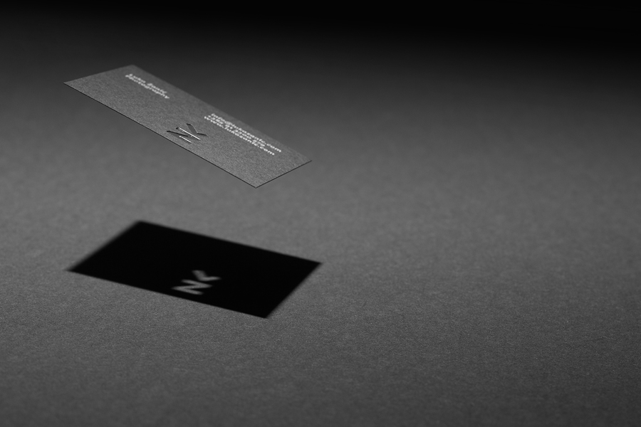
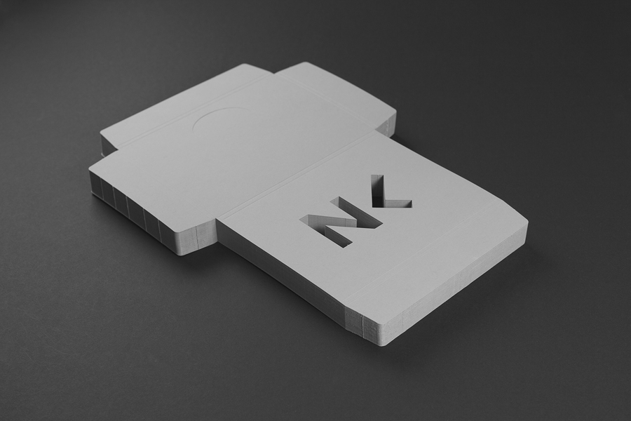
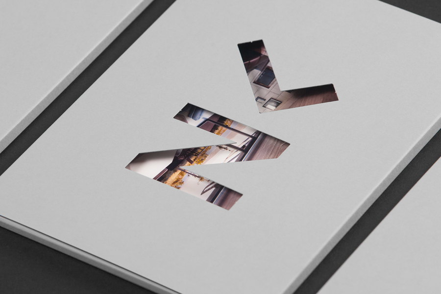
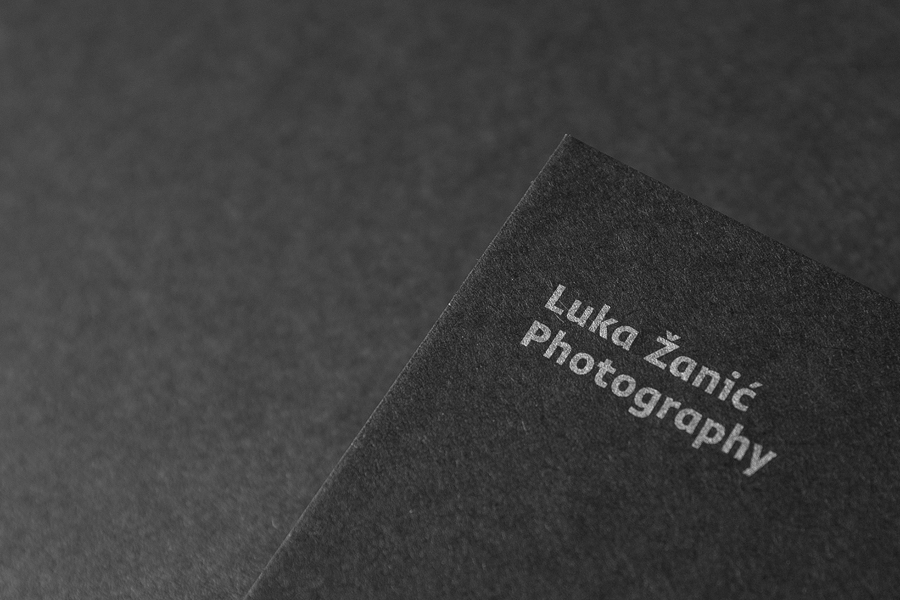
As you might expect from something tied to architecture, the identity plays with light and shadow, references building materials and structure through a die cut detail, a dark and light colour palette, the shine of a silver metallic ink, the use of uncoated boards, a cool concrete grey, and favours grid-based layouts across the stationery. An argument could be made that it leans rather heavily on architectural conventions when Luka Žanić also captures the flourish of interiors and the incredibly personal occasion of a wedding photography, but this is perhaps in service of a more focused future direction.
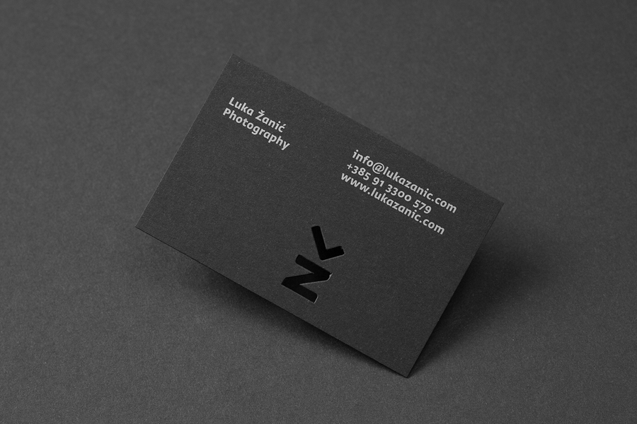
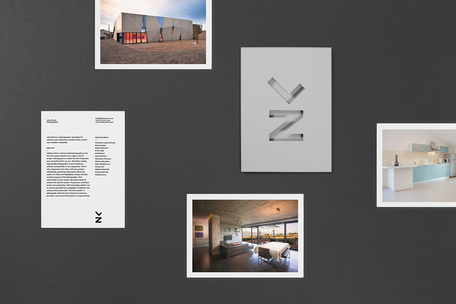
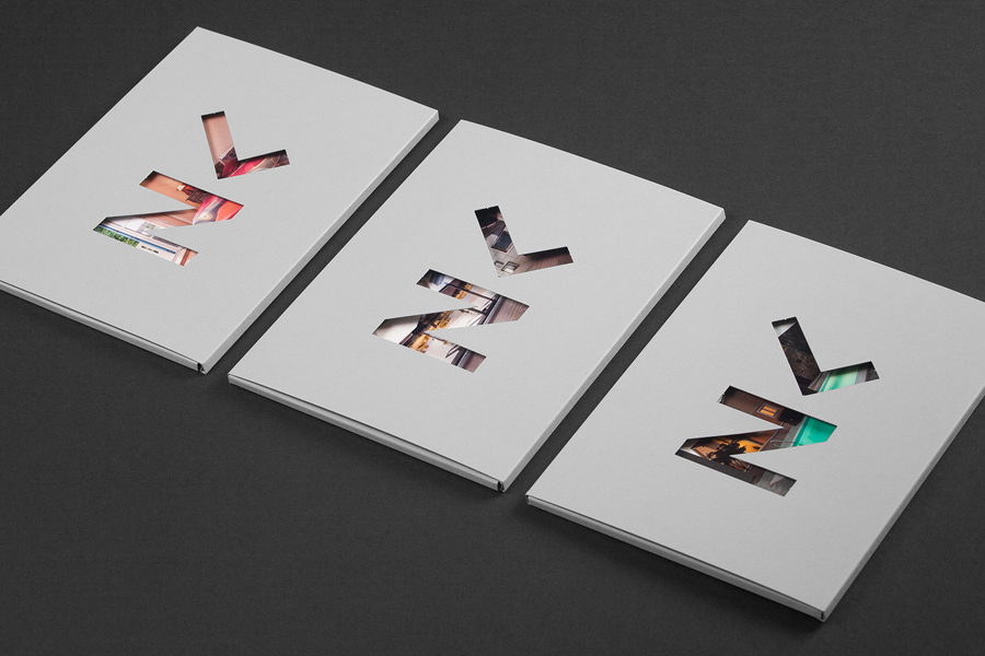
I appreciate its reductive nature but there are occasions where it appears a little too sparse. The images, the more communicative asset of any photographer, are hidden and secondary to the architectural sensibilities. The broad flaps of the portfolio folder and the heavy white borders of the cards draw away some of the initial impact you would expect to get on opening a portfolio but the use of individual cards is smart and economical, accommodating new images without having to print and bind a new book. The die cut window, the monogram becoming a large and impactful container, takes on and draws out the detail of the images and adds colour to the identity in print.
Design: Studio8585. Opinion: Richard Baird. Fonts Used: Greta Sans
