Nourcy by lg2boutique
Opinion by Richard Baird Posted 24 February 2015

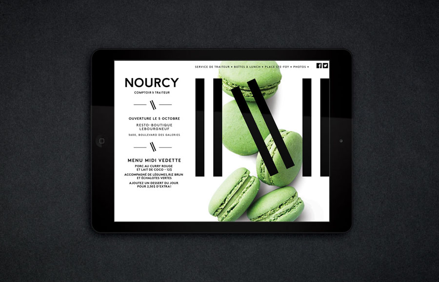
Nourcy is a delicatessen that has been creating fresh, home-made and original products for thirty years from its location in Quebec City. While providing a contemporary dining environment Nourcy also offers catering services and lunch boxes to customers who have come to expect restaurant-quality at work and at home. In conjunction with a new menu of pastries, an expanded chocolate selection, exclusive gourmet delicacies and the development of a second location in the area of Lebourgneuf, Canadian graphic design studio lg2boutique developed a new brand identity and interior design treatment that places ingredients and products at the forefront.
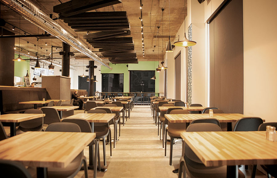
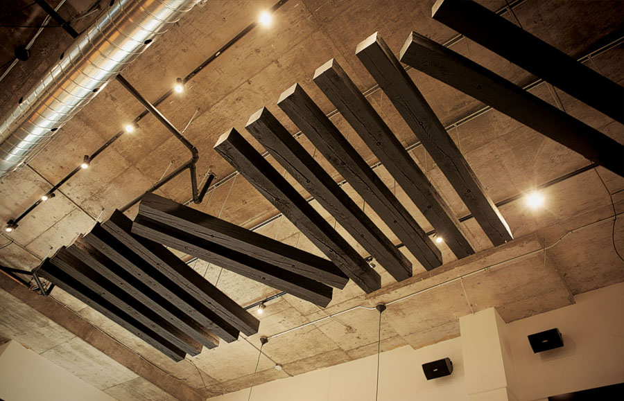
Through bold, uppercase, sans-serif typography, a black and white colour palette, and the reductive sensibilities of the logo, an interior of exposed utilities, spot and low hanging lights, concrete, solid wood tables and injection moulded seating, lg2boutique establishes a strong relationship between visual identity and interior environment through robust architectural and structural sensibilities, confidently mixing elements of contemporary utility and style, warmth, comfort and quality.
Colour and texture is absent from the identity, and the environment sticks to natural tones and uncoated cast surfaces in a way that draws attention to the texture, colour and details of Nourcy’s menu, and to some degree, reflects elements of the craft and precision you might associate with the skills of a patisserie.
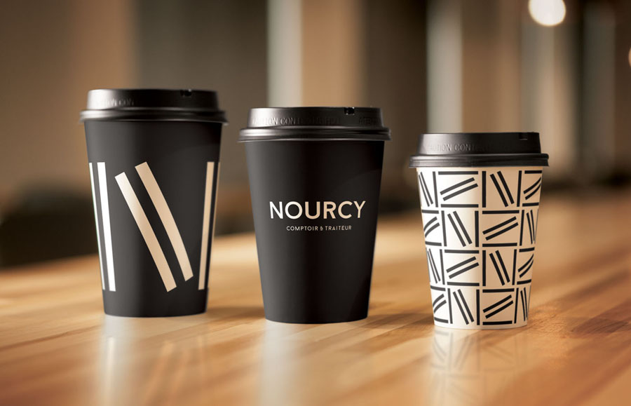
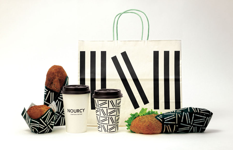
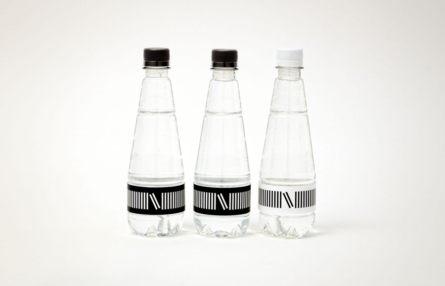
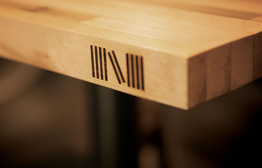
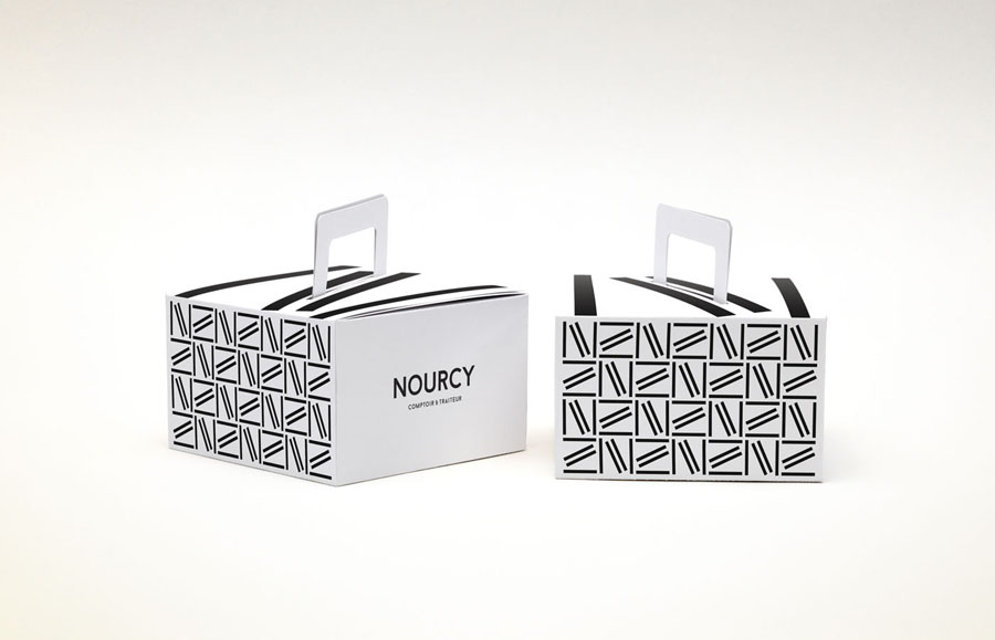
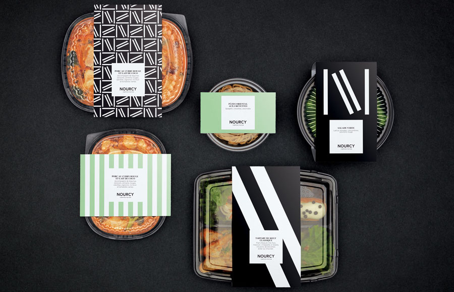
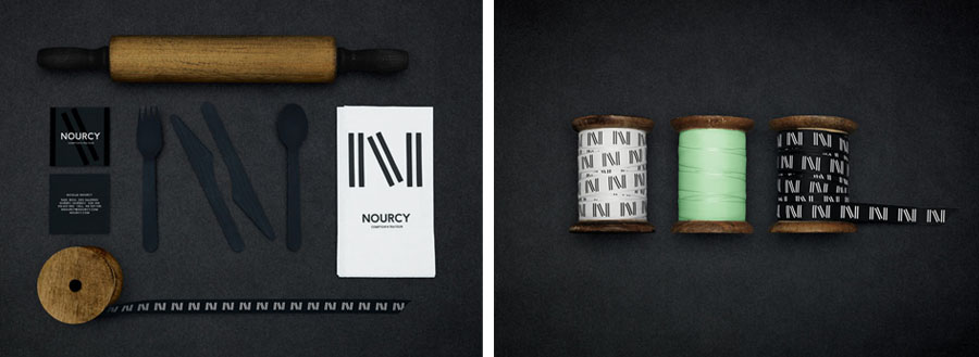
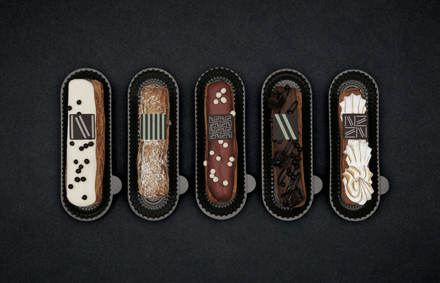
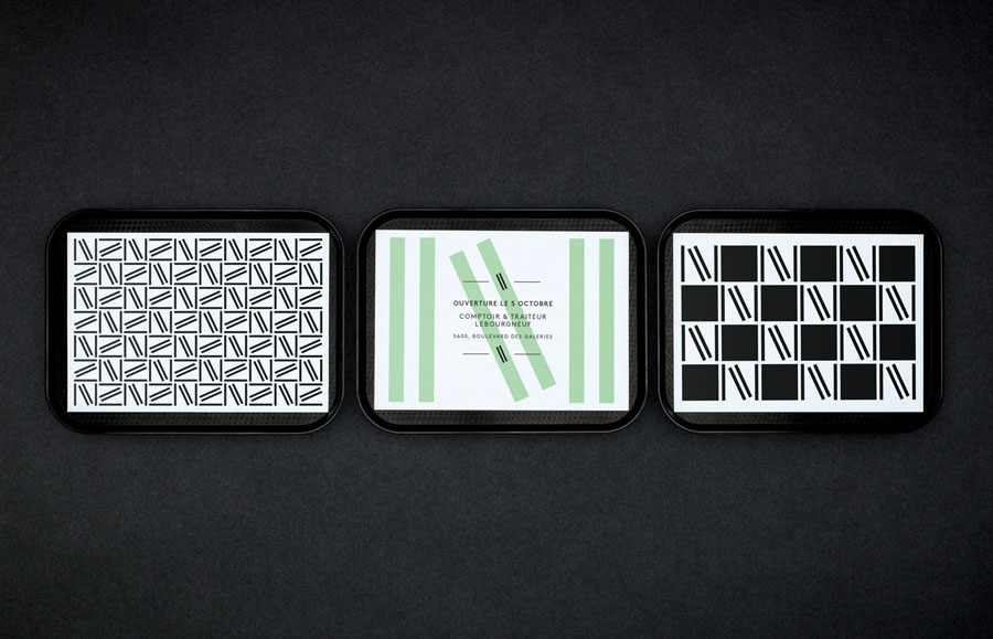
Founded on the theme of breaking with convention the logo is aesthetically simple but conceptually well-founded, its diagonal stroke introducing a dynamic quality to and interrupting mechanical repetition which plays out more across the packaging. The potentially dominant bold, geometric and monolinear form and black and white colour of the logo is tempered by its diverse applications throughout the interior and iconic in service of recognition outside. These include a distinctive and confidently oversized graphic across bags, as a pattern circling coffee cups and water, heat treated detail along the edge of tables, overhanging interior detail, wallpaper, and as tempered chocolate flourishes across products. More from lg2boutique on BP&O.
Design: lg2boutique. Opinion: Richard Baird.
