Adisgladis by Bedow
Opinion by Richard Baird Posted 27 February 2015

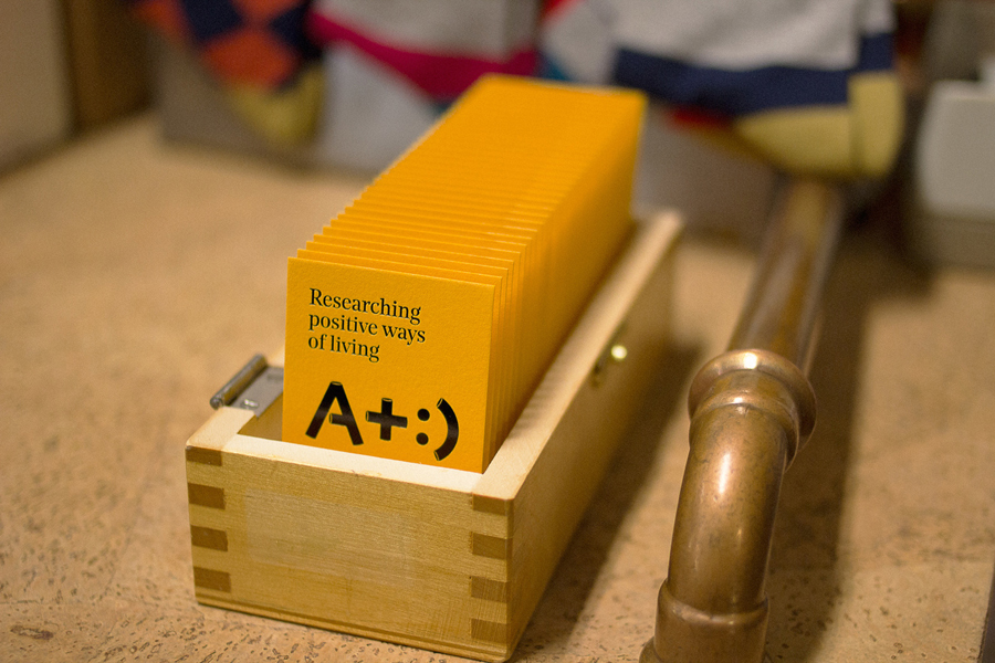
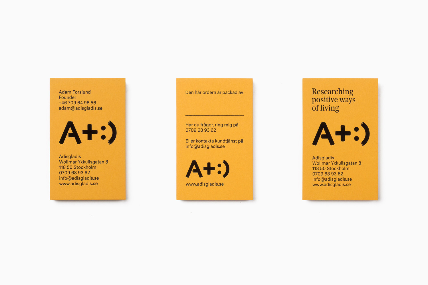
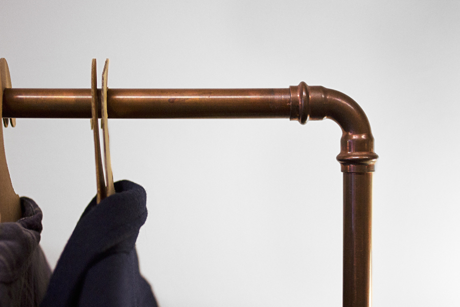
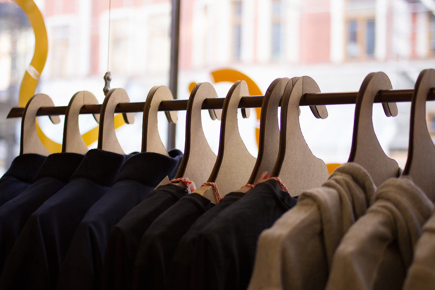
Adisgladis is a Swedish clothing, accessories, outdoor gear and gadget retailer with premises on Stockholm’s Wollmar Yxkullsgatan street. It has a distinctive interior of copper pipe racks, die cut card hangers, wood fibre and chipboard surfaces, and a philosophy that embraces organic, up-cycled and positive living. Adisgladis’ new visual identity, developed by Stockholm based graphic design studio Bedow, draws on the retailer’s interior, its positive and sustainable ideologies and an element of utility and technology, visualising these using a mix of illustration, pictograms, type, colour and material choice across bags, packaging, signage, stationery, business cards and storefront display.
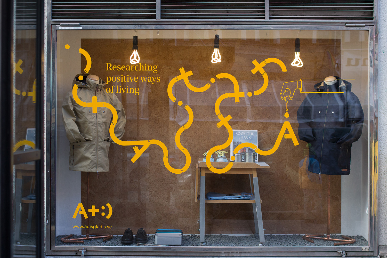
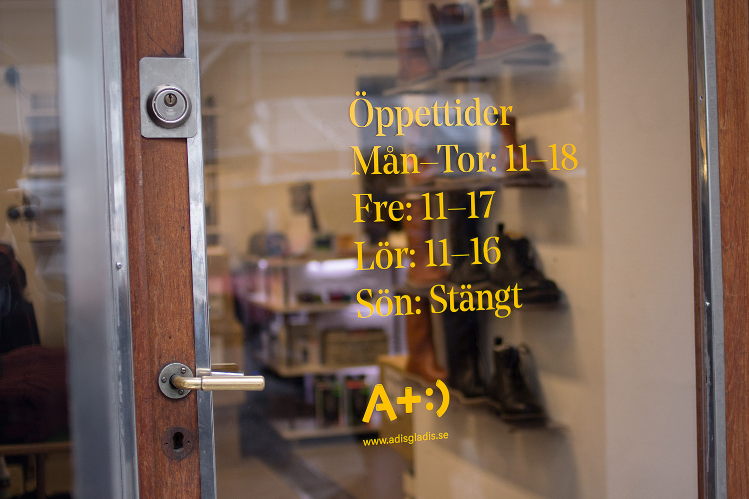
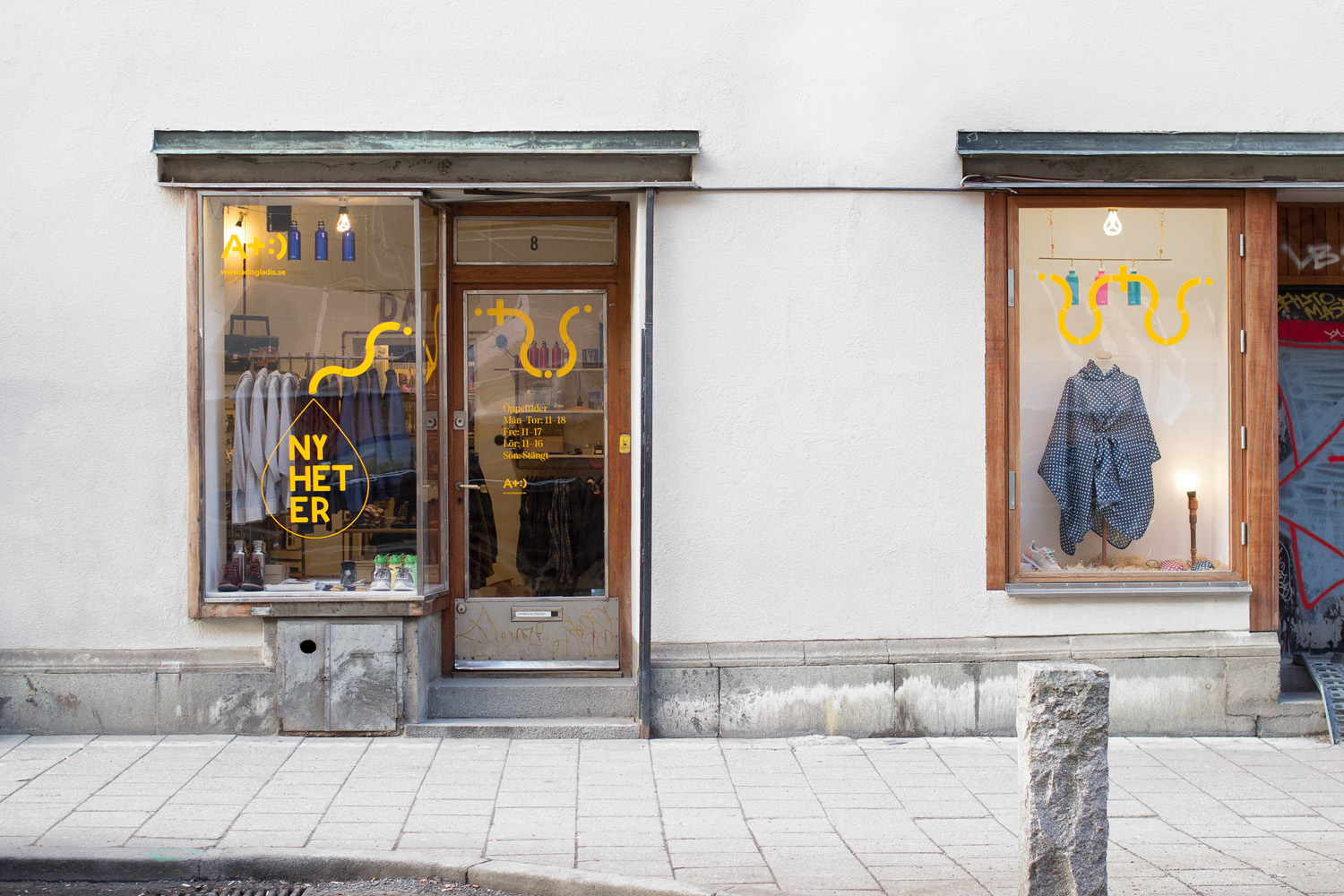
Taking its cues from Adisgladis’ retail environment, Bedow draws conviviality, personality and a strong aesthetic value from the low-fi up-cycled nature of the interior and its use of bent copper piping through a series of modular illustrations applied to windows and as a logo across the print work.
The illustration, a graphic treatment presumably inspired by the original utility of copper piping and then its up-cycled repurposing as clothes rack, is an neat flourish that manages to not only reference the unique environment of the store, bind experience and identity, and secure originality, but in some ways reflects the functionality of gadgetry and garments, and contemporary urban fashion. These are well-rendered, benefit from a striking colour choice, sit well over the simple storefront display and make their way into the lighting choices.
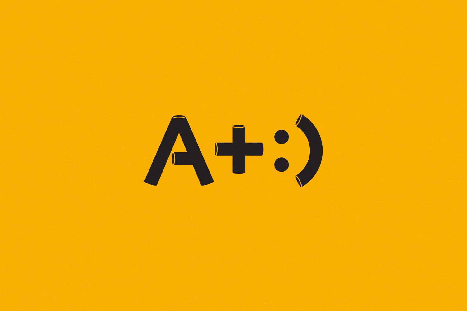
The logo’s appropriation of the ubiquitous smiley, the use of the + symbol, the highest grade A+, and the ability to type it on a keyboard, mix positivity, accessibility, quality, and technology in a simple, single and own-able visual expression. Its playful and accessible without being childish, is design sophisticated, modern and styled in a way that is uniquely tied to physical elements of the store.
Monolinear pictograms share some of the same qualities and ideas that underpin the logo. These are current and on-trend, are individually unique and collectively cohesive, and balance themes such as functionality, raw and refined materials, technology, environment and recycling. The majority of these require little in the way of context or explanation, and effectively reduce down complex objects such as balls of wool and wood texture into simple forms. Created to allow written material to be untouched by the character of the typeface, the selection of the sans-serif Neutral complements the reductive and communicative nature of pictograms.
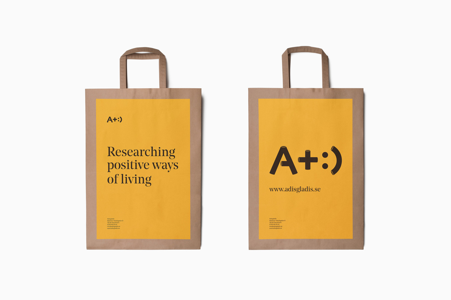
The serif choice of Noe Display, its wedge shaped serifs, a high stroke contrast and engraved undertones, introduce significant contrast to the monolinear qualities of the iconography and the practical qualities of Neutral. It grounds the expressive, playful and modular qualities of the illustration with something more traditional and finer in detail, leveraging a high quality you might associate with a tailor with significant heritage or perhaps a high fashion editorial.
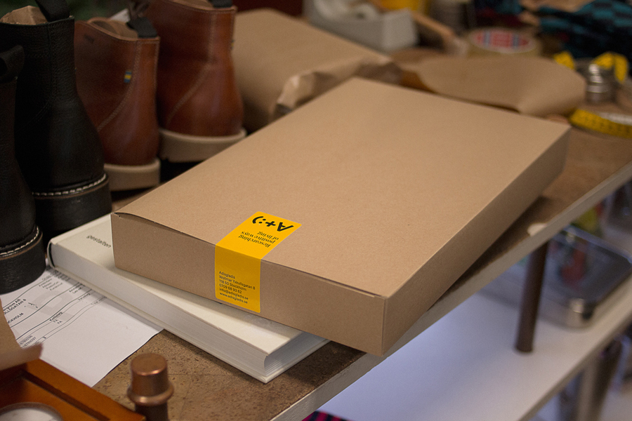
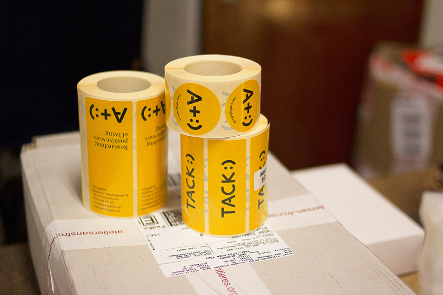
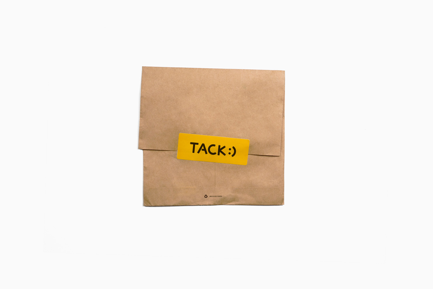
These assets are bound by a high-impact black and yellow colour palette. This familiar combination is given a sense of quality and expensive through the use of dyed boards and papers and a black block foil print finish. The associations this combination has with bees – think hardworking, robust outdoor workers and an industriousness and by extension practicality, functionality and utility – is embraced with a hexagonal pattern that contains iconography. Contrast is used to good effect, setting brightly coloured stickers across unbleached and uncoated boards. Again these draw on the interior and inject a bit of warmth and life into materials that, while resonating well with the philosophies of the store, are largely associated with the practical and utilitarian.
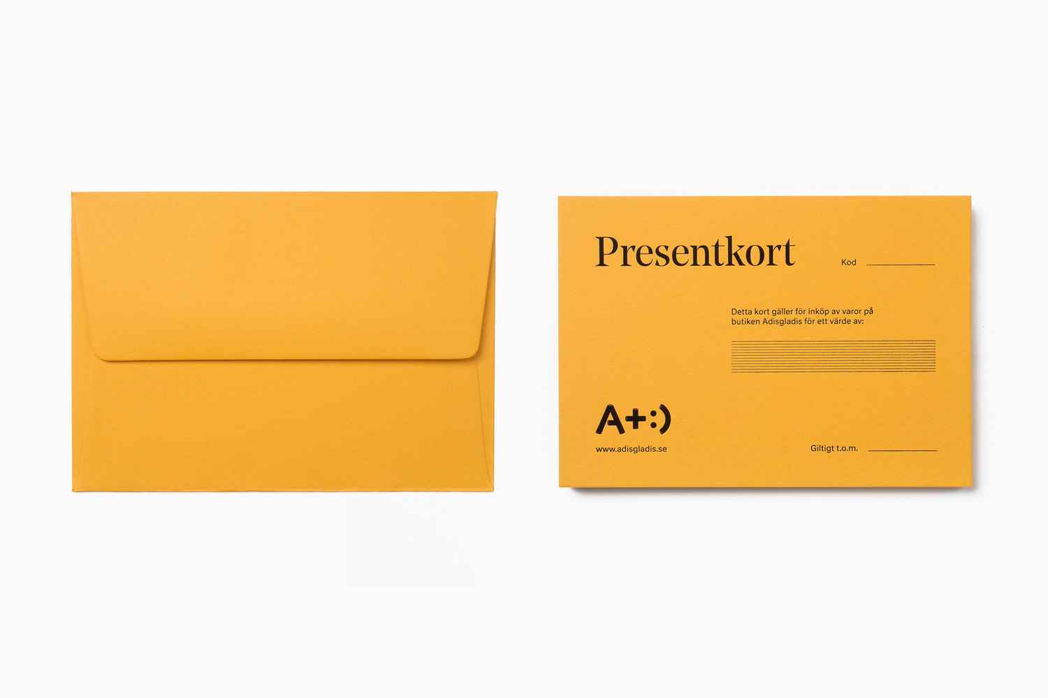
Bedow’s solution is distinctive, effectively uses typographical and colour contrast, high quality and lo-fi robust material choices, and a contemporary conviviality alongside traditional quality cues to effectively balance up-cycling, mindful living, accessibility and practicality alongside fashion and lifestyle. More from Bedow on BP&O.
Design: Bedow. Opinion: Richard Baird. Fonts Used: Noe Display & Neutral
