StrangeLove by Marx Design
Opinion by Richard Baird Posted 9 March 2015
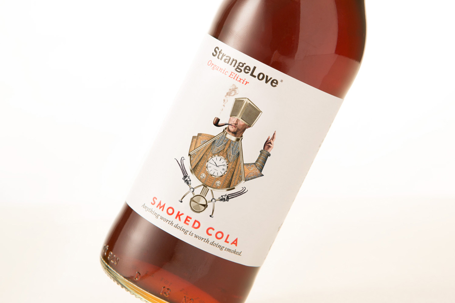
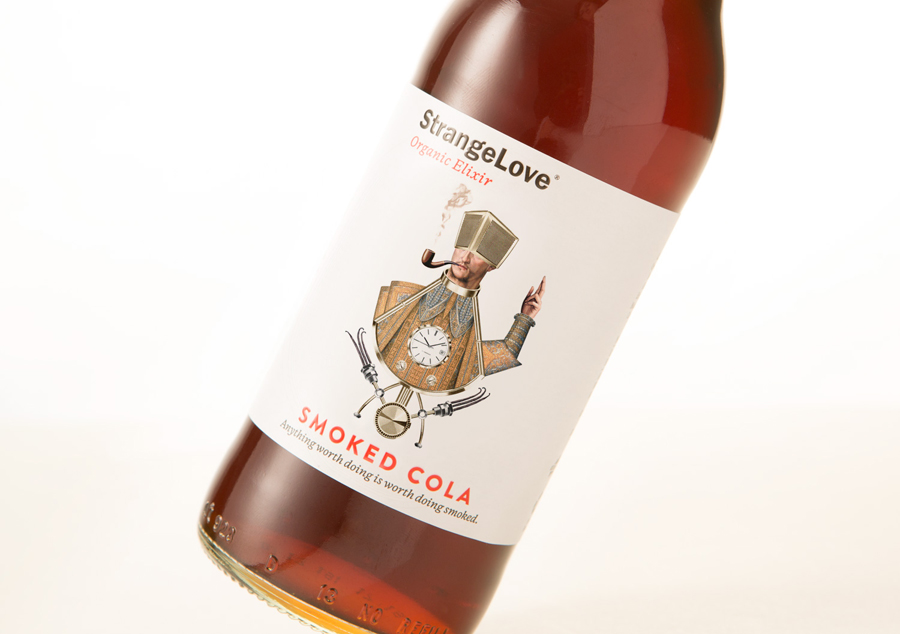
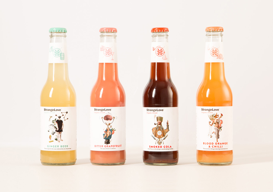
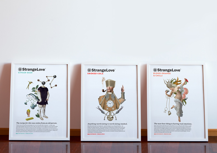
StrangeLove is an Australian energy drink creator with a four flavour range made up of Ginger Beer, Blood Orange & Chilli, Smoked Cola and Bitter Grapefruit. Although mass-produced, each variety has been crafted to taste homemade using high quality organic ingredients, and developed in response to other energy drink brands who have failed to live up to their premium positioning. Keen to avoid the visual tropes of the category and secure a witty, eye-catching and original look, Marx Design worked with StrangeLove to improve on the illustrative brand character established by their earlier bottles using simpler compositions, plenty of white space and sharp copywriting.
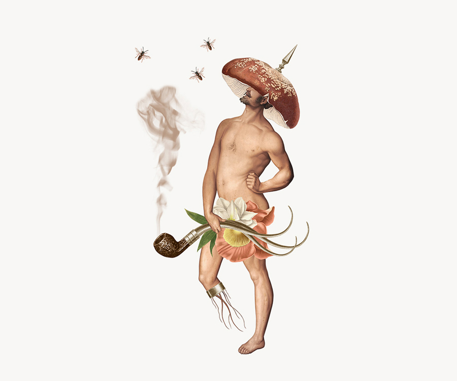
The edge to edge colour and full illustrative panels of StrangeLove’s previous bottles, designed by The Creative Method, make way for clearer less busy label treatments. These improve the visual impact and enhance the fine detail and quality of Randy Mora’s original illustrative work and the work he did in collaboration with Marx Design on StrangeLove’s promotional boxes.
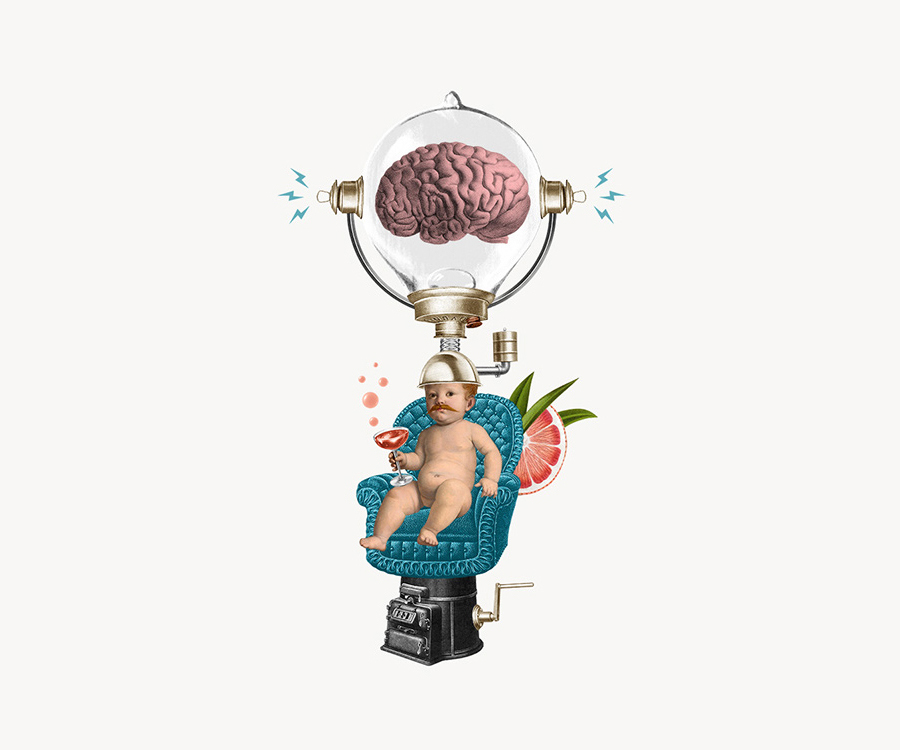
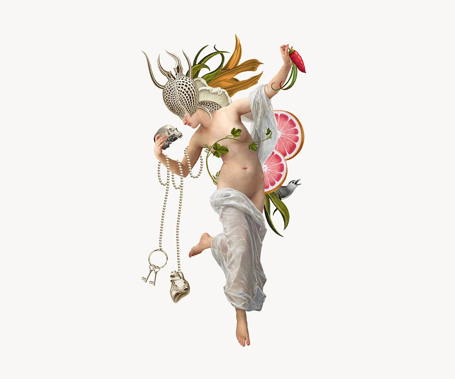
Based on the concept of the founder’s past lives and the sins that they are atoning for, the illustrations are thematically layered, and draw whimsical brand character from the fusion of botanical, classical, medicinal and scientific imagery as they relate to nature, art, health and formulation. Although founded on a rather abstract concept, the rendering and choice of image effectively hint at traditional recipes, authenticity of organic ingredients and traditional processes remixed with a contemporary enthusiasm (and energy) for experimentation.
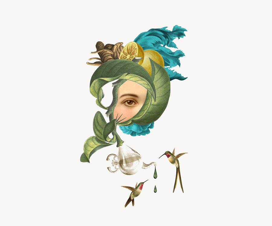
The illustrations appear detailed and authentic in their rendering with a period quality that could have easily been cut from the pages of an antique botanical journal or encyclopaedia. Their compositions, while made up of disparate objects, are well-balanced with a sculptural and still life sensibility, a good contrast of proportion and form, light and shadow, and an appreciation for natural colour and rhythm.
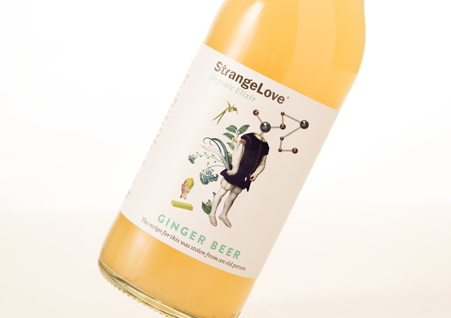
The illustrations are effectively drawn out by regions of white unprinted space where previous iterations were lost in panels of full colour and heavy detail. This contemporary restraint, referencing the current and premium conventions of other categories, and also manifesting itself within the juxtaposition of bold sans-serif characters alongside a finer italic and a subtle embossed detail, is a significant improvement.
Although the compounding of disparate imagery, the appropriation of traditional colouring techniques, and botanical and floral references is a familiar approach, rarely is it done so well, and then expanded upon so thoroughly using smart copy, not only across bottles and posters but online and across social media.
Copy Opinion by Seth Rowden
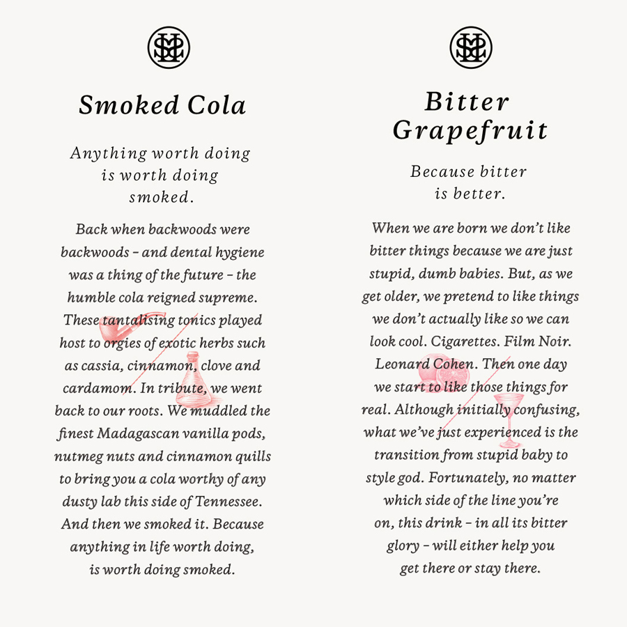
If most energy drinks make you look like you’ve been kissing your cousin under the bleachers at the Parramatta Speedway, then the StrangeLove copy sounds like a desperate attempt to atone for the sin – supposedly the stories on each bottle are even based on past indiscretions of the company directors. The copy is dark, humorous, homespun, and packs more punch than a fusion of taurine and caffeine. Oh, wait – StrangeLove is a remedy to the that kind of energy drink, instead positioned as an organic, natural ‘elixir’ for a new audience of bartenders, hipsters, and designers.
And it’s about time. Like a crazy relation of Fentiman’s, the copy uses delectable adjectives to deliver a promise of taste that will surely tickle the taste buds of foodies, using names like ‘Blood Orange and Chilli’ to beautifully descriptive passages such as, ‘Sour, succulent lemons and sultry, cinnamon spice’ and ‘Madagascan vanilla pods, nutmeg nuts and cinnamon quills’. But then it takes a U-turn into the charming and eccentric stories that define the StrangeLove tone of voice.
Laid back, provocative, colloquial, written as we speak – the back of pack and poster copy is bursting with warmth, chattiness, personality and confidence. The stories are spun with a charm and detail that make me identify strongly with at least one of the four drinks (I’m not saying which one). They tap a feeling we all have. And yet they still contain enough bite to make me read the labels twice and wonder: what do they really mean when they say, “Because anything in life worth doing, is worth doing smoked”?
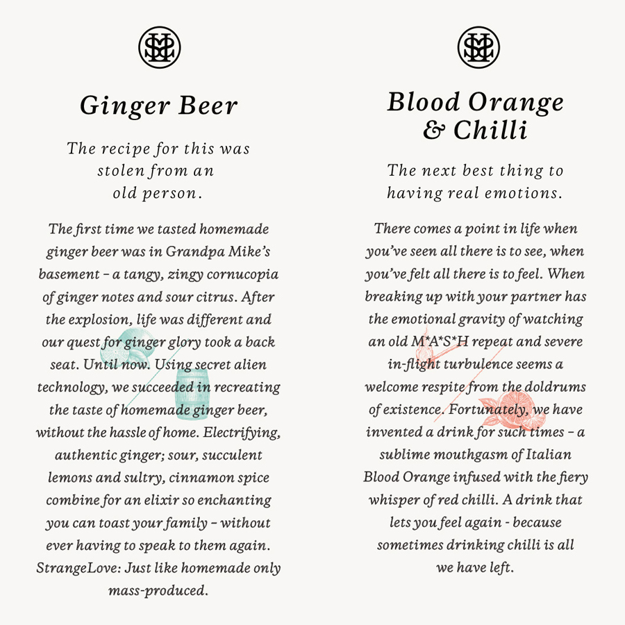
By retaining the images of Randy Mora but affording these plenty of space, alongside improved typography, print finish detail and a commitment to copy, Marx Design secures category differentiation, strong visual impact backed up by the familiar values of natural quality and unexpected flavour and those founded on ideas from StrangeLove’s creators, and expands on these with an element of storytelling. More from Marx Design on BP&O.
Design: Marx Design. Illustration: Randy Mora. Opinion: Richard Baird & Seth Rowden
