Marco Marco by Acre
Opinion by Richard Baird Posted 25 March 2015

Marco Marco is an Italian restaurant business with five locations across the city-state of Singapore and an affordable menu made up of international interpretations of classic dishes. These are created from simple recipes inspired by modern food culture using fresh locally sourced ingredients. The name, a reference to the adventures of merchant traveller Marco Polo, was chosen to reflect the international meeting point of ingredients and cultures.
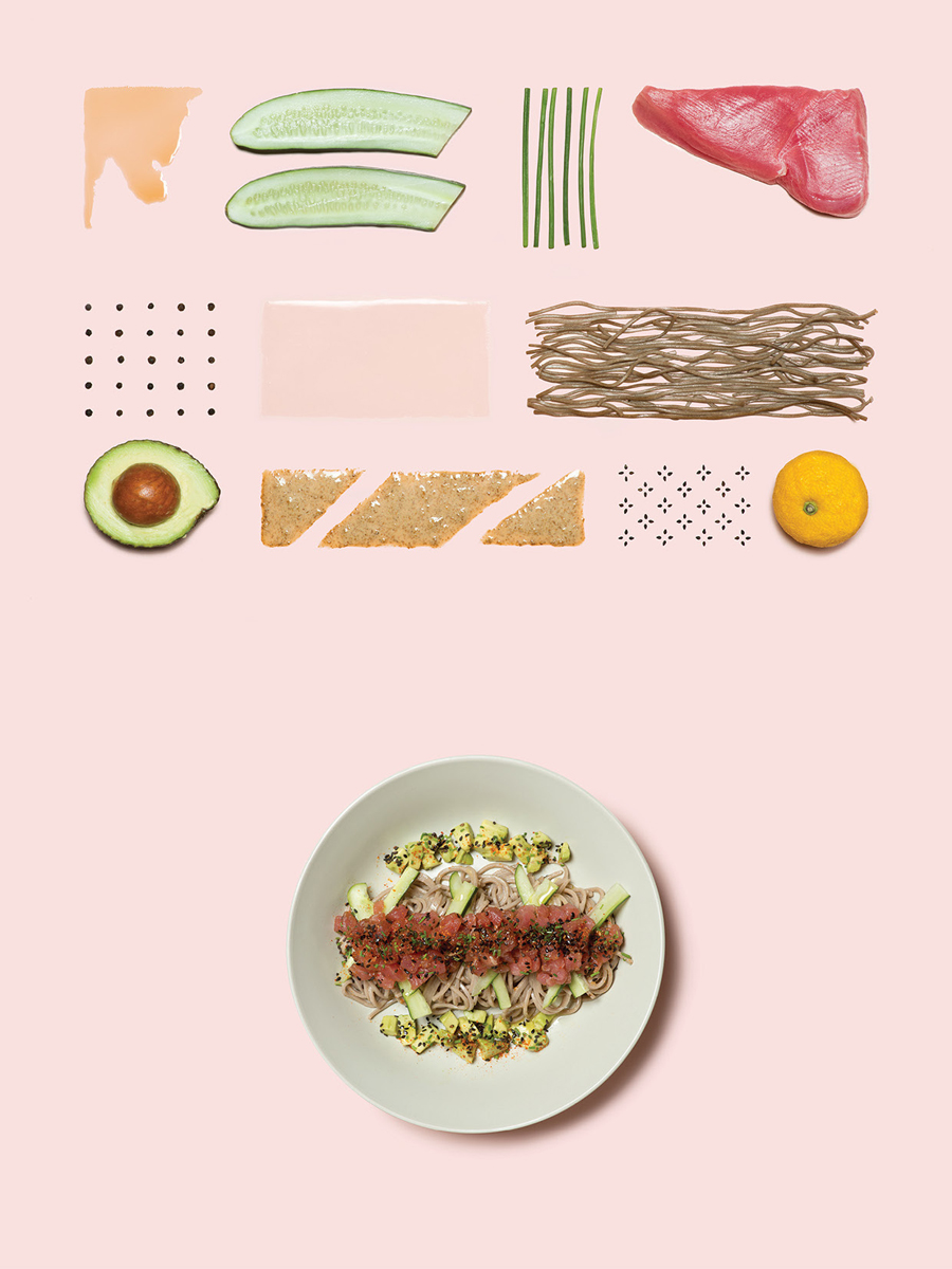
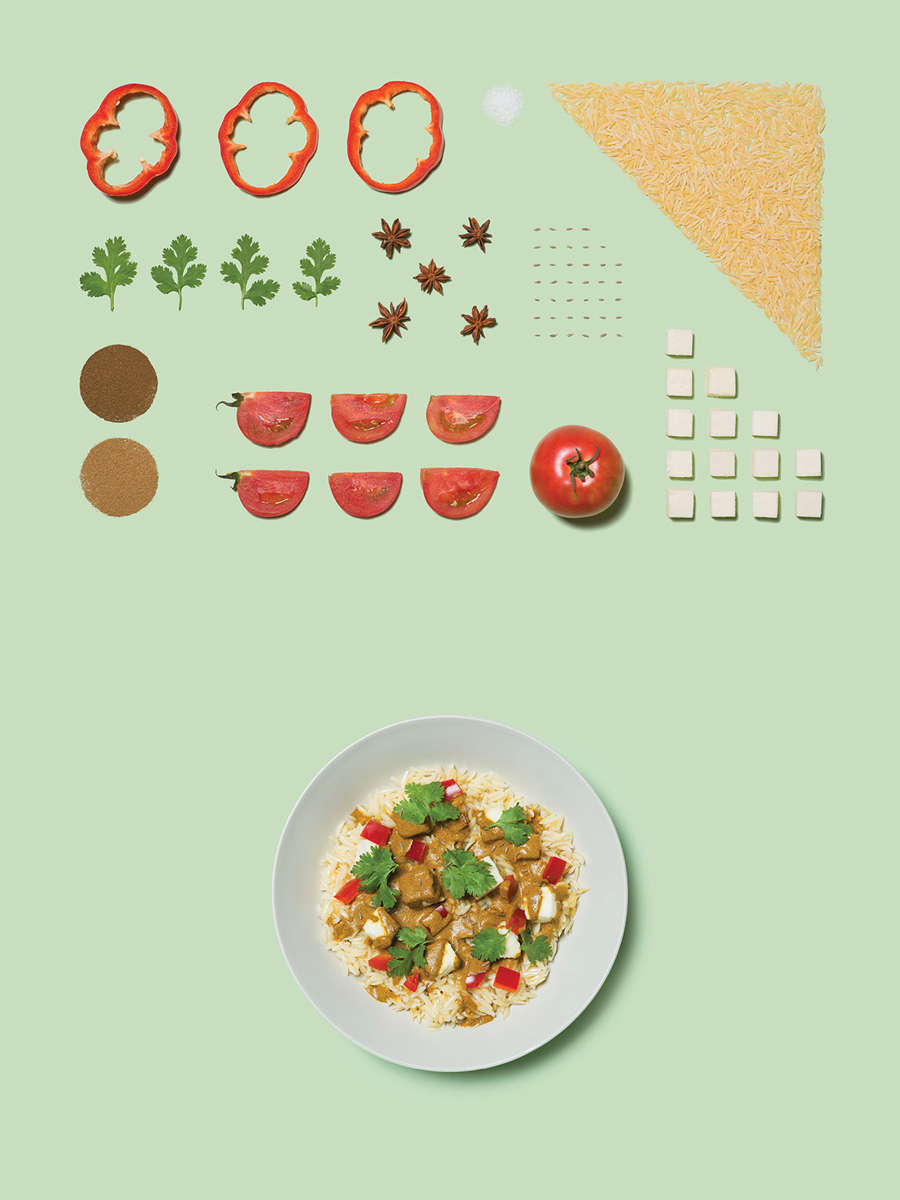
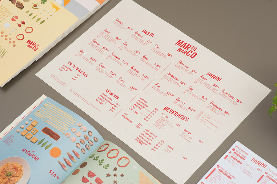
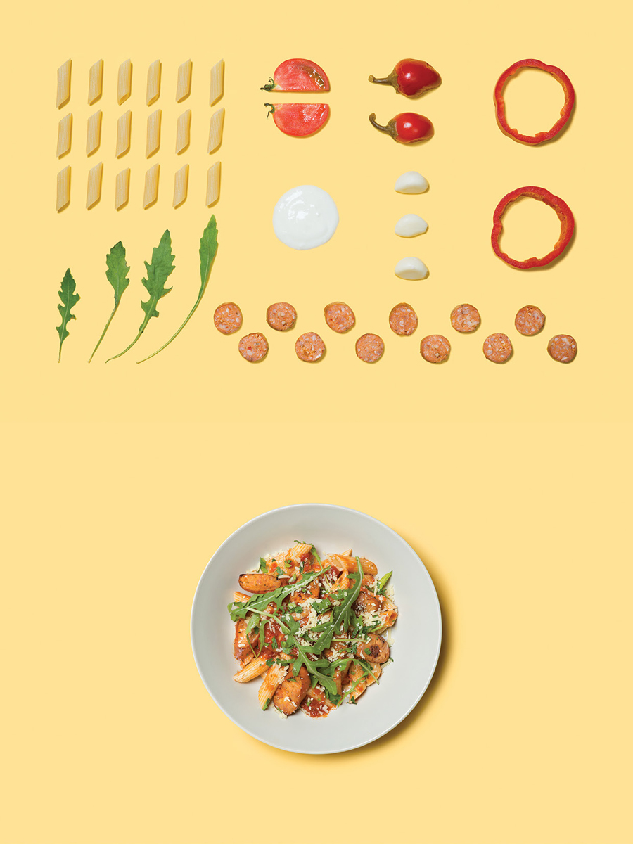
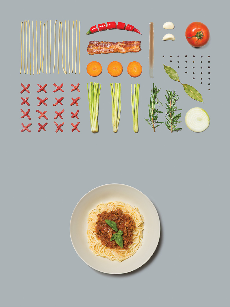
Marco Marco’s brand identity, designed by Acre, draws on the simplicity and accessibility of the experience, the quality and creativity of the dishes and their modern international influences, and visualises these through the juxtaposition of a simple type alongside the detail of deconstructed dish photography. The project included business card and menu design.
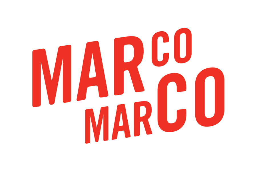
Acre’s approach effectively mixes a typographic simplicity with richer photographic detail, balancing aesthetic interest with a clear communicative intention that is both inferred and obvious in nature.
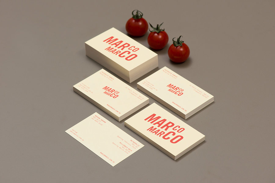
The logotype’s uppercase sans-serif characters, rounded corners, the motion carried through the diagonal baseline and dual type size, and its bright red colour conveys an accessibility and affordability without appearing cheap, captures some of the vibrancy you would expect from fresh Italian dishes and the energy you might associate with Italian culture. Acre’s intention to be universal, international and friendly is well-served by this particular choice and typesetting, and is appropriate when considered in conjunction with the more compelling and visually richer and organic aspects of the imagery.
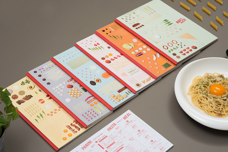
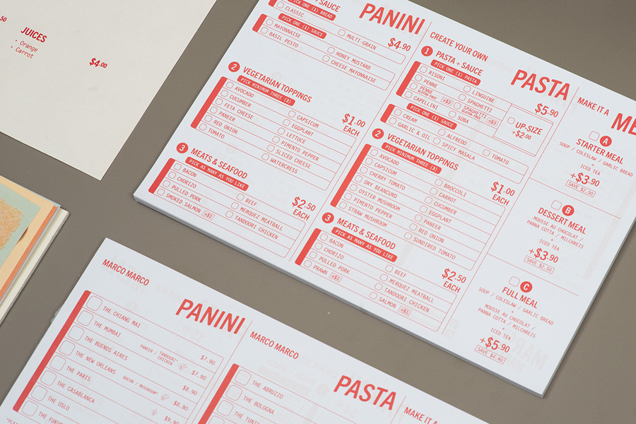
This simplicity and the perception of affordability is expanded upon across a one ink single sheet menu with the white background of a standard stock, a conventional, well-spaced, grid-based layout and the addition of a monospaced type selection.
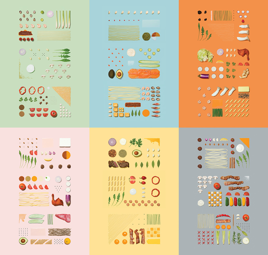
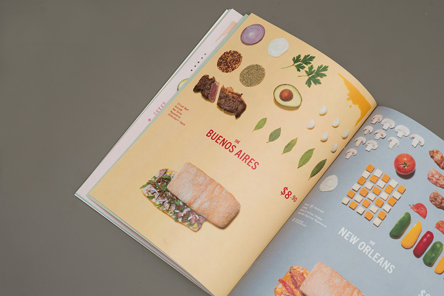
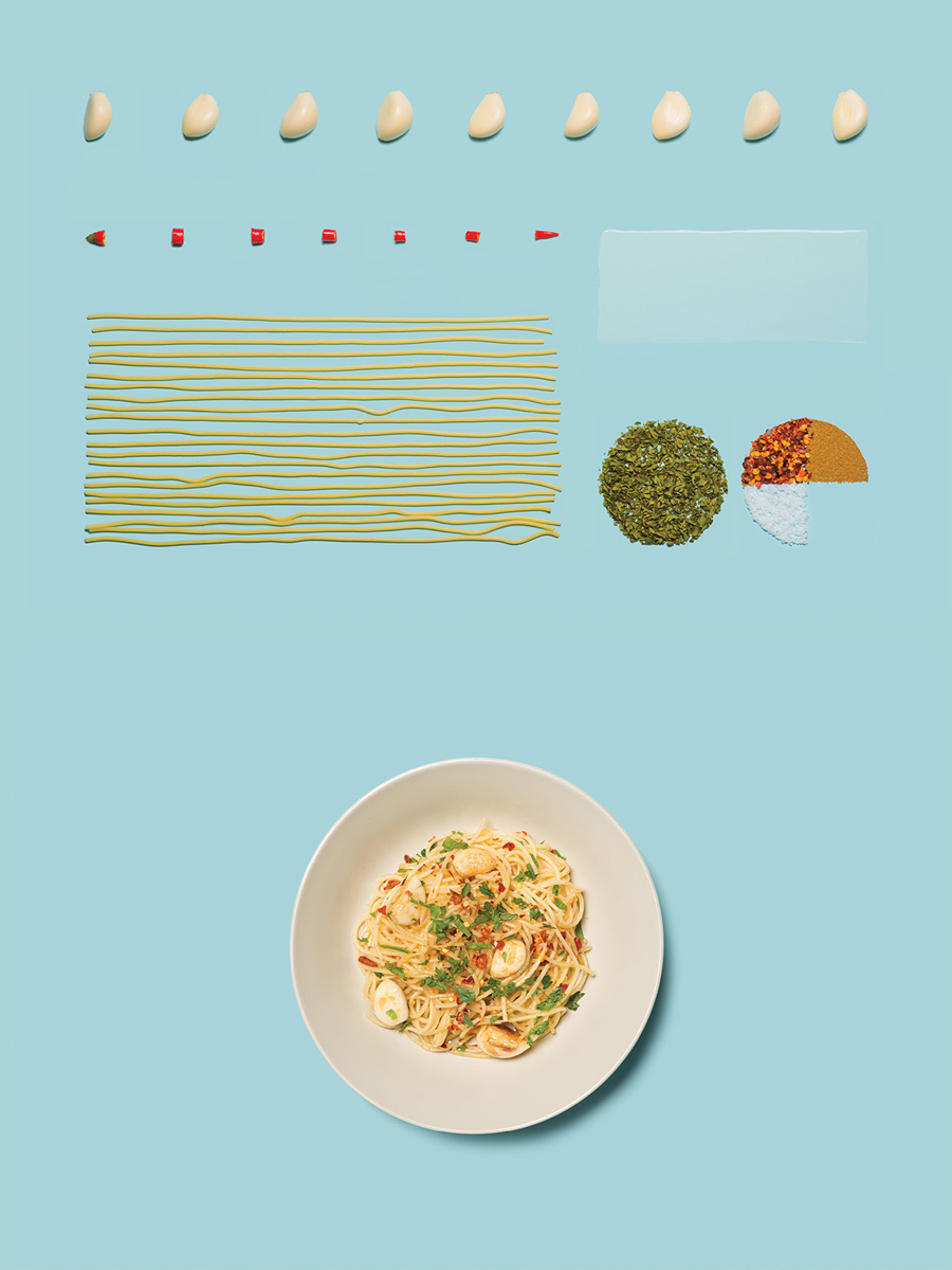
The project gets its distinctive qualities from a series of still life dish deconstructions. Each is well shot, feature some neat approaches to difficult ingredients such as sauce and spices, pastas and garnishes, and although consistent in concept, benefit from the wide variety of ingredients and the different ways that these have been placed, as well as a broad and current pastel colour palette that picks out the fine natural detail of the ingredients. The absence of overt character within the logotype, and the structured nature and detail of the images appear well-balanced.
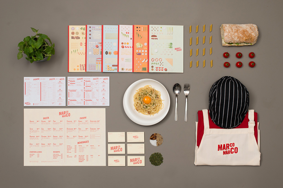
The images not only work well to inform guests of ingredients in a more universal manner, one that goes beyond the broad use of English, and secure a unique, well-founded and compelling aesthetic, but also sets an open and honest tone, a sense of freshness and creativity with an ordered quality that implies consistency. These resonate well with the open kitchens of the restaurants, and are well-utilised across the menus, giving a richer and alternative detail to the functionality of the single sheet menus.
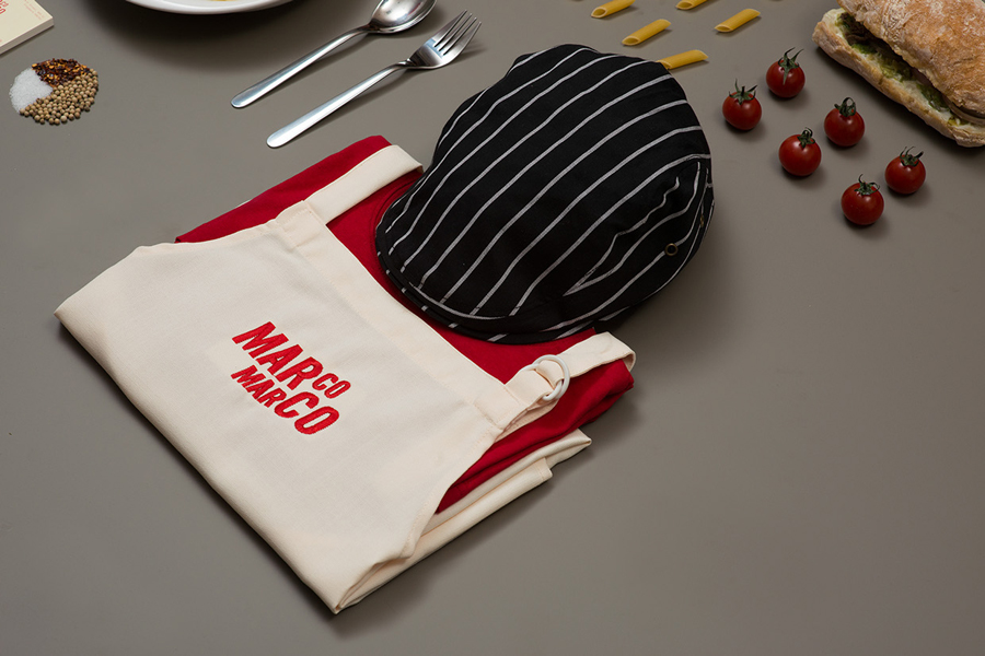
Small details such as the naming conventions of each dish, based on cities of the world, the use of a cream substrate across the business cards, the striped cap, red shirt and apron of the uniform, introduce a variety of smaller details that reinforce the theme of traditional Italian experience with international influences. More from Acre on BP&O.
Design: Acre
Opinion: Richard Baird
Fonts Used: Letter Gothic & Trade Gothic Next Soft Round
