Beanworks by Paul Belford Ltd
Opinion by Richard Baird Posted 13 April 2015
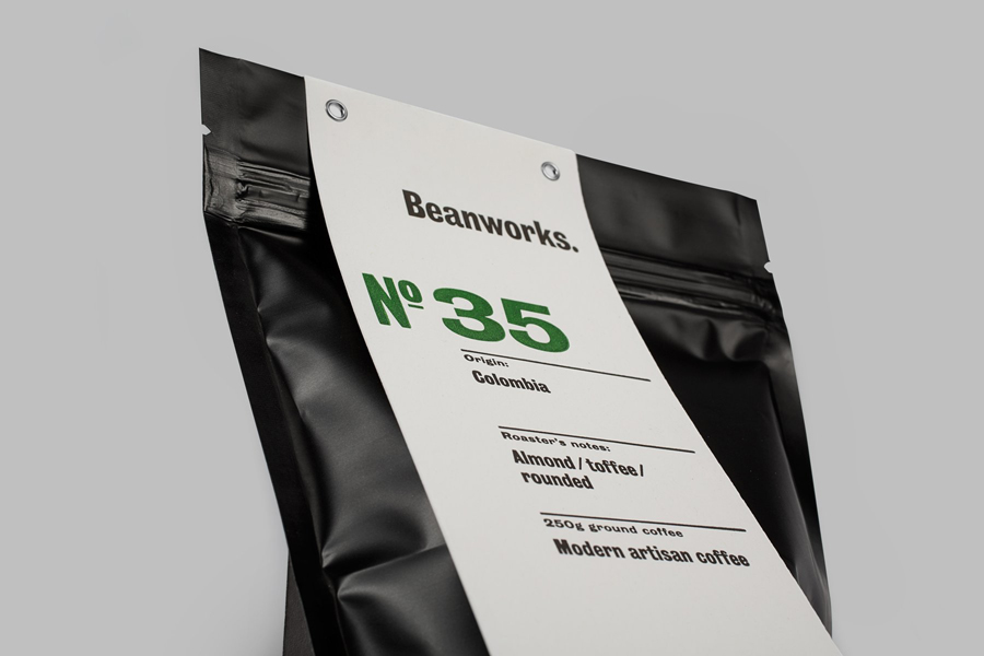
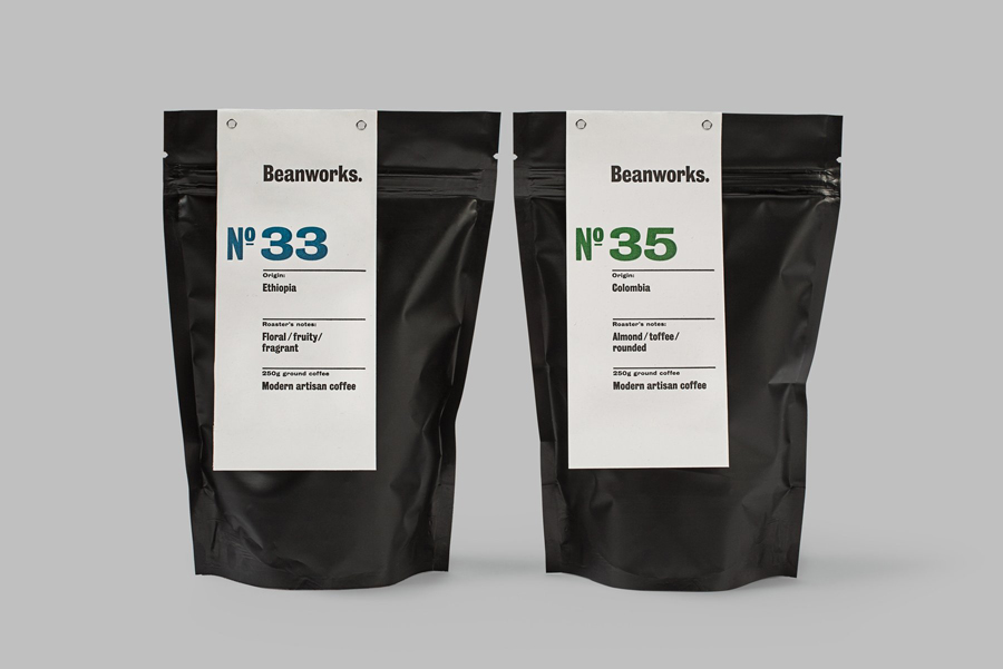
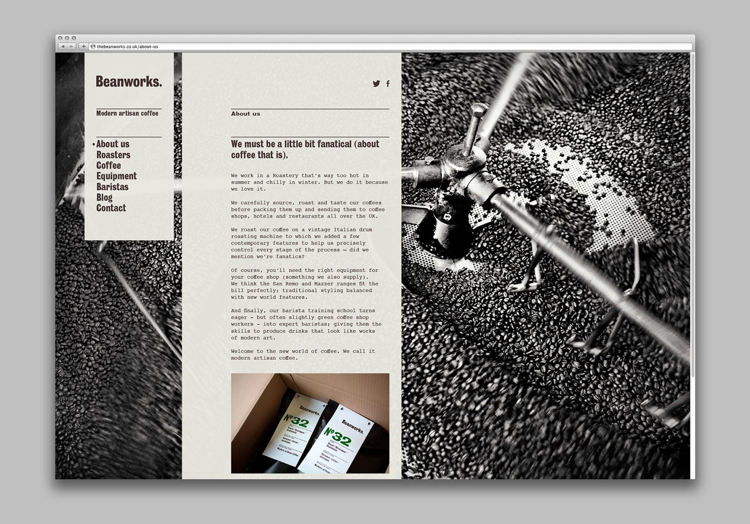
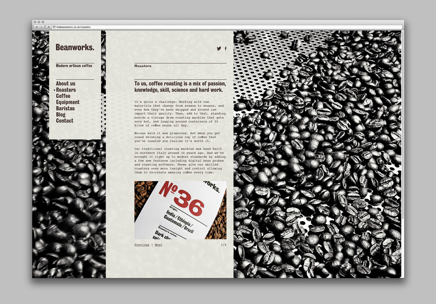
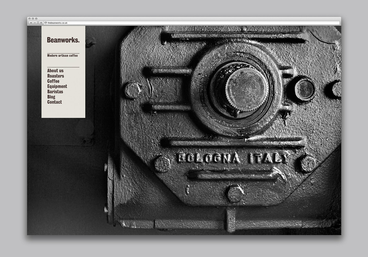
Beanworks is a UK wholesale coffee roaster and supplier, coffee machine specialist and barista training school. It prepares its beans using a customised vintage Italian drum roasting machine that allow it to digitally monitor process, and produces a range of single and multi-origin coffee varieties. Although the roaster embraces contemporary artisanal coffee culture, when it comes to naming conventions it favours the utility of numbers, over a current preference for the quirky. This juxtaposition of artisanal practice and an element of wholesale utility makes its way into a packaging design and brand identity treatment developed by London based graphic design studio Paul Belford Ltd.
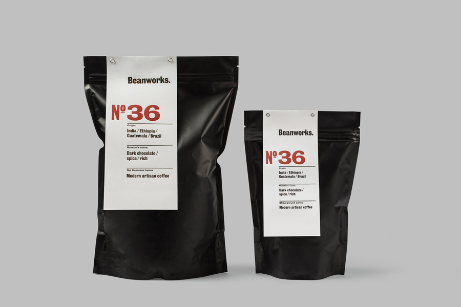
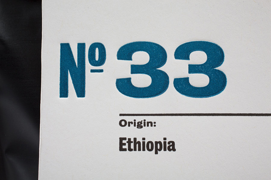
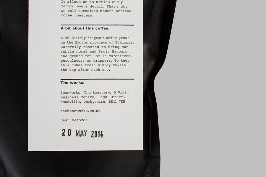
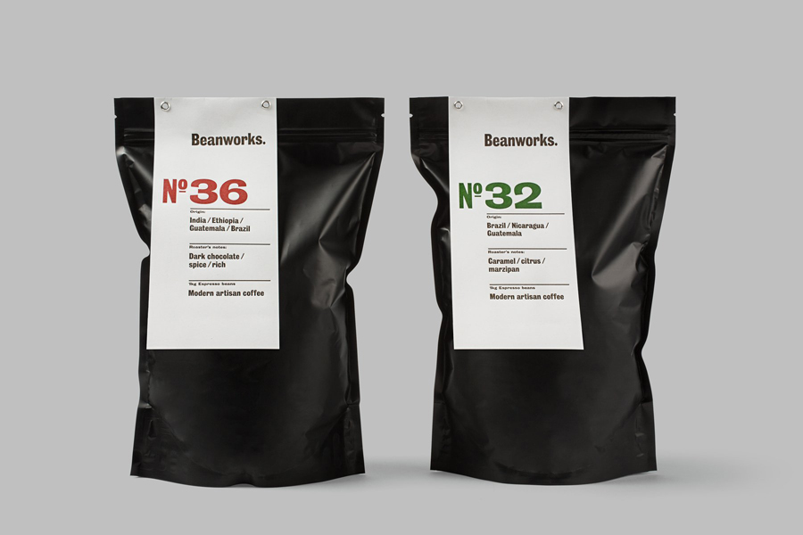
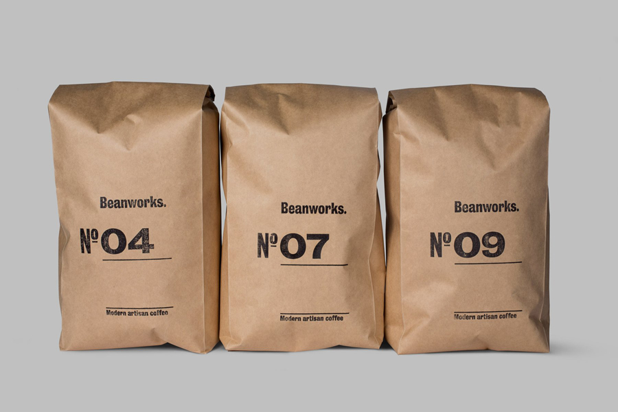
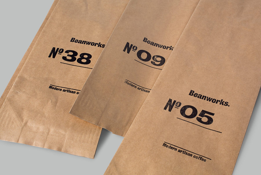
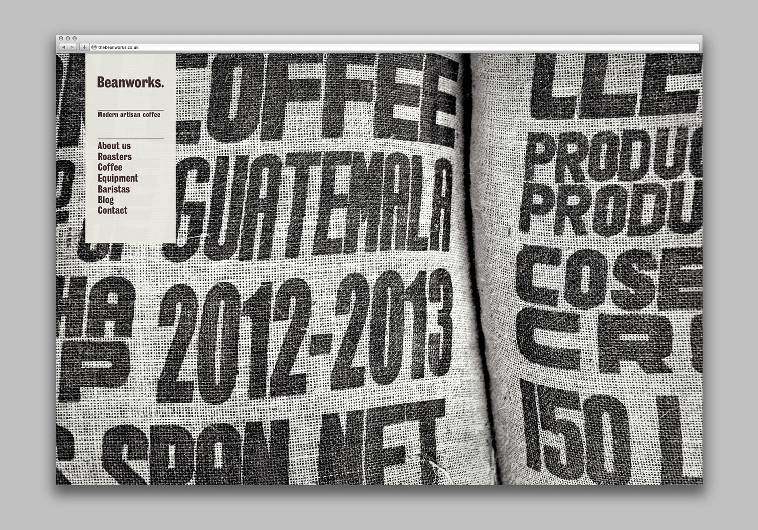
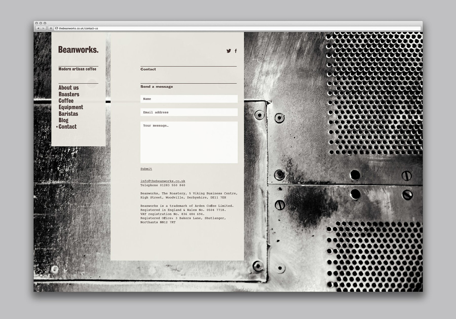
The traditional practices and vintage machinery of Beanworks, its wholesale proposition, and the unfussy naming convention of its range, manifests itself well across Paul Belford’s packaging treatment, both in the aesthetic of graphic design and structural choice, but also in production.
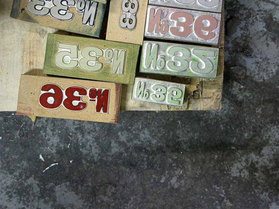
Juxtaposition has been well-utilised across a variety of assets. From the off-the-shelf structural design and matt coated finish of a black bag, alongside the uncoated white board of the label, to the mix of bold extended sans-serif, monospaced serif and the small flourishes of the logotype. Hot metal and wood block type layer the design with a traditional crafted subtext as well as a physical surface impression that, in conjunction with colour, texture and type contrast, draws a good quality wholesale aesthetic and communicative impact from a few assets. More from Paul Belford Ltd. on BP&O.
Design: Paul Belford Ltd. Opinion: Richard Baird. Fonts Used: Bureau Grot.
