David Ryle by S-T
Opinion by Richard Baird Posted 24 April 2015
David Ryle is an internationally recognised and award-winning photographer with a studio in London. He has a portfolio of work that includes shots for The Sunday Times Magazine, JWT and Saatchi & Saatchi, and is represented across Europe and America by management agency The Peter Bailey Company.
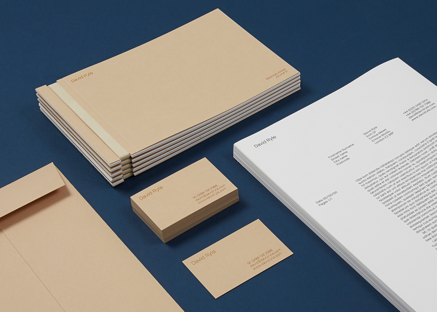
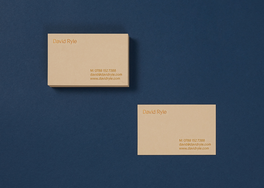
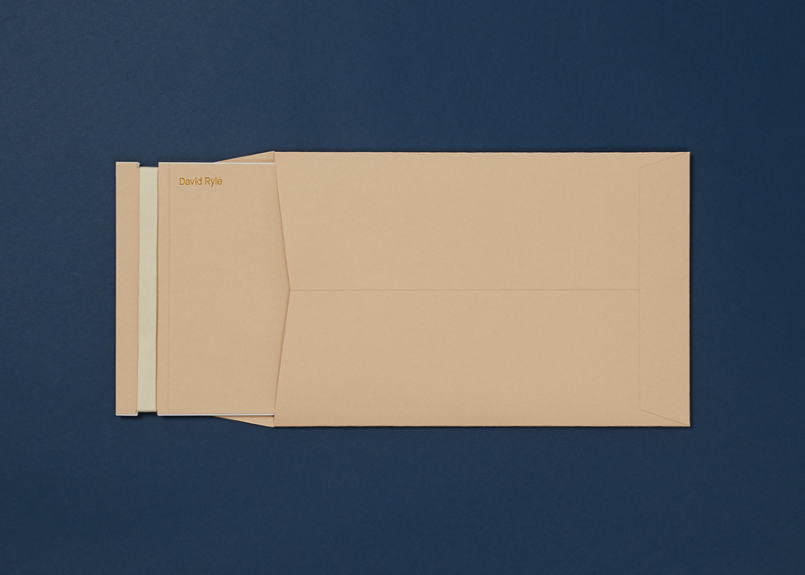
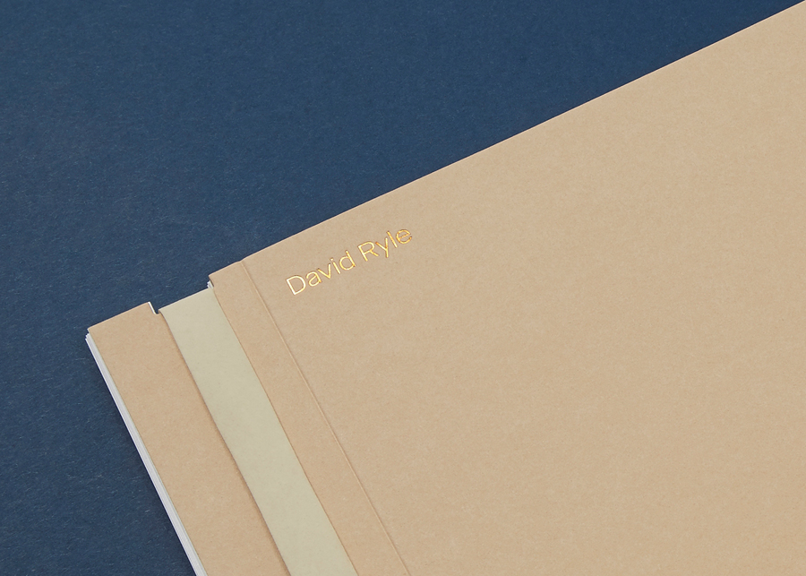
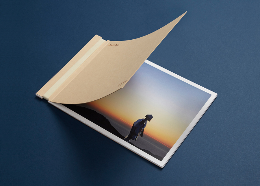
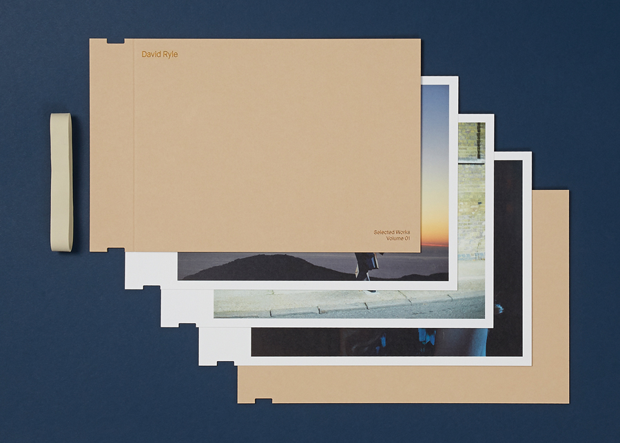
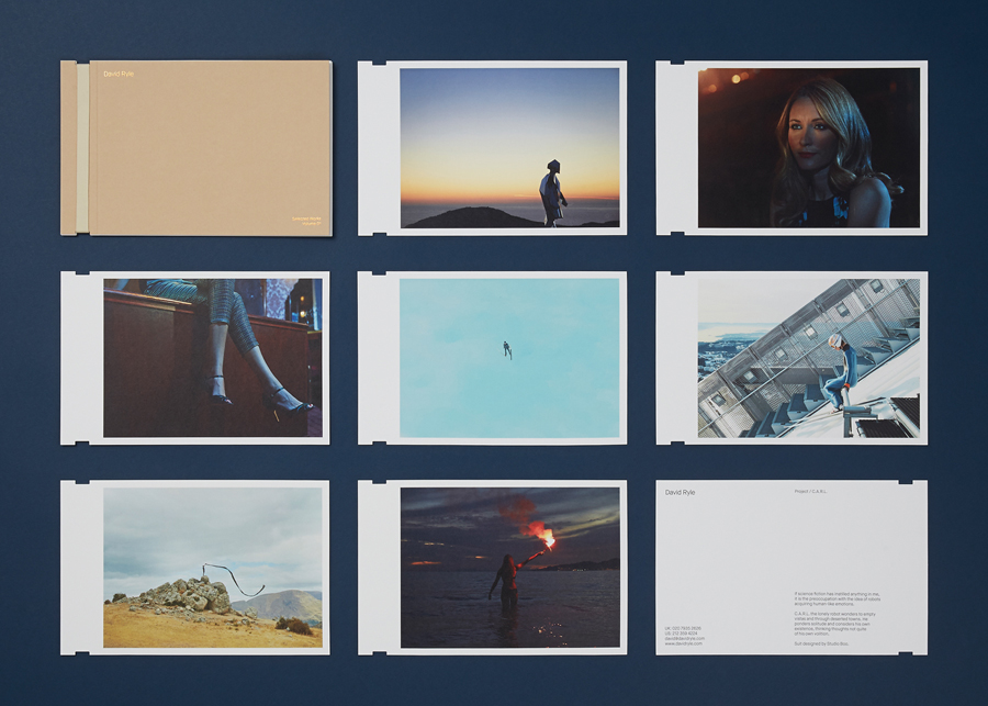
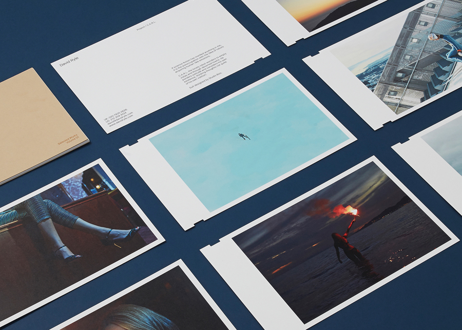
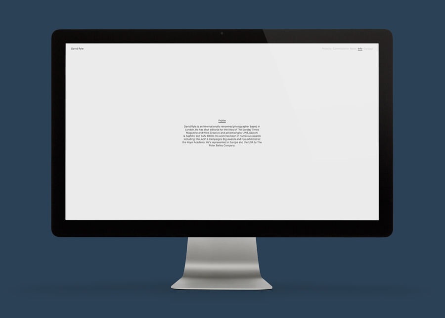
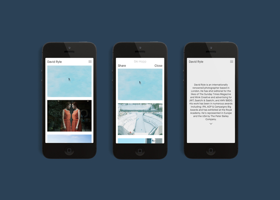
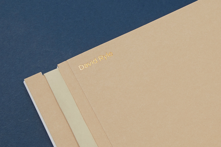
Drawing on his attention to detail and relentless pursuit of quality, design studio S-T developed a brand identity treatment for David Ryle that favours plenty of space, a consistent typographical approach and a distinctive manila and copper foil combination across portfolio, envelopes and business cards.
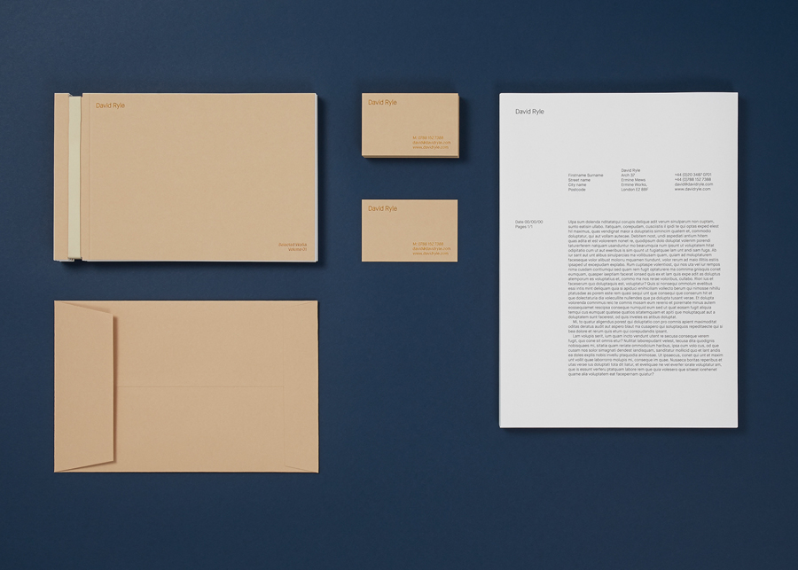
It is a simple and familiar yet well-executed and appropriate approach that is ideally suited to a photographer with a unique, broad and compelling portfolio of work. S-T’s typographical restraint and confident use of space functions well to place weight on, draw out and compliment the tone, detail, colour and communicative value of David Ryle’s images, whilst using material and print finish to reinforce quality through tactile detail.
Maison Neue makes sure that there are moments of small typographical detail, subtle character and a consistency between print and digital experience, and frames image with information without distraction. Manila papers and boards, finished with a copper block foil, mix a postal utility with a traditional high quality—perhaps hinting at David’s international profile—and secures a distinction through a few well chosen components. More from S-T on BP&O.
Design: S-T. Opinion: Richard Baird. Fonts Used: Maison Neue
