The Mansion on Marylebone Lane by Pentagram
Opinion by Richard Baird Posted 19 May 2015
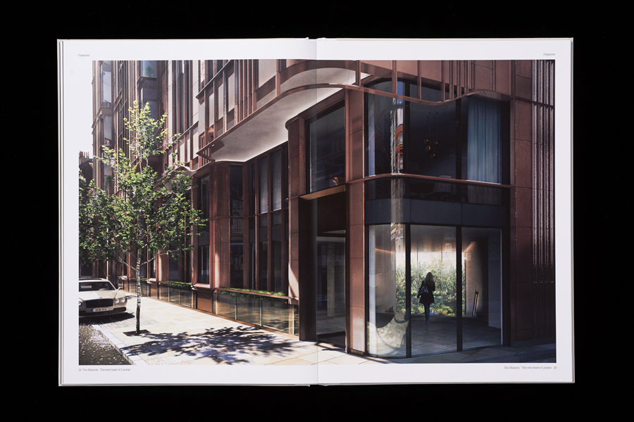
The Mansion on Marylebone Lane will be a 22-unit high-quality residential development in Central London with lower ground, ground and seven upper floors, roof terraces and two basement levels. It will feature reflective glazed terracotta external cladding with a subtle variation in colour and shade to achieve an element of interest and complexity, while the reverse will be a white reflective glazed terracotta inspired by the brick courtyards of Victorian London.
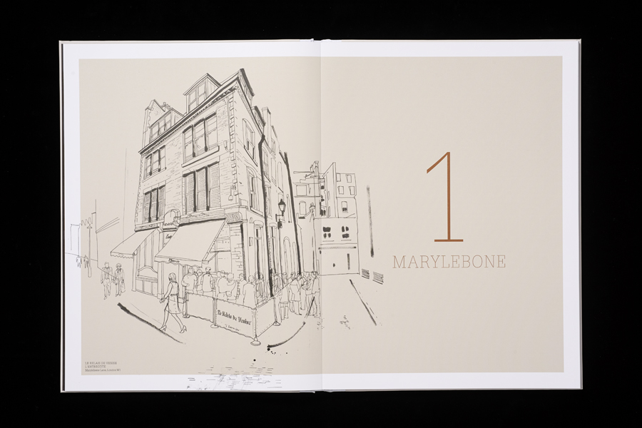
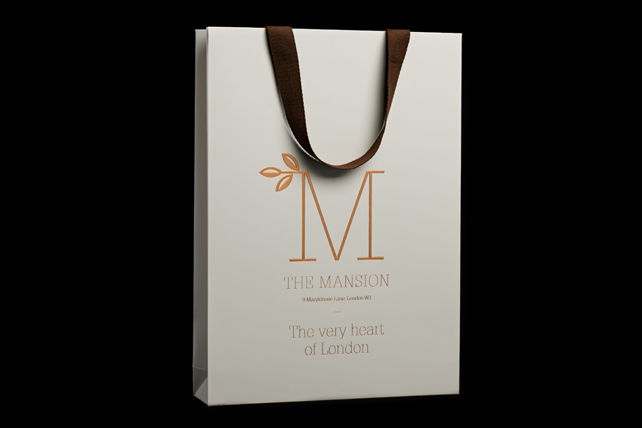
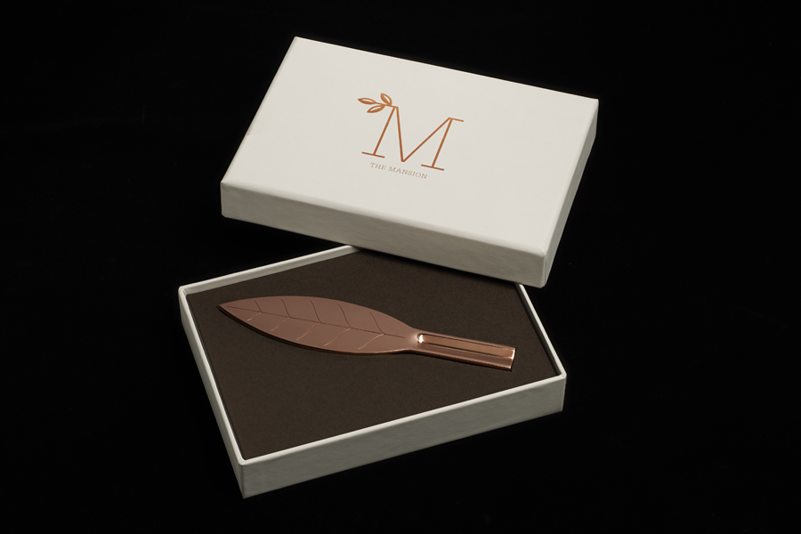
Informed by the long history of mansion buildings in London—built for those looking to secure a prestigious address in the city during the boom of the industrial revolution—Pentagram partner John Rushworth developed a strategy and brand identity treatment for the property based around a monogram, slab-serif typography, terracotta colour palette, lifestyle photography and illustration. This extended across brochure, bag and box.
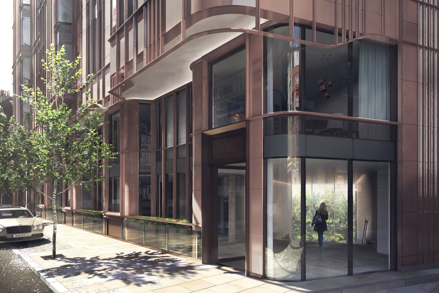
Photography CGI: Cityscape
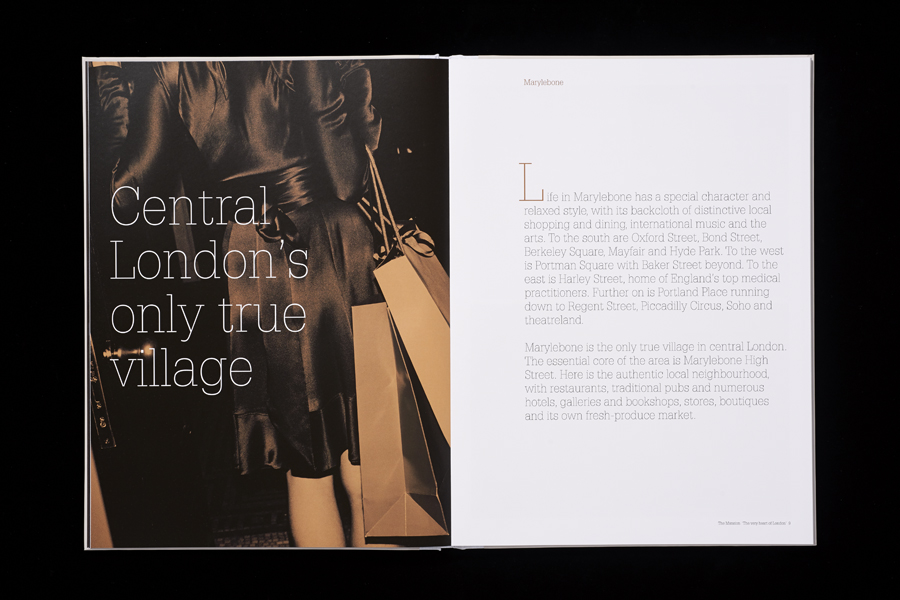
John Rushworth’s brand identity treatment captures and distills down some of the distinctive qualities of the property, and the mansions of Kensington, Marylebone and Knightsbridge. It emphasises the prestige of the address, has a sensitivity to the historic and urban nature of its location, and finds a comfortable meeting point between retrospection and modernity. This is cohesively expressed across a variety of assets, each well-weighted collectively and individually interesting. Examples include a terracotta colour palette used to reflect the material of London’s mansion blocks, illustration to convey the ‘village’ feel of the area, the affluence within the life style photography and the timeless quality associated with copper foil.
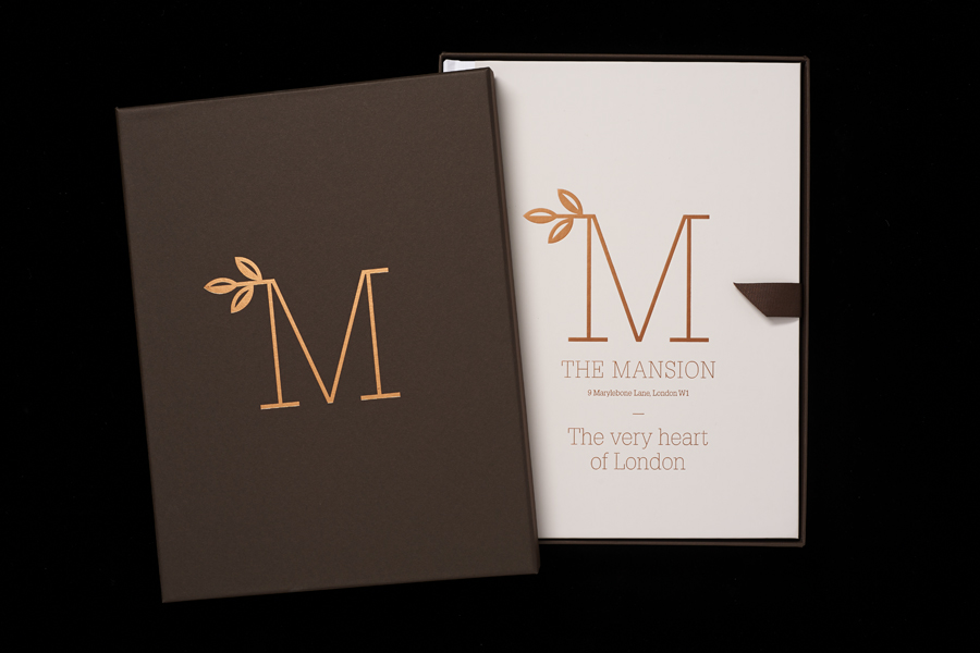
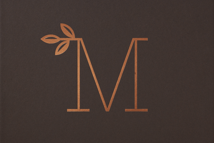
The logo, a light monolinear slab-serif M with square terminals and a small illustrative flourish, draws on arts and crafts—the period in which the mansion blocks were first built. Its consistently weighted strokes appear to reference, but reduce down, the building’s facade. The leaf detail is a neat reference to the property’s private garden and adds a comfortable a-symmetry and point of interest while the monogram’s oversized application in print and simple geometric shapes give it impact and a structural quality. Like the building, it finds a good balance between a current reduction and subtle retrospective ornament.

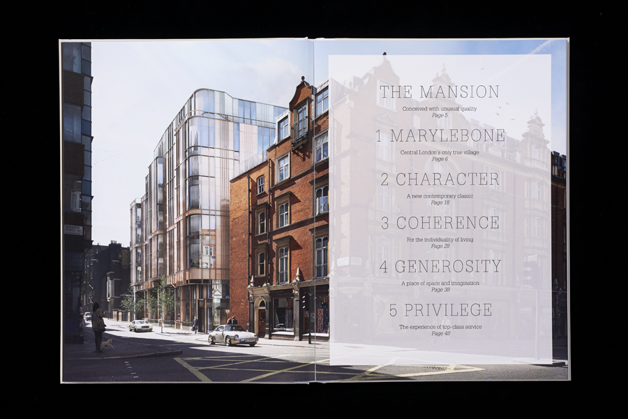
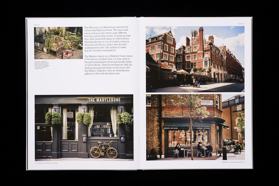
In print a mix of tinted imagery, location photography and property visualisation convey the character, historic nature and affluence of the area, and language is effectively built around opportunity, distinction, a village within a city, and an element of storytelling. There is plenty of contextual detail that you would expect from a property in such a distinguished area.
Uncoated material and the gloss of a foil print finish, uppercase and all lowercase typesetting, illustration and photography, borders and full bleed photography provide contrast and secure variation and interest, placing moments of craft alongside a luxury polish.
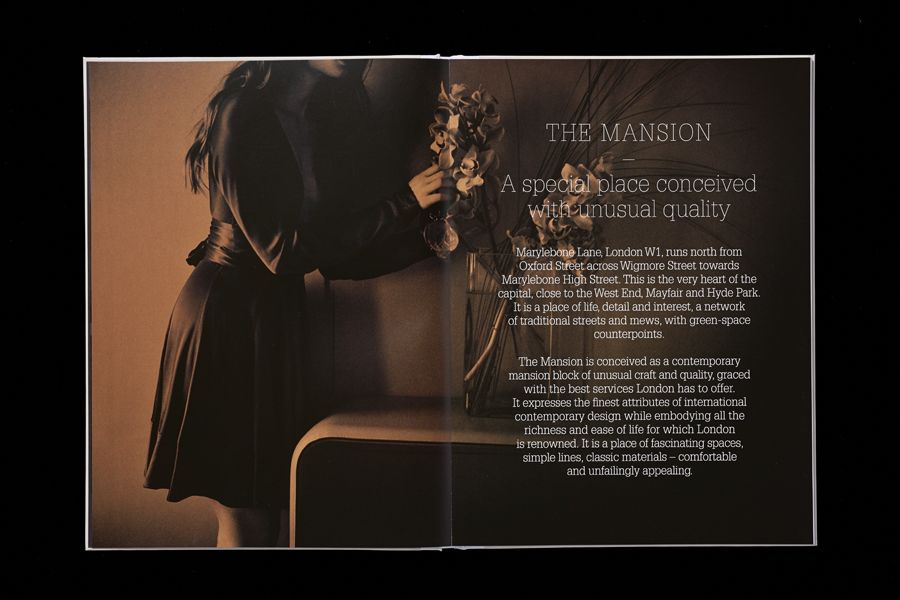
The brand identity secures distinctive character where often you might experience a default modernist severity, and places the property geographically and historically within the context of its neighbourhood and within greater London. Although recent in its build, the approach gives the property a sense of heritage, drawing out both its tangible and intangible value. More from Pentagram.
Design: Pentagram
Partner-in-charge: John Rushworth,
Associate & Designer: Jane Plüer
Designer: Joe Stephenson
