Zuzunaga by Folch
Opinion by Richard Baird Posted 20 May 2015
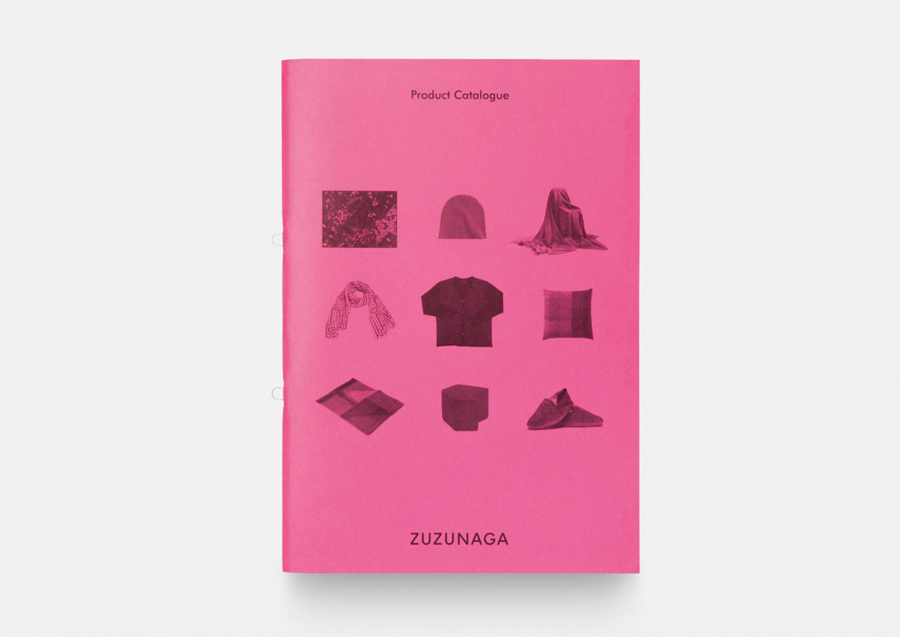
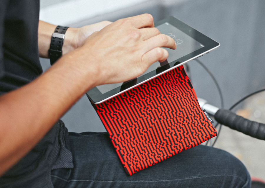
Zuzunaga is a homeware and fashion accessory business founded in ’07 by London and Barcelona based artist and designer Cristian Zuzunaga. Zuzunaga’s products, which include towels, tech covers, cushions, shawls, shoes and upholstery fabrics, are informed by contemporary living and seek to find a charm, warmth and humanity within the digital world. Products are characterised by lines, pixels, geometric abstractions and a high contrast colour palette across good quality handcrafted materials.
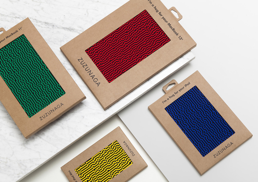
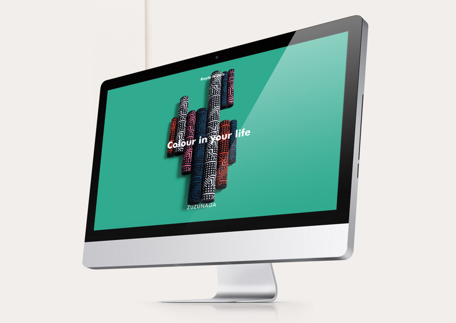
Design studio Folch worked with Cristian Zuzunaga to deliver a broad and cohesive brand identity treatment that spanned packaging, editorial design (lookbook & brochure), art direction, website development and revisions to the Zuzunaga logotype that frame the rich visual texture of the Zuzunaga collection.

“Our mission is to create beautiful products that capture the dynamic nature of contemporary living. Inspired by supermodern architecture and global megacities like London, Barcelona, New York and Shanghai, our designs create a space for human vitality within a digital world. This passion is focused on the pixel, the icon of our time. We work to combine this modern-day icon with analogue traditions and ancient ideas of being.” – Zuzunaga
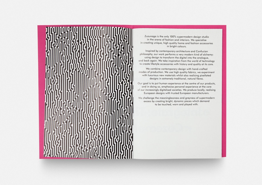
Folch’s brand identity treatment mixes an element of utility in type choice, layout and unprinted space with the crafted flourishes of uncoated dyed papers, unbleached boards and a single ink across the brochure covers. It effectively uses a bright, distinctive and impactful flat colour palette to draw out the complexity of the pattern work, and makes good use of these with full bleed images opposite white pages and the simple typesetting of a geometric sans-serif. Where the products are detailed, often random and chaotic, the identity is largely very simple and ordered, placing product at the forefront and emphasising it through significant contrast.
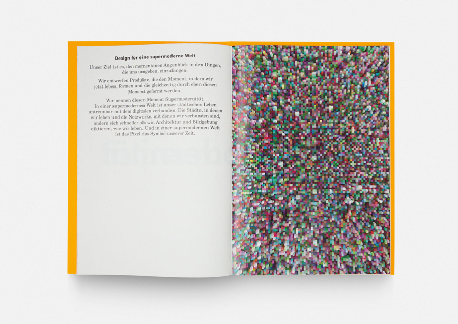
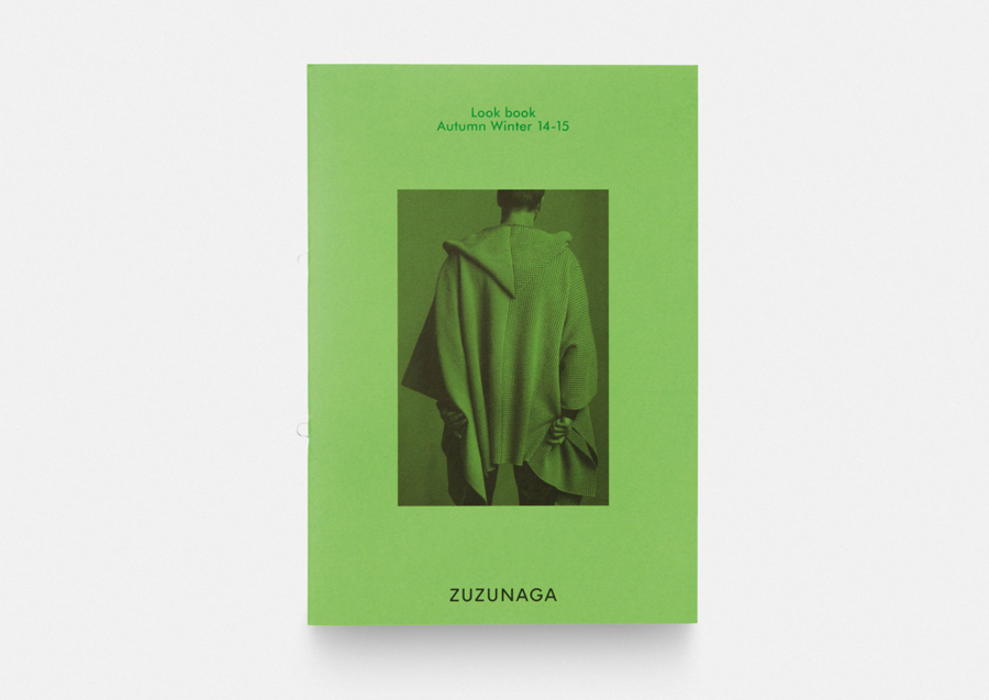
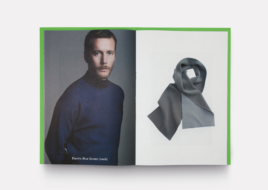
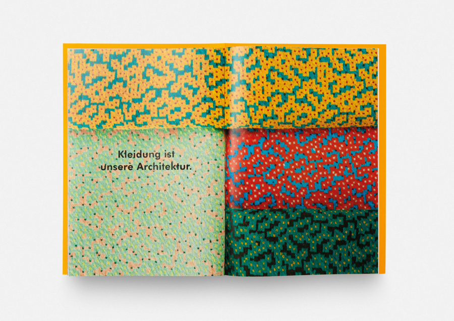
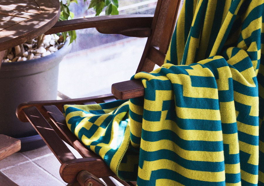
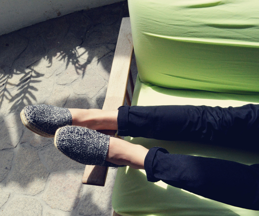
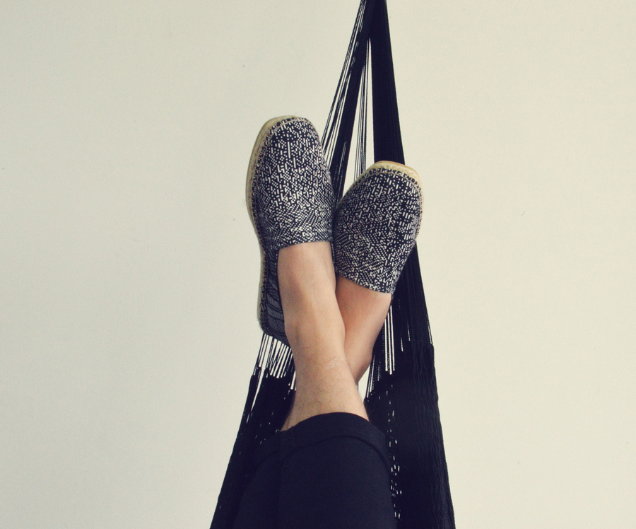
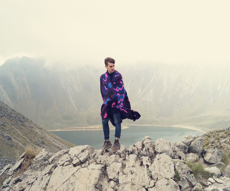
Contrast is further explored throughout Zuzunaga’s campaign, brochure and product photography, often juxtaposing the bright colours and geometric forms of the products alongside urban, earthy and home environments. Like the type, space, flat colour, and quality of materials in print, the photography plays with functionality and quality whilst also introducing a sense of comfort and accessibility alongside fashion conventions. These images are well-shot and current in their crops, proportions, model choice, dressing and subtle filters. Check out the Zuzunaga website for more.
Together these assets appear as a fitting interpretation and distillation of Zuzunaga philosophies and as an appropriate framing and leveraging of unique product characteristics through reduction and context. More from Folch on BP&O.
Design: Folch. Opinion: Richard Baird.
