Bocce’s Bakery by Robot Food
Opinion by Richard Baird Posted 1 June 2015
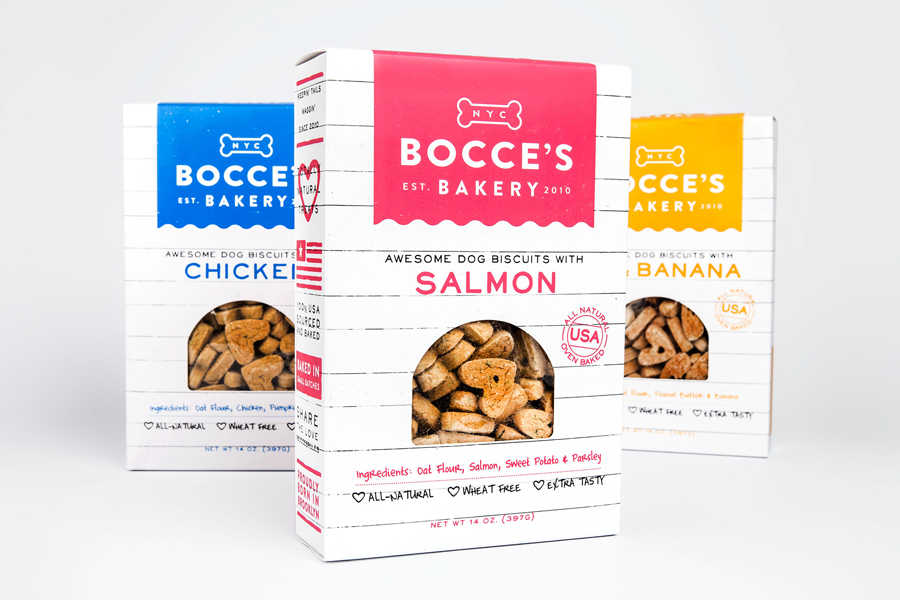
Bocce’s Bakery creates nutritious handcrafted dog treats from natural, nutritious, locally sourced and seasonal ingredients from its premises in the New York borough of Brooklyn. Each of the bakery’s treats are batch-produced from four or less ingredients, brought together using simple wheat-free recipes, and born of a passion for conscientious organic cookery and inspired by Bocce, a biscuit loving dog who was carrying a few extra pounds.
Bocce’s reached out to UK based design studio Robot Food to develop a new brand identity and package design treatment that would bring these more in line with the quality of their product and convey the values, story and personable qualities that are the foundation of their business.
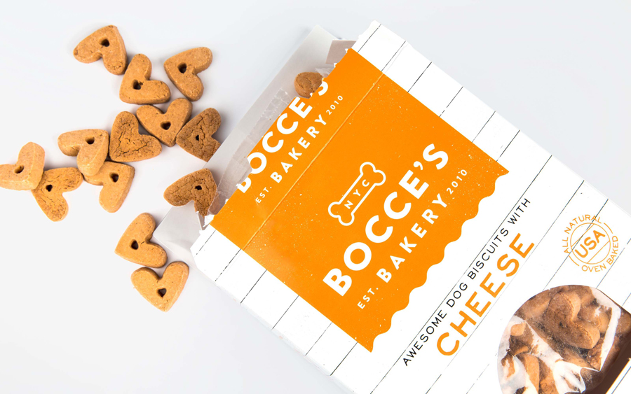
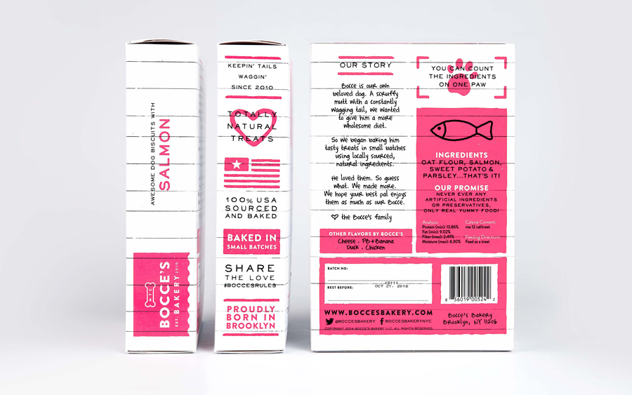
The communicative intentions of the project are extensive. Themes such as nutrition, an absence of chemicals and preservatives, pride in quality, batch-production, recipe simplicity, flavour, craft and provenance, alongside brand story, a convivial positioning, and a social component are all touched upon.
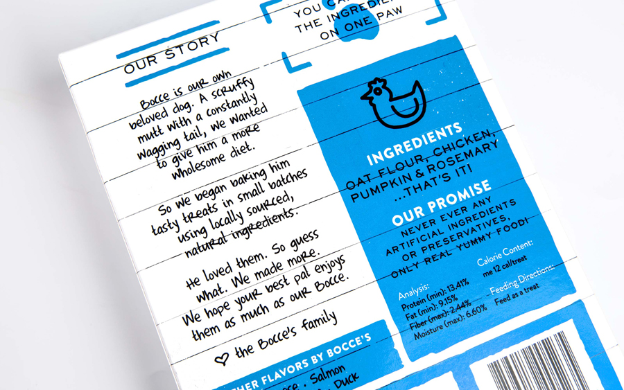
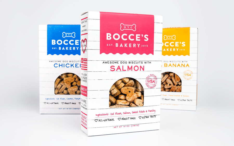
What could have been cluttered and unclear in its breadth of message has been well-resolved. Each communicative intention is appropriately delivered through the most effective and engaging asset. This includes, but not limited to, the informal language, tone of voice and content of a storytelling detail, the use of hashtags, the all natural, oven baked and American made seal, loosely drawn script, white washed wood panelled background, plenty of space, bright colour, die cut window, language abbreviations, stars and stripes, and the iconic detail of hearts, paws and fish.
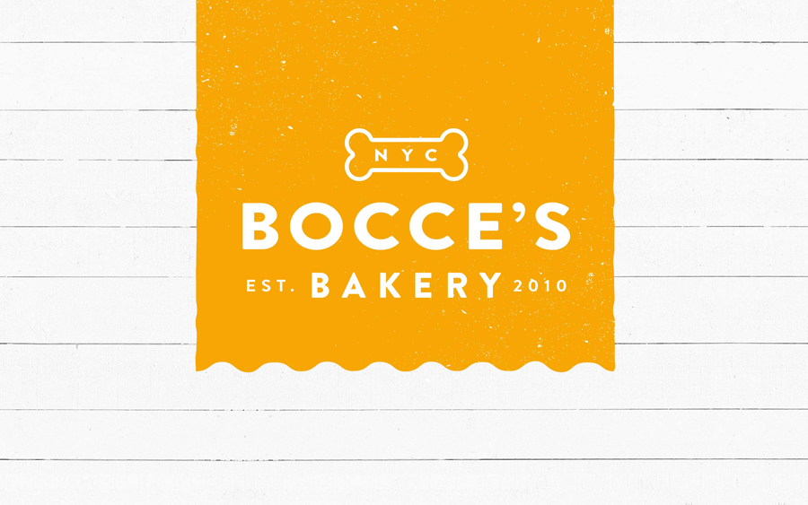
What looks like Brandon Grotesque, within a visually rich context of colour, iconography and fine hand drawn type, is a welcome break in its simple, bold, geometric forms and soft corners. The logotype and its position on pack, alongside NYC, a container reminiscent of the awnings you might associate with traditional bakers, and the universality of a bone icon, prioritises provenance, quality and makes sure the product is understood to be a dog treat.
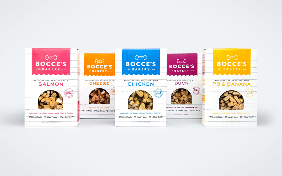
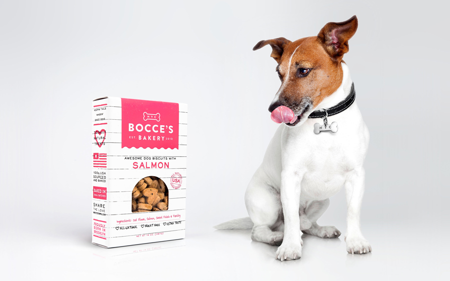
A single bright spot colour, over white stock and within a large canvas, effectively divides varieties and has a light and bright quality that borrows a little from contemporary bakeries, delis and patisseries. It makes a connection between the quality we would expect as consumers and the elevated position dogs now occupy within many households.
The simple colour palette and use of plenty of white space afford each asset a clarity amongst variety. These are individually clear in their intention, none of which feels superfluous, and are collectively well-resolved to secure a unique aesthetic impact.
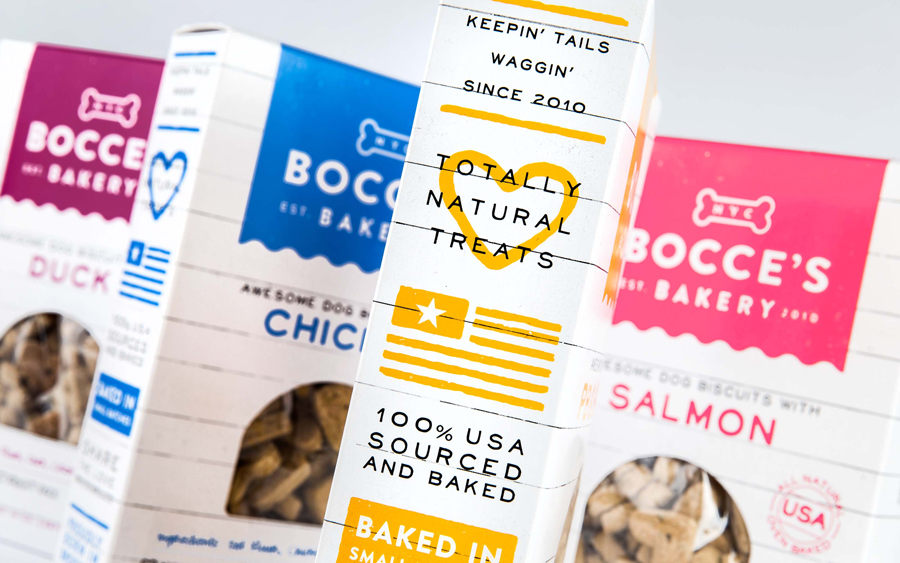
The line between industries and categories continues to be blurred. Convention and familiarity in one becomes differentiation in another. Robot Food recognises and leverages this to secure distinction within this new context without undermining communicative effectiveness. More from Robot Food on BP&O.
Design: Robot Food. Opinion: Richard Baird. Fonts Used: Brandon Printed, Neo Retro Fill & Complete in Him.
