Melba at The Savoy by Pentagram
Opinion by Richard Baird Posted 16 June 2015
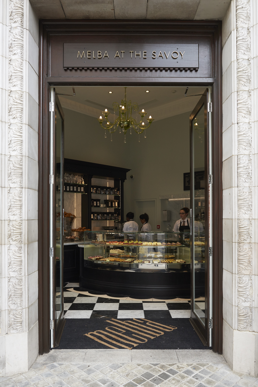
Melba is a pâtisserie and cafe, located on the corner of The Strand and Savoy Place in London’s North Bank, and is one of nine places to eat and drink at The Savoy hotel. The patisserie is described as offering a glimpse into the exclusive and luxury world of The Savoy, and is the first time that the hotel, accessed via private road, will have a presence on the high street. Melba features a distinctive interior of black and white tiles, white marble alongside dark stained woods, cornicing, a curved glass counter and gold chandelier. It also features a distinctive visual identity treatment developed by UK based Pentagram partner John Rushworth.
“Melba is the ninth food and beverage outlet to open at The Savoy, with a menu created by hotel’s executive pastry chef, Lugwig Hely. It is named after Australian soprano, Nellie Melba, one of the hotel’s most famed guests and the inspiration for two of Escoffier’s most celebrated creations, Peach Melba and Melba toast.”
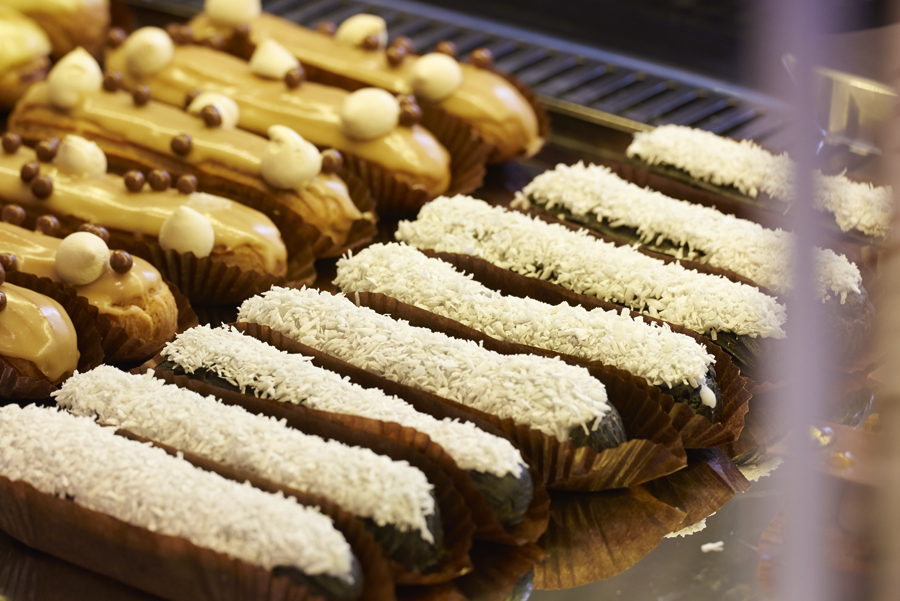
“The visual identity is inspired by the eclair, Melba’s signature offer, that is served in a variety of seasonal and classic flavours. Melba is Pentagram’s latest project with The Savoy, for which we have twice created identity programmes for in the last twenty years – the latest after the first major restoration of the hotel since it opened and costing over £200 million.” – Pentagram
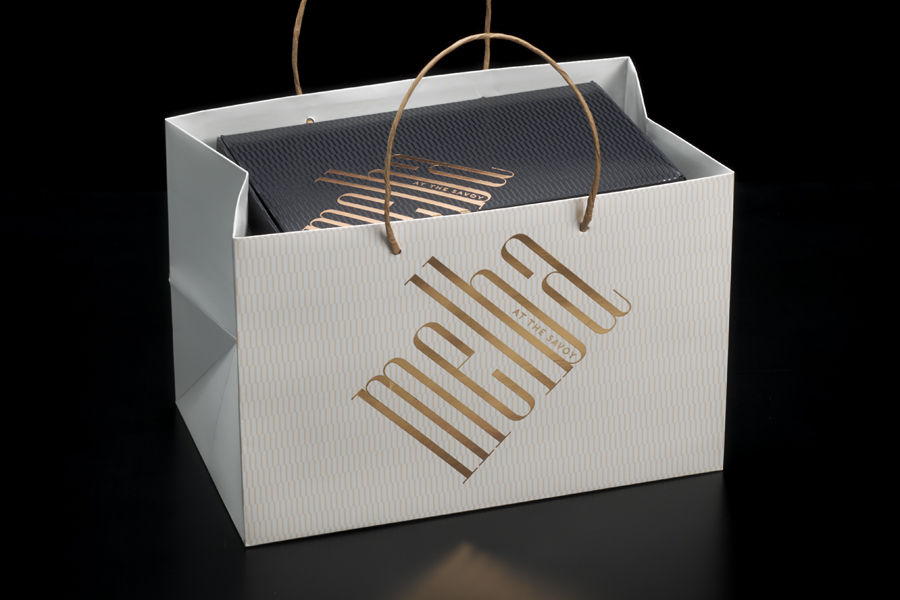
Rushworth’s treatment plays with the familiar and formal and gives it an unconventional and distinctive twist. It takes the high-stroke contrast, hairline serifs, even proportion, structure and symmetry of a rational serif and, drawing inspiration from Melba’s signature pastry, the eclair, accentuates these and effectively secures proprietary character through height, proportion and application.
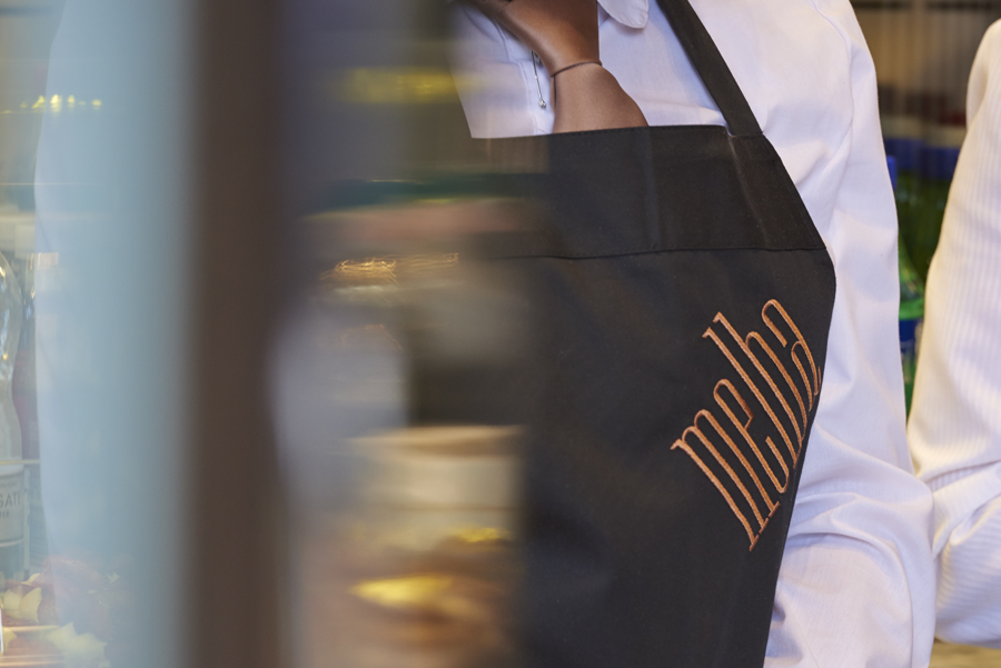
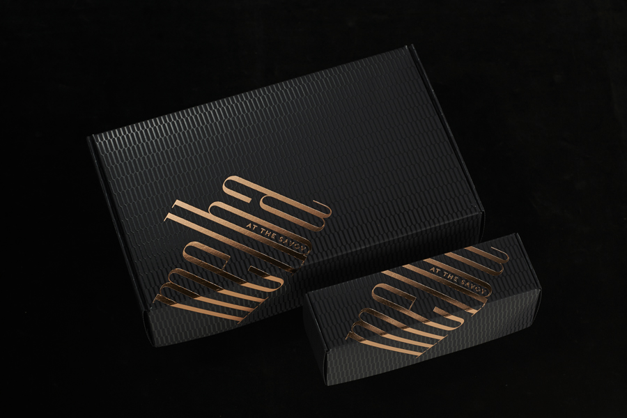
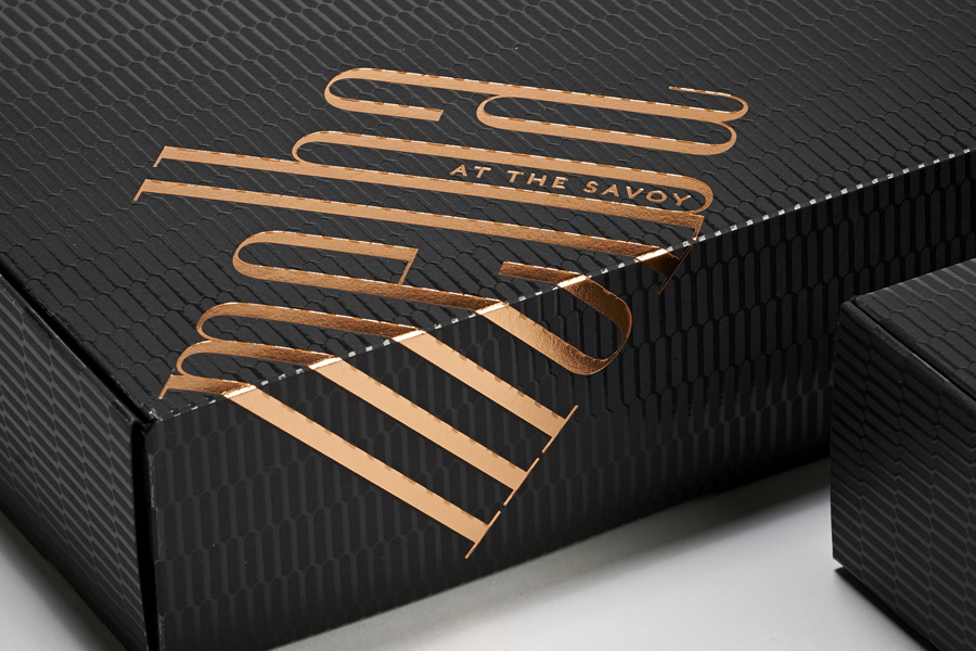
Set at an angle, confidently oversized in places and running over the edge of boxes, the logotype, in its implementation, breaks from the traditional practices and restraint you might associate with The Savoy, to establish personality with an element of quirk. A warm copper foil and a UV varnished pattern–perhaps a reference to glazed and iced pastry–across light and dark surfaces appears to draw on Melba’s interior and effectively leverage finishes that continue to be closely associated with quality and luxury.

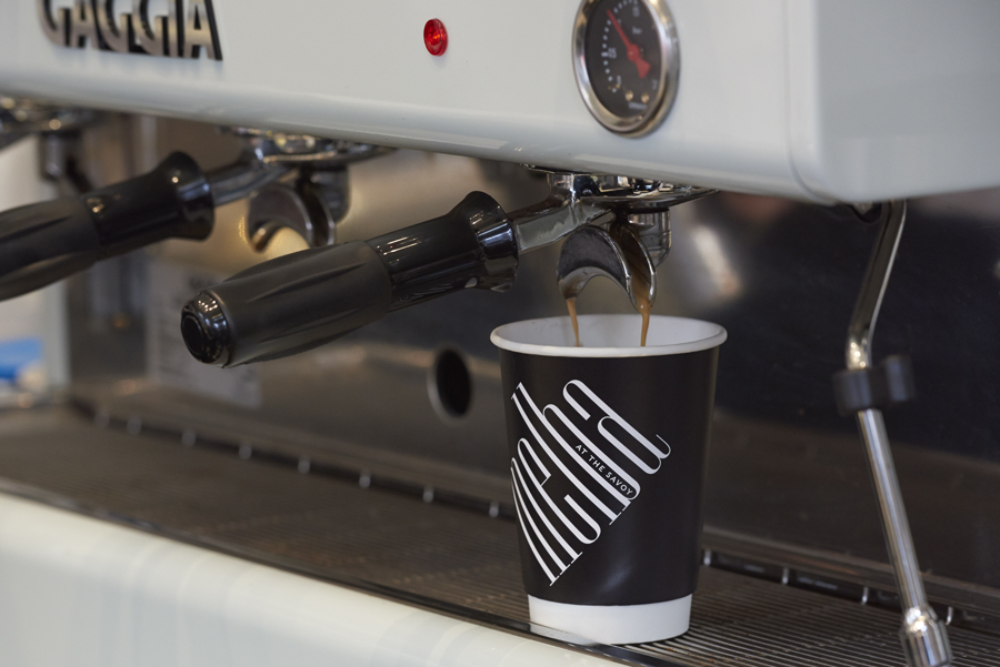
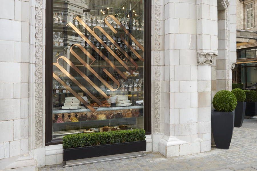
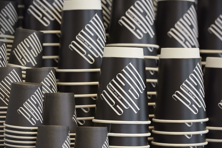
The simplicity and logo-centricity of the project feels like an appropriate acknowledgement and response to rich interior detailing, and although boldly applied across all manner of surfaces–the black white coffee cups and the window treatment being a particular highlight and striking expression–contextually these appears well-balanced and complimentary.
The result finds its own distinctive character within the context of a world renowned hotel and its brand identity system. It subtly touches upon interior design and signature product through colour and typographic form and establishes a unique, accessible, high street presence through consistent but unusual implementation. It is sensitive to its environment and location whilst also making a connection, through the quality of finish and above the door signage, with the exclusivity and experience associated with The Savoy. More from Pentagram on BP&O.
Design: Pentagram
Partner in Charge: John Rushworth
Designer: Joe Stephenson
Opinion: Richard Baird
