Fever-Tree by B&B Studio
Opinion by Richard Baird Posted 17 June 2015
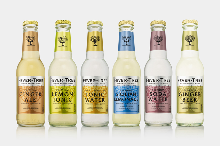
Responding to the continued and widespread use of preservatives, artificial sweeteners and cheap aromatics, Charles Rolls and Tim Warrillow combined their experience of the beverage and luxury food industries to develop a tonic made from natural high quality ingredients. Since its launch in 2005, under the brand Fever-Tree—the colloquial name for the cinchona tree, source of quinine, a key ingredient in tonic—the range has grown year on year and now includes a variety of soft drink mixers alongside its tonic waters.
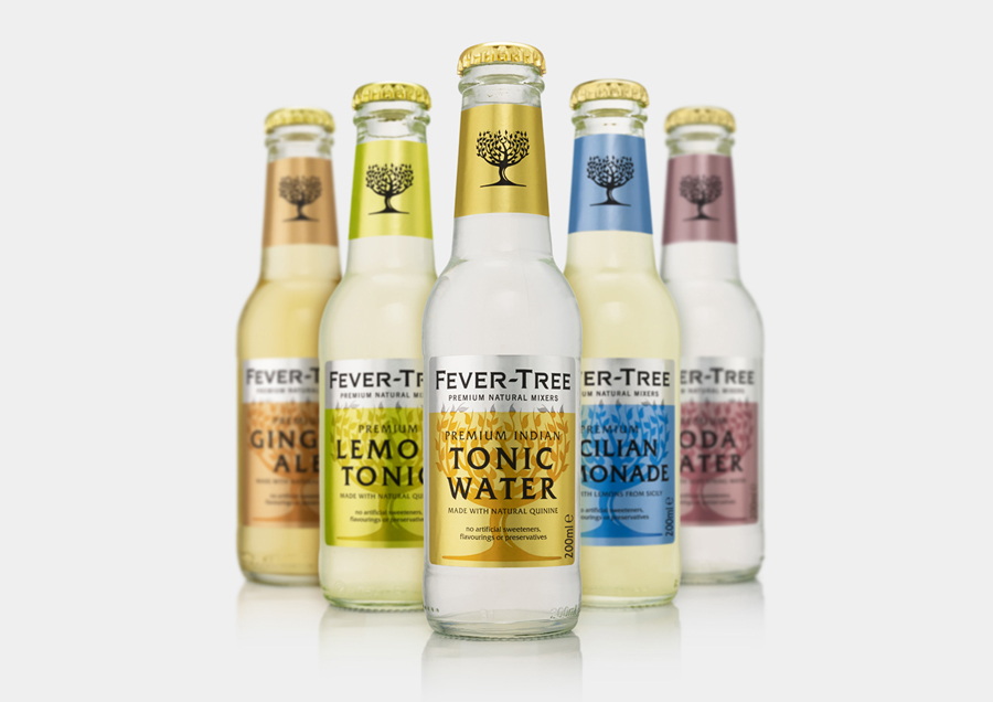
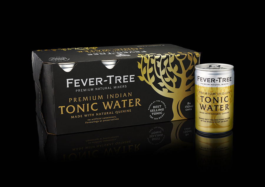
Experiencing growth and critical acclaim, Fever-Tree worked with London based B&B Studio to refresh its package design and secure a prouder more contemporary aesthetic more in line with its premium positioning. The studio’s approach is a sensitive revision, replacing type, improving colour and addressing proportion alongside a more proprietary logotype treatment.
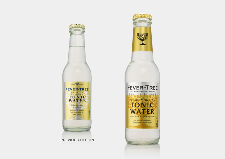
B&B Studio’s treatment is a significant improvement achieved, rather effectively, without the need for additional assets. A simple restructuring, such as moving the Fever-Tree logo to the neck, improved communication hierarchy that places weight on premium natural positioning, and single line rather than stacked type make far better use of the available space and the slim width of the bottle.
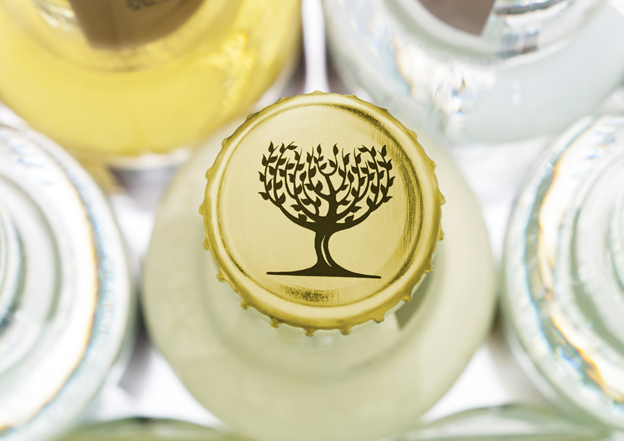
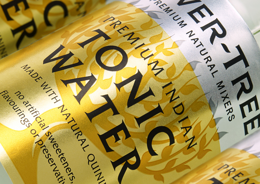
Swaps include a more distinctive and heavier typographical choice with a stone-carved sense of craft and experience, a brighter more refreshing colour palette that retains a premium metallic quality, and a shaded rather than knocked out tree. Structurally the bottle remains largely the same but is now topped with a richer gold cap, one that appears of higher value and of better quality.
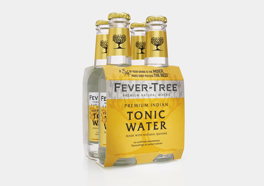
A revised logotype, which feature small details such as a break in the R, curved terminals and flared serifs, moves it further away from the ubiquity of what looks like Copperplate, in favour of something with more character yet still anchored by an engraved origin. While different, logotype and product variety share similar qualities and communicative value, so picking identity out with a silver panel functions well to keep these clearly defined. More from B&B Studio on BP&O.
Design: B&B Studio. Opinion: Richard Baird
