The Washington Post Magazine by Snask
Opinion by Richard Baird Posted 6 July 2015
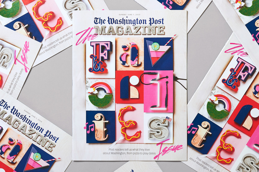
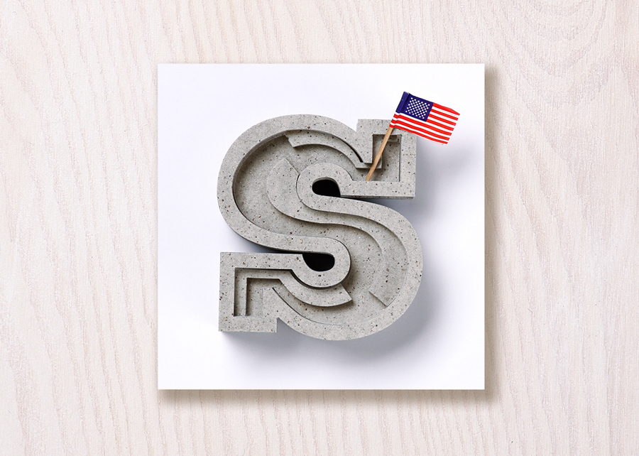
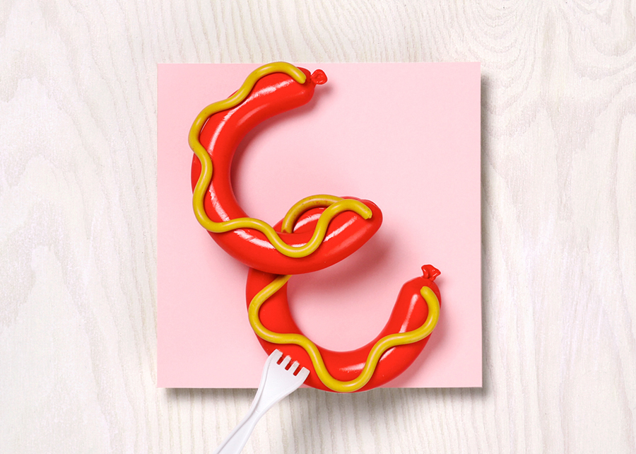
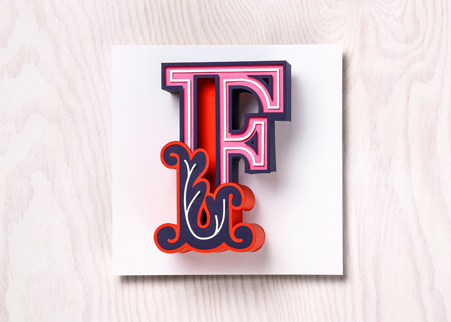
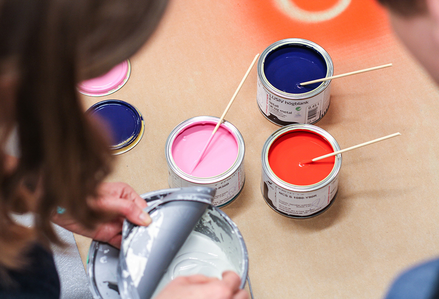
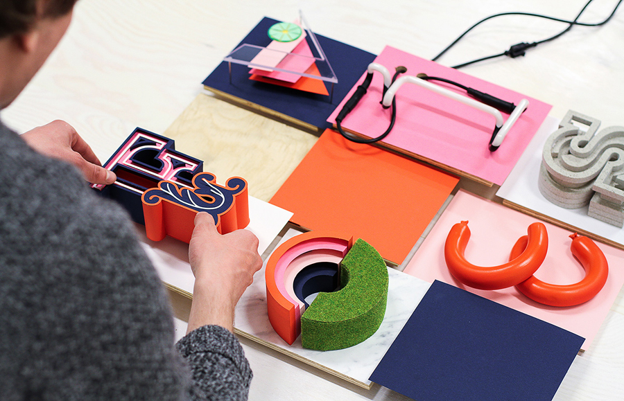
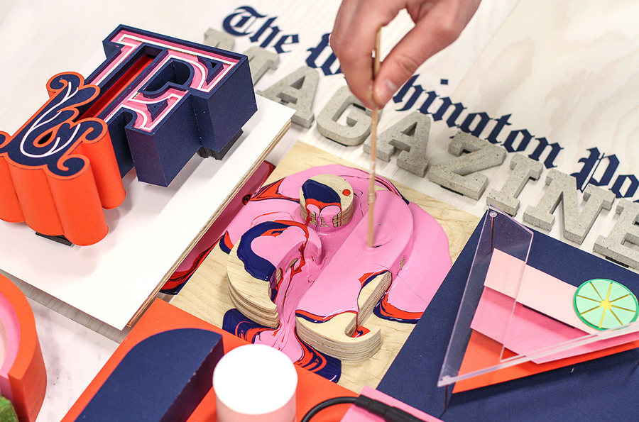
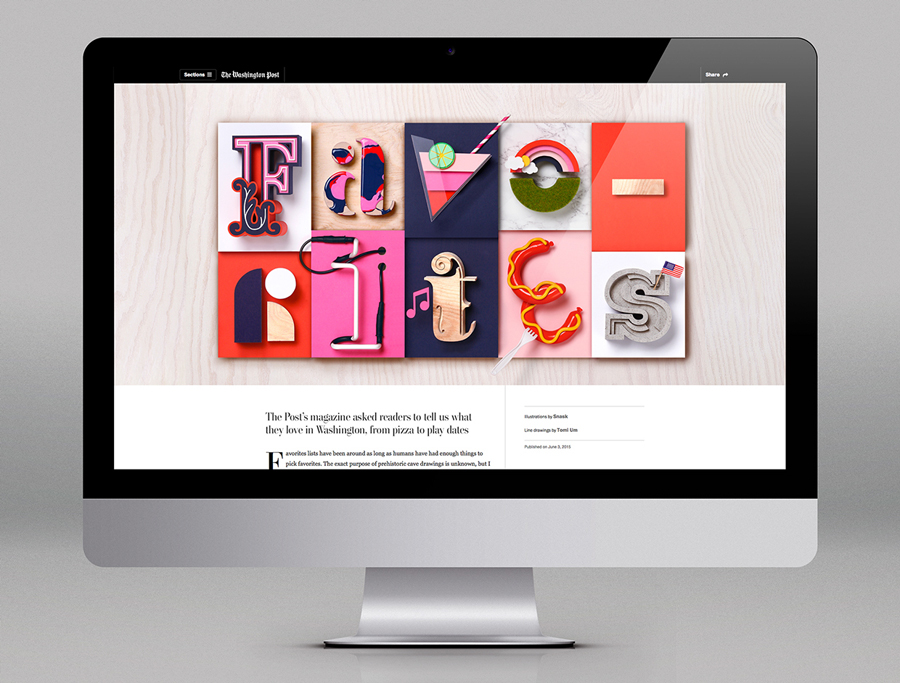
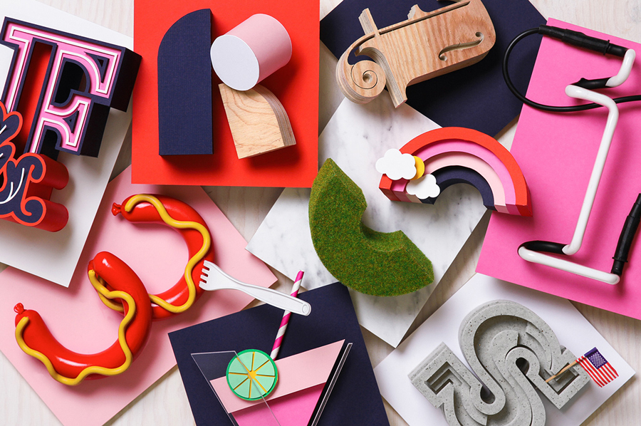
Following an extensive studio search The Washington Post, one of America’s most widely circulated newspapers, commissioned Stockholm based graphic design studio Snask to illustrate The Favorite’s Issue with a fun and tactile idea that would unite, amongst others, topics such as food and drink, music, art and the outdoors. Snask’s concept is informed by the essence and characteristics of each topic, and individually visualised through form, texture, colour, process and material variety. These are combined to create a rich cover, spread and set of single typographic panels bound by a physical crafted quality.
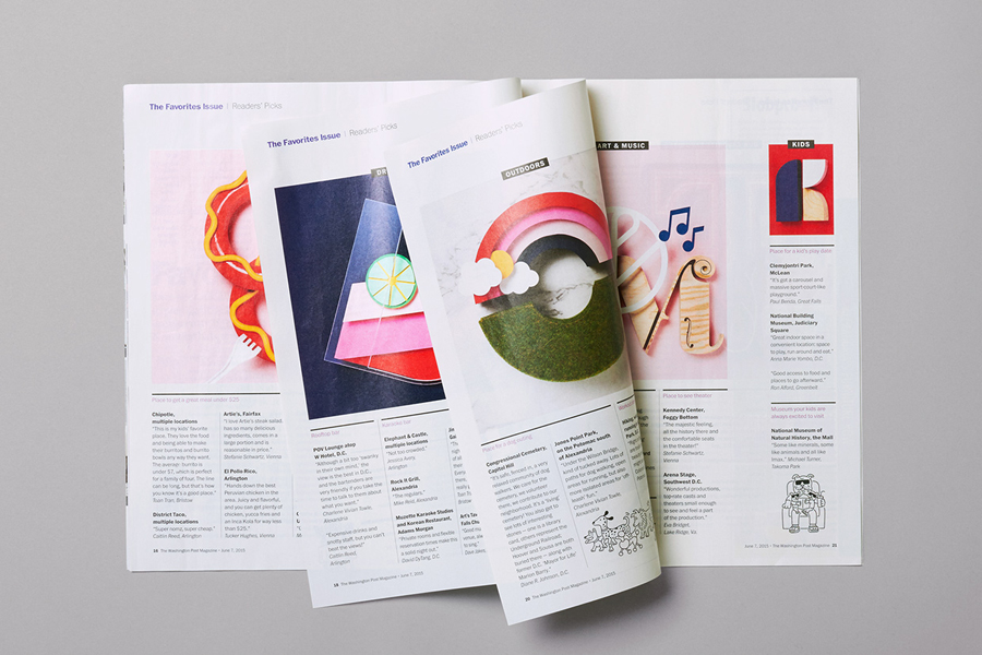
The challenge of bringing together a variety of topics is dealt with in a straightforward and practical manner, very much in keeping with what could now be described as the traditions of the studio. Snask’s work for Attention: Craft appears as a precursor to this more ambitious piece. Here we see a refinement and diversity of process, technique and finish, fitting of a magazine with such a significant distribution, and well-suited to its content and the breadth of its audience.
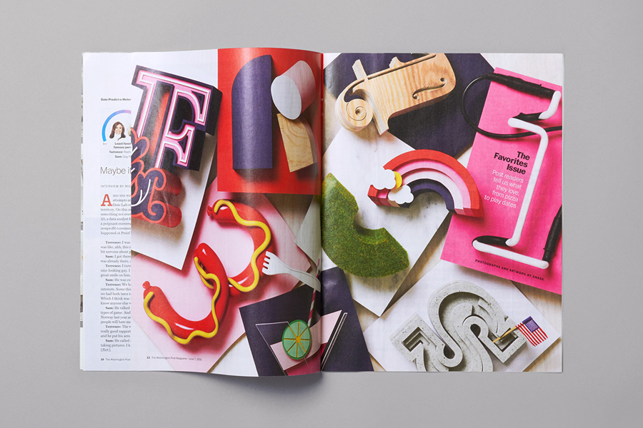
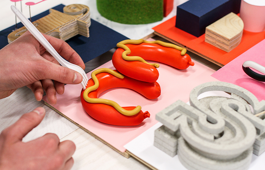
Each letter shares a creative and physical quality. Individually, some letters stand up better than others. Highlights include the neon tube I, hotdog E, cast S, and painted A. Each is clearly well-made, and together, effectively utilise not only a contrast in typographic form but also colour and surface texture, balancing a compelling aesthetic impact with relevant communicative intention that compliments content. The arrangement of the spread, which sees the letters stacked high, alongside real-world light and shade and good photography, work well to emphasises their built quality and material nuance.
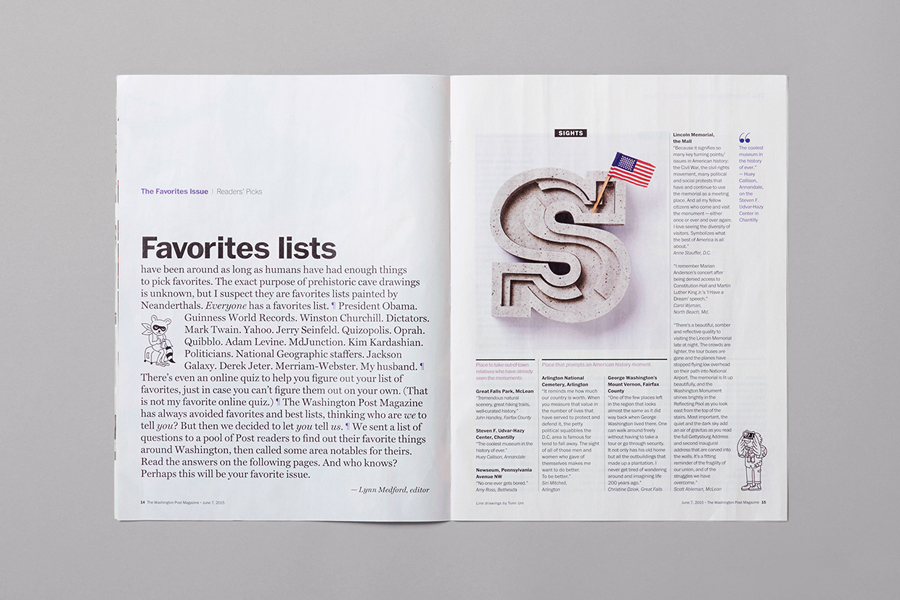
In some ways these letters, in their placement and ornamental nature, appear as drop caps amongst columns of finer text – something that is unfortunately lost online. So while distinctly contemporary in their creation, their use editorially neatly touches upon the traditional, much like the Gothic script of The Washington Post masthead. More from Snask on BP&O.
Design: Snask. Opinion: Richard Baird
