Biber Architects by Spin
Opinion by Richard Baird Posted 7 July 2015

Biber Architects is the New York based practice of teacher, author, architect and former Pentagram partner James Biber. Biber is made up of a tightly organized, highly experienced, and efficient team that have been producing design-led work—where others are process-focused or ideologically orientated—for more than 25 years.
The practice was conceived as a place to tackle architectural work from a fresh perspective, one that can respond to an industry that continues to experience significant change brought on by the personal computer, Internet ubiquity, rapid prototyping, instant and real-time communications, and the separation of design and production. Projects have included the Harley-Davidson Museum, the Fashion Center Needle and Button, and the Glass House Visitors Centre.
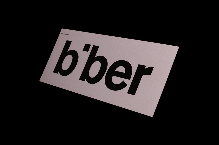
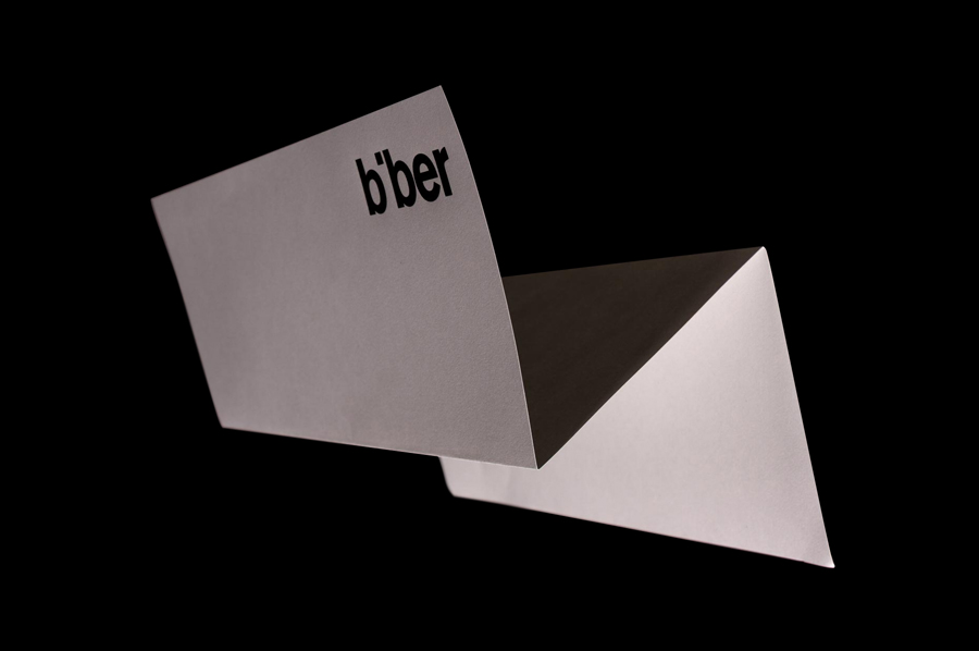
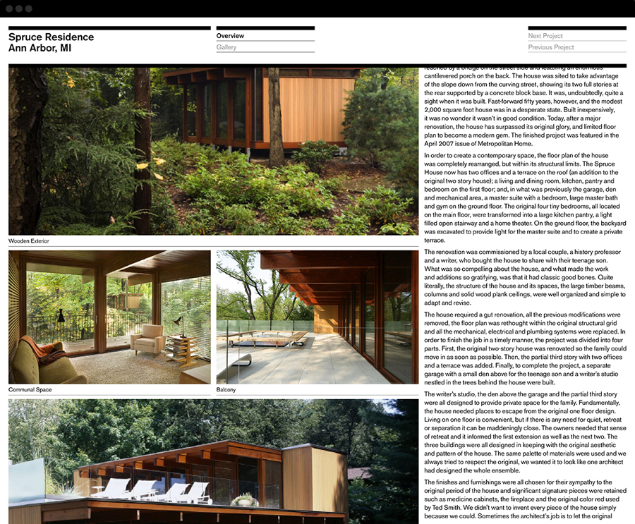
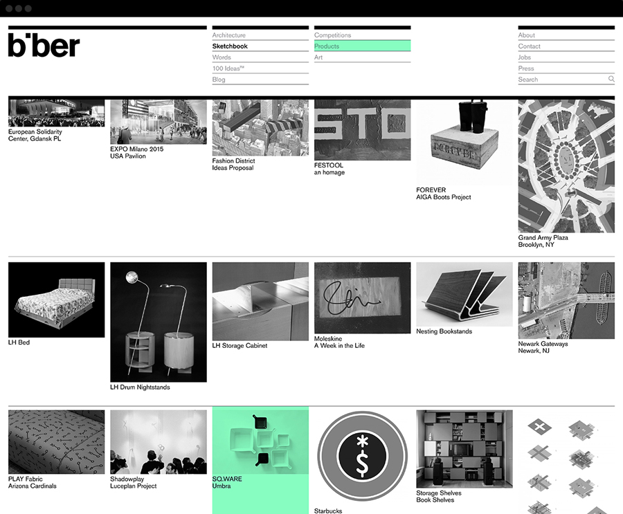
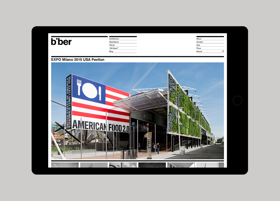
Biber’s visual identity, created by UK based graphic design studio Spin and which included logotype, business cards, stationery and website design, is described as having a playful structure and an economy of expression that make a connection with the philosophies of the practice.
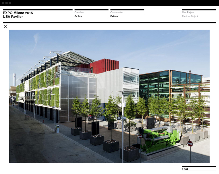
Biber’s philosophy is rich in detail and its work distinctive and diverse, so it is unsurprising to see this expressed across a well-written and insightful about page, blog and article content, and through photography online, rather than trying to infuse too much into, or expect to draw too much out of a visual identity system.

Spin’s identity treatment embraces some of the visual vernacular of the industry in print through bold sans-serif typography, the sense of light and shade you get from white and black ink, a warm concrete grey, and online using grid based layouts, the structural qualities of vertically stacked menus and heavy horizontal dividers, and black copy over a white background. These are punctuated by a contemporary neon green highlight and frame compelling full colour project photography.
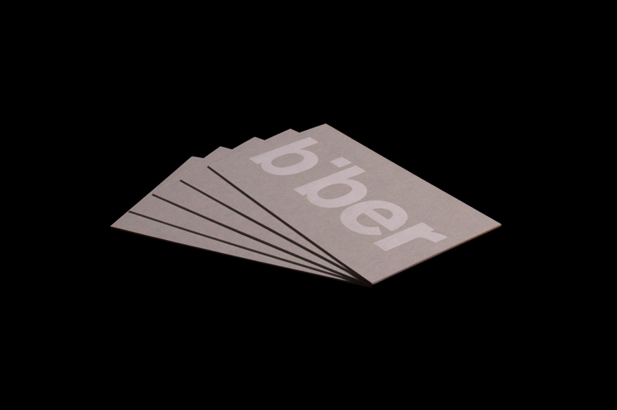
The typographic reduction and all lowercase typesetting of the logotype, its use of negative space and its under and oversized application, introduce a moment of play, an informality, subtle reference to space and proprietary quality to a simple typographical expression without undermining its robust qualities.
Spending time on the Biber Architects website it becomes clear that identity is largely held within words and, as you might expect, the architectural forms of their work. Spin’s contribution effectively leads with these more expressive components, facilitates and frames insight and process, and is in line with what Biber describe as “The Architecture of Identity”. It is cohesive and consistent, favours simplicity and familiarity over overt personality, and avoids trivialising the rich philosophies that underpin the practice through restraint. More from Spin on BP&O.
Design: Spin. Opinion: Richard Baird. Fonts in Use: Akzidenz Grotesk
