Gripoix Paris by Mind
Opinion by Richard Baird Posted 28 July 2015

Gripoix is a Parisian costume jewellery manufacturer with a significant history, one that stretches back to the late 19th Century and the Art Nouveau period. Gridpoix’s pieces are created using a traditional kilncasting technique, known as pate de verre, which sees molten glass poured into a thin linear framework, giving each a luxury and uniquely crafted quality.
This traditional process, and the period in which Gridpoix has its origins, formed the basis of its new brand identity developed by UK based graphic design studio Mind. This treatment included a calligraphic logotype and a monolinear pattern which extends across business cards, postcards, packaging, bags, website and a variety of print based communications.
Gripoix describe their philosophy as embracing traditional practices and infusing these with the contemporary spirit of its new design team. This is reflected throughout Mind’s brand identity work, both explicitly and implicitly.
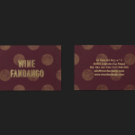
The logotype’s slim and full characters, and the high stroke contrast of a calligraphic origin, effectively bring together and express period influences and a handcrafted component. The high waist of the G, the repetition of shapes across the p and o, as well as the ri and ix pairing, draw the most from the characters of the name. These appear well-balanced, and alongside the broadly spaced sans-serif characters of Paris below, secures distinction whilst also acknowledging fashion conventions.

The pattern work, in contrast to the logotype, is far more recent in its monolinear execution and effervescent in its composition. It is distinctive, detailed and clearly mixes luxury and modernity in its choice of gold ink and brighter spots, but also grounds form and colour in Gripoix’s processes, referencing drops, a thin linear framework, and the natural irregular qualities of molten glass without being too abstract.
The expressive and idiosyncratic qualities of the pattern could have undermined the high fashion nature of the brand, as they are typically perceived today, with the potential to feel a touch high-street. However, this is tempered by its application, either hidden away on the interior walls of bags and envelopes, glimpsed through packaging joins, a particular highlight, or used as a single coloured detail across tissue paper, all of which favour plenty of unprinted space and bleached boards. This balance of white and black, punctuated by gold pattern, feel about right for costume jewellery, their craft and expense.

In summary, the combination of gold metallic ink intersected by fine lines, brighter spot colours caught in loops, the calligraphic and period qualities of the logotype, reduction and weight of a light sans-serif, plenty of white space and interior walls of illustrative flourish, effectively contrast classic, luxury convention alongside an element of play and a more recent sensibility grounded in the traditional process of pate de verre, and the aesthetic of costume jewellery.
The ornament and history of Didot, the recent favour for the monolinear sans-serif Brown, and the centre-aligned business cards continue to play with past and present, ornament and reduction, and expand on the qualities of pattern and logotype, albeit in a more subtle and impressionistic way. And while the small names across the business cards appears touch awkward, Mind’s work result comfortably sits at the intersection between compelling and unique aesthetic, high fashion convention, and a clear communicative agenda. More from Mind on BP&O.
Design: Mind
Postcard Photography: Sebastian Kaufmann
Opinion: Richard Baird
Fonts Used: Didot & Brown