The Factory by Ghost
Opinion by Richard Baird Posted 29 July 2015

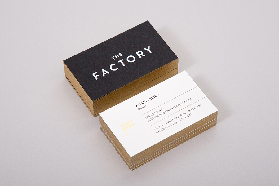
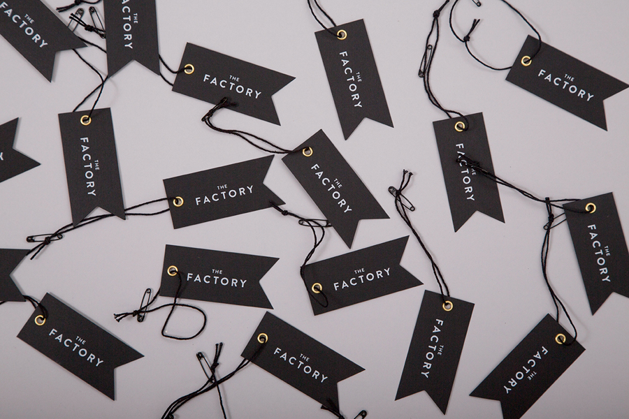
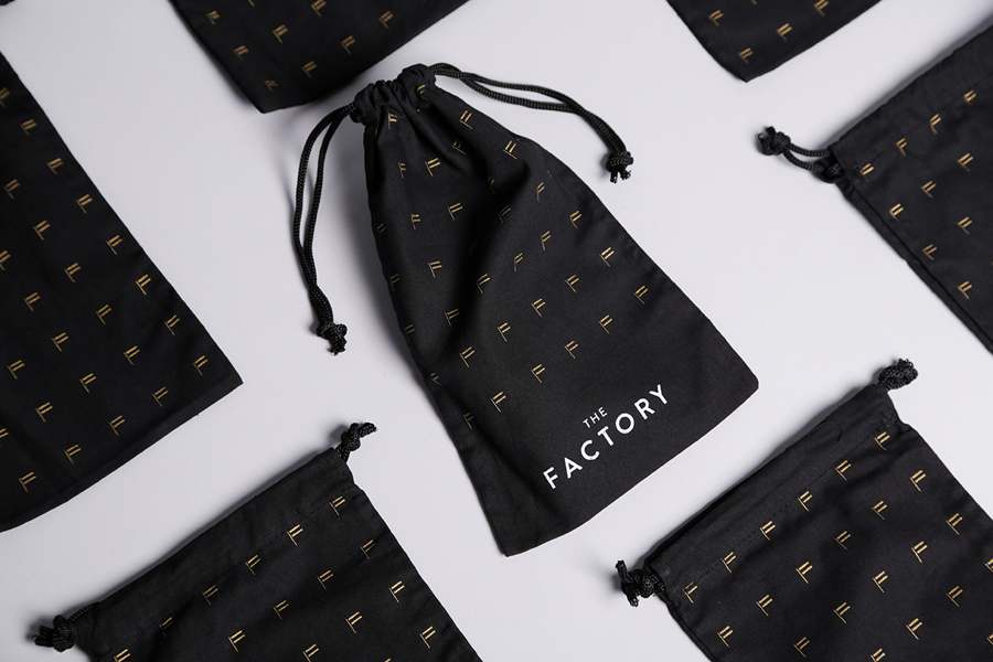
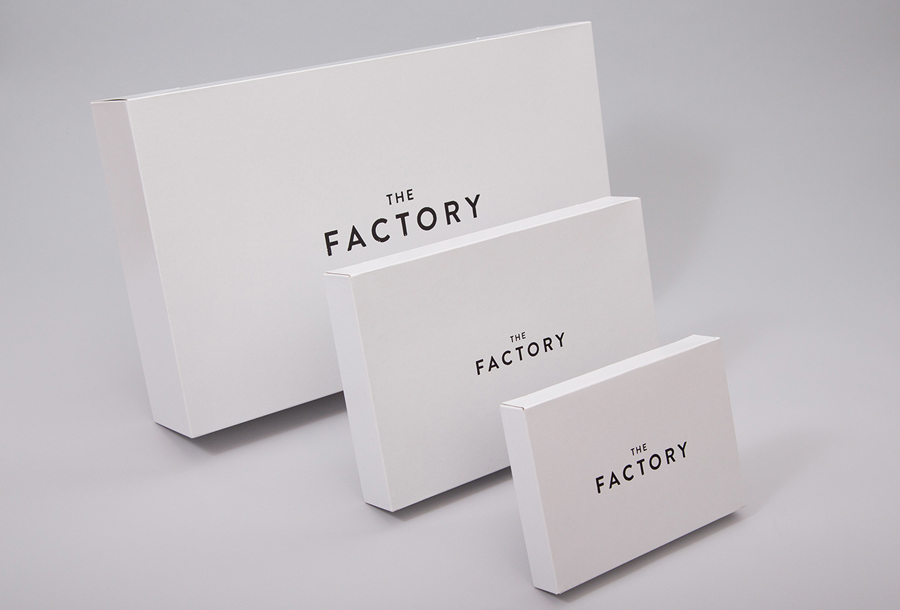
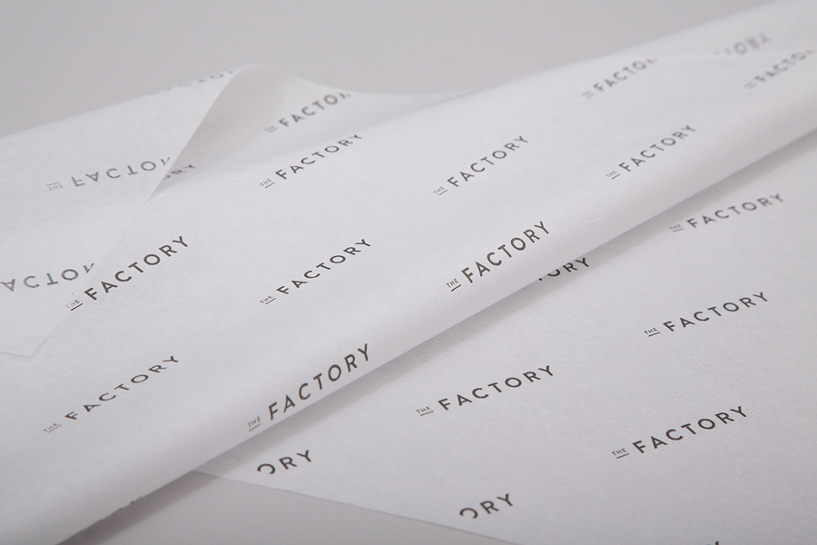
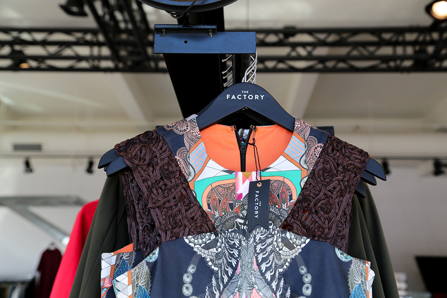
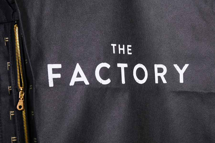
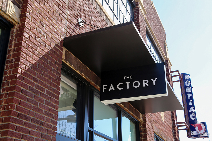
The Factory is an Oklahoma based fashion retailer, inspired by the energy and attitude of the people of Manhattan, Los Angeles and Tokyo, that mixes streetware with high fashion garments, shoes and accessories. Think ripped jeans, vintage purse and Louboutins. American graphic design studio Ghost worked with The Factory to develop a brand identity concept, which went on to include logotype and logo applied to business cards, tags, packaging and signage, underpinned by the concept of the store and compliments its interior design.
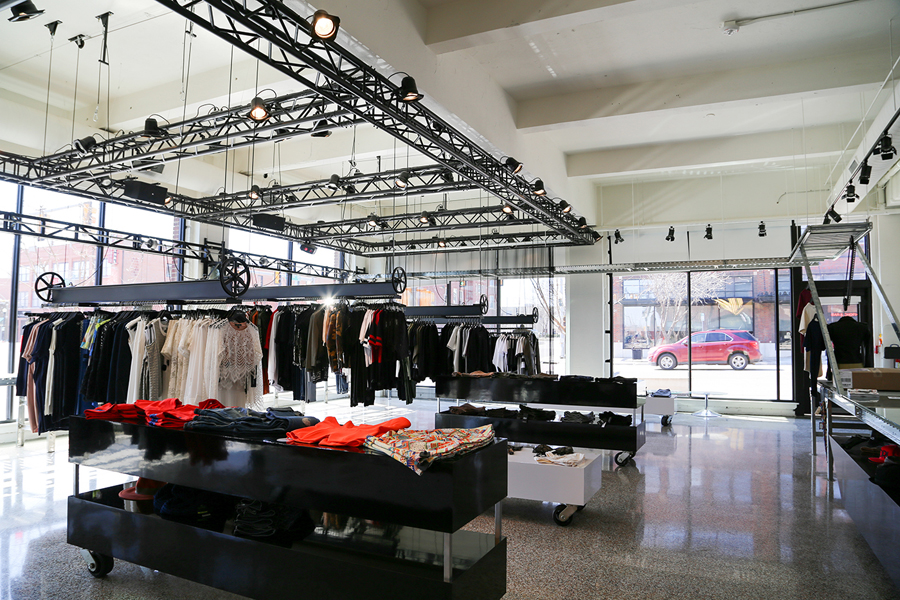
The low hanging lighting rigs, pulleys and suspended clothes racks, spot lights and steel framework, conveyer belt, exposed wires, DJ booth, polished stone floor, large windows, display surfaces with castors, white walls and black furniture fuse catwalk glamour with an industrial and urban utility. It is not unfamiliar and in some ways a touch retro, however, the distance between the permanent structure of the building and its retrofitting, which is emphasised through colour, is interesting, well done and delivers a temporary fashion show quality.

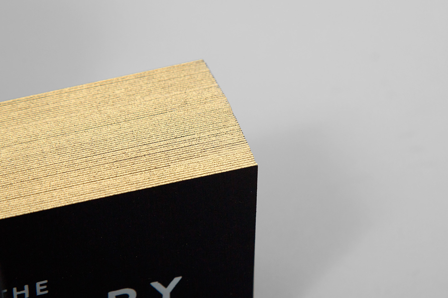
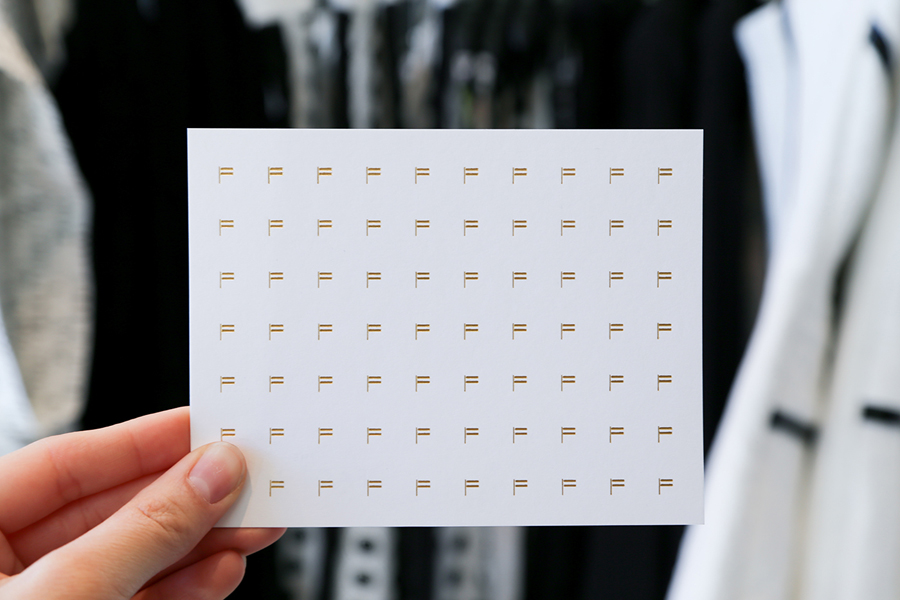
Ghost’s brand identity treatment is straightforward–an appropriate acknowledgement of contextual detail–with a consistency built around the geometric sans-serif characters of Brandon Grotesque and the mechanical qualities of Courier. It effectively leverages contrast through colour palette, typographical weight, size and style, reduction and flourish bound by a clear concept, and includes a few neat touches that break up the repetition of the logotype. These include the perceived luxury of gold edge painted detail, the quality of dyed black and uncoated boards with a white ink print finish, black safety pins and gold hole reinforcements, a symbol that exists somewhere between a flag and an F that is also used as a pattern to add texture, die cut tags and large white neon sign set across a black wall, a particular highlight.
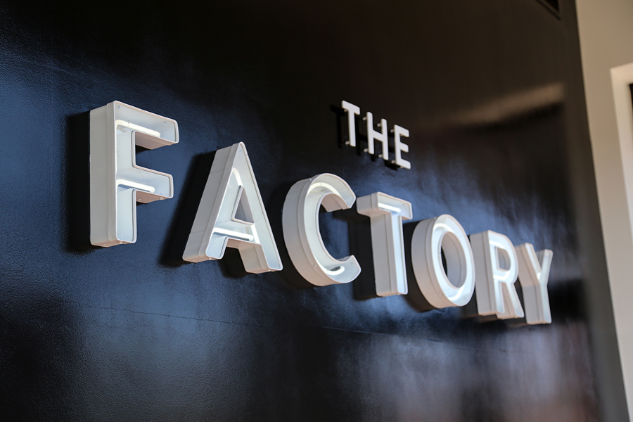
The approach comfortably brings together a robust industrial quality, a luxury component, and a couple of fashion conventions distributed through colour, type, form and finish, and compliments interior detail by favouring consistency and the absence of overt expression yet conveys the the concept of the store in a reductive and specific manner outside of the retail experience. More from Ghost on BP&O.
Design: Ghost. Opinion: Richard Baird. Fonts Used: Courier & Brandon Grotesque
