Studio South by Studio South
Opinion by Richard Baird Posted 4 August 2015
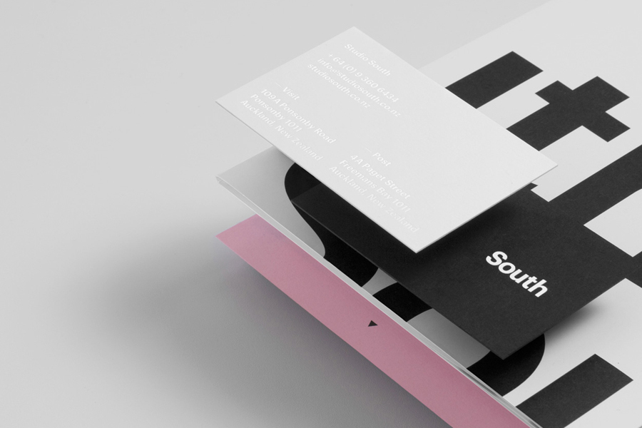
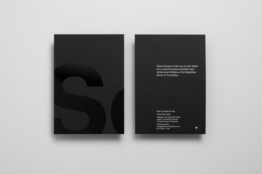
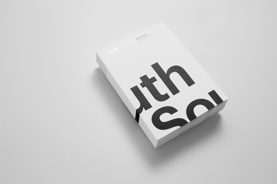
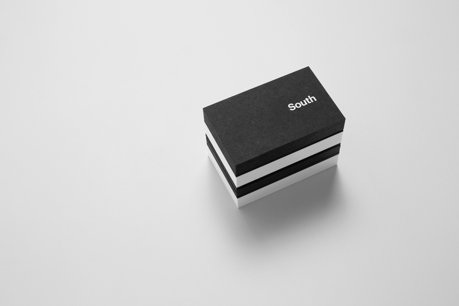
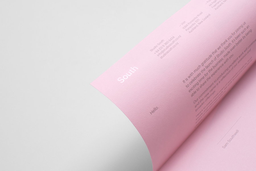
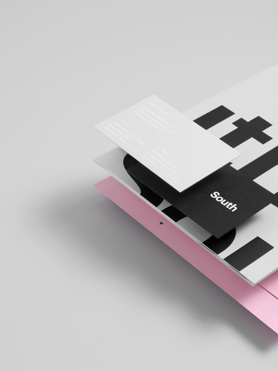
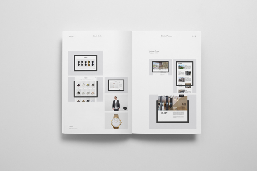
Studio South, formerly APLUS, is graphic design studio working within the fields of brand identity and packaging from their office in the city of Auckland, New Zealand. In conjunction with a new name and site launch, which coincides with the expansion of studio space, South have also developed a new visual identity treatment. This extends across business cards, folders and headed paper, a project brochure, launch invitation and promotion materials.
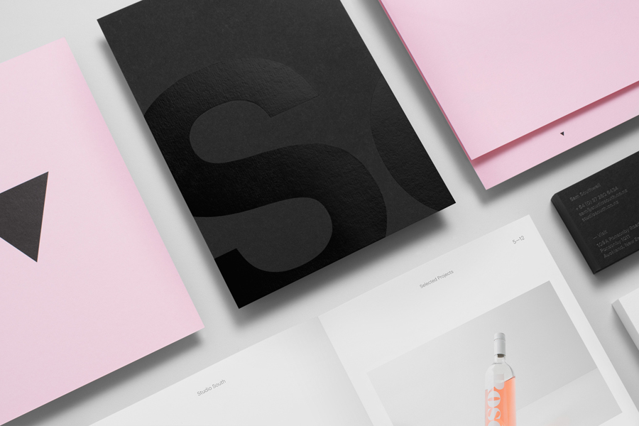
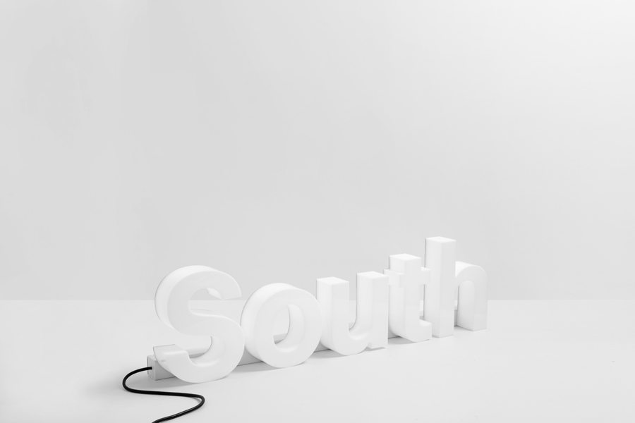
Studio South’s self-initiated brand identity design is an exercise in reduction, material choice and print finish. While not necessarily big on individual character, the theme of studio growth, its expanding reach and its location within the southern hemisphere are clearly there, conveyed through the use of oversized sans-serif characters, which run off the edges of the brochure and emphasised with small font sizes, and an arrow that points south.
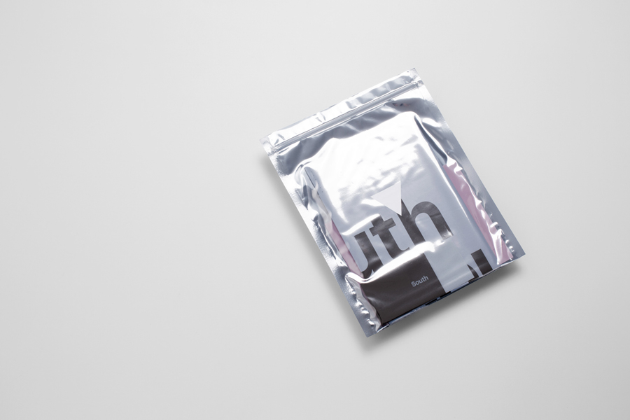
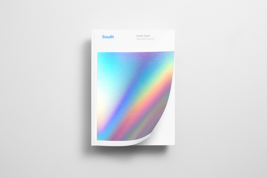
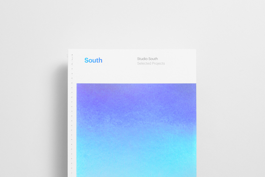
Material choices, print finishes and binding, which include combinations of white, black and pink uncoated dyed boards, black and white foils, a large coverage holographic foil, open stitch detail, brochure sleeve and silver envelope convey opportunity to clients and reflect the studio’s own interests and current aesthetic sensitivities.
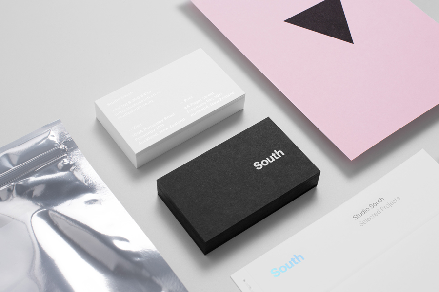
A single and fairly neutral sans-serif in a number of different weights, grid based layouts and plenty of unprinted space play with contemporary design studio convention, functioning as a way to frame the studio’s case studies, and avoid overwhelming these with a particular studio personality. Although on trend in its combination of reduction and finish, Studio South’s identity is well-polished, has just enough to be distinctive, is grounded in its location and studio growth, is likely to peak the interests of new clients, and is a fair reflection of its portfolio.
Design: Studio South
Opinion: Richard Baird
Fonts Used: Graphik
