Iron Grill by End Of Work
Opinion by Richard Baird Posted 14 August 2015
Iron Grill is fast food outlet preparing healthy, flame grilled wraps and burgers, to order, from its kitchen and counter at the Optus headquarters at Macquarie Park, Australia. The food court at Optus is a competitive environment with a large captive audience of over 6,500 people and a number of other food outlets competing for business but serving familiar, unhealthy favourites.
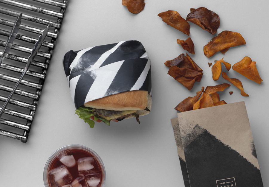
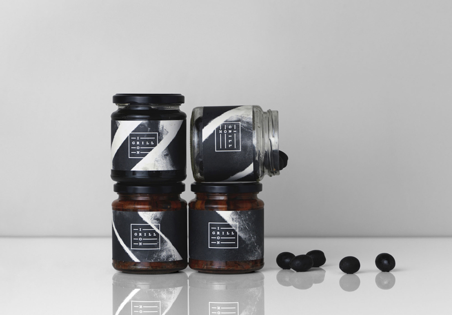
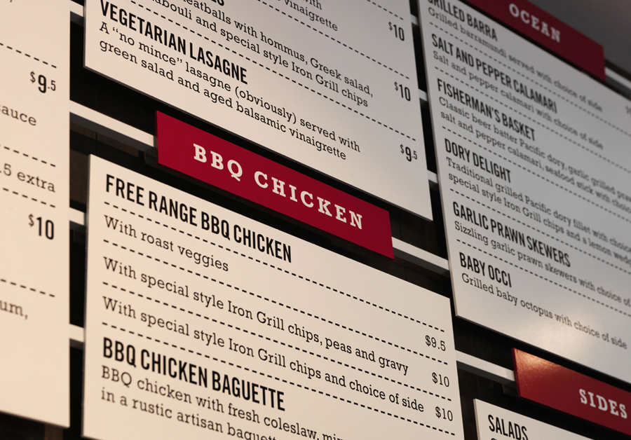
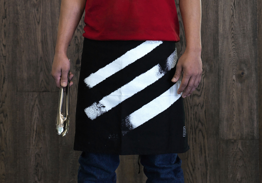
To help define and convey the simplicity, preparation and quality of Iron Grill’s menu, and to emphasise its difference, graphic design studio End Of Work developed a brand identity treatment that takes the flame grilled foundation of the business’s menu and the industry qualities of its counter, and infuses these with an earthy crafted quality through watercolour brush strokes, a limited economical colour palette and uncoated papers and boards. The project included, business card, packaging, signage and menu design.
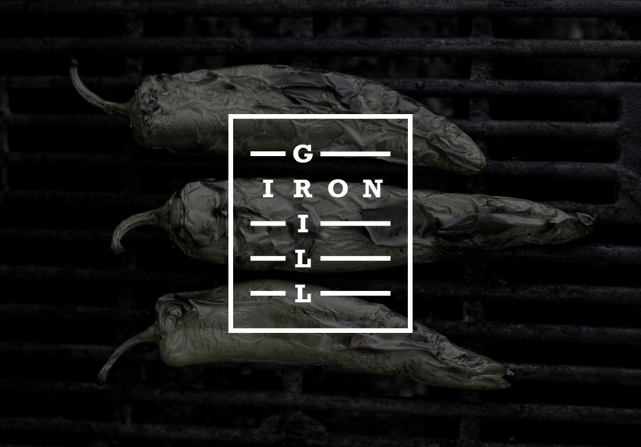
“Here we imagined a whole story complete with a powerful manifesto. It’s a gutsy, clean-living, Ché Guevara-style flavour-first mantra which has customers queuing up at lunch time. The food offer is a rebellion against the perception that fast food is low in nutritional value. At Iron Grill they are passionate about fresh produce. The food’s natural flavours are made to be the hero so we created a brand identity true to this ethos.” – End Of Work
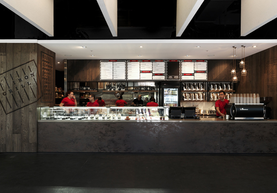
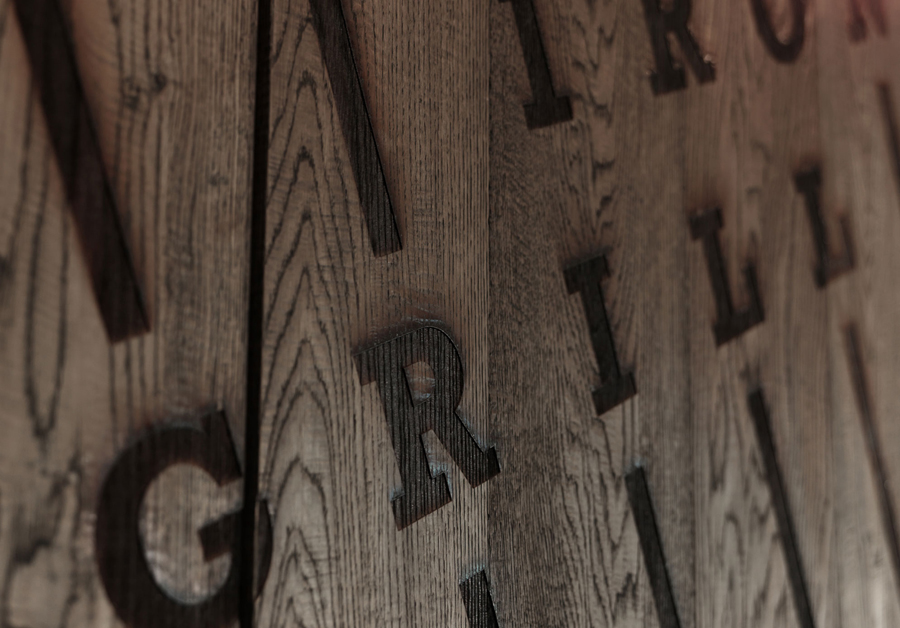
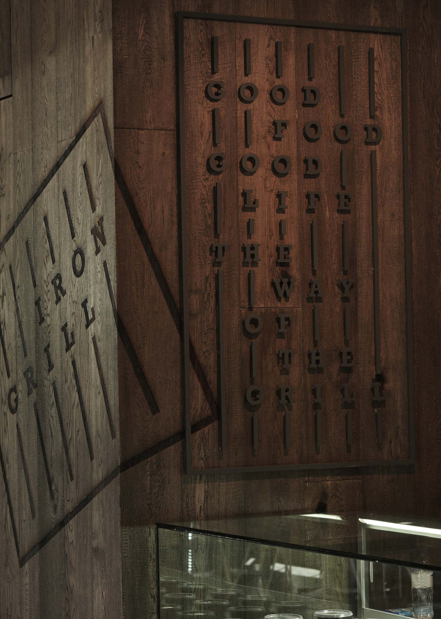
A dark counter of worn iron panels and rivets, stained wood, punctuated by a menu board of white panels and a well-lit display, and a wealth of material texture, is expressed through visual identity using bold slab serif typography, cast signage, the economy of a single black ink, brush textures, and uncoated white and unbleached materials. There is an unmistakably earthy and robust industrial quality to the work that fits comfortably within the context of heat, open flame and a simple hearty menu. Although this is not an uncommon aesthetic, alongside lighter, brighter and more polished fast food outlets next door, is likely to appear distinctive, and in the words of End Of Work, rebellious.
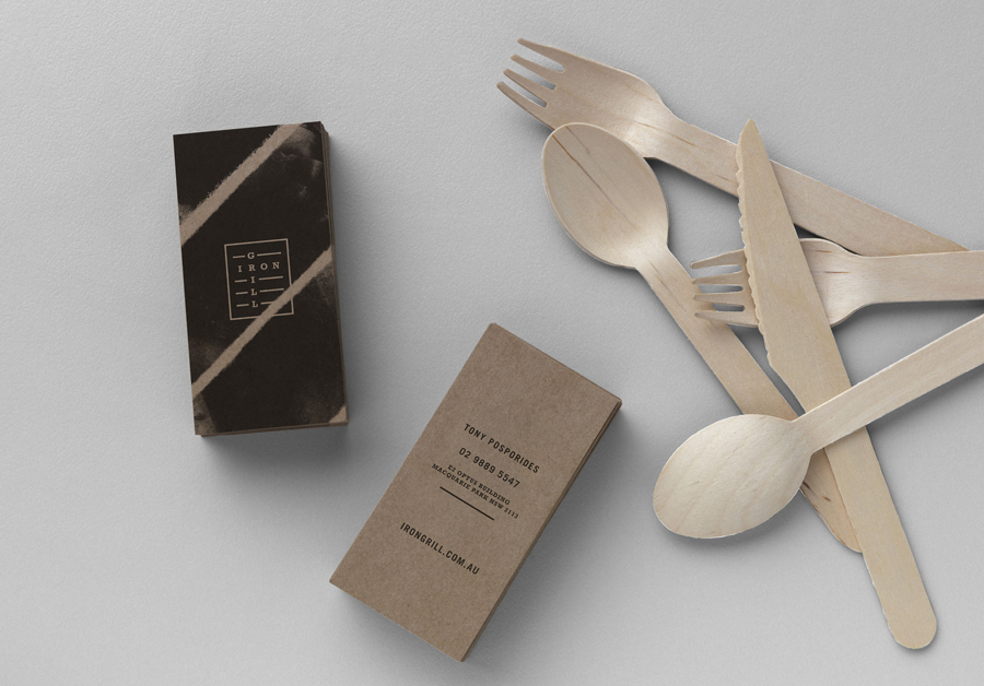
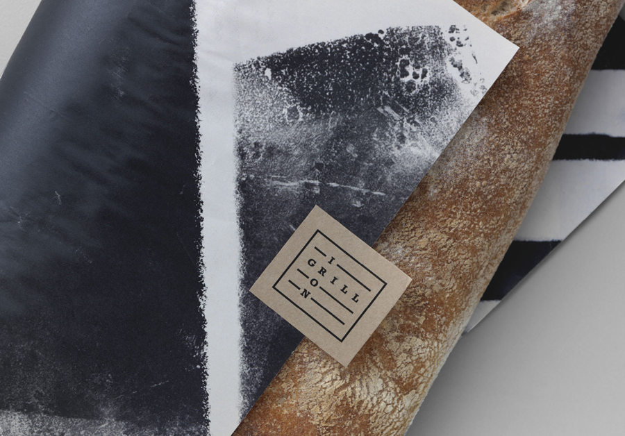
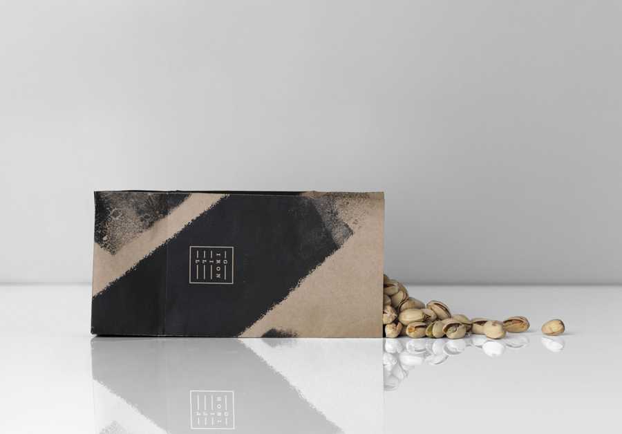
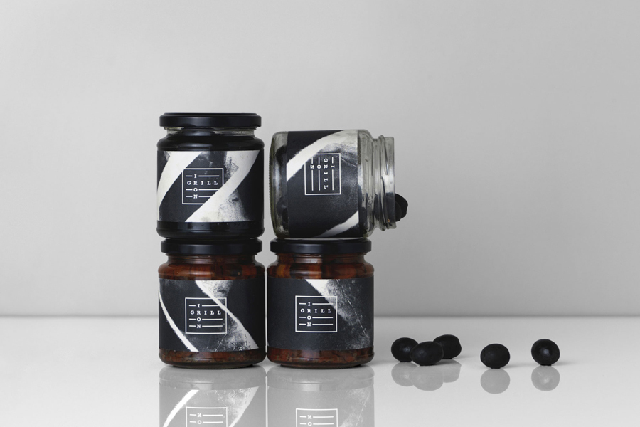
Although not particularly imaginative or striking, the logo is straightforward and clear in its communicative intention, much like the name. The logo’s consistent monolinear qualities, slab serif type, horizontal lines and square container, as well as plenty interior space, allow it to sit comfortably over a variety of brushed textures and work well as both cut and cast signage. While the use of contrast is to be commended, these two components do appear a touch disjointed, with pattern work delivering far more communicative and aesthetic value. This is largely down to positioning and proportion which is not an issue across the counter, check out the large wood cut and cast signage.
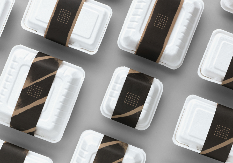
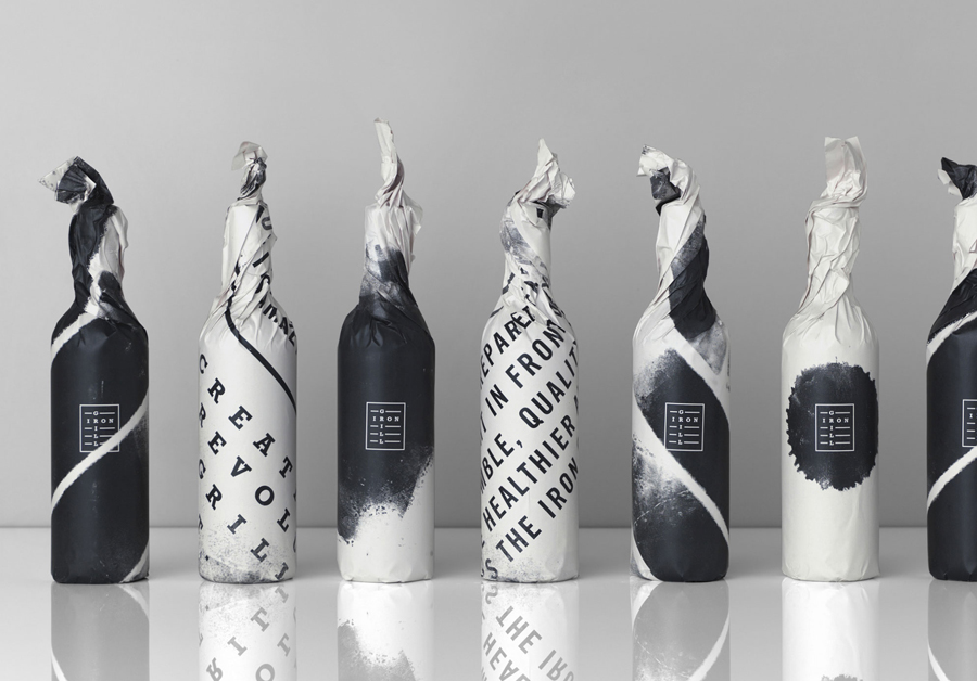
Alongside counter design, the use of brush strokes across the packaging is the real highlight of the project. Their linear implementation, corse organic outlines, watercolour and charcoal finishes, make a neat and clear connection between seared and grilled meat and hand preparation, craft, quality and simplicity. Although applied as a single economical ink, a mix of width, direction, force of impression and negative space, and the way that these take advantage of a variety of packaging structures, as well as tissue and grease-proof paper, provides a much need variation where it could have become repetitive.
Design: End Of Work. Opinion: Richard Baird
