Loving Earth by Round
Opinion by Richard Baird Posted 19 August 2015

Loving Earth is an Australian business, established in 2007 by Scott Fry and Martha Butler, that produces a variety of chocolates, snacks, cereals, butters and spreads. All of Loving Earth’s products are made from high quality, organic and fairtrade ingredients, and include ranges that are gluten, grain, dairy and sugar-free. Although taking advantage of a growing multi-million dollar industry, Loving Earth’s values are grounded by a genuine passion for environmental sustainability and individual well-being, rather than wealth, which is expressed, at length, online.
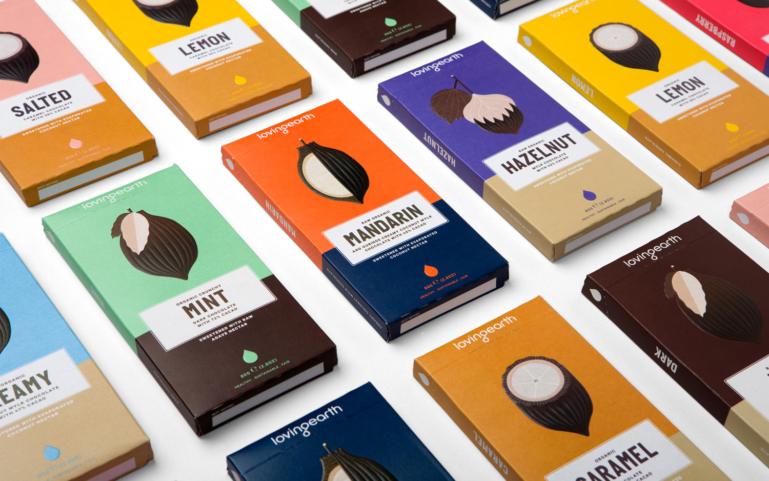
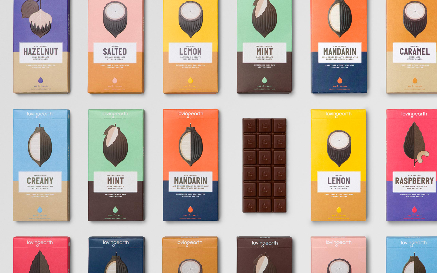
Loving Earth worked with Melbourne based graphic design studio Round to redesign its raw chocolate packaging. This replaces a low impact but earthy design with one of visual interest that effectively uses colour, form and type to make a better and more compelling connection with raw ingredient, emphasises flavour profile and secures a far more idiosyncratic quality.
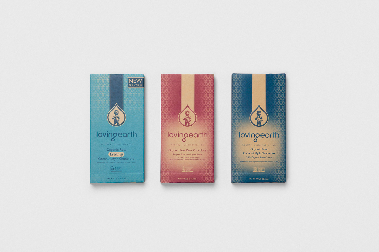
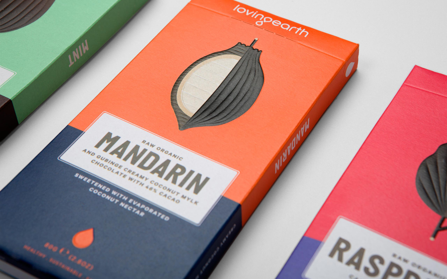
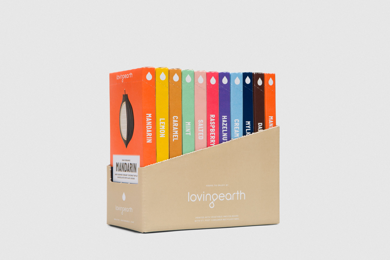
Round’s treatment is bright and distinctive from a distance with some nice details and finishes up close. A striking palette juxtaposes an earthy cocoa brown with a variety of bright contemporary colour, introducing differentiation, communicating a little of flavour profile and securing a simple yet infused quality.
The approach to cocoa illustration is unusual, balancing areas of detail with moments of reduction. What has become a commodity has been visualised as a distinctive, high value and proprietary asset that captures the distinctive shell and internal qualities of cocoa through whole and cross section views. These are aesthetically interesting whilst also making a connection with raw ingredient. Alongside the flat colour palette, these illustrations have a clear communicative intention and a compelling visual polish which is enhanced and given further value with what looks like a sculpted emboss.
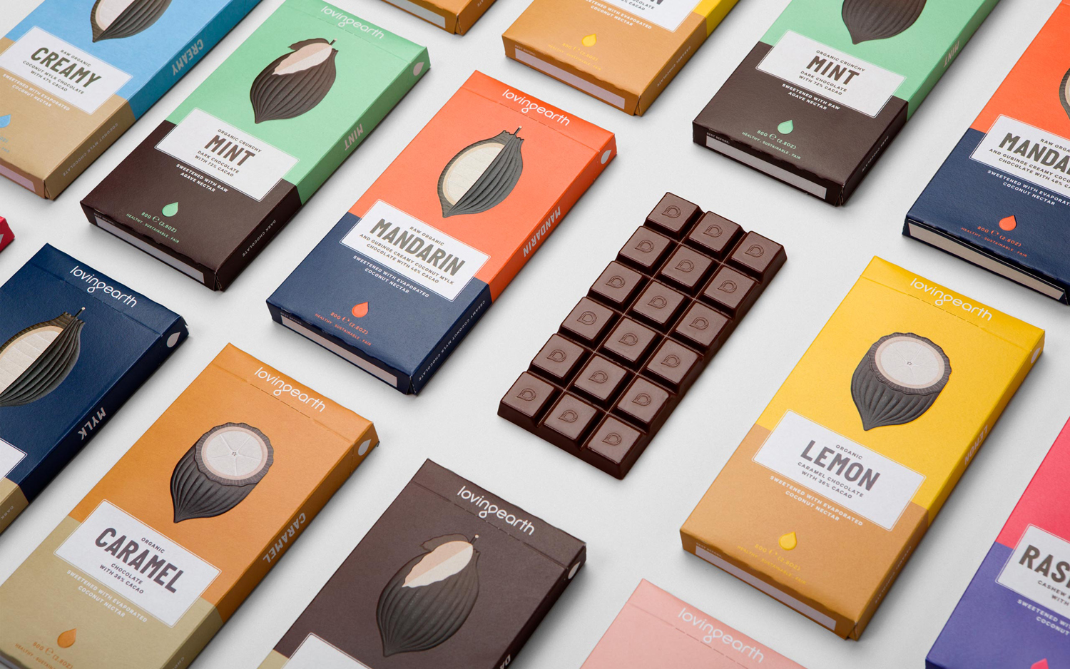
The condensed, uppercase, sans-serif, geometric characters of what looks like Biko, much like the cocoa illustrations, unites geometric reduction with some small quirks. While the colour palette is current, there is a subtle retrospective quality in some of the characters that is hard to place but works in Loving Earth’s favour, contributing to the character of the packaging and offering contrast to an awkward logotype.
The structural design’s mix of plant-based inner wrapper—which maximises freshness, improves shelf life and is compostable—and a 97% recycled post-consumer cardboard box printed with vegetable inks, reflect a complete commitment to environmental sustainability from the inside out. More from Round on BP&O.
Design: Round. Opinion: Richard Baird. Fonts Used: Calibre & Biko
