Edvard Munch High School by Snøhetta
Opinion by Richard Baird Posted 18 September 2015
Edvard Munch High School provides students with a broad programme of study, with a particular focus on creative classes such as music, dance, product design and textiles, in conjunction with core academic subjects. Classes are given in a newly refurbished, early 20th century building, and the former home of the Oslo National Academy of the Arts.
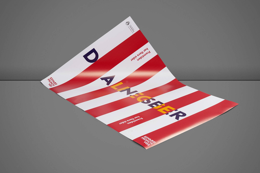
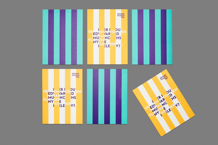
To coincide with the refurbishment, the school also launched a new brand identity system, created by Norwegian graphic design studio Snøhetta, and based around theme of duality and the concept perspectives, a reflection of the school’s academic and creative programme, versatility and knowledge. This extended to posters, business card, brochure, tote bag and signage, some of which feature a folded, three-dimensional, interactive component.
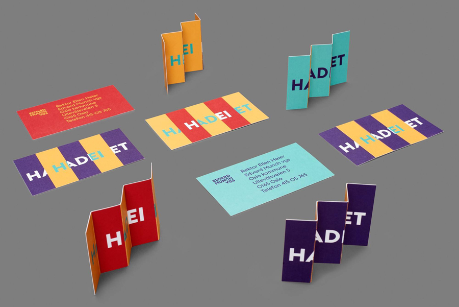
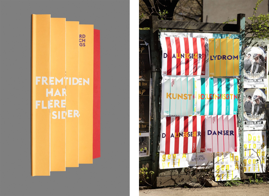
There are, what feels like, two separate components to this identity. A lenticular print-like approach to posters and a few other assets such as business cards, and a signage system of custom typography and pictograms which share a dual line and stencil cut quality. The former, drawing on the concept of perspectives, and playing with space, movement and interaction, much like the subjects of the school, is creative and adventurous. This challenges convention and, in doing so, manages to balance visual impact, clear communicative intention and identity, whilst pushing for engagement.
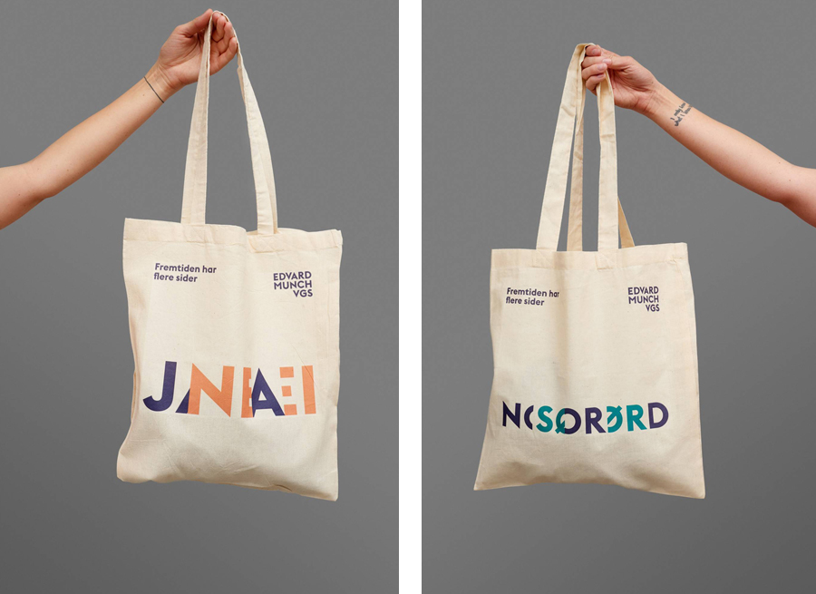
This folded concertina detail works particularly well as posters in bus shelters, is perhaps a little optimistic when it comes to fly posters, buckles slightly when it comes to the practicality of business cards, and is close to illegible when folding is not an option. However, the use of creases across the tote bags is a neat idea.
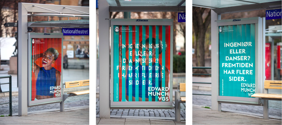
As flat artwork, the strips of colour appear bold, distinctive and eye catching, share some of the qualities and associations with circus tents and performance without undermining the prestige of the school and the building’s original occupants, yet, when seen from an angle, flat colour manages to pick out type and communicate message.
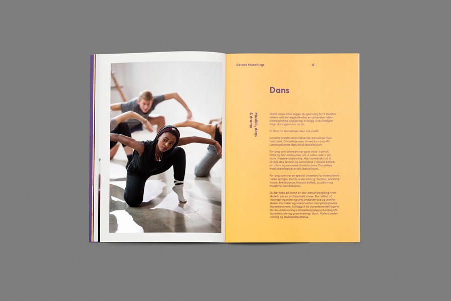
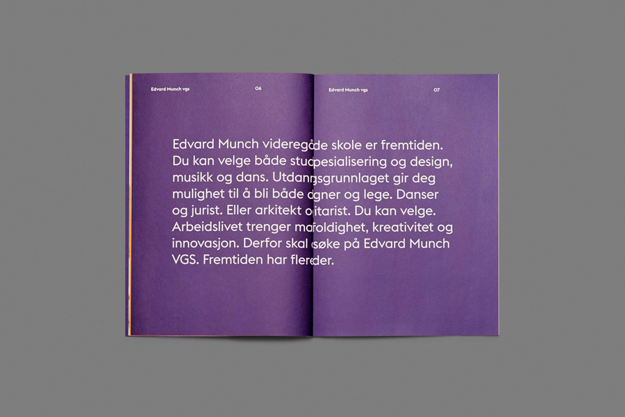
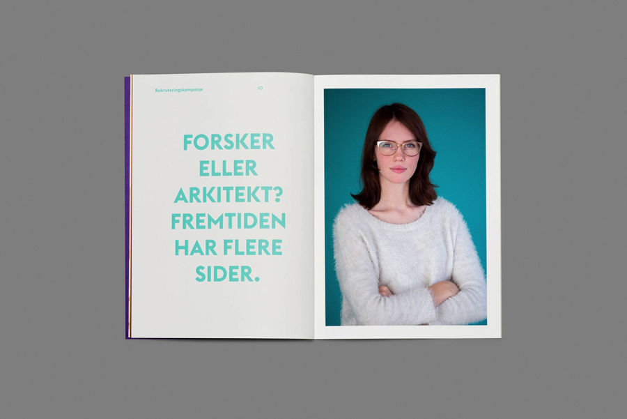
The prospectus is a little more conventional, however, makes a connection with life at the school through compelling well-shot photography. It shares the bright colours, bold geometric characters of Euclid Flex, and large statements of the posters, and also plays with perspective using orientation within type layout.
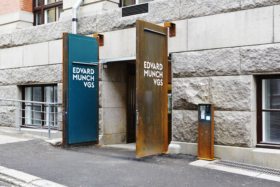
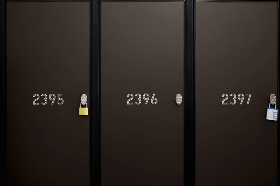
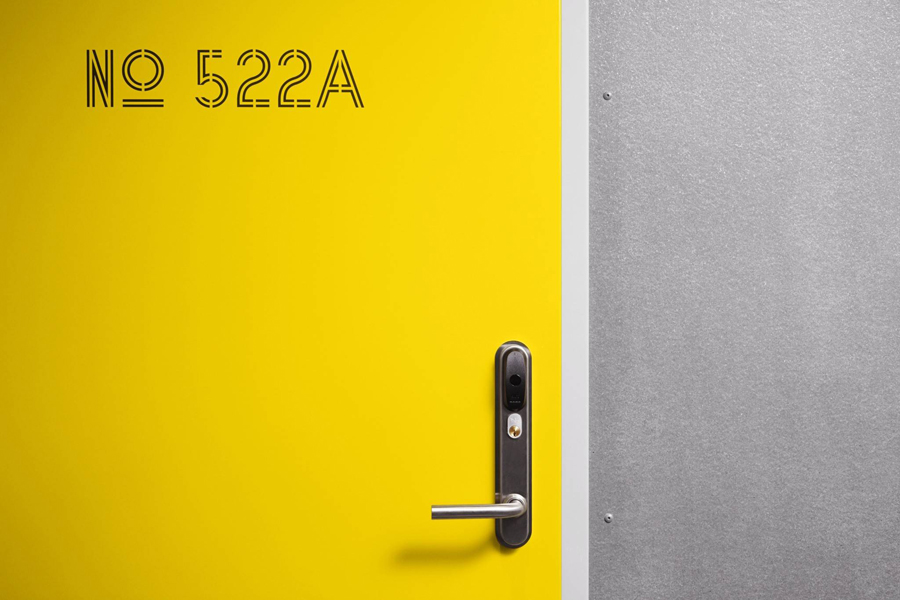
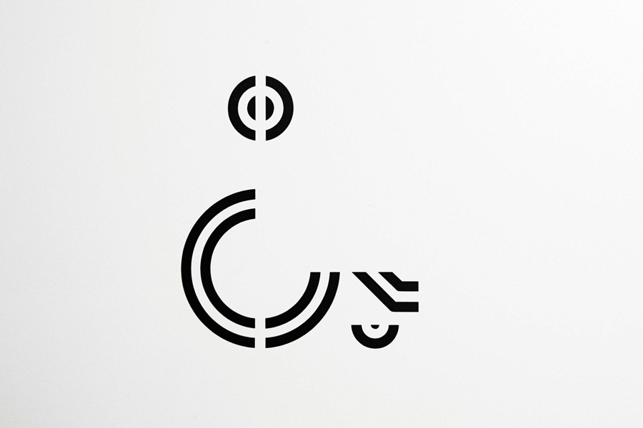
When it comes to signage, which is characterised by custom sans-serif type and pictograms, the concept of duality is far less explicit, manifesting itself within the use of dual lines. Alongside stencil cuts, geometric monolinear form and their application, these do a good job of establishing a clear, contemporary and unified system. These are particularly well-suited to their context, both in contrast to the significant history of the building, but also in their shared modernity following refurbishment.
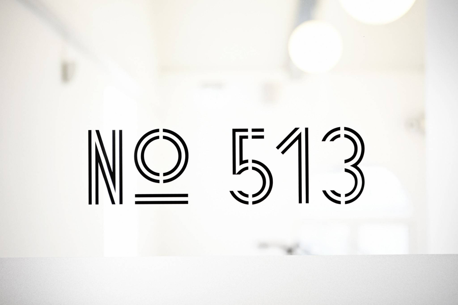
Without the three-dimensional component, the signage feels a little removed from the ambition and creativity of the print work. The disparity is further compounded by different type choices, with neither sharing any interchangeable components or similarities. Colour does go some way to resolving this, the brochure and profile photography, however, it might have been neat to have seen the three-dimensional component play out within the interior of the school. More from Snøhetta on BP&O.
Design: Snøhetta. Opinion: Richard Baird. Fonts Used: Euclid Flex
