Designed by Bielke & Yang
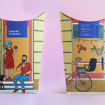
Talor&Jørgen Coffee by Bielke & Yang
Talor&Jørgen is a Norwegian speciality coffee roastery and coffee subscription service that delivers small boxes of freshly roasted beans, sourced from across the globe, to subscribers based on their drinking habits rather than to a schedule. Product naming focuses on bringing to the forefront flavour notes rather than bean provenance, variety and preparation (although this is online and on pack) with the intention of making...
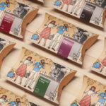
Talor&Jørgen Coffee by Bielke & Yang
Talor&Jørgen is a Norwegian speciality coffee roastery and coffee subscription service delivering small boxes of freshly roasted beans, sourced from across the globe, to subscribers based on their drinking habits rather than to a schedule. Product naming focuses on bringing to the forefront flavour notes rather than bean provenance, variety and preparation (although this is online and on pack) with the intention of making speciality coffee...
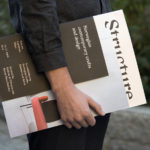
Norwegian Structure by Bielke & Yang
Structure is an exhibition of Norwegian contemporary crafts and design that began its European journey at Milan Design Week in April 2017 and is currently being held at Norwegische Botschaft in Berlin until April 2017. The exhibition features the work of 26 designers and studios, and covers a variety of products and prototypes; from furniture to lighting, to ceramics, textiles and home accessories....
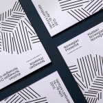
K. Apeland by Bielke&Yang, Norway
K. Apeland is a Norwegian independent civil engineering consultancy that specialises in construction technologies, and applies its experience to new builds, remodelling projects and renovation. It has a favour for steel-wood and concrete structures, which has won the consultancy a number of awards, and has a broad portfolio that covers public infrastructure, private offices and housing, as well as viewing platforms,...
Norwegian Presence by Bielke&Yang
Norwegian Presence was an exhibition of handcraft and design, past and present, from Norway. It was held at Fuorisalone, which makes up part of Milan Design Week, and moved on to The Gifts & Interior trade fair in Oslo and 100% Norway in London. The exhibition featured 51 different products from 46 designers, with the intention of showcasing a diversity of approaches, innovations,...
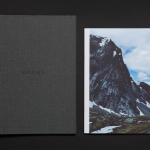
Maaemo by Bielke&Yang
Design studio Bielke&Yang have worked with Norwegian two Michelin starred restaurant Maaemo to develop a holistic brand identity solution informed by the philosophies and creative practices of its unique dining experience and culinary expertise. The studio’s brand identity design, which encompassed website, custom typography, colour, the tone and content of images, and the tactile finishes of welcome notes, magazines, business cards, folders...

Taco República by Bielke&Yang
Taco República is described by Bielke&Yang, the design studio behind its visual identity, as Norway’s very first genuine taqueria. Wanting to avoid some of the Mexican restaurant clichés, Bielke&Yang juxtaposed classic typography and a guacamole based color scheme with a colourful and contemporary illustrative panel created by Uglylogo, which offers a humorous take on the “enthusiasm and craziness” of the local community prior...
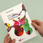
Vitenparken by Bielke&Yang
Vitenparken is a science centre committed to facilitating and improving the dialogue between the bioscience research community and the general public. The centre contains an exhibit hall, cafe, dairy museum and meeting facilities set within the Campus Ås grounds of the Norwegian University of Life Sciences. As well as the science centre these grounds are home to over a 1000 scientists, a university with...
Food Studio by Bielke&Yang
Food Studio is a group of food professionals, designers and photographers that come together to create unique and unconventional shared, natural and Nordic food experiences, table talks and workshops where “food becomes conceptualized through physical and mental experiments”. Design agency Bielke&Yang, who have been part of Food Studio from the beginning, recently worked with a team of copywriters, film producers and photographers to...
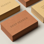
Deep Search by Bielke&Yang
Deep Search is a Norwegian shoe brand that devotes its time to the inquiry of nature, fundamental human activities and their practical impact on the aesthetic of shoes. Deep Search’s brand identity—which includes a logo, logotype, stationery and packaging solution created by Bielke&Yang—is a neat fine lined and geometric logo-type that sits over the tactile quality of the material choices...