Flight PR by DIA
Opinion by Richard Baird Posted 24 September 2015
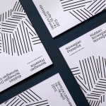
Flight is a Los Angeles based public relations business, founded by Alysha Light, that works with clients at the intersection of the technology, marketing and entertainment industries. New York graphic design studio DIA worked with Alysha to update the Flight visual identity. This extended to custom logotype and logo animation, business card, poster and website design. These are bound by a distinctive colour palette, make good use of gradients, and draw a new idea from inline letterforms.

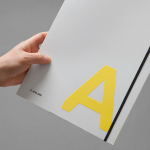
Although the tote bag, t-shirt and posters feel like portfolio pieces rather than useful brand assets, and the tagline “Elevate Your Brand” a touch trite, DIA have managed to get a lot out of the name whilst not going overboard. Think boarding passes, terminal signage, iconography and airport vernacular etc.


Highlights include the condensation trails of the logotype, the way that this has been emphasised through animation (presumably to be employed within promotional videos and not just a studio flourish), the sky blue, cloud white and sun yellow of the business cards, and the way gradient, typesetting, space and long vertical lines gives a sense of altitude to both the desktop and mobile website. A heavy dyed board, foil print finish and the use of Colophon’s font Value, add a tactile quality and good contemporary typographical detail to a simple concept.

Although these choices do not contribute to a particular communicative agenda, beyond a sense of creativity, quality and expanding on the theme of going places, which of course is enough for a small brand but ultimately generic, it does secure a distinctive aesthetic impact that is clear and cohesive in its ideation, supportive of the name and tagline, and does a good job of linking each asset. More from DIA on BP&O.
Design: DIA. Opinion: Richard Baird. Fonts Used: Value Sans