Estones de Mishima by Folch
Opinion by Richard Baird Posted 21 October 2015

Vins de Mas Sersal is a Spanish wine producer, founded by winemaker Salvi Moliner and sommelier Sergi Montalà in 2008. Inspired by the lyrics of Qui n’ha Begut from the album Set Tota La Vida (Thirsty The Whole Life) by singer, songwriter and friend of Salvi and Sergi, David Carabén of the indie band Mishima, the winery created a special edition release of its Estones.
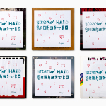
Estones de Mishima is a blend of Grenache, Syrah and Carignan grapes grown in the lands of Catalonia and aged seven months. The bottle features a distinctive label design by Barcelona based studio Folch that takes its cues from Mishima’s Set Tota La Vida album cover, also designed by Folch. The result is described by the studio as a unique and synergic combination, and the Spanish wine industry’s first co-branded venture.

Folch’s cover for Mishima’s album features an engraving of a straight stake tied to a crooked tree, an ancient image taken from the frontispiece of Nicholas Andry’s Orthopaedia. Although choosing to limit the visual expression of the label to one of type only, Folch make connection with this image and the wine label, and touches upon age, by reproducing the density of the engraving within the typographical forms of Futura Condensed—also used on the album cover—with charcoal.
The ancient qualities of the image, that of charcoal, and the indian ink used across the wine labels of the follow-up, within the context of a product where age plays a large part in process, is a subtle and neat detail that gives further depth to what is a simple custom typographical treatment.


The hand drawn and charcoal texture of the custom typography, in opposition to, yet derived from, the geometric forms of Futura Condensed, makes for a thoughtful duality, a balance of aesthetic impact and a communicative intention that touches upon the creative and personal qualities of a small wine producer, and its wooded Catalonian surroundings.

Although the resemblance between album artwork and wine label is more visceral than literal, well-suited to the complexity of wine, the emotional quality of music and their shared creative process, the typographical connection of Futura and naming between the two is more explicit. Much like wine, there is an element of discovery in this co-branded effort.


Following the sellout success of Estones de Mishima, and wide media coverage, a follow-up was created. Vine, named after another of Mishima’s songs, balances White grenache and Macabeo grapes. The bottle features a similar label treatment, with the theme of age and creativity, alongside typographical impact, being achieved using indian ink, a medium that dates back to the middle of the 3rd millennium BC. More from Folch on BP&O.
Design: Folch. Opinion: Richard Baird. Fonts Used: Futura Condensed.