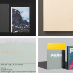
Flow Festival 2015 by Bond
Opinion by Richard Baird Posted 24 November 2015
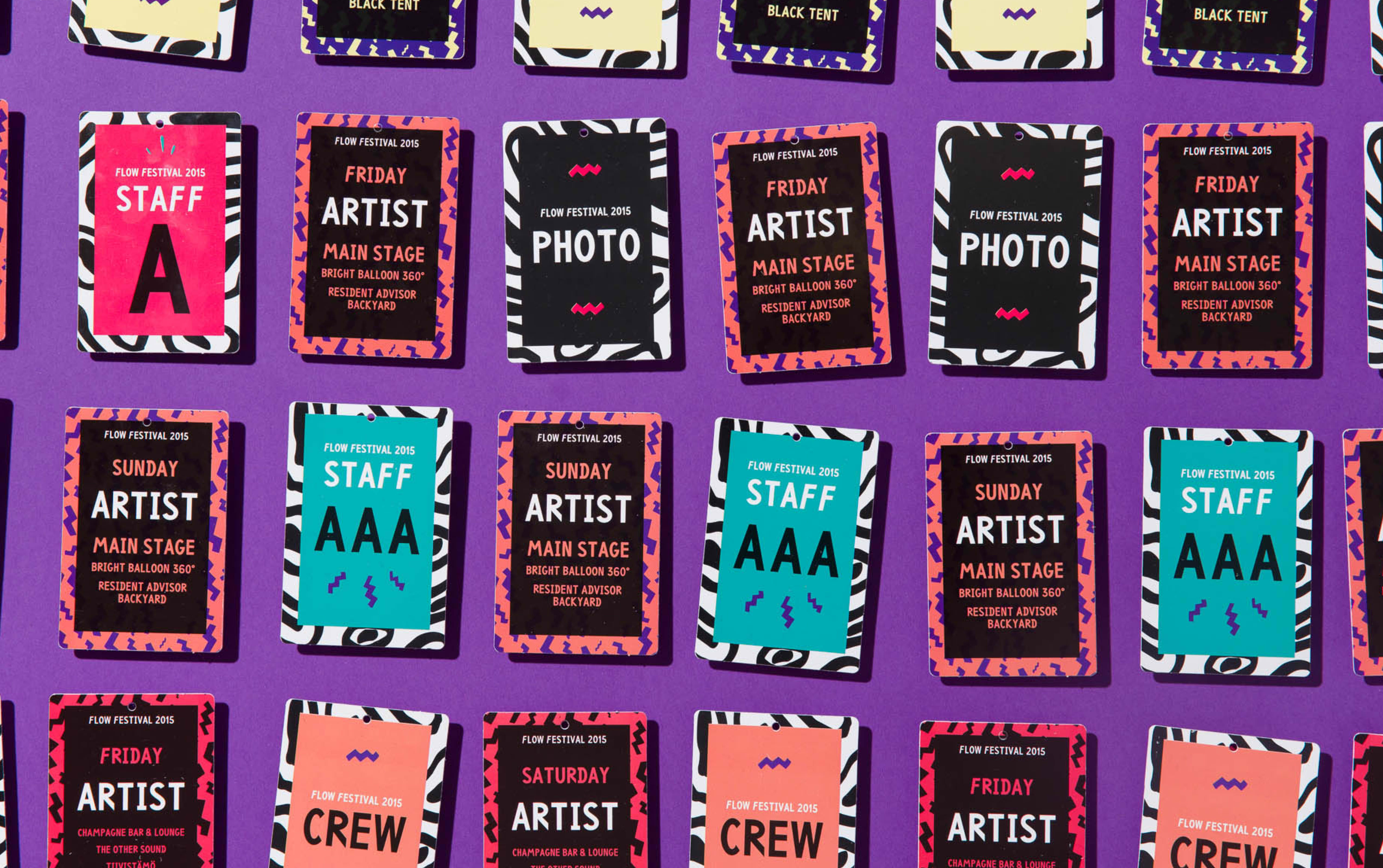
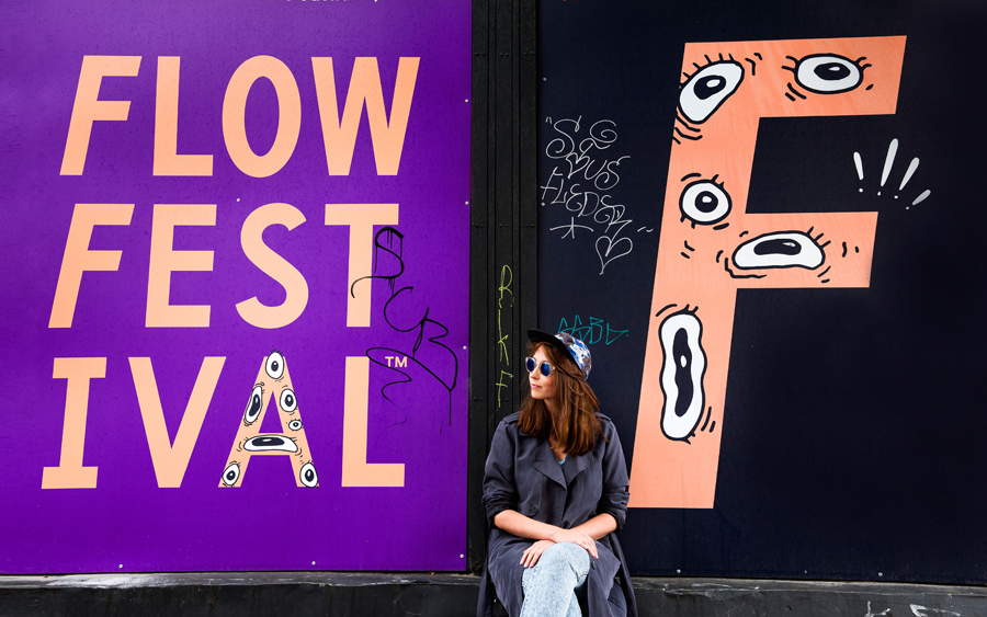
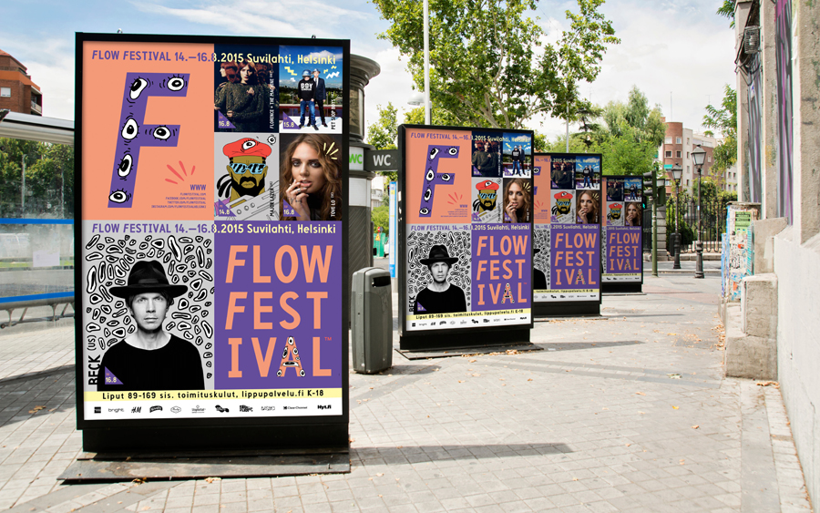
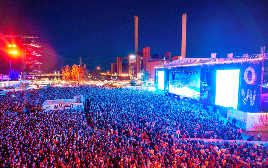
Flow is an annual three day music and arts festival that this year took place across the weekend of the 14th of August in Helsinki, and played host to a variety of artists including Florence and the Machine, Major Lazer, Nina Kraviz and Willey. Finnish graphic design studio Bond worked with the festival to create a visual identity treatment for its 2015 event based around the idea of festival visitors as an urban tribe. This was visualised as new-tribal imagery, a mix of handmade illustration and custom typography, bound by what Bond describe as a quirky yet charming quality, and a colour palette of black and fluorescent inks. This builds on the concept and some of the assets created by Tsto for Flow Festivals between 2011 and 2014.
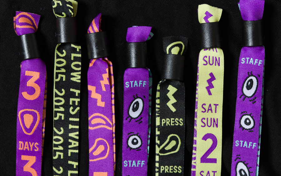
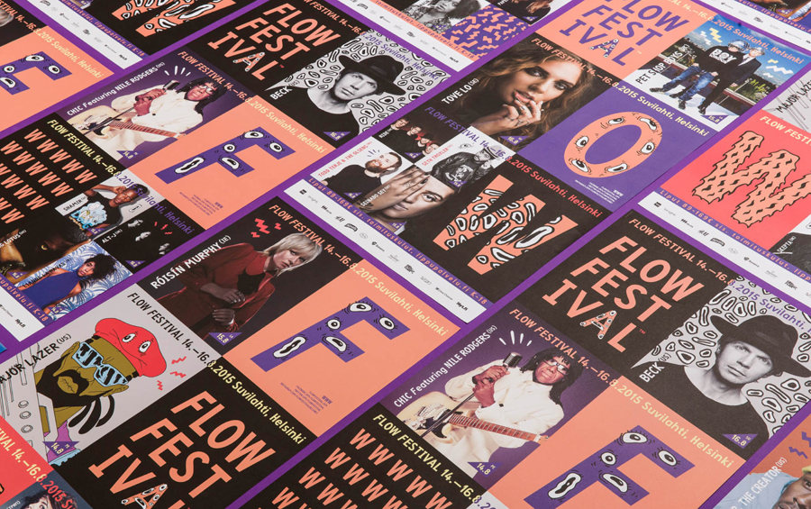
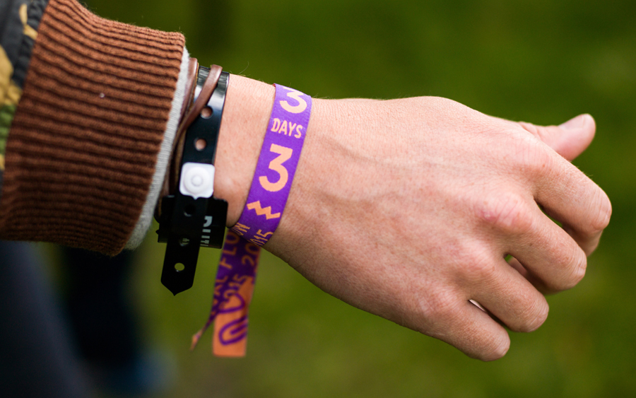
Bond’s treatment is bright, impactful, full of character and energy, and as such, feels well-suited to a contemporary arts festival. The concept of festival goers as tribe members is more visceral than explicit but functions in a similar way, unifying through idiosyncratic imagery drawn from street art and design culture. Brand and tribe become interchangeable, but knowingly, with visual identity applied fervently and consistently across posters, lanyards, balloons and merchandise.
It is interesting to compare Tsto’s early work for Flow Festival 2011 and 2014, with that of Bond’s this year. Both approaches share the concept of urban tribes (the leveraging of iconography, typography, imagery and language familiar and appealing to particular groups), however, Bond’s opens this up with a style that moves more towards the commercial and broadly accessible yet still has its own character that people can identify with.

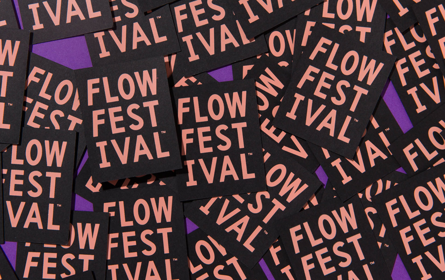
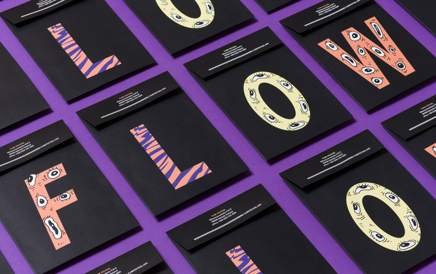
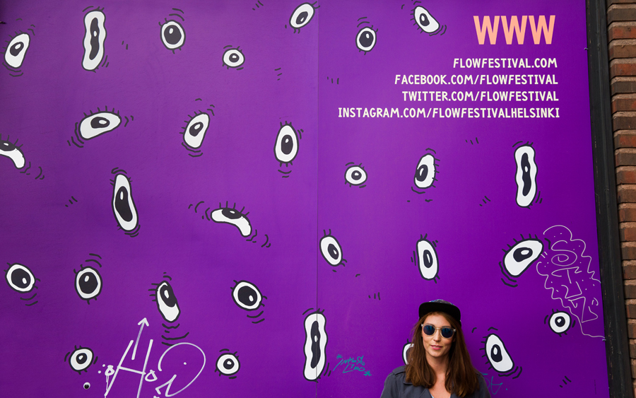
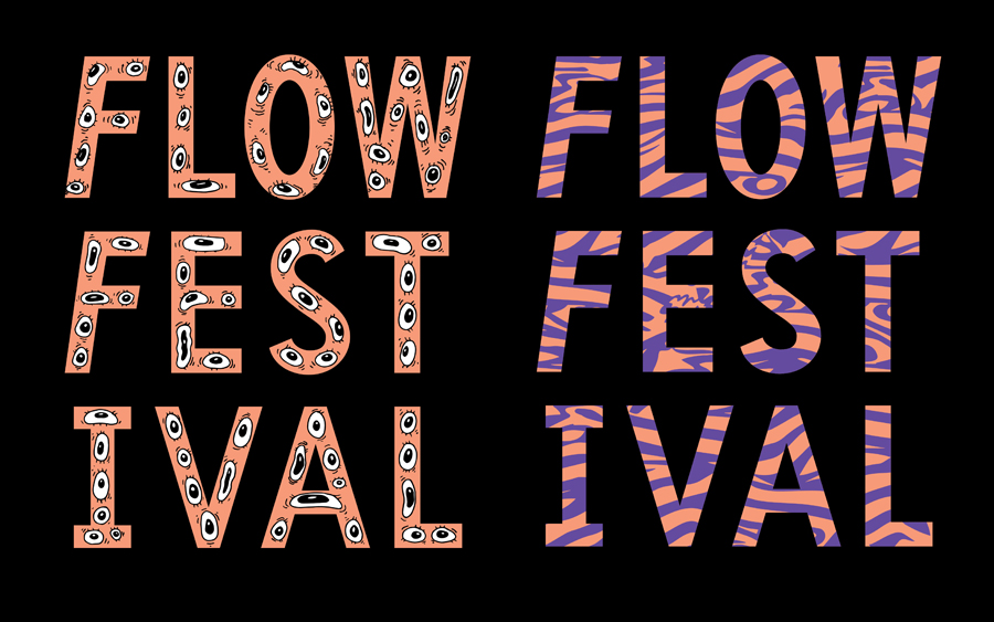
As a motif that transcends individual tribes and cultures, the recurring use of eyes is a particularly neat idea, and is given a current quality in its loose quirky rendering, excessive use, and its pairing with an uppercase sans-serif designed by Tsto. This sans-serif is described as being influenced by the contemporary central European trend of postmodern craftsmanship, which feels like another group/tribe reference.
Other highlights include a good use of contrast in irregular and precise typographic form, black and fluorescent ink that shares some of the qualities of bright stage lighting across a dark sky, and patterns, that when cropped, appear to draw reference from animal pelts. More from Bond on BP&O.
Design: Bond. Opinion: Richard Baird.
