Flamingo by Bibliothèque
Opinion by Richard Baird Posted 27 November 2015
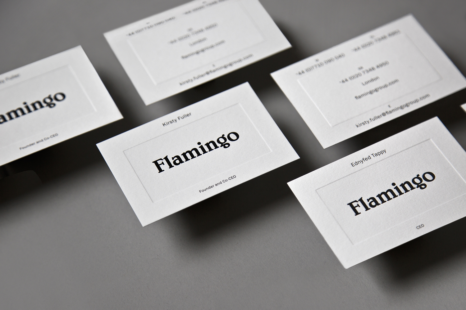
Flamingo is an insight and strategy consultancy, founded by Kirsty Fuller and Maggie Collier in 1997, that works with businesses, and at the intersection of people, culture and brands, to help enrich lives by shaping culture and evolving behaviours. The consultancy is described as a group and not just a network, collaborating and sharing across its seven offices throughout Europe, Asia, India and South America.
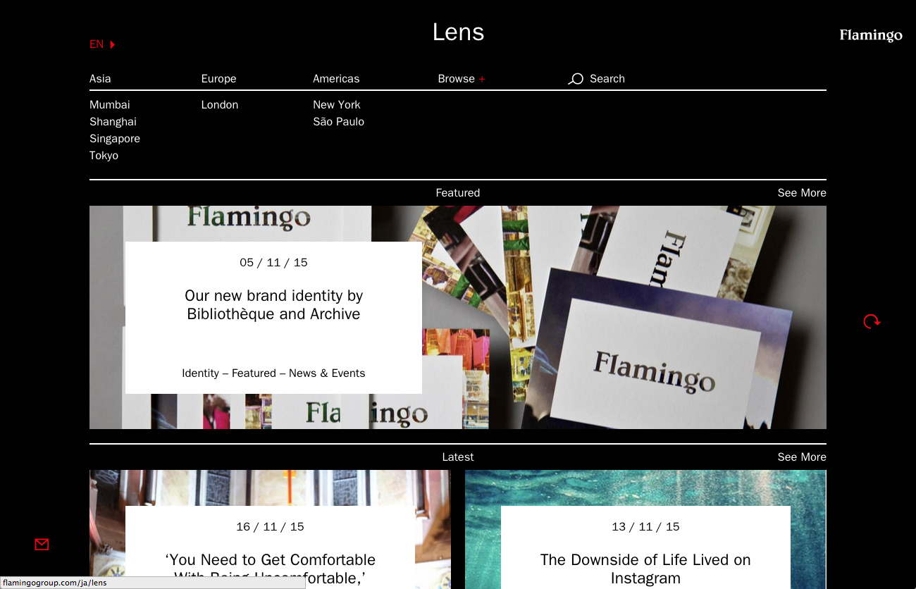
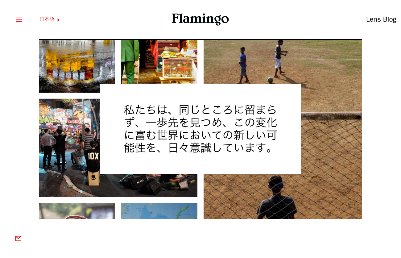
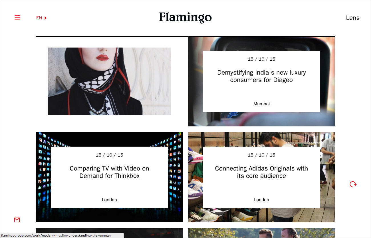
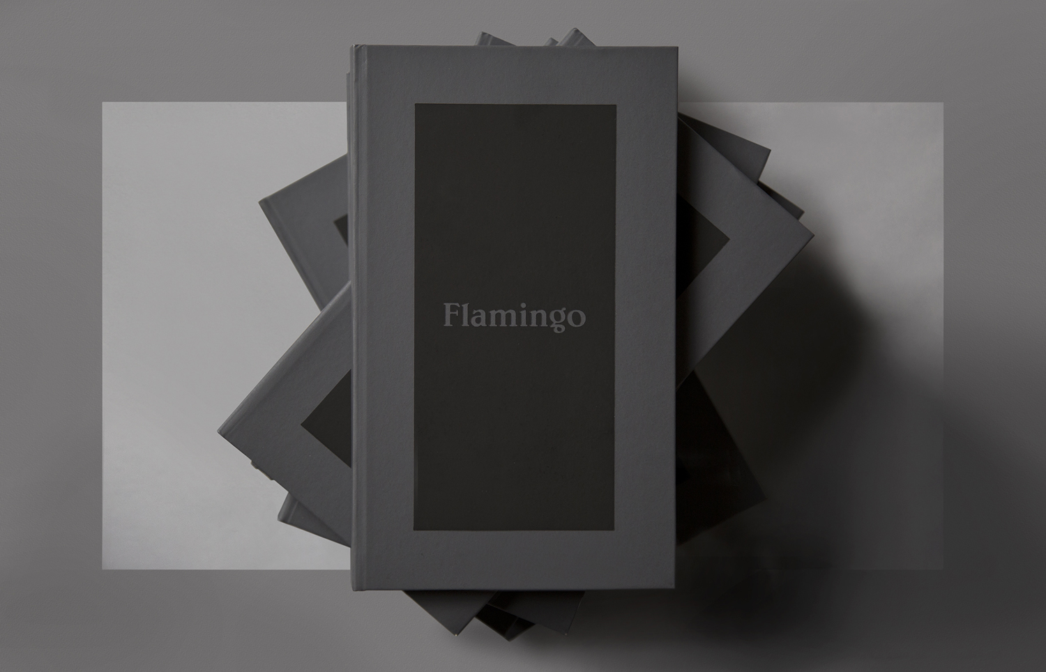
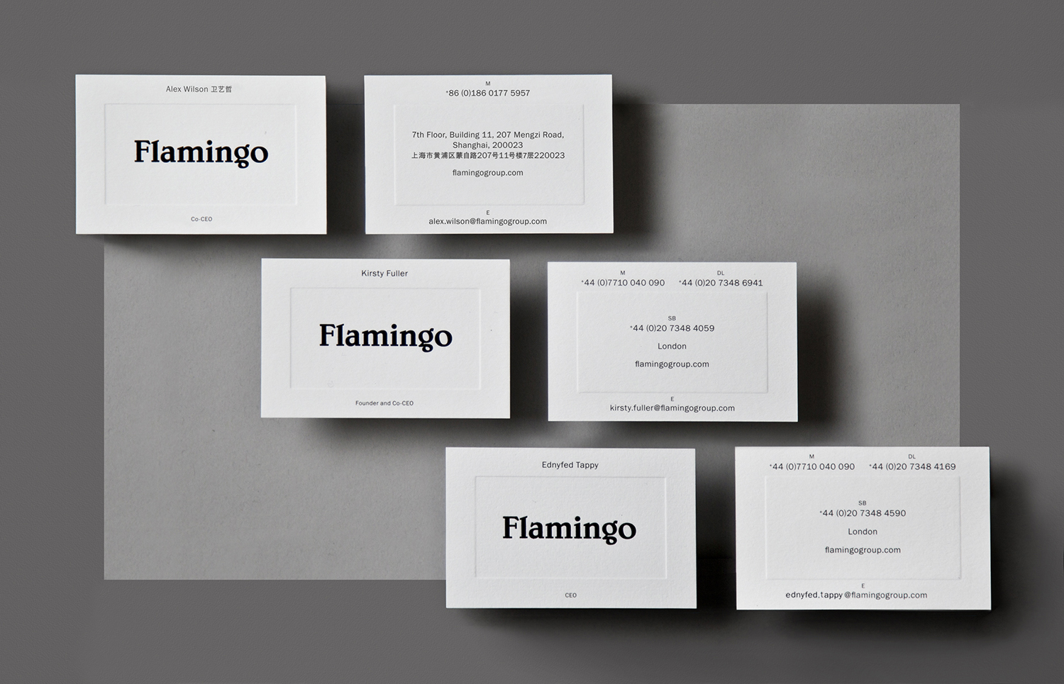
Flamingo recently worked with London based graphic design studio Bibliothèque to create a new brand identity and visual language that would better reflect who they are, and would speak clearly about their broad range of specialisations. This new brand identity extendeds to printed materials that included business cards, postcards, book cover and tote bags, and an online presence developed in collaboration with Archive Studio.
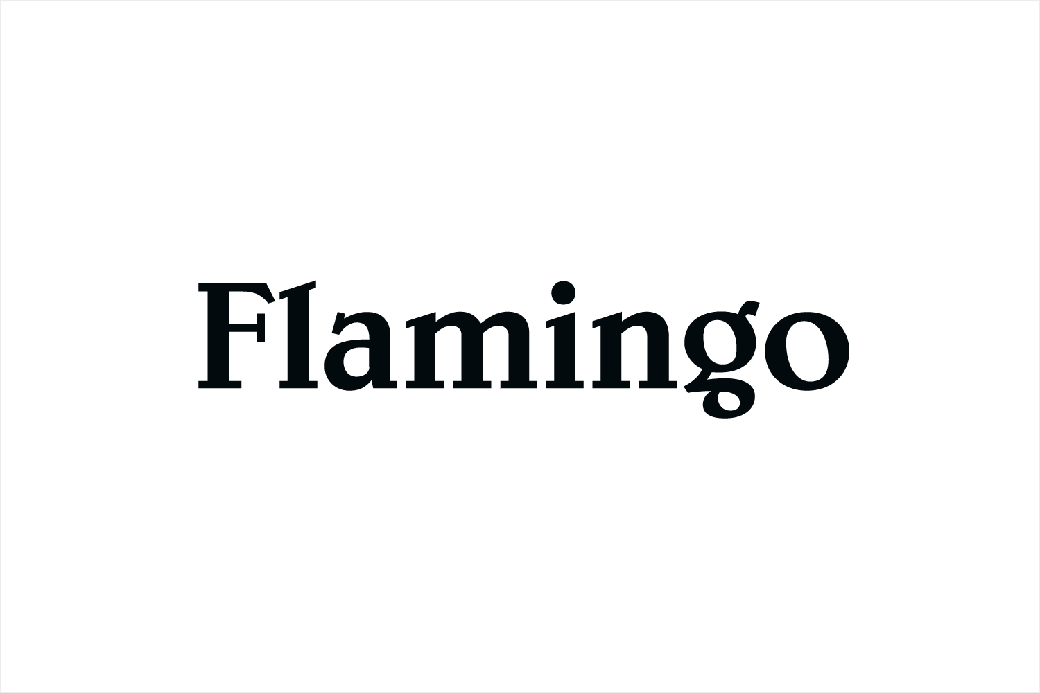
Flamingo’s growth is attributed to its refusal to be pigeon-holed or be constrained by industry expectations. This is clearly reflected by a logotype, built from what looks like Belwe, that pretty much defies corporate convention.
Belwe is a distinctive choice. Rather than an impersonal corporate efficiency, often characteristesed by an economy of form and a consistency of line, there is flourish, contrast and character, particularly across the F, A and G. Taking inspiration from blackletter, and in conjunction with intentionally irregular and unusual proportions, the logotype feels distinctly human and personal, well-suited to a business about people and culture, and a name like Flamingo.
The more reductive letterforms of Franklin Gothic, used online and across business cards to deliver information, works well to emphasis the idiosyncrasies of the logotype, introduces depth and contrast with a straightforward communicative clarity. This continues in the use of language and through a predominantly black and white colour palette.
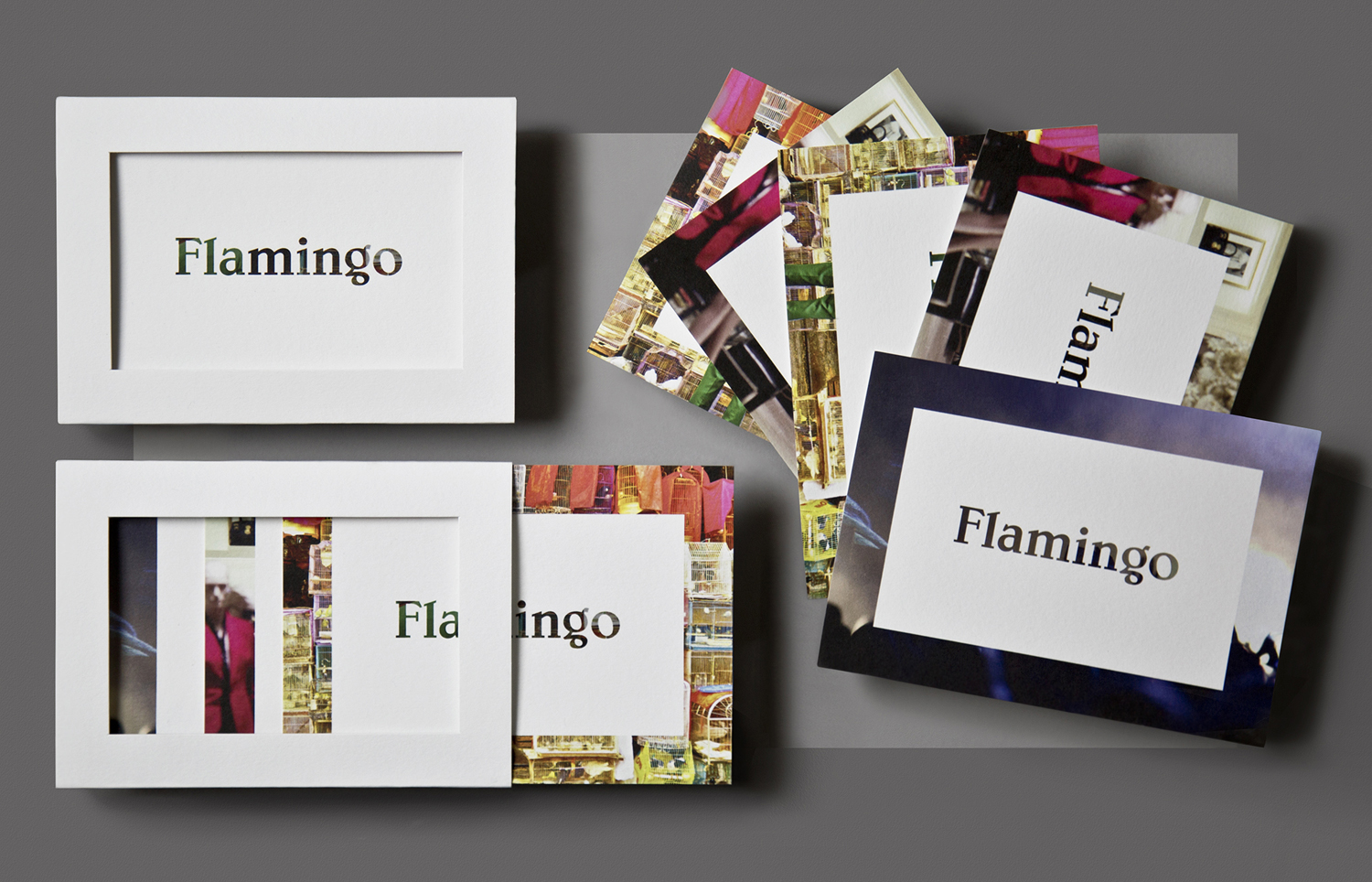
“At the foundation of the identity is the ‘Cultural Lens’ – a way to take ownership of the amazing array of cultural content, that Flamingo both understands and generates. This strong visual framework enables a ‘reveal’ of its content, as a metaphor for the Flamingo viewpoint on the world.” – Bibliotheque
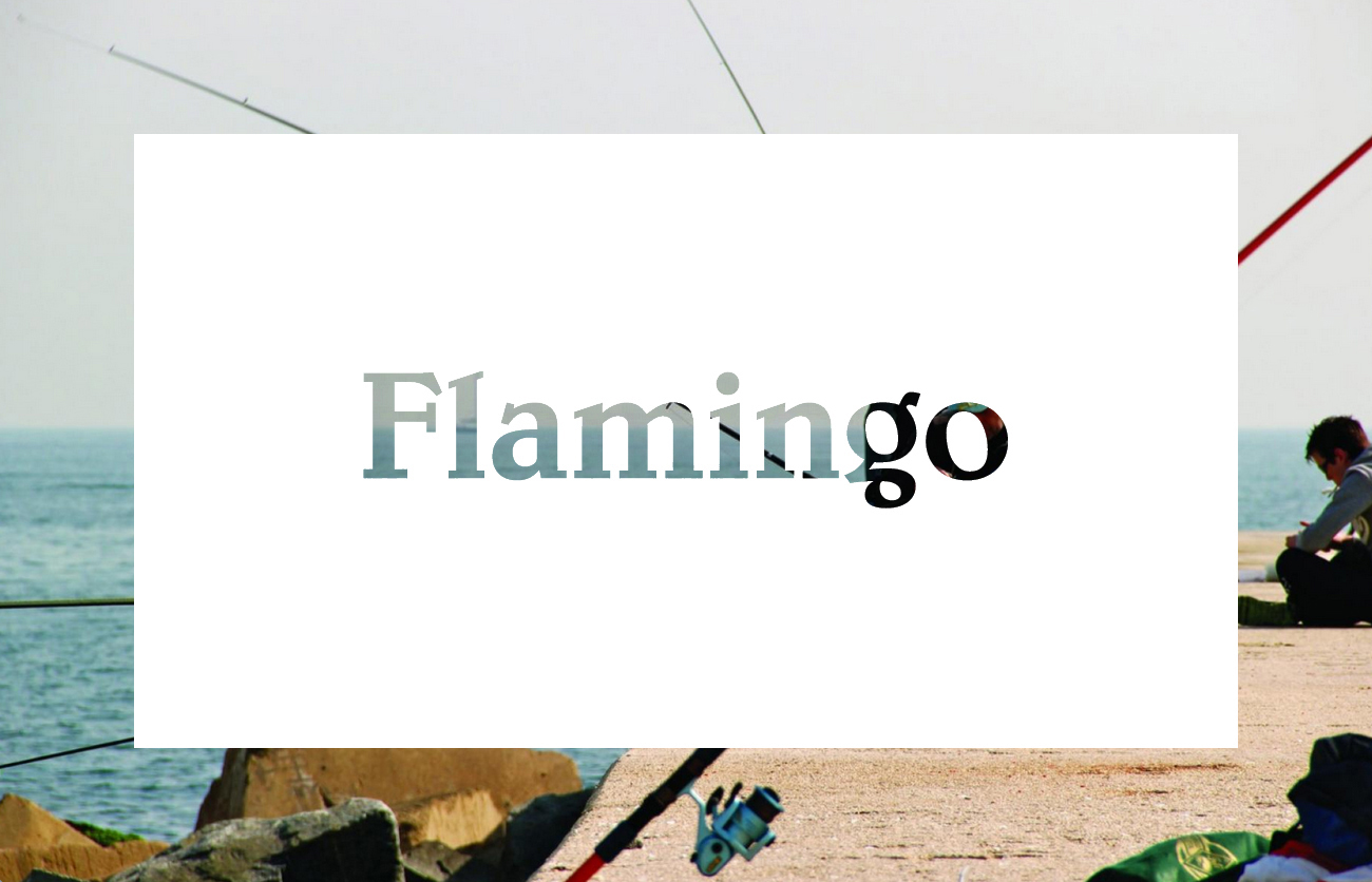
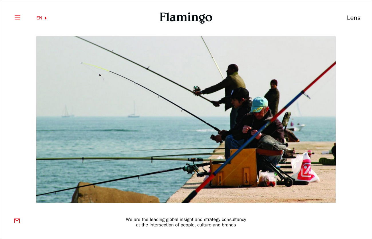
The white box, obscuring photography, much like the logotype, defines convention. Where you often expect identity to frame image, here, image literally frames identity and fills logotype, which is attributed the qualities of a lens from which to look through. It is a challenge to think about the periphery, question its communicative intention, and the positioning of the business. Conceptually and aesthetically this shares a little in common with Barnbook’s The Next Day album cover for David Bowie.
Metaphorically, there is also a bit of weight, Flamingo is placed at the heart of culture, as depicted by placing logotype over a diverse set of images and, by using a framing device, draws on the theme and act of revealing insight.
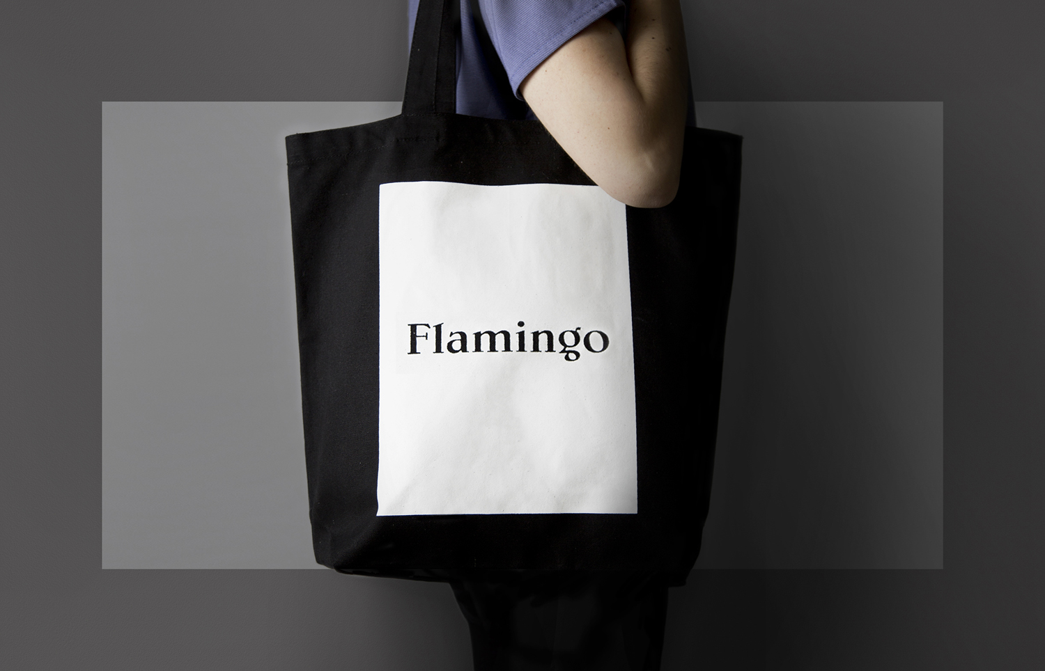
Metaphors aside, the use of space, image and the knock out of the logotype across the postcards, the blind emboss of the business cards, and large screen printed white panel of the black tote bag is visually appealing without feeling superfluous or gratuitous.
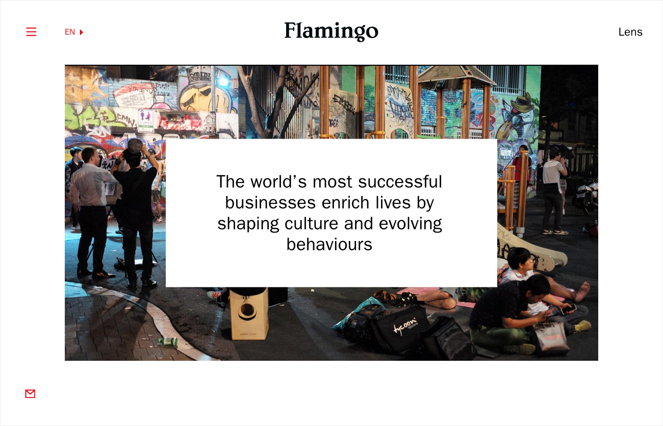
“The website, in collaboration with Archive Studio, provides the key platform for the sharing of Flamingo’s rich seam of content. A go-to place, that helps inform businesses with a common need for consumer, cultural and strategic expertise – to help create opportunities for growth.” – Bibliotheque
The connection between print communication and website is strong and consistent. The reveal of the postcards is given fluidity and motion online, image punctuates space and the white box is filled with straightforward and concise language delivered through precise sans-serif letterforms.
At its most basic, Bibliotheque’s work for Flmamingo is visually distinctive, consistent and communicatively clear. Conceptually, there is plenty of weight to the use of contrast, in type flourish and reduction, image and space, and the ideas attribute to the framing device.
Design: Bibliothèque.
Website: Archive Studio & Bibliothèque.
Opinion: Richard Baird.
Fonts Used: Franklin Gothic & Belwe
