Bord 13 by Snask
Opinion by Richard Baird Posted 30 November 2015
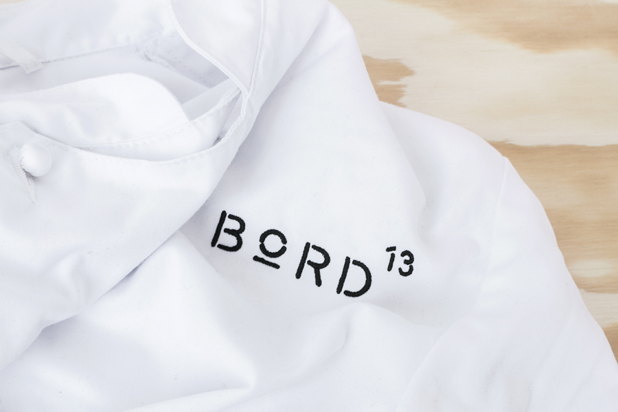
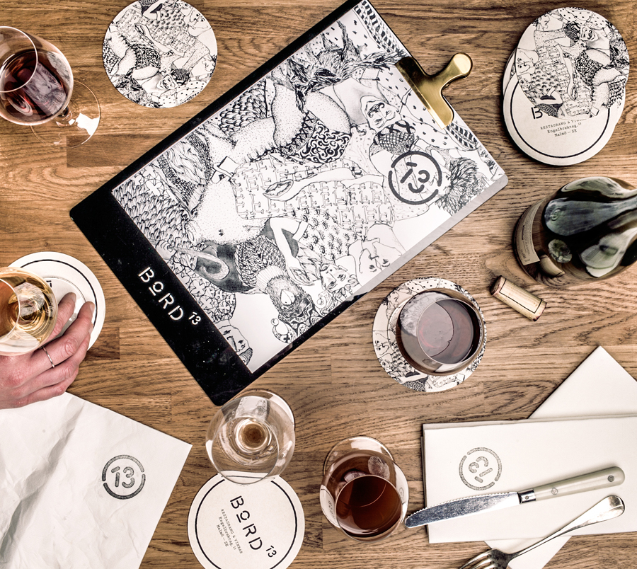
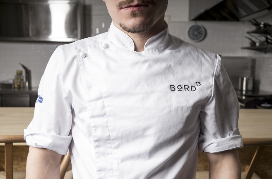
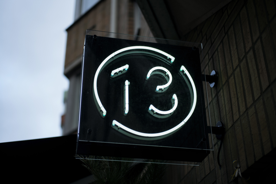
Bord 13 is a restaurant, located on Malmö’s Engelbrektsgatan, with a menu that steers clear of the overfished, the modified and unnatural. It is a collaboration between chefs Robert Jacobson and Besnik Gashi, a former Souschef and a Head Sommelier from world-renowned Noma, and features a brand identity and interior design by Scandinavian studio Snask. This extended to material, lighting and furniture choices, and included menu and coaster design, branded chef whites and signage.
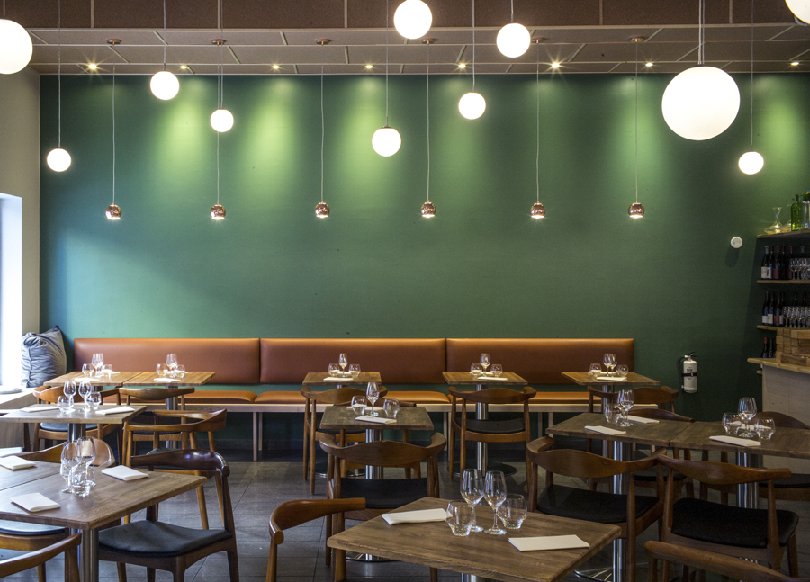
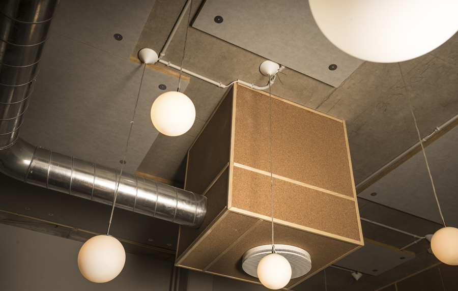
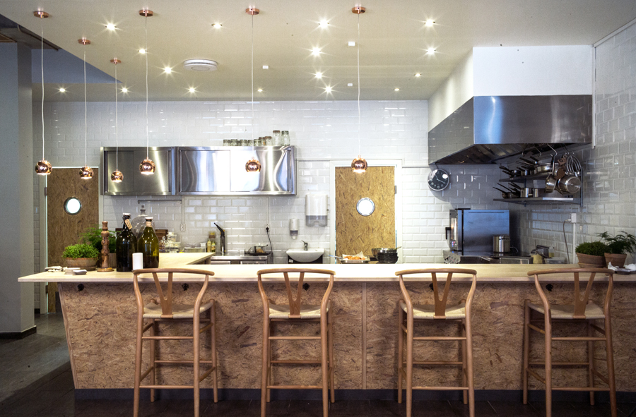
Bond 13 has an unusual and distinctive interior that mixes light and dark wood seating, tan leather upholstery, low hanging lighting, copper details and an open kitchen of stainless steel and white tiles with the utilitarian qualities of chipboard, concrete, corkboard and exposed ventilation.
The restaurant’s character, as you would expect, is effectively and primarily delivered through interior experience, with brand identity reflecting its concept and aesthetic through type, material choice and print finish, whilst introducing its own layer of detail and personality through illustration.
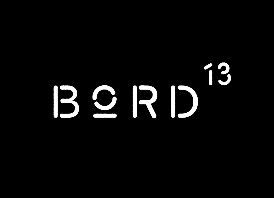
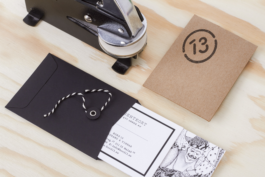
The industrial and utilitarian components of interior are clearly reflected within the of stencil cut, geometric and monolinear characters of the logotype, a monospaced typewriter typeface and an economical colour palette. The more crafted components are emphasised using uncoated and unbleached boards, and the finishes of a hand stamp and blind emboss.
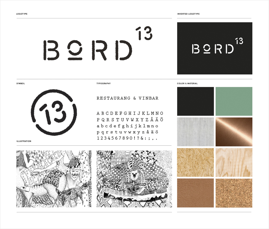
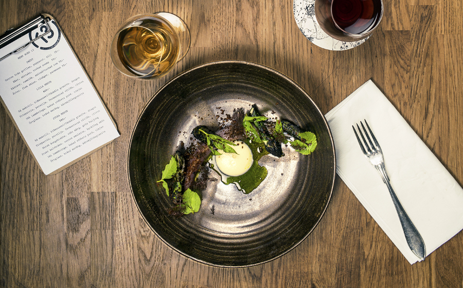
Where type choices are industrial and mechanical in their origins, illustration is irregular, personable and human. These panels, created by Emilie Florin, are rich in detail, visual texture and, again in opposition to type, are unique and full of character.
This character is rooted in the concept of unlucky thirteen drawn from the restaurant’s location on street no.13, the superstitious belief held by chefs that it is bad luck to have a table thirteen, and the name of the restaurant, which also translates as Table 13. This manifests itself as images described by Snask as having a dark side.
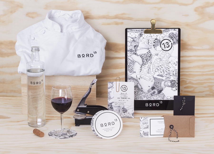
Contrast is used effectively throughout, touching upon the personal and impersonal, the industrial and crafted, space and detail, light and dark, simplicity and complexity, the regular and irregular.
Although not an unfamiliar concept, its continuity, from menu to interior to brand identity, alongside the unusual qualities of illustration and the embracing of superstition, mark this out as something rather interesting and distinctive. More from Snask on BP&O.
Design: Snask. Illustration: Emilie Florin. Photography by Gustav Arnetz. Opinion: Richard Baird.
