The Working Capitol by Foreign Policy
Opinion by Richard Baird Posted 15 December 2015

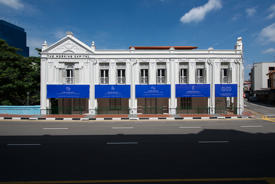
The Working Capitol is a co-working space located within a historic building situated in Singapore’s Chinatown. It is described as being less of a start-up incubator and more of a community of knowledgeable people working at the intersection creativity, technology and business.
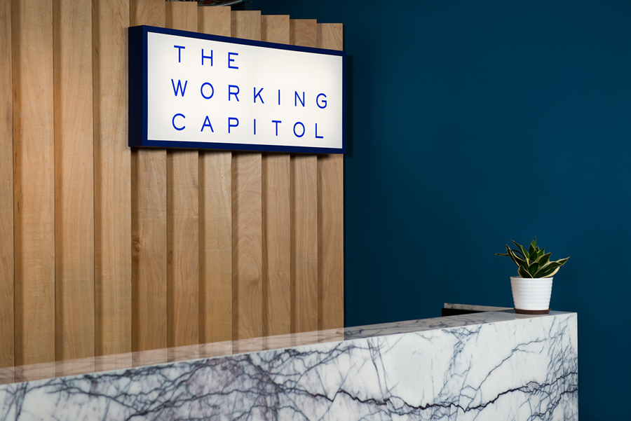
Its brand identity, designed by Foreign Policy, is based around the Euclidean Principle, a mathematical system of basic parts that contribute equally to the whole, without undermining their own individual value. This principle is also the basis of a trisection of brand values; to provide a good quality space, combined with a sense of contemporary lifestyle and the fostering of community.
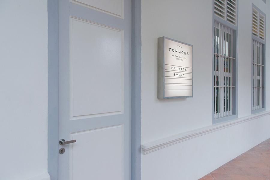
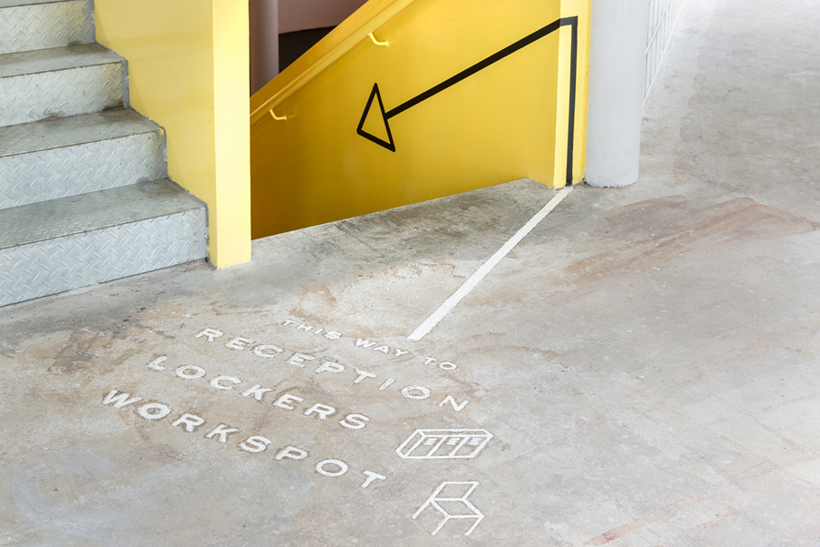
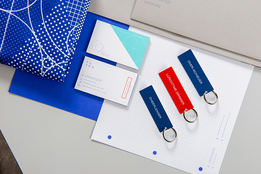
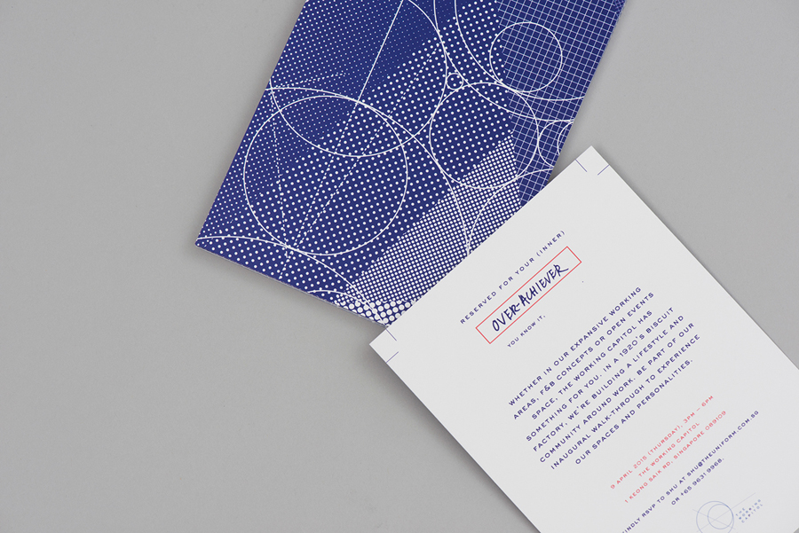
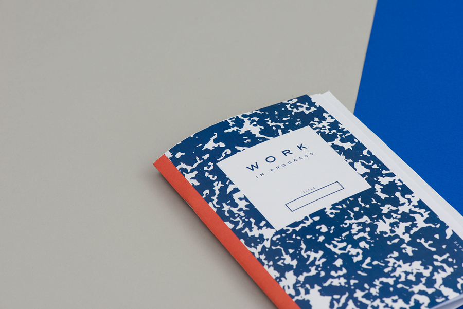
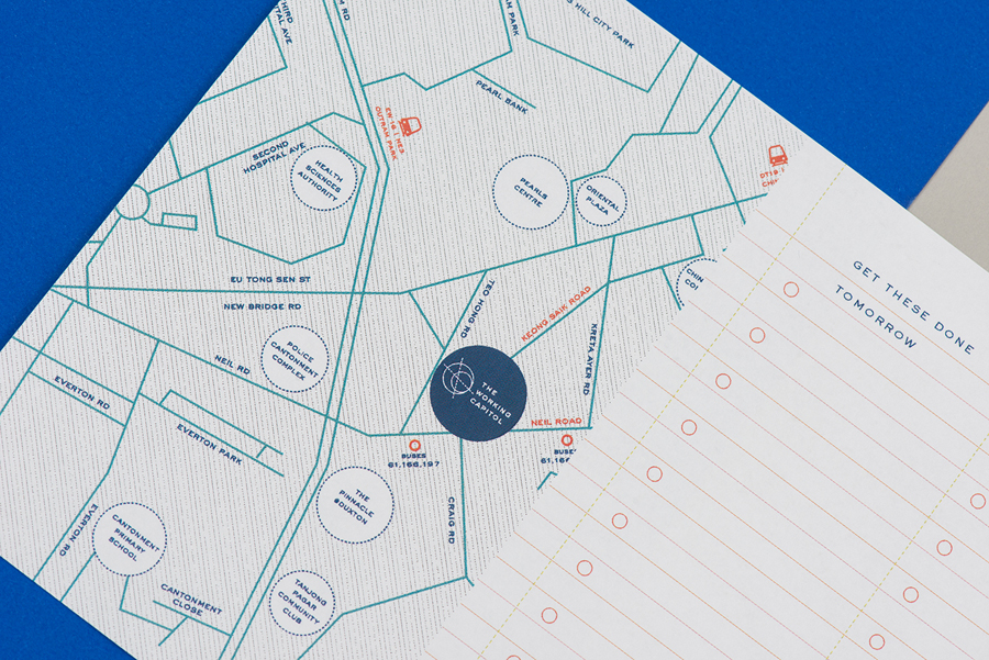
These ideas, and the intersection of disciplines, are conveyed through a visual language that juxtaposes a technical precision alongside the creative and crafted, and throughout an interior of utility and bright colour. This interior draws further impact and distinction from an exterior structure which is firmly rooted in the traditional. The project went on to include signage and wayfinding, stationery and business cards.

It would be difficult not to acknowledge the slightly convoluted nature of the concept, and perhaps an absence of simplicity or clarity in its documentation, however, the logo, a combination of intersecting dashed lines and radiating circles does, to some degree, convey the themes of convergence and spheres of influence that tie in well with a co-working space.
The use of monolinear lines and a generously spaced sans-serif contribute to a general sense of the technical and formal while the interplay of materials, an anamorphic and sculptural approach to signage, bright colour and concise but tongue-in-cheek copy introduces a creative counterpoint, and a conviviality to what is a utilitarian space. Together, these manage to find a balance between formal and creative practices, their collaboration and shared space.
Other highlights include a very clear distinction made, through colour, between wayfinding in yellow and print communication in blue, bound by a shared approach to typography and monolinear iconography, a mix of materials, and details, particularly in signage and wayfinding, that move between the utilitarian, the crafted and the playful. Check out more from Foreign Policy’s on BP&O.
Design: Foreign Policy. Opinion: Richard Baird.
