Grand Ferdinand by Moodley
Opinion by Richard Baird Posted 6 January 2016
Grand Ferdinand is hotelier Florian Weitzer’s fifth hotel. It features a distinctive interior of green leather upholstery and Lobmeyr chandeliers, rooms with ornate and functional furnishings, and a restaurant that is said to serve the best French champagne and the grandest Viennese cuisine, all set within a landmark building located on Vienna’s Ringstraße.
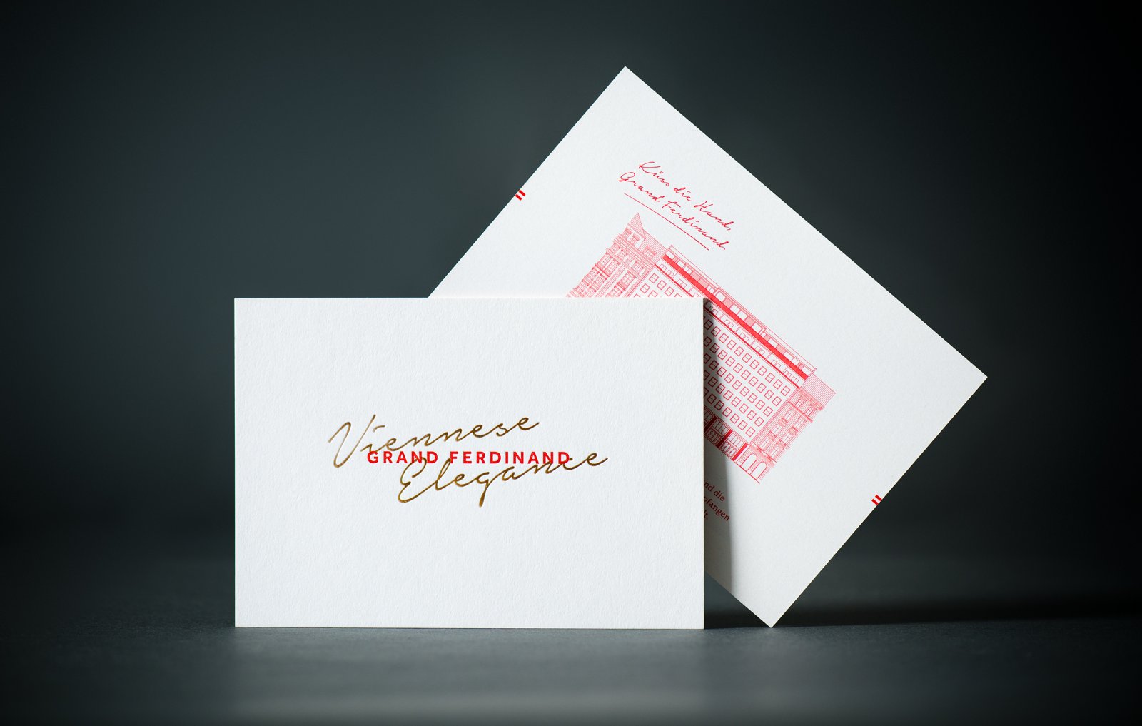
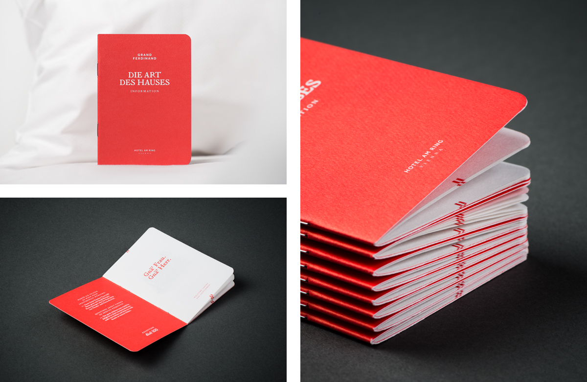
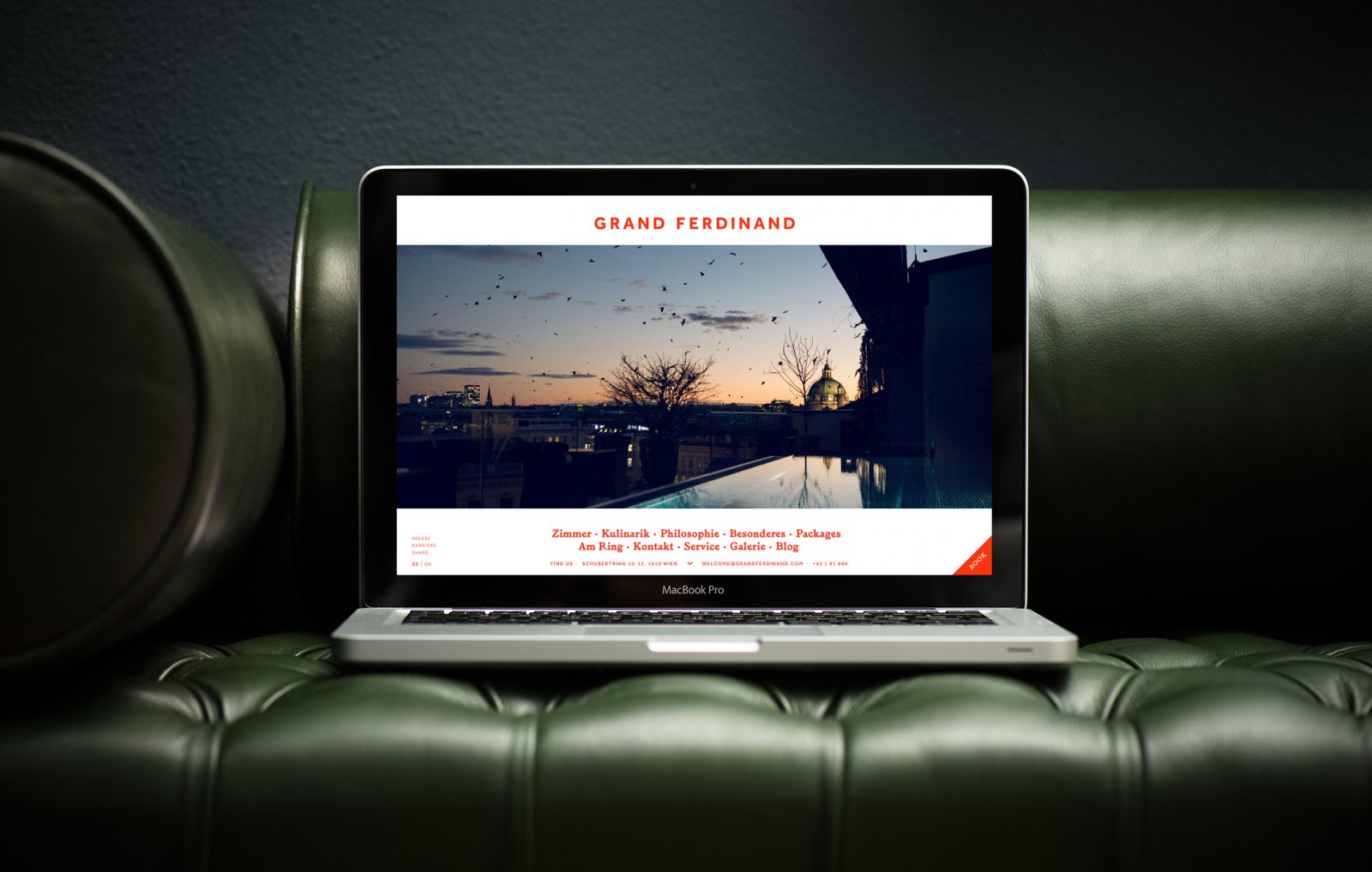
Grand Ferdinand has a philosophy that celebrates the past whilst moving forward. This meeting of tradition and modernity, whilst running throughout the hotel’s interior design and underpinning service practice, also informs its brand identity, created by Austrian graphic design studio Moodley. This encompassed stationery, signage and website design, as well as a variety of printed assets that included menus, posters and postcards.
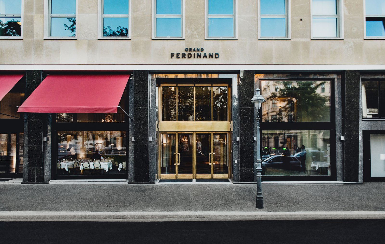
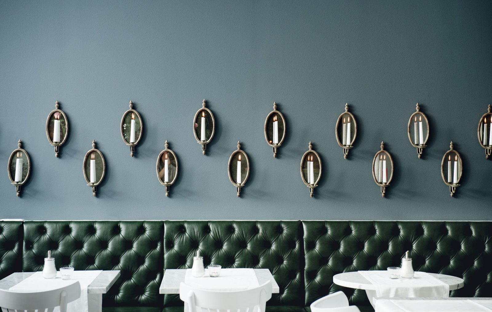
It is worth noting the extent and precision to which contrast exists throughout the hotel’s interior design. The classically ornate sits next to the practical and contemporary, picked out by a striking use of bright white alongside deep greens and greys, while brand identity introduces red. The intersection of past and present is far from an unusual concept, but well implemented, securing memorable character from the unique combination of the familiar bound by a distinctive colour palette.
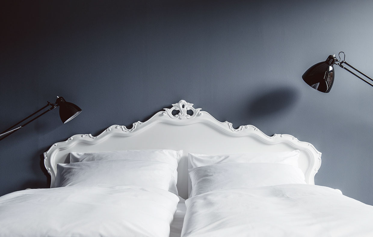
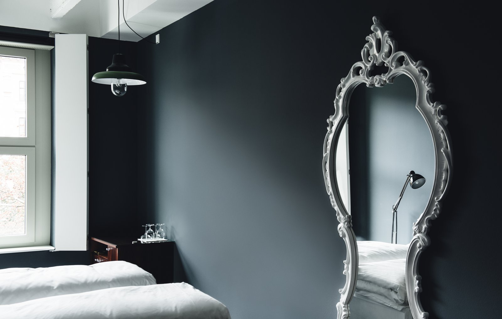
Although there is a lot to look at and a wealth material, print finish and graphic design detail, which is in keeping with the grand and high quality of the hotel’s interior, menu and service, the concept of tradition meeting modernity, and the philosophy that looks to acknowledge the past but confidently move forward, essentially and effectively plays out through juxtaposition, in a multitude of interesting and compelling forms.
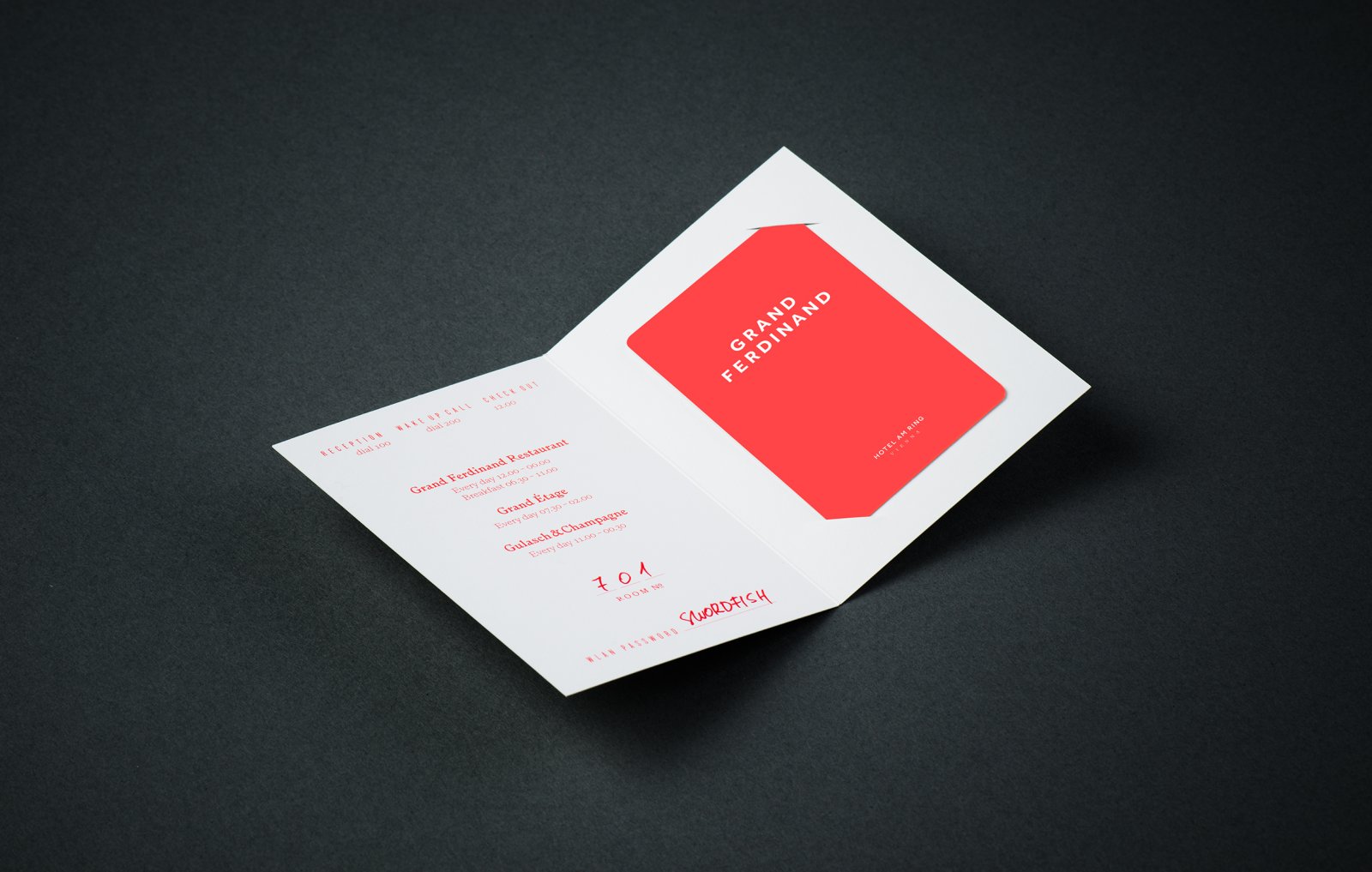
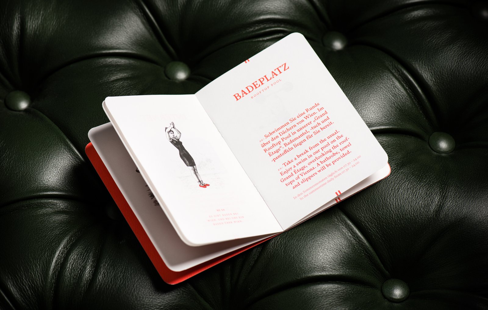
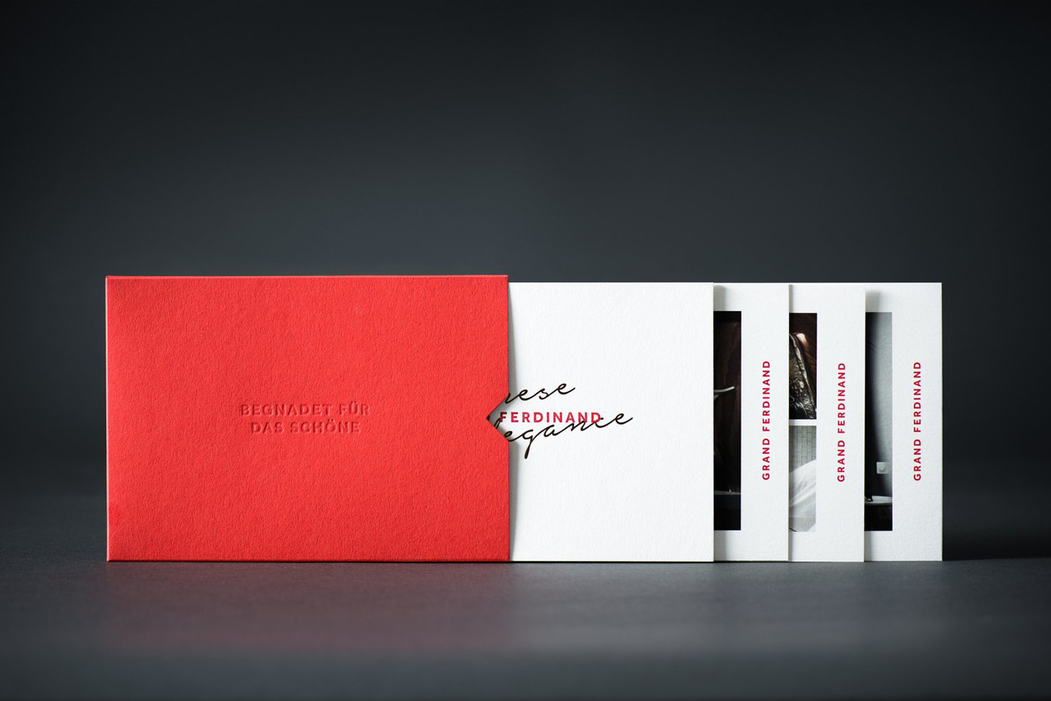
Where there is continuity of concept, brand identity adds a layer of further contrast and communicative detail. The intersection of past and present is perhaps most prominently expressed through a combination of bright red, and classic white papers and boards, and a type combination that mixes a hand written script, the serif detail of Larish Alte and the more reductive qualities of a bold sans-serif.
Brand identity really benefits from the disparate aesthetic qualities of type but also their precise communicative intention, touching upon the personal, the ornamental, and both retrospection and modernity. The typeface Larish Alte, inspired by series of prints and books designed by Rudolf von Larisch published at the beginning of twentieth century, adds character and a period detail alongside the well-spaced, but less expressive logotype.
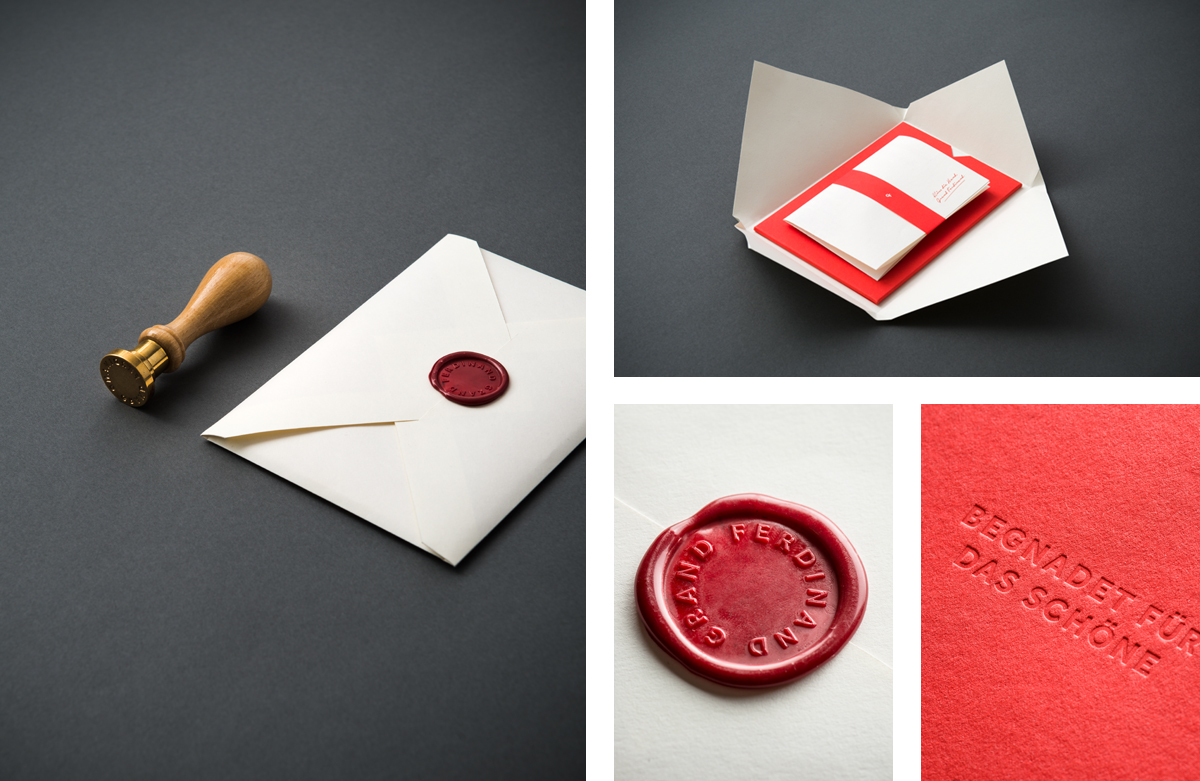
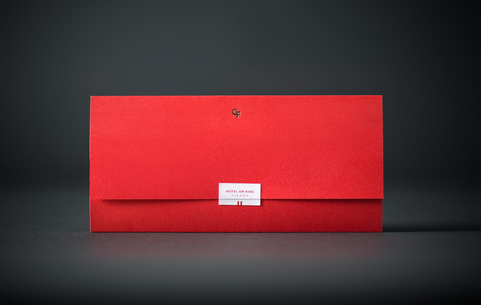
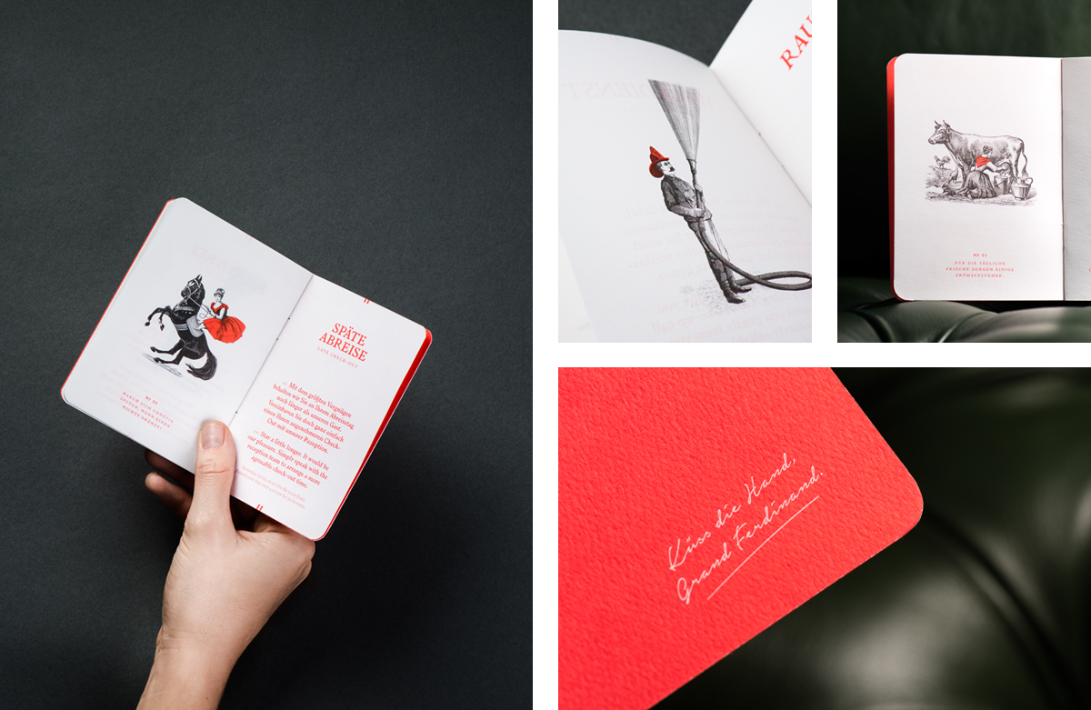
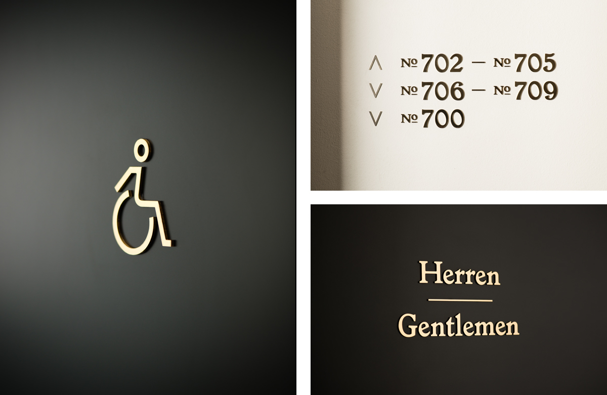
This fusion is the foundation of many of Moodley’s choices. Some of these are a little more nuanced, such as etched and more precise illustration, the blind embossing of the logotype, the gold foiling of a simple monogram, where others are more obvious. These include the thoroughly current monolinear iconography and Larish Alte that makes up interior signage and wayfinding.
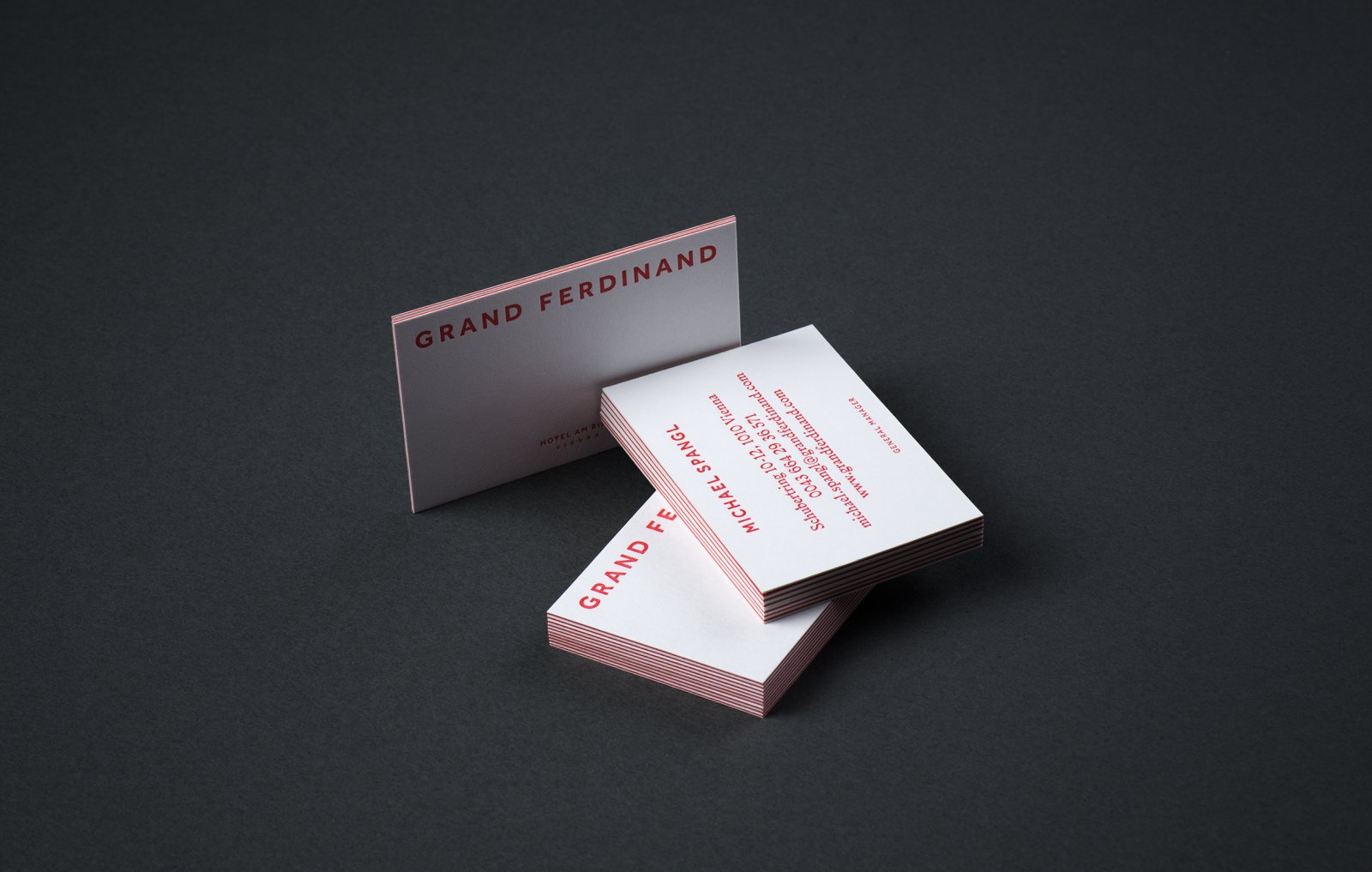
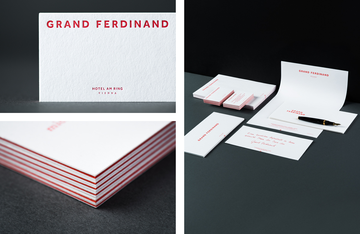
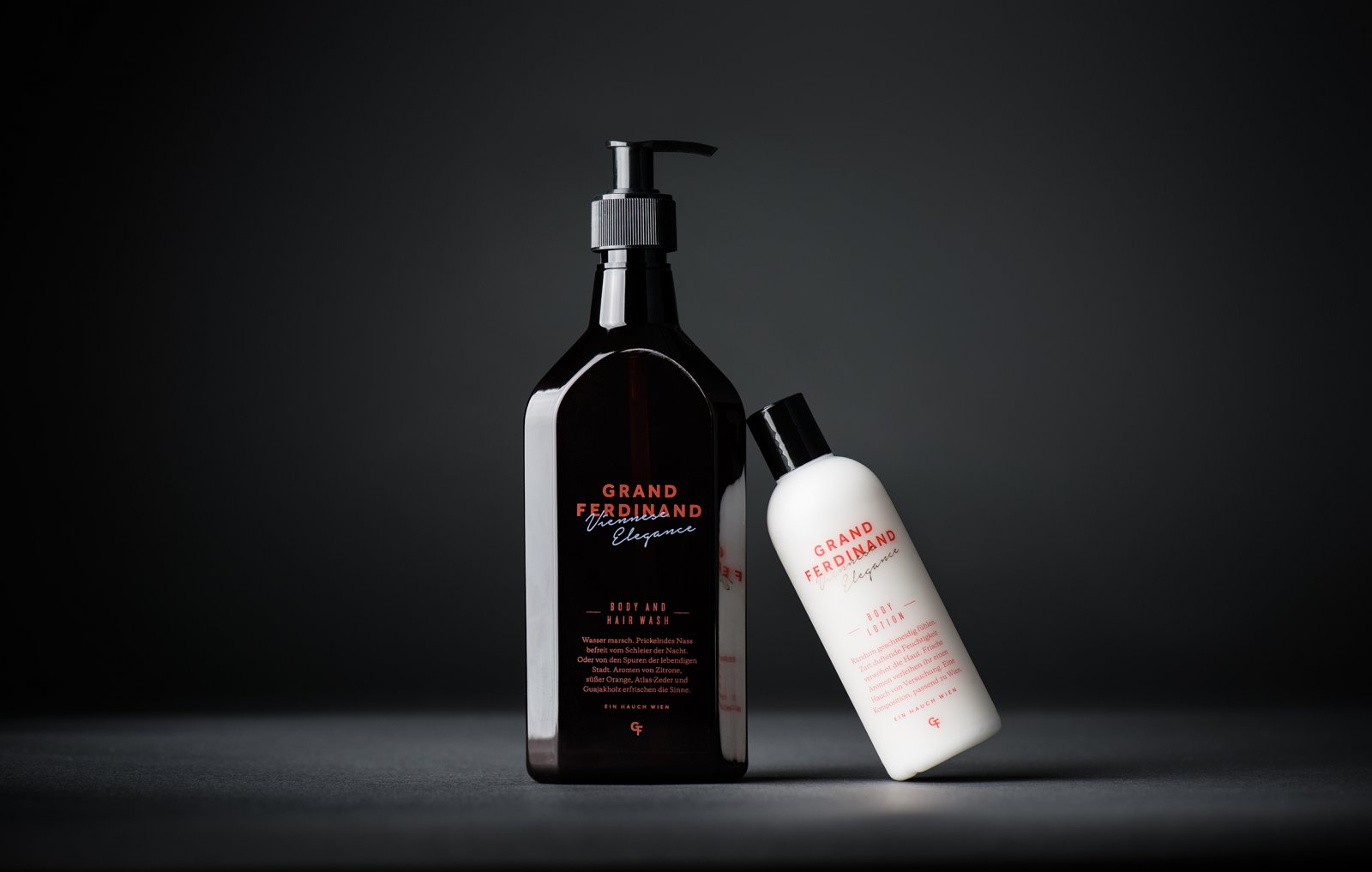
Other traditional details include a wax seal which builds on the personal qualities of the script, the structure, colour and gloss of the soap bottles, uncoated materials, the way the envelopes fold out, black and white photography, and the weight of triplex business cards. There is a lot of detail, much more than those picked out in this article, but each with a clear intention and well-balanced, with colour palette working well to hold it all together, and introducing a bright shot of colour within the context of the deeper shades of the interior design. More from Moodley on BP&O.
Design: Moodley. Opinion: Richard Baird. Fonts Used: Larish Alte & Effra.
