Mercer Supply Co. by Peck & Co.
Opinion by Richard Baird Posted 3 February 2016

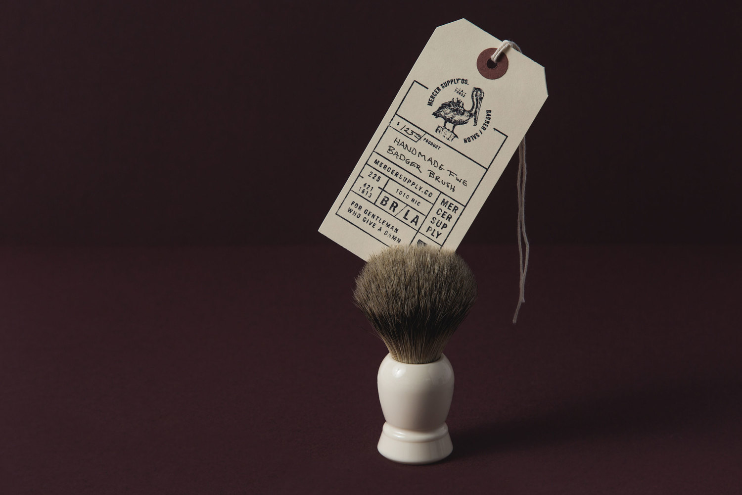
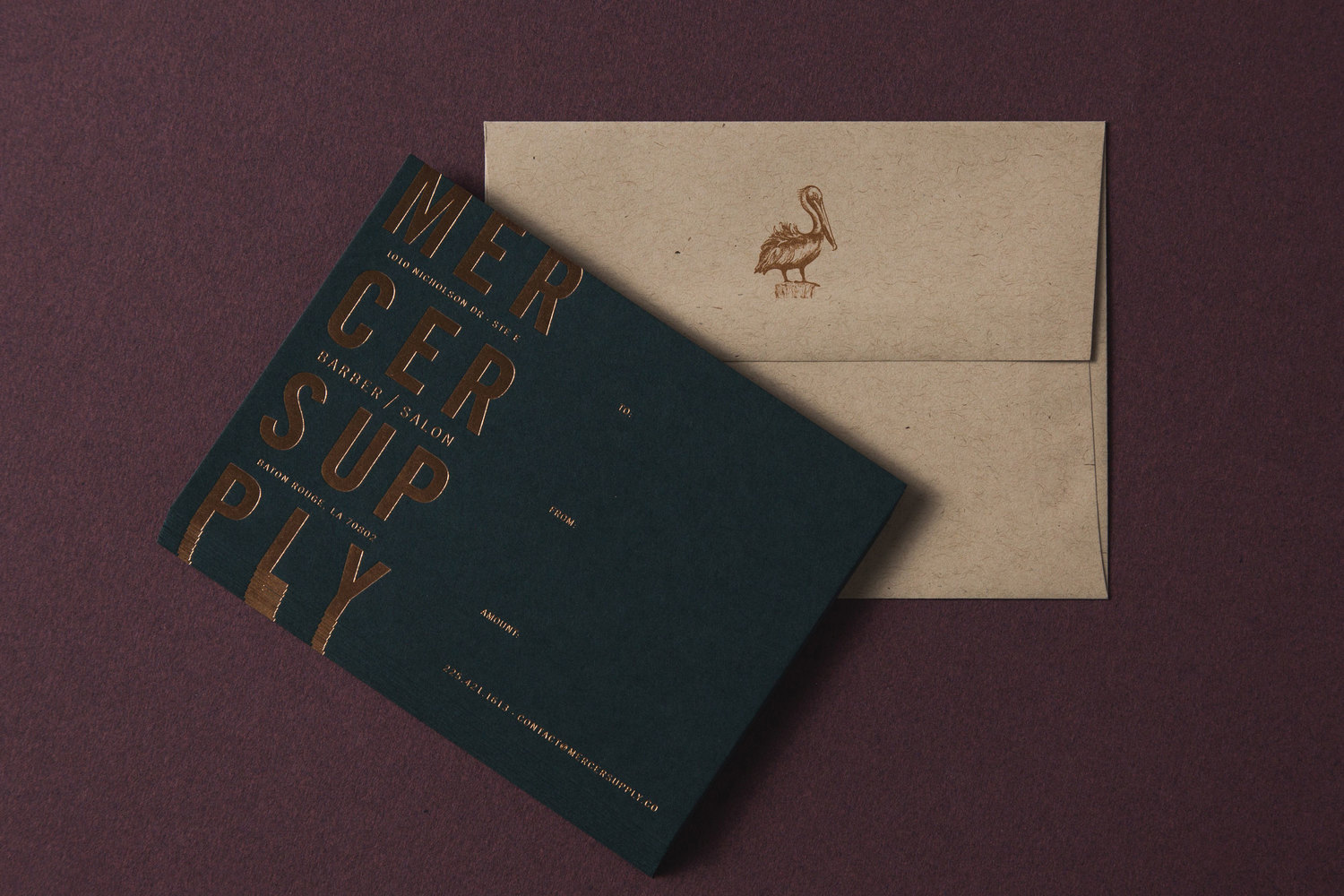
Mercer Supply Co. is a barbershop, salon and retailer that provides high-end grooming goods and services to the modern man and woman of Baton Rouge, Louisiana. The salon has an interior design of polished concrete flooring, exposed trusses, Edison bulbs, panels of wood, leather furniture and waxed denim aprons. It is thoroughly current in its mix of the hardwearing, utilitarian and the traditional. This is also expressed throughout its brand identity, designed by Tennessee studio Peck & Co., using type, illustration, material choice and print finish across bags, notecards, business cards, stationery, swing tags, tissue paper, coasters, and website.
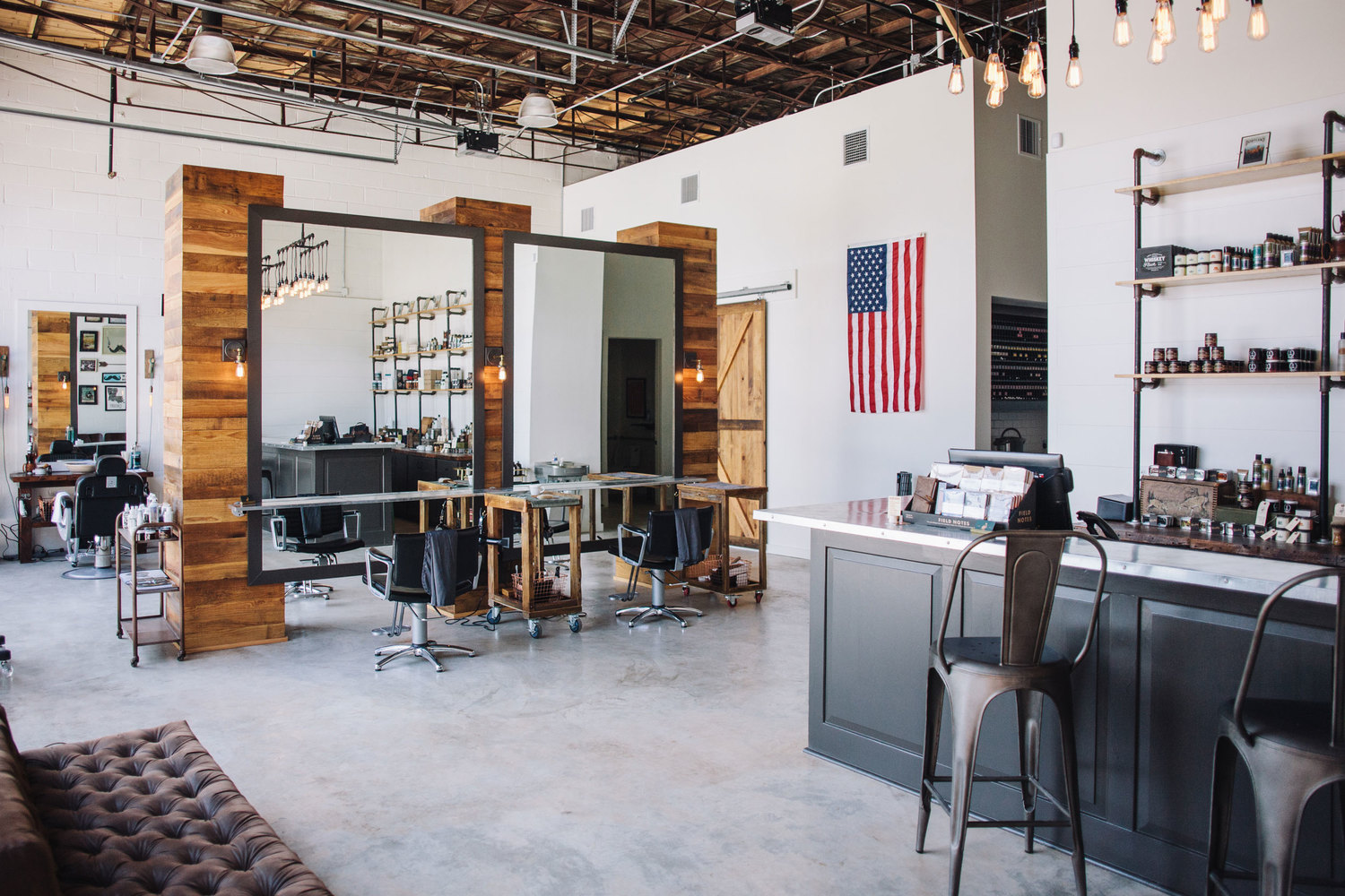
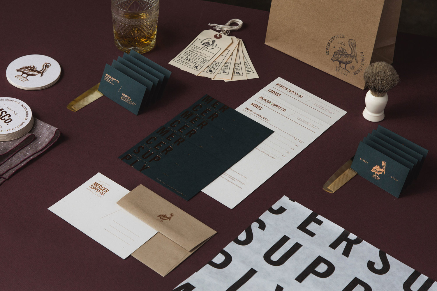
The bold and robust interior manifests itself well across Mercer’s brand identity through bold condensed sans-serif typography, often oversized and cropped in print (which gives it a reclaimed quality), the choice of uncoated and unbleached papers, and heavy boards. These set a rough, rugged and utilitarian quality that mix an import aesthetic, which ties in well with supplies, with a contemporary take on the traditional barber’s shop.
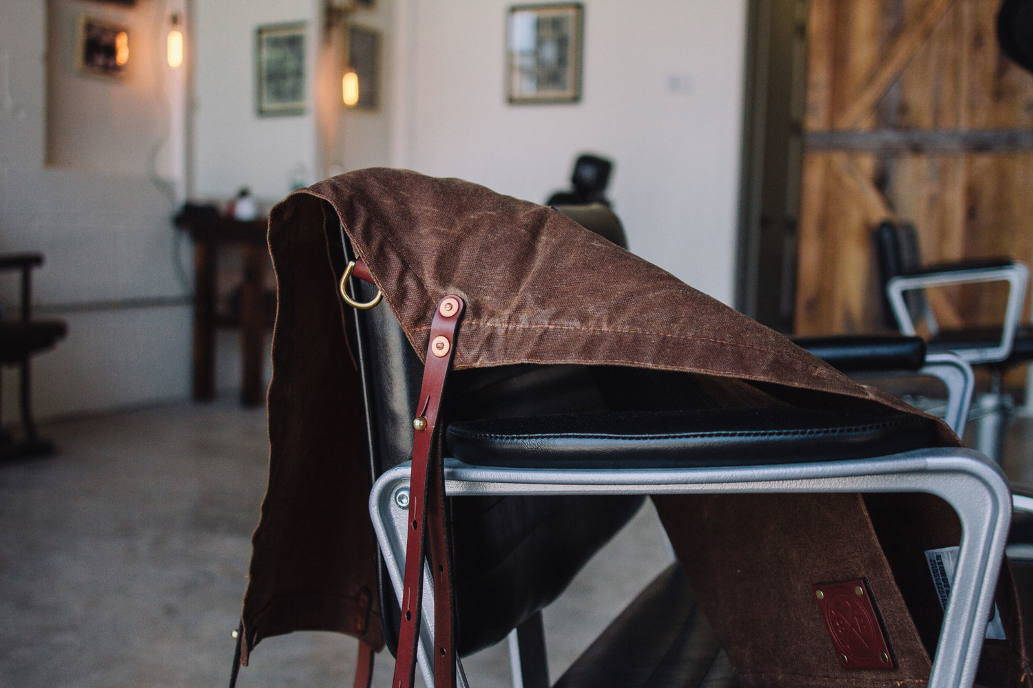
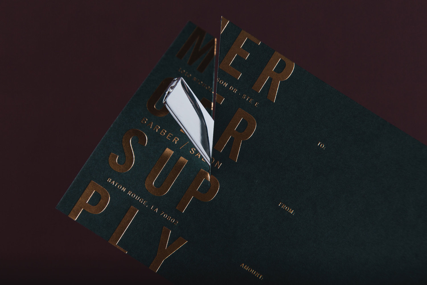
The generous and extensive use of a copper block foil, the etched qualities of the pelican, the aged and period set-up of stylist photography online, as well as the cut and material of the swing tag clearly draw on the past, and play with the perceptions of traditional services and values. This gives a little more depth and texture to the heavy and utilitarian qualities of type, and communicates a sense of high quality.
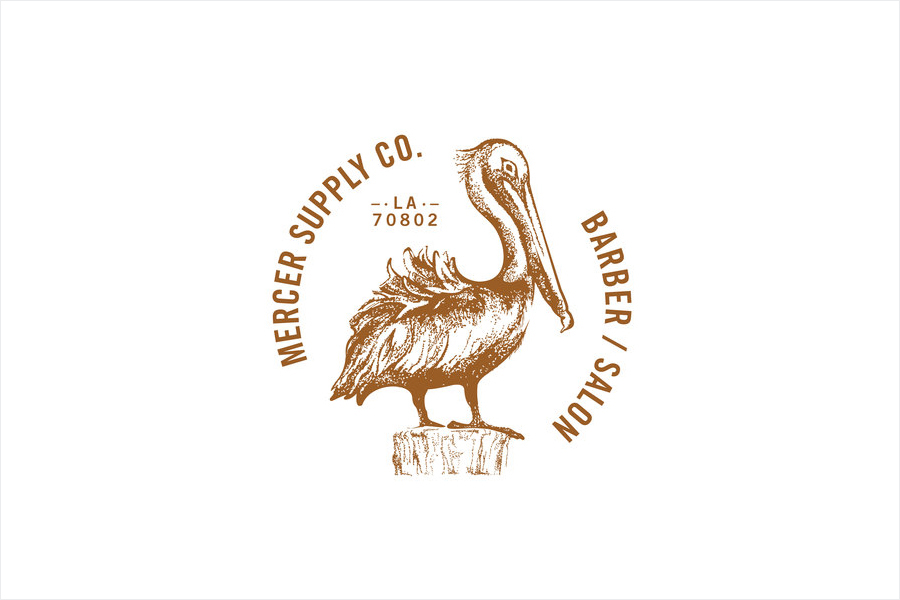
The roundel and logotype are well constructed. Both do a good job of leveraging retrospective detail but with a contemporary eye for space, typesetting, balance, detail, reduction and contrast. The pelican looks particular nice, functioning as a proud icon that looks ruffled, and an asset that has a more authentic period quality, where others details are perhaps polished interpretations.
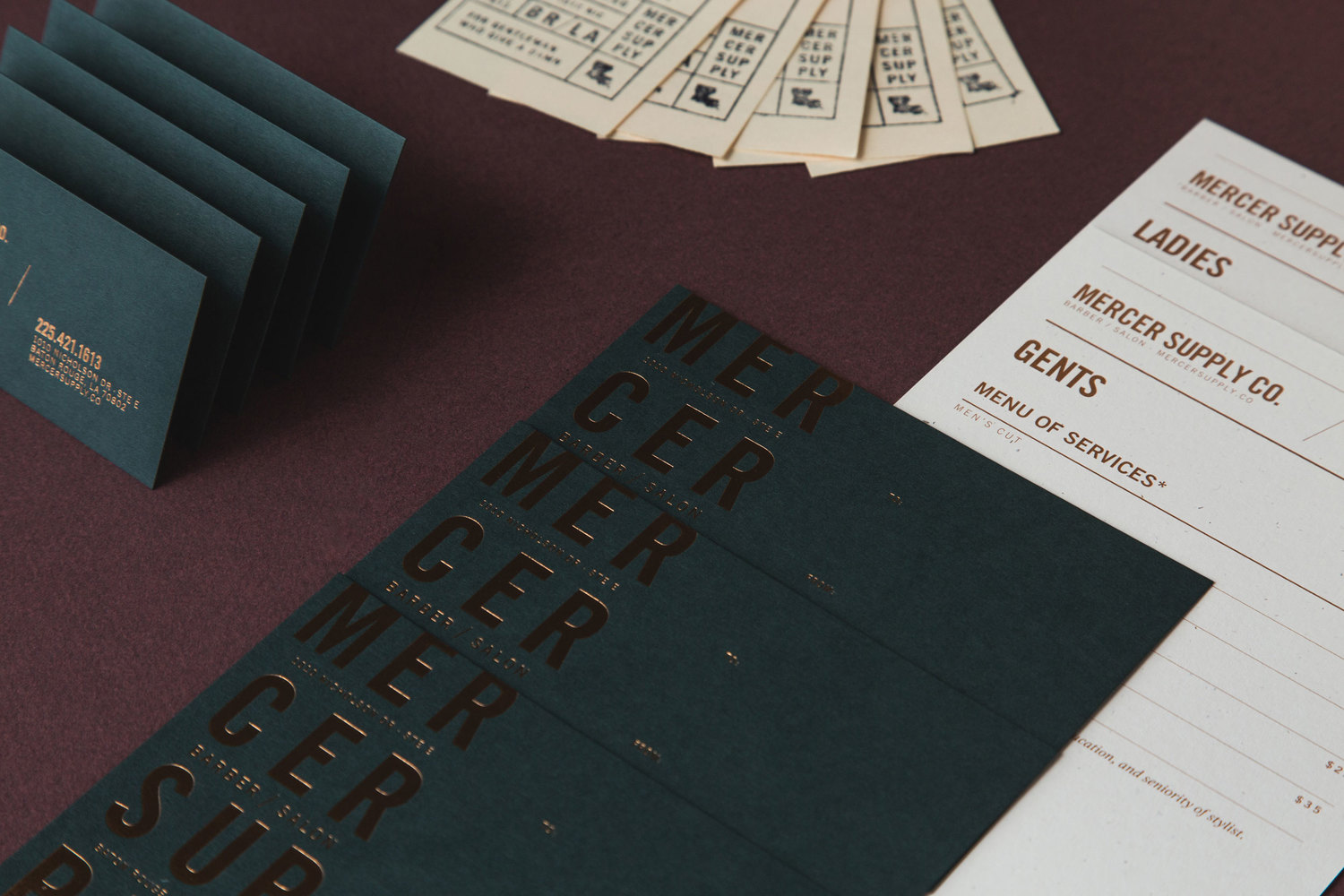
Contrast has been used to great effect, alongside layout and proportion, to secure a lot of visual interest and variation from a few key assets. Highlights include oversized typesetting and thinner patterns across tissue paper, the gloss and reflective qualities of a copper block foil over dark and uncoated boards, black and white papers, monolinear typography and organic illustrative detail, and the rough texture and personable qualities of a hand stamp and the precision and polish of a block foil.
The Mercer Supplies Co. website does a good job of bring all of these details online, and adds a couple of extra traditional and contemporary flourishes in the form of vintage stylist photography and a responsive site build.
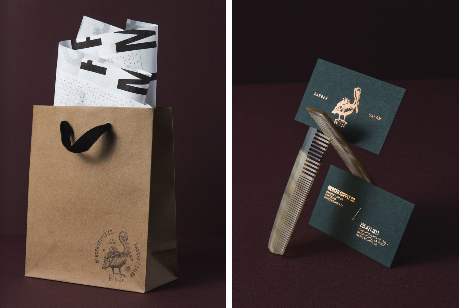
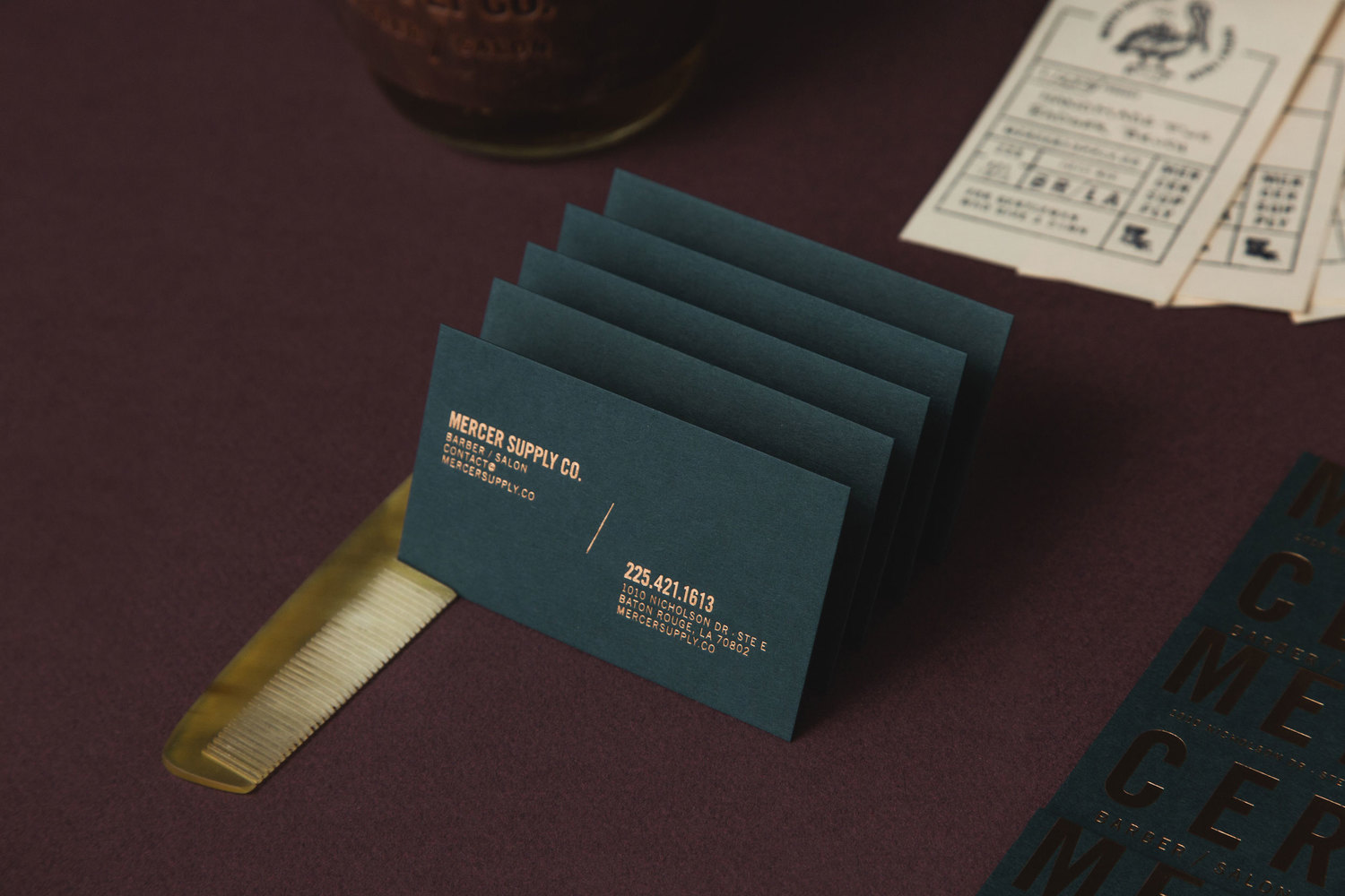
Occasionally there is a small detail that does not quite work, the layouts of the business card backs in particular, however, it is largely well-resolved, thoroughly current and although familiar in concept—a fair response to the positioning and demographic of business—it appropriately takes its cues from the growing male grooming market, a focus on supplies and the qualities of the salon’s interior design. More from Peck & Co. on BP&O.
Design: Peck & Co. Opinion: Richard Baird. Fonts Used: Alternate Gothic & Franklin Gothic.
