James Cohan Gallery by Project Projects
Opinion by Richard Baird Posted 9 February 2016
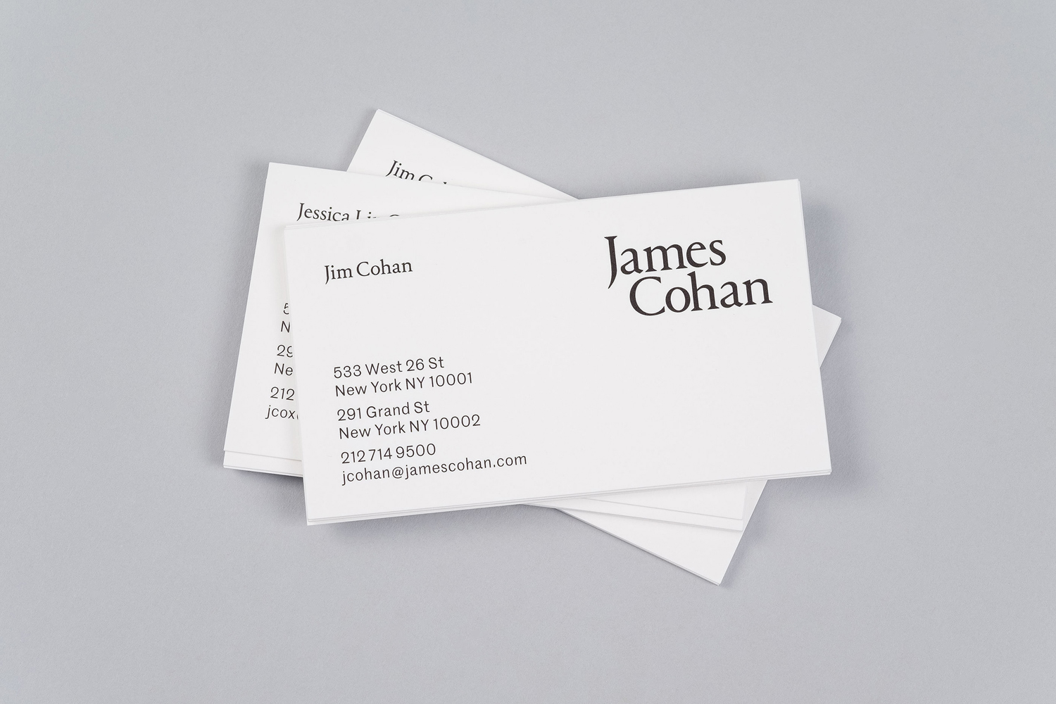
James Cohan is a contemporary art gallery with two locations in New York, one in Lower East Side and the other in Chelsea. Recent exhibitions have included work by artists such as Mernet Larsen, Fred Tomaselli and Beatriz Milhazes, with Philip Hanson and Omer Fast to follow later this year.
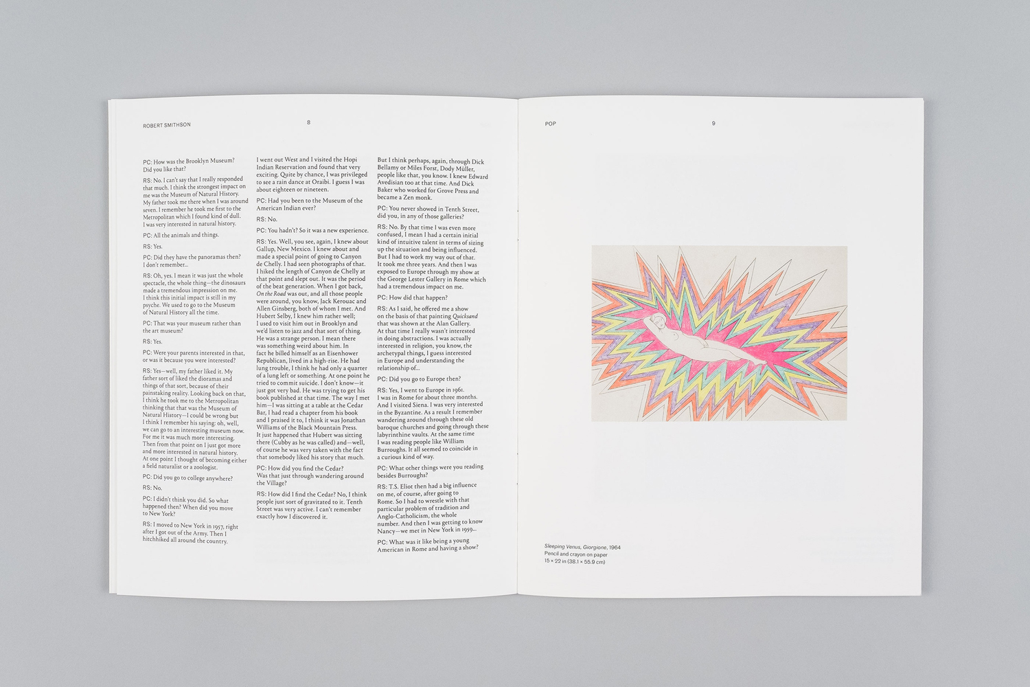
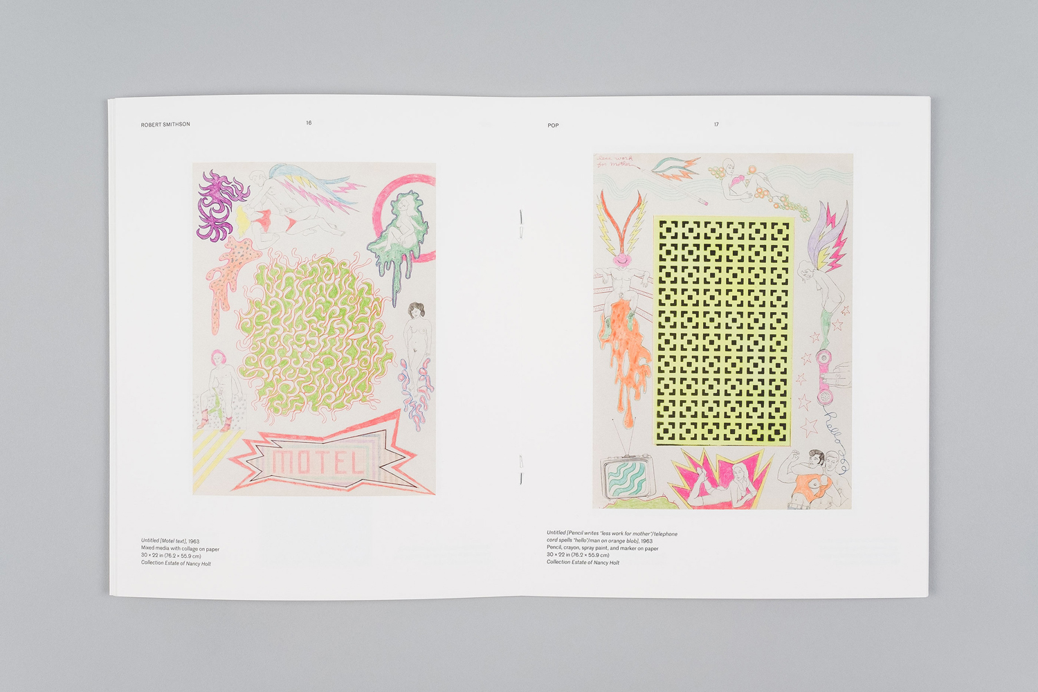
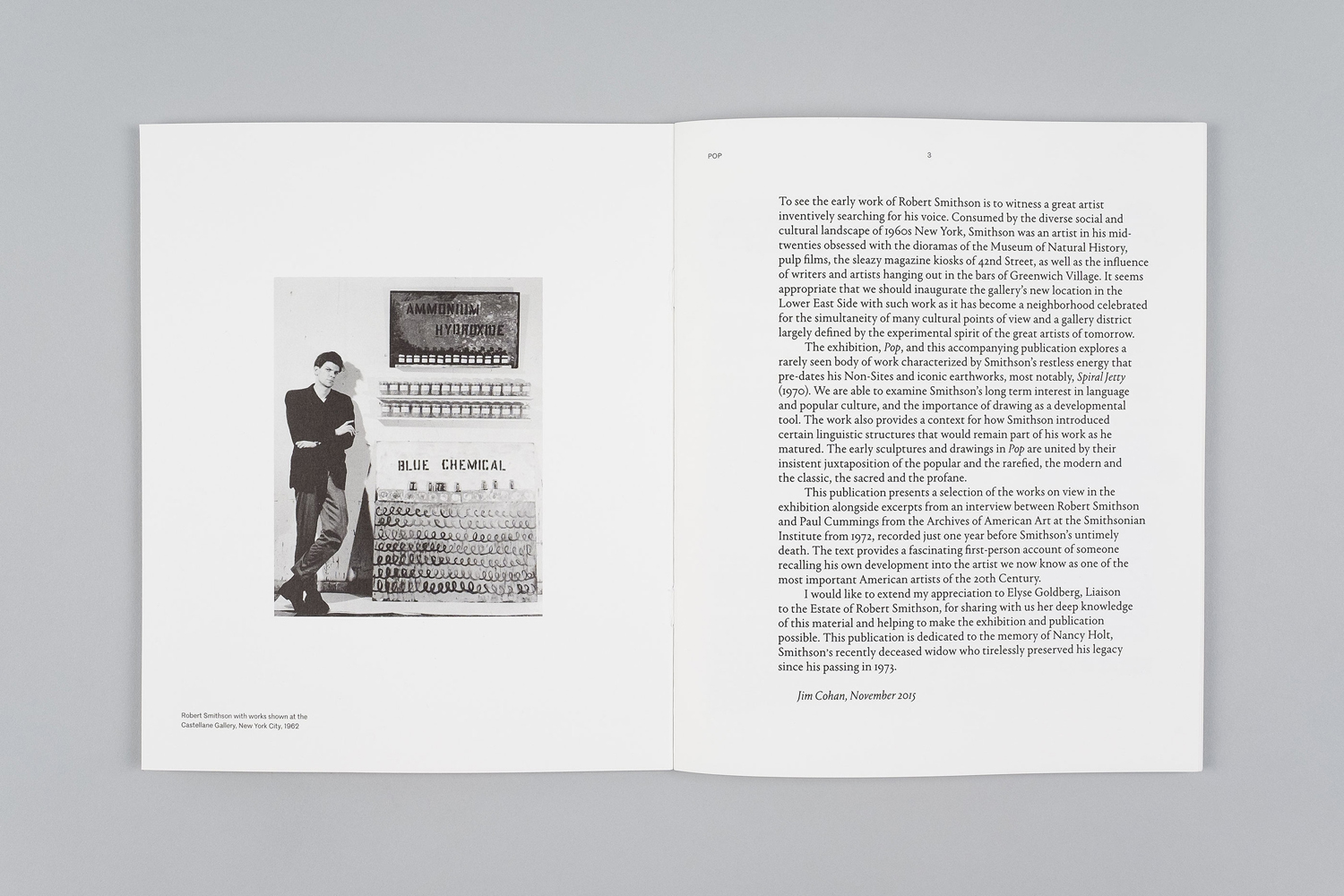
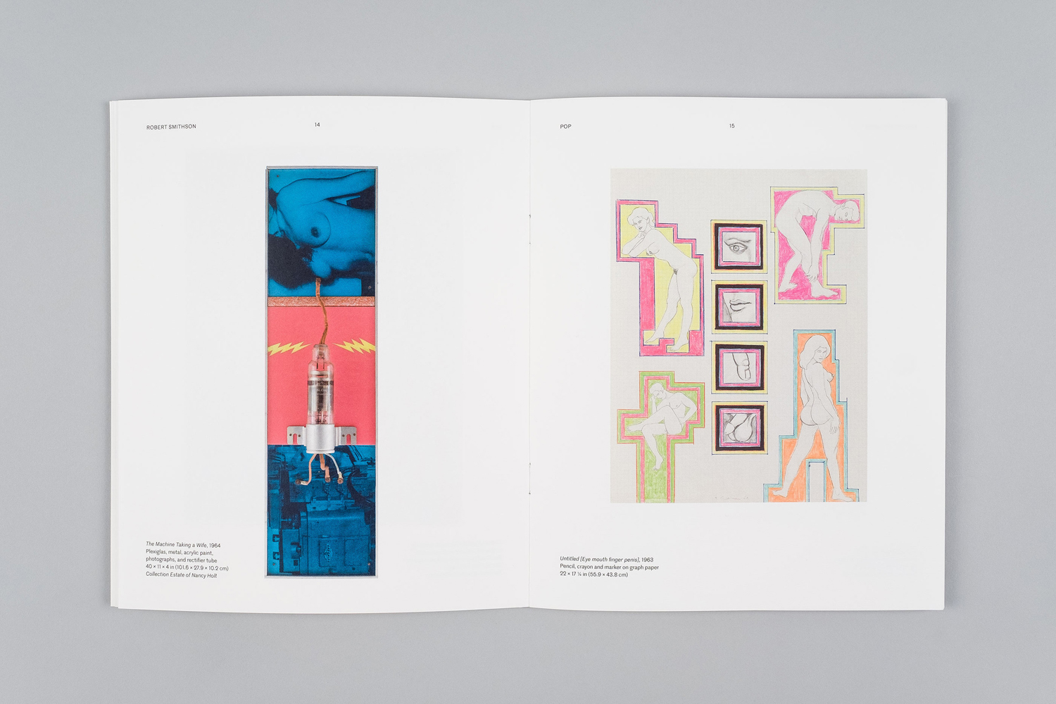
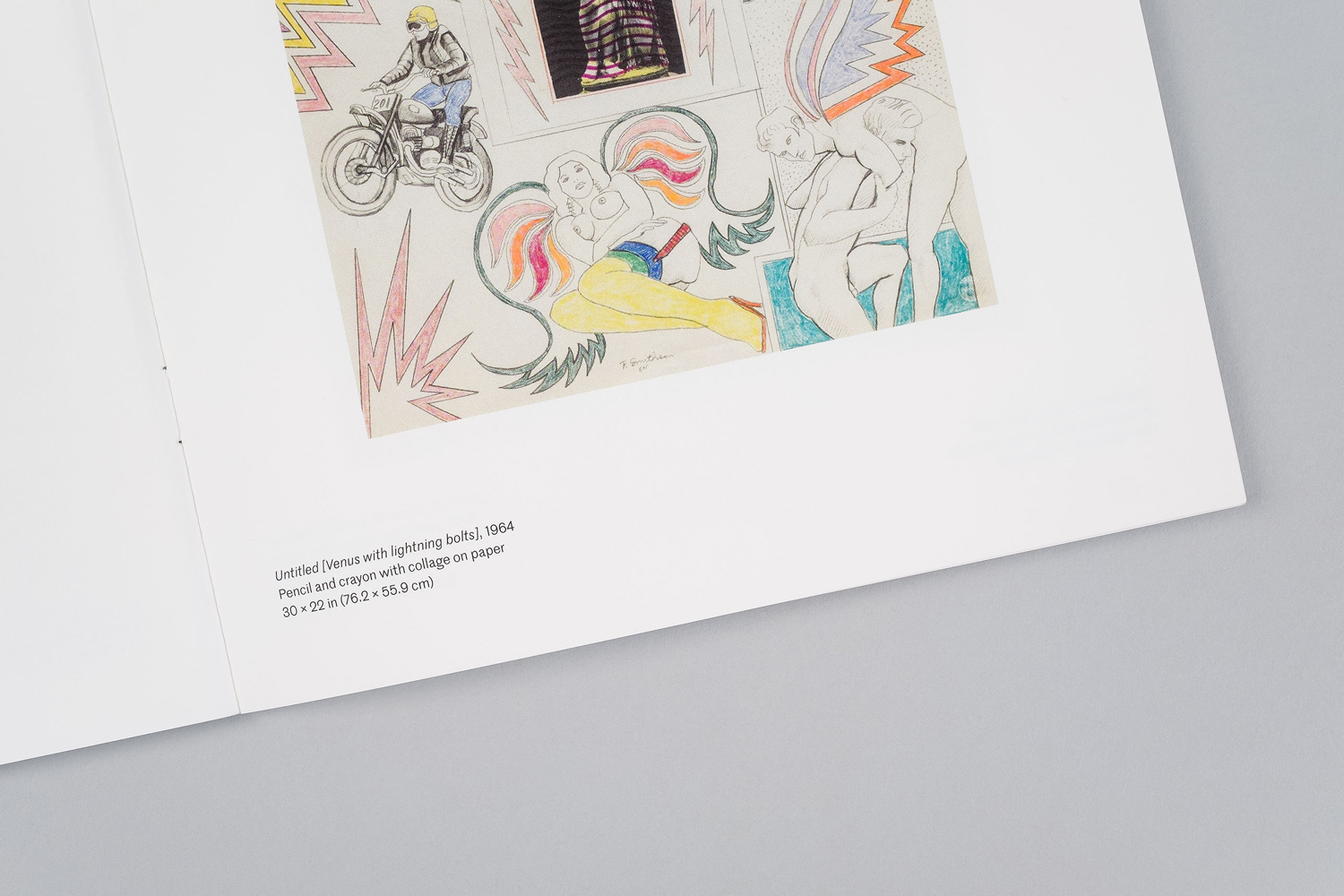
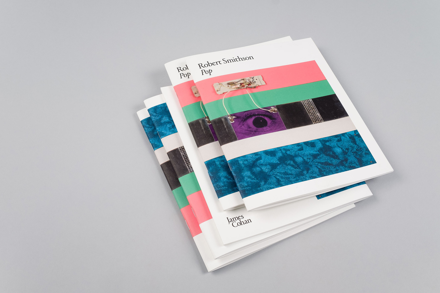
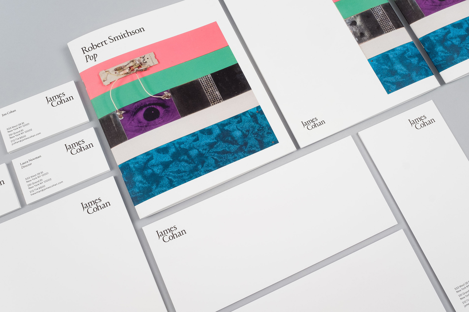
The gallery recently collaborated with American graphic design studio Project Projects to develop a new visual identity. This went on to include custom logotype, business cards, stationery and website, as well as print for the inaugural exhibition of early drawings and sculptures by artist Robert Smithson.
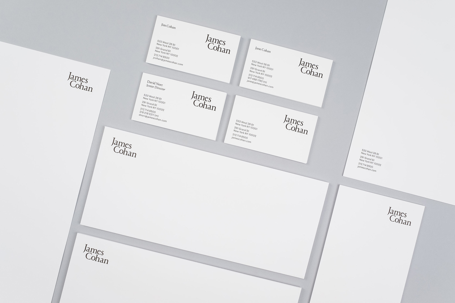
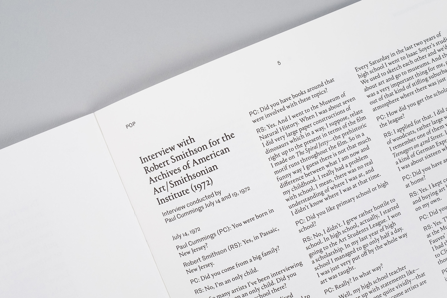
Project Projects’ treatment emerged from thorough research into contemporary art gallery communications, and it shows. The visual identity is characterised by plenty of white space that frames image, much like a gallery space, a custom logotype that introduces individual character, and the modernity of a European Grotesk.
Project Projects explain that certain angles of Commercial Type’s Portrait were shaved down to create a feeling of both an openness and playfulness in an otherwise serious serif, with the secondary typeface, Commercial Type’s Marr Sans, providing a contemporary counterpoint. The changes to Portrait are sensitive to its original intentions, a minimalist depiction of French Renaissance types, with only the slightest amendments and some solid spacing.
The tension that exists between the promotion and exhibition of artist work and a gallery’s own identity is navigated through typographical nuance and the subtle contrast of classical and contemporary forms.
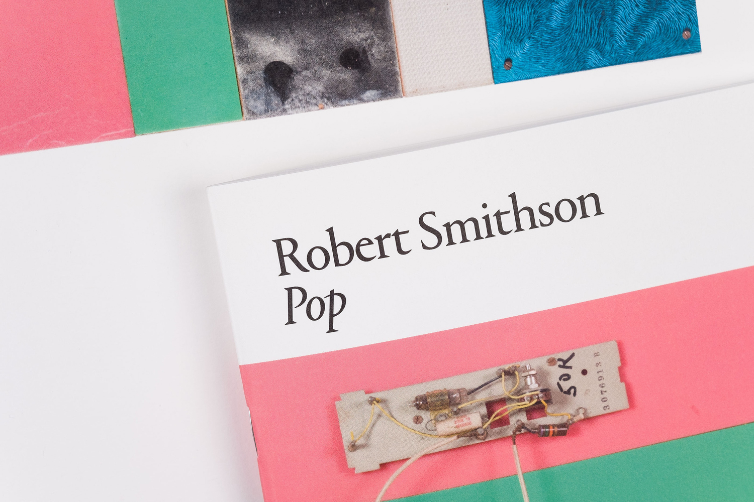
The direction does not look to redefine or challenge what is a sensible approach to gallery identity design, but embraces it. There are some simple but neat layouts and a good use of contrast, both typographically but also in the use of black ink on white board alongside the detail and texture of artwork.
There is a satisfying continuity that exists between print and digital experience in structure and type implementation. This should of course not be unusual, however, there have been a couple of projects recently where this relationship has fallen a little short.
Design: Project Projects. Opinion: Richard Baird. Fonts Used: Portrait & Marr Sans.
